Walk into a room that feels right and something is almost always repeating.
Repetition is one of the key principles of interior designing that makes a room feel pulled together, balanced, and intentional.
When the same color, shape, texture, or pattern shows up more than once, the eye starts to find a natural flow. Without it, even the most expensive rooms can feel scattered.
This guide covers how repetition in interior design works, from color schemes and patterns to symmetry and rhythm and how to use it well in any space.
What is Repetition in Design?
Repetition in interior design means using the same element more than once across a space.
That element can be a color, a shape, a texture, a pattern, or a material.
When used with intention, it creates visual connections that make a room feel complete.
Most people apply this principle without even knowing it. Matching pillows, a repeated wood finish, or the same metal tone across light fixtures, all of these are repetition at work.
The goal is not to match everything. It is to create a visual thread that the eye can follow. That thread is what makes a room feel like a decision was made, not a series of purchases.
Why it Works
It builds visual flow, pulling the eye from one part of a room to the next without forcing it.
A repeated element also makes a room feel intentional. It signals that the design was planned, not thrown together.
There is a psychological side to it. The brain actively looks for patterns.
When it finds them, a space feels calm and familiar. That is why a room with good repetition reads as comfortable before you can explain why.
Repetition vs. Pattern vs. Symmetry
These three terms get used interchangeably but they mean different things.
Here is how they actually differ.
| Concept | What it means | Example |
|---|---|---|
| Repetition | Any element used more than once across a space | The same terracotta tone in a pillow, a vase, and a piece of art |
| Pattern | A single design that repeats within itself | A geometric motif that tiles across a rug |
| Symmetry | Elements mirrored on either side of a central point | Two matching lamps on either side of a bed |
Symmetry is always a form of repetition, but repetition does not have to be symmetrical.
Pattern is a type of repetition too, but it operates within one object rather than across a whole room. More on this below.
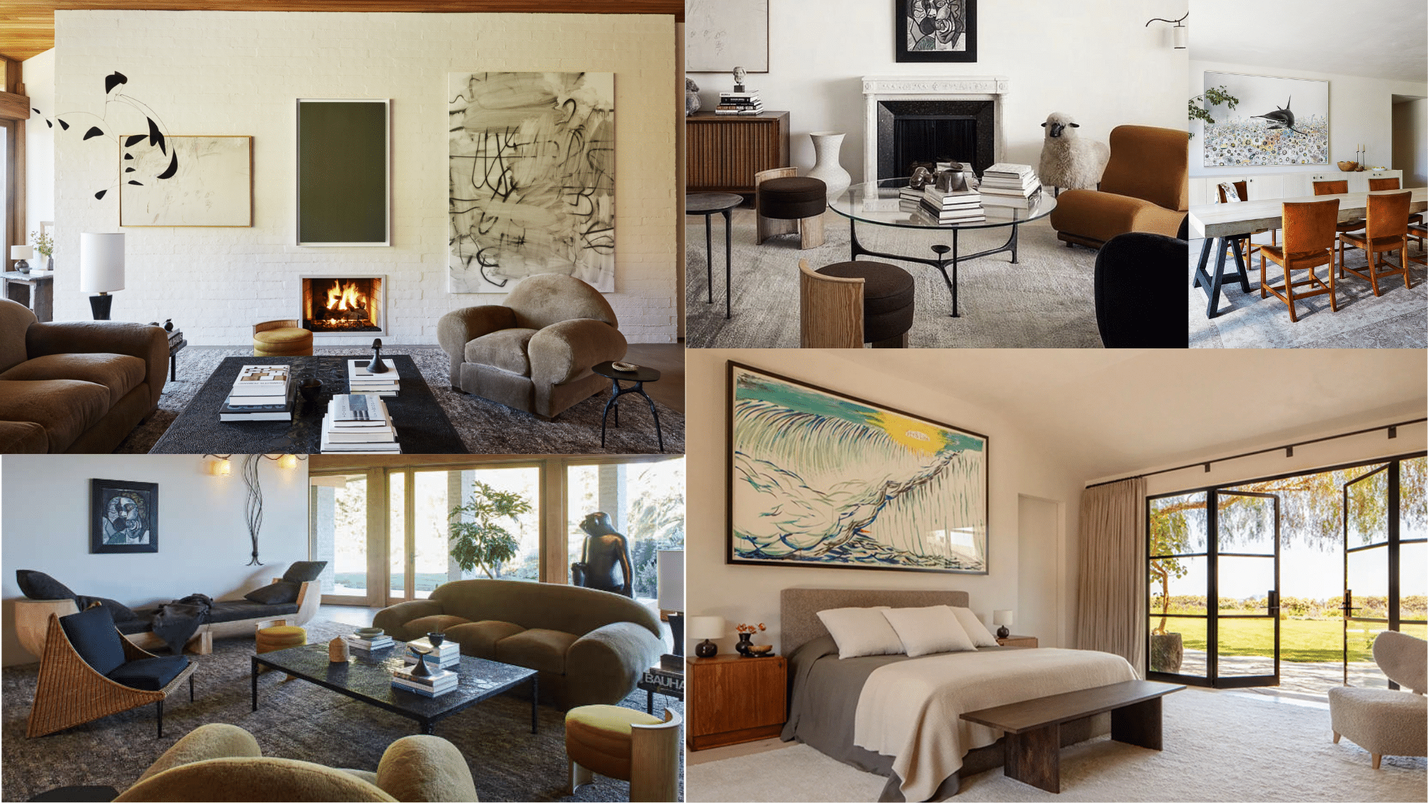
How to Create Repetition in Interior Design
You do not need to start over. Most rooms already have the raw material. It is about noticing what is there and deciding what to repeat with purpose.
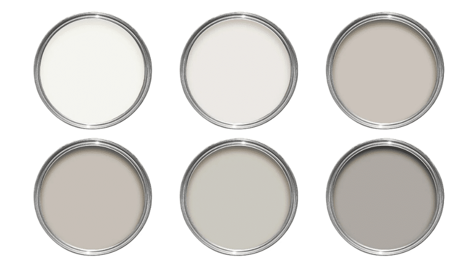
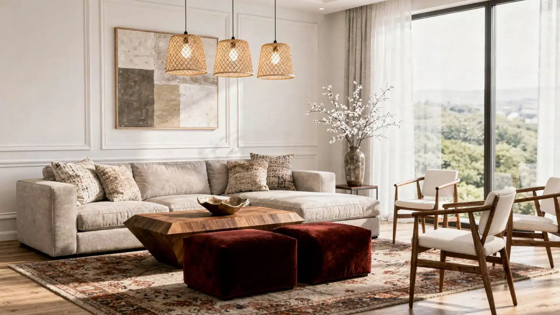
Color Scheme
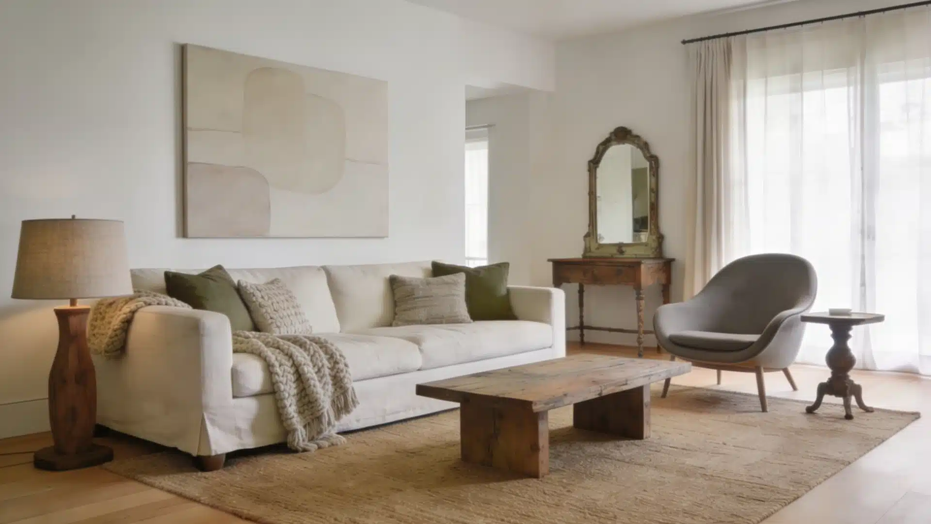
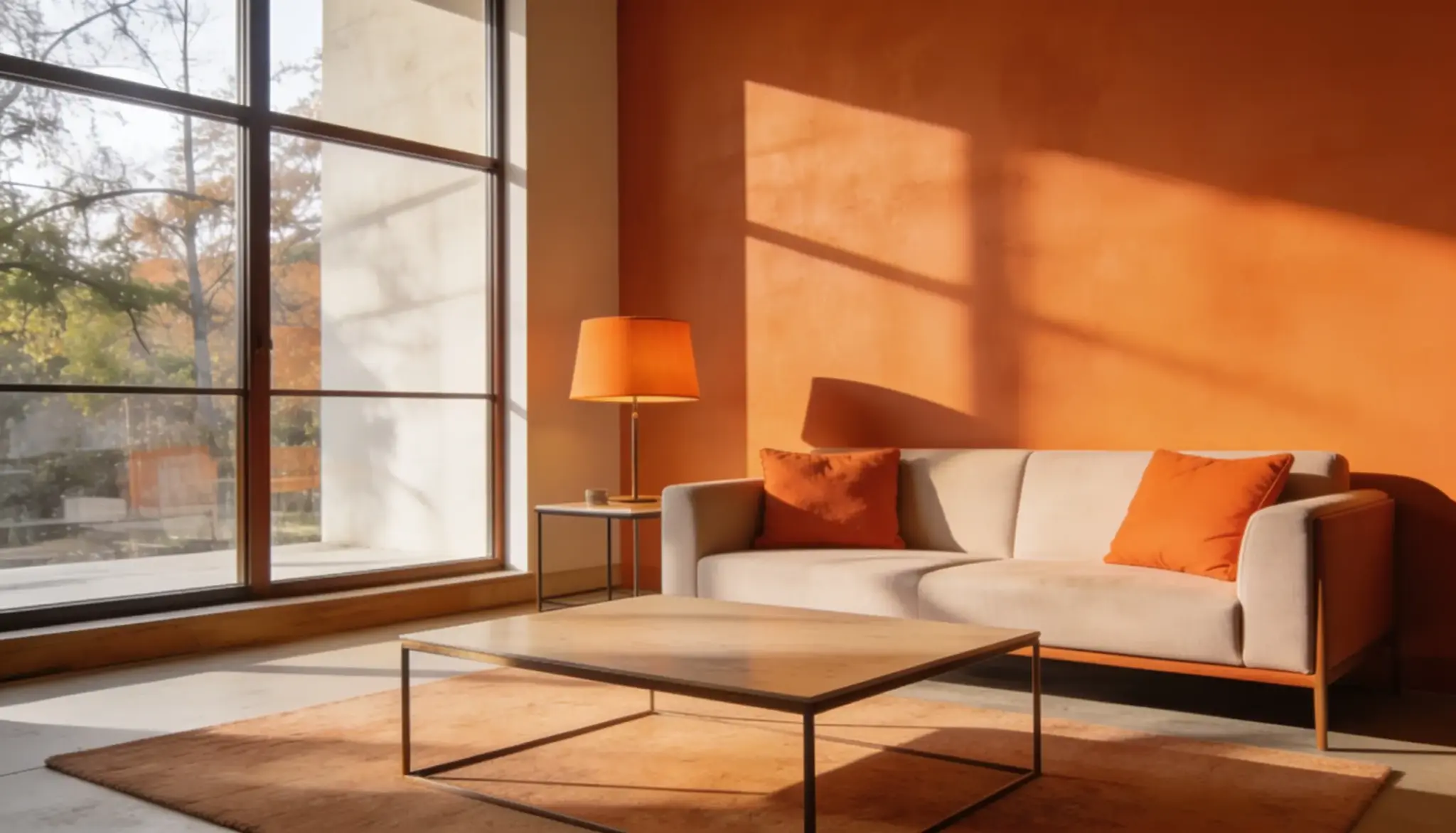
Color is the simplest way to build repetition in a room. Pick one or two anchor colors and let them show up in different spots like in a pillow, a vase, a piece of wall art, or a lamp shade.
Repeat it at least three times for it to read as deliberate. Two placements looks like coincidence.
Vary the shade slightly across those placements so it does not feel copy-pasted.
A deep navy on the wall can echo through a lighter blue cushion without feeling overdone.
Odd numbers work better than even ones. Three or five placements read as natural. Four feels like you ran out of ideas halfway through.
In a living room, this might look like terracotta showing up in a throw pillow, repeated in a ceramic vase on the shelf, and again in a small piece of art above the sofa.
Patterns
Repeating a pattern across different surfaces adds visual interest without adding clutter. A geometric print on a rug can echo in the curtains or cushion covers.
Vary the scale. One large, bold version and one smaller, quieter version of the same pattern gives the eye something to do without overwhelming it.
Stick to the same color family across all patterned pieces so everything seems connected.
Competing patterns in clashing color families is where rooms go wrong fast.
A classic version of this is a bold geometric rug in the living room with the same motif appearing at a smaller scale on scatter cushions and again as a subtle print on the curtain border.
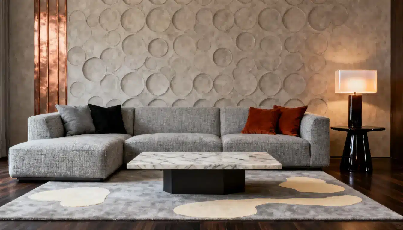
Symmetry
Symmetry is the most structured form of repetition. Mirror elements on either side of a central point and the room settles immediately.
Two matching lamps on either side of a bed, a pair of identical chairs facing a sofa, or twin planters flanking a doorway, all create a grounded, formal feel.
It does not have to be exact.
Near-symmetry, where pieces match in scale and weight but differ slightly in shape or finish, gives the same sense of calm without feeling rigid.
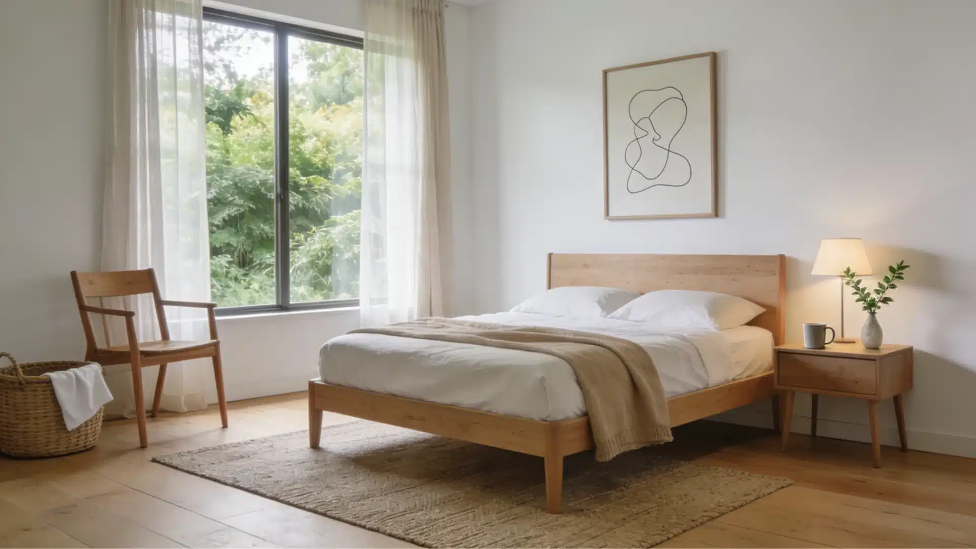
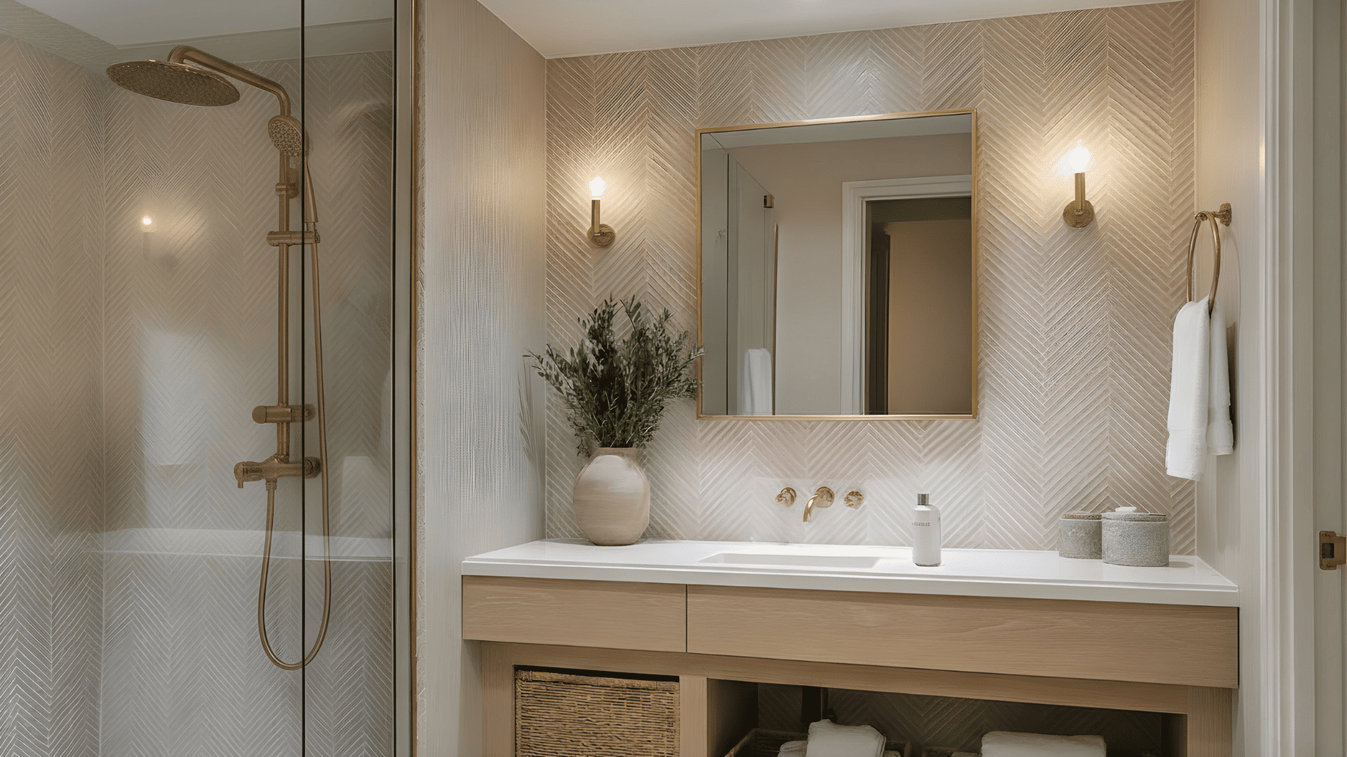
Texture
Texture is the quietest form of repetition and often the most effective. It shapes how a room feels, not just how it looks. Linen, boucle, and rattan are all warm and tactile.
Running one of those across a few key pieces creates a cohesive mood without the room ever feeling matchy.
A boucle sofa paired with a woven rug and linen curtains all speak the same textural language. Balance is important here.
Pair soft, rough textures with at least one smooth or hard surface to avoid a flat, one-note feel.
A marble tray or lacquered side table next to all that softness makes the texture read louder, not quieter.
In a bedroom, a linen duvet paired with a woven jute rug and a rattan beside lamp all share the same warm, tactile quality without a single piece matching another.
Repeat texture across at least three surfaces using furniture, soft furnishings, and a decorative accessory just for the effect to register visually.
Rhythm Assessment
Rhythm is repetition with direction. It guides the eye across a room rather than just anchoring it in one spot.
This can happen through repeating shapes along a shelf, using lighting fixtures at consistent intervals, or arranging artwork in a line.
Gradation is one of the most useful rhythm tools: arranging objects from small to large, or light to dark, creates a sense of movement and progression.
A shelf styled this way reads as curated rather than cluttered.
A well-placed rhythm stops the eye from jumping and gives a room a pace that feels natural.
A long open shelf styled with objects that gradually increase in height from left to right is a simple example: the eye follows the progression naturally from one end to the other without needing a focal point to land on.
Shapes
Shape is one of the easiest repetition tools to overlook because it works quietly.
When the same silhouette shows up in different objects across a room, the eye connects them without the brain registering why the space feels settled.
It works in both directions. Rounded shapes — curved sofas, circular mirrors, arched doorways, oval trays — create a soft, flowing feel when repeated.
Sharp, geometric shapes repeated across furniture legs, frame profiles, and light fixtures read as structured and modern.
Pick one dominant shape family and let it echo. If your sofa has rounded arms, look for that curve again in a side table edge, a lamp base, or a piece of wall art.
You do not need an exact match. A shared silhouette is enough.
Avoid mixing too many competing shape families. Curves and hard angles can coexist, but one should lead and the other should support.
The Mistakes That Kill it
Repetition works best when it is applied with balance and intention. Knowing what to avoid is just as important as knowing what to do.
Over-Matching: Repeating every single element in a room makes the space feel staged and flat. One contrasting piece breaks the monotony and actually makes the repeated elements read stronger.
Under-Repeating: Using a color, shape, or texture just once does not create repetition, it creates an accident. For an element to feel intentional, it needs to appear at least three times across the space in different forms or placements.
Ignoring Scale: Repeating the same size of an element throughout a room creates a monotonous, one-dimensional look. Mix large, medium, and small versions of the repeated element to add depth and visual interest.
Conclusion
Repetition in design is not about making a space look uniform. It is about creating a visual language that holds a room together.
When color, pattern, texture, symmetry, and rhythm are repeated with care, a space gains balance, flow, and intention.
Most rooms that feel slightly off are missing it in some form.
Start with one element. Pick a color already in the room, repeat it in two more spots, and see how the space shifts. That is the whole principle in practice.