Earth tone colors have a way of making any room feel grounded without trying too hard. No cold grays. No stark whites.
Just shades pulled straight from nature like rich soil, sun-baked clay, aged wood, and dry stone.
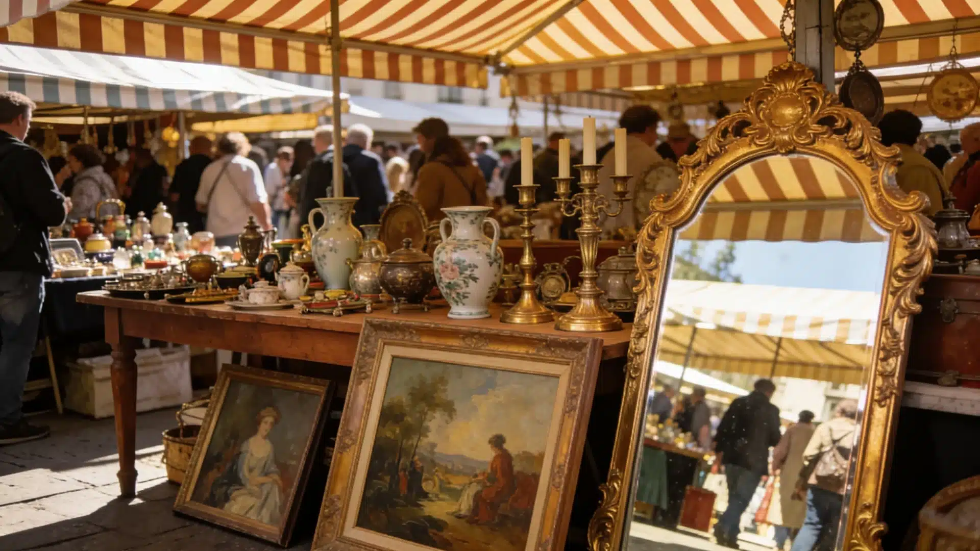
These colors have been showing up everywhere lately, and for good reason. They layer well, they age well, and they work in almost every room.
If you have been thinking about building an earthy color palette but don’t know where to start, this is the place.
What are Earth Tone Colors?
Earth tone colors are shades derived directly from the natural world.
We are talking about the warm color of dry desert sand, dark tree bark, terracotta pots, mossy rocks, and sun-bleached stone. These are not made-up shades.
They exist in nature, and that is exactly why they feel so easy to live with.
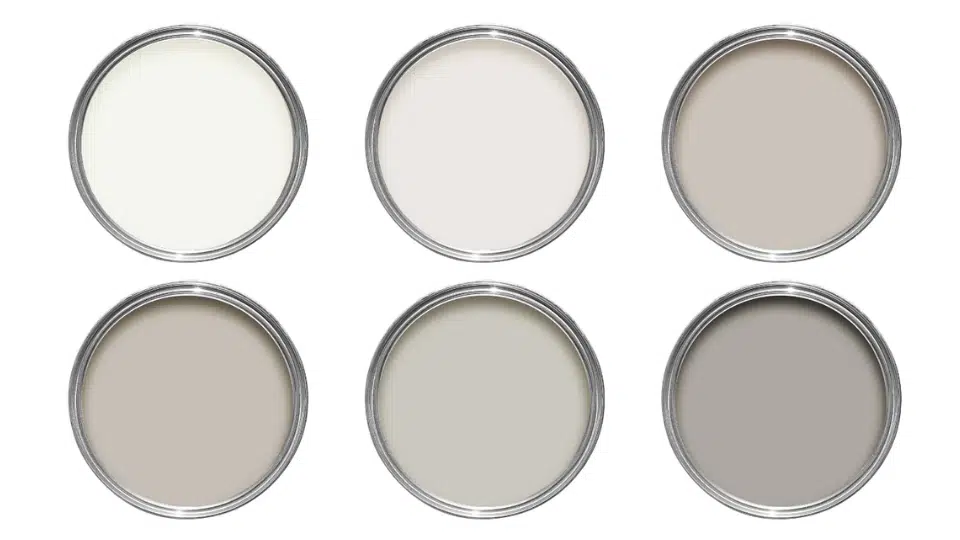
Earthy colors sit in the brown, beige, tan, rust, olive, and clay families. Some lean darker, like deep walnut or charcoal clay. Others stay light, like cream or oat.
A well-built earthy color palette pulls from both ends, so the space never feels flat or one-dimensional.
Earth Tone Color Palette Codes: Every Shade You Need to Know
An earthy palette brings together shades inspired by nature, such as soil, stone, wood, and foliage.
These tones work across spaces because they feel grounded and easy to mix.
The secret to making them work is knowing which group each shade belongs to, and how to combine groups without the space feeling muddy or flat.
1. Warm Earth Tone Colors
Warm earth tone colors add depth and life to any space. They pull from fired clay, sun-baked soil, and dry leaves.
These shades are especially popular for earth tone colors for bedroom settings where the goal is comfort and a cozy, grounded feel.
- Terracotta
- Rust
- Burnt orange
- Mustard yellow
Earthy Color Palette: Terracotta + Mustard Yellow + Cream + Warm Brown
2. Cool Earthy Color Palette
Cool colors bring calm and freshness into a room. They reflect elements like shaded moss, river stone, and forest canopy.
These work well in spaces where you want things to feel relaxed rather than energized.
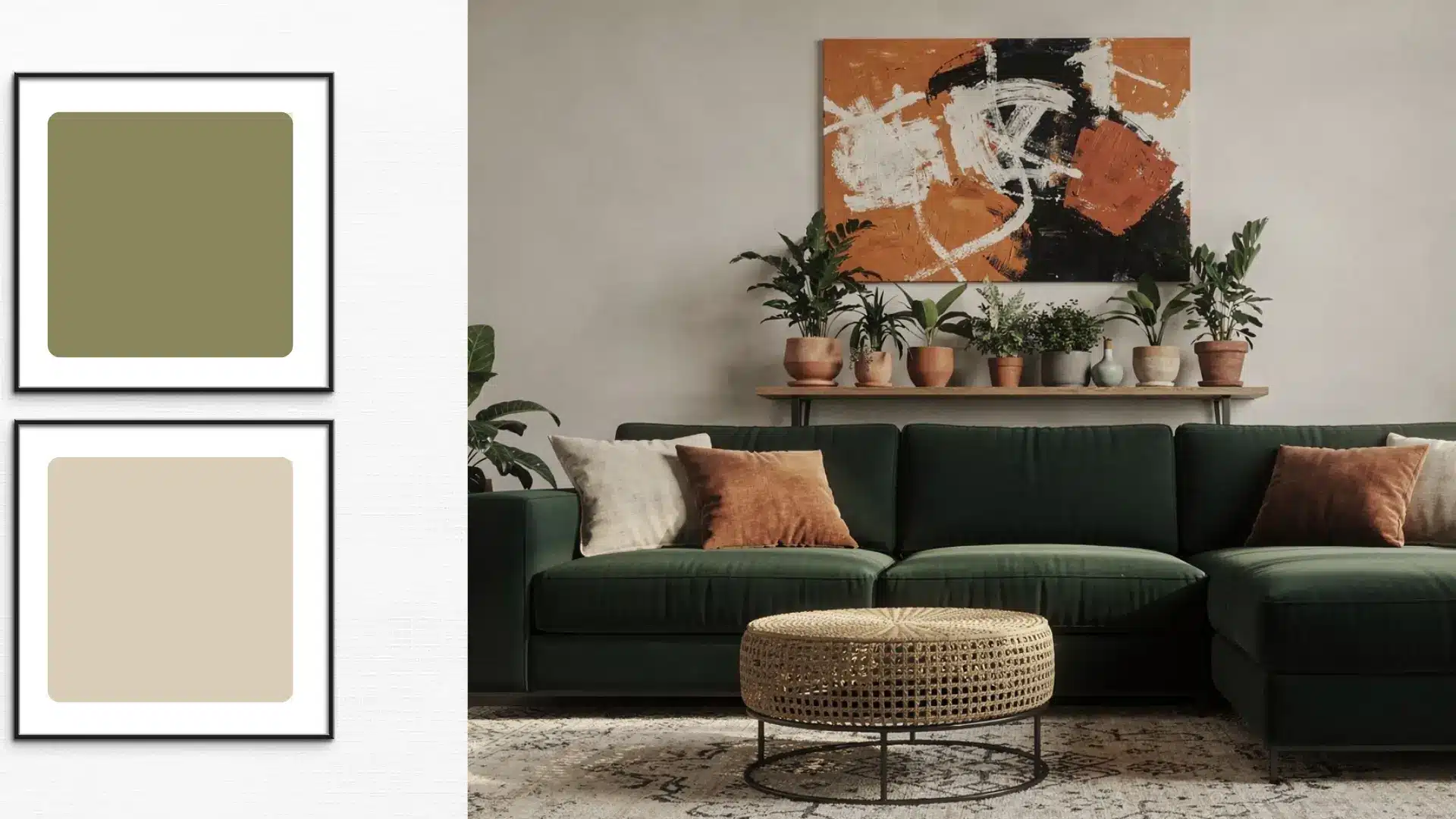
- Olive green
- Moss green
- Slate gray
- Dusty blue
Earthy Color Palette: Olive Green + Slate Gray + Dusty Blue + Soft Beige
3. Neutral Earth Tones
Neutral tones are the foundation of any strong color palette.
They are easy to layer, hard to get wrong, and help balance both warm and cool shades in the same room.
Without at least one neutral in the mix, earth tone colors can start to feel heavy fast.
- Beige
- Taupe
- Sand
- Cream
Earthy Color Palette: Beige + Taupe + Sand + Cream + Light Wood Accents
How to Create a Balanced Earthy Color Palette
Start with three layers. Pick a light base like cream or sand, a mid-tone like taupe or olive, and one darker anchor like rust or walnut brown.
That structure alone gives any room a sense of depth without feeling overdone.
Do not stick to only warm or only cool shades. Mixing warm terracotta with cool slate gray keeps an earthy color palette from looking flat. Contrast is good.
Just make sure every shade still has some brown or gray in it so the palette stays connected. Earth tone colors work best when layered, not matched.
A simple starting combination: cream base, olive mid-tone, rust anchor, and natural wood texture throughout.
How Earth Tone Colors Work in Every Room
Earth tone colors are practical, not just pretty. They hide wear and age well and work across every room without feeling out of place.
Most color families force you to redesign around them. Instead, they do the opposite. They adapt.
1. House Exterior
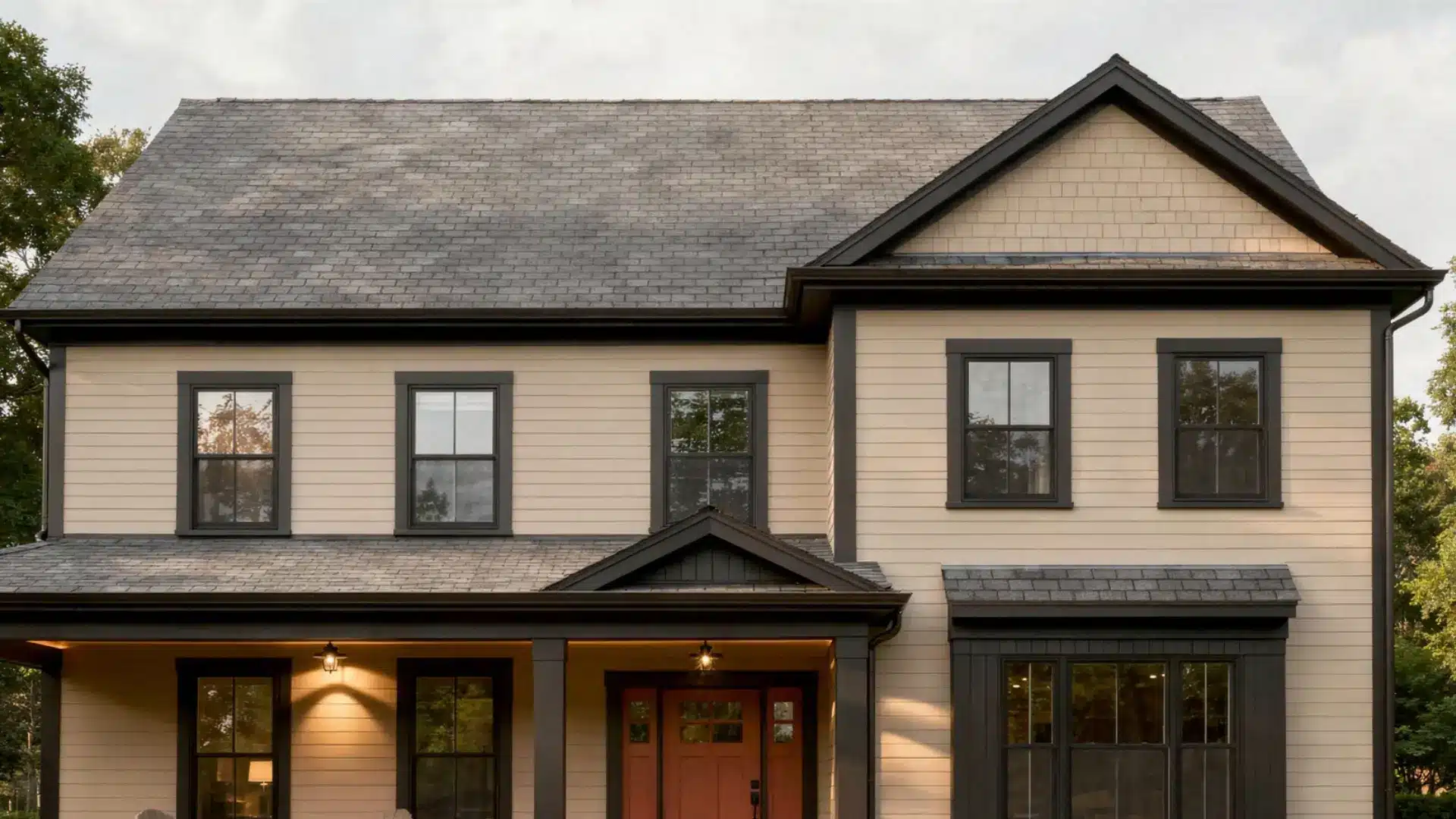
Earthy colors handle sun, rain, and dust better than most because they do not show grime the way white or cool gray does. They also sit naturally against grass, stone, and wood landscaping.
- Main walls: warm taupe or sand
- Trim and shutters: deep walnut brown or charcoal clay
- Front door: terracotta or rust
Best shades to try:
- Sherwin-Williams:Accessible Beige (SW 7036)
- Benjamin Moore:Grant Beige (HC-83)
Using too many shades at once. Three is the limit. Any more, and the exterior starts looking patchy rather than layered.
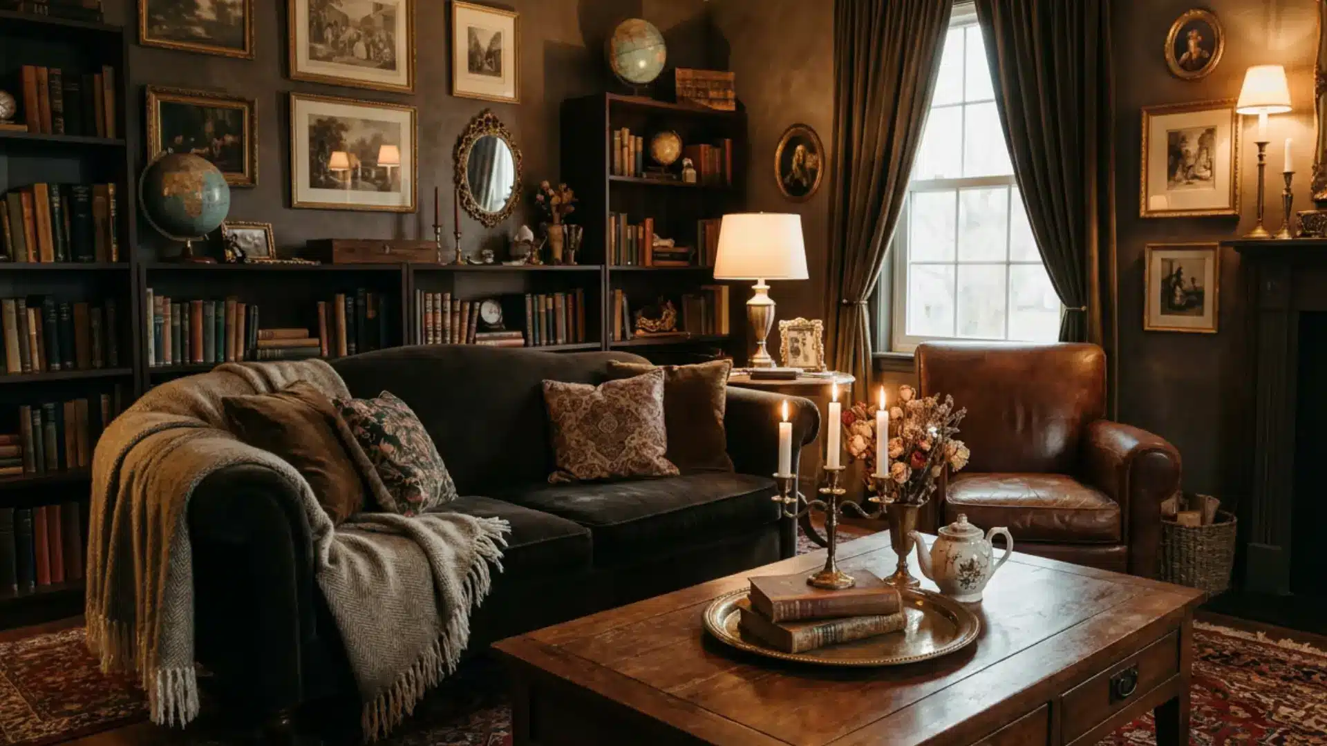
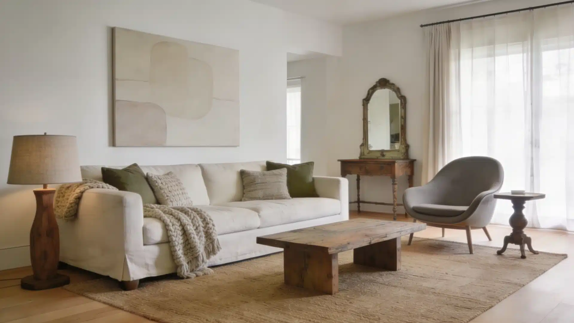
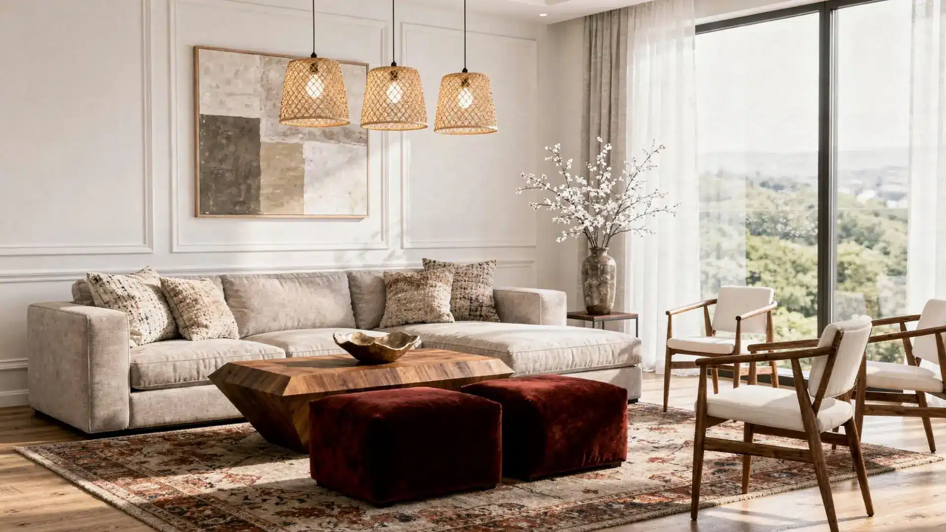
2. The Living Room
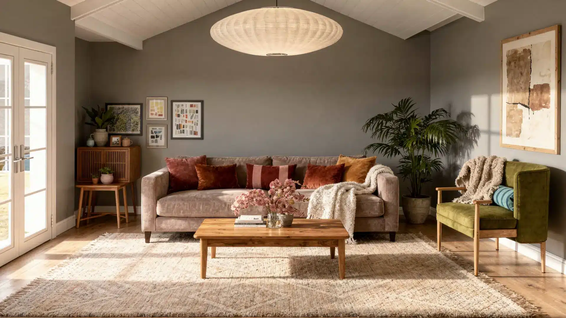
Start with warm beige or sand on the walls. Layer in a taupe sofa, rust or terracotta cushions, olive green through a chair or plant, and natural wood in the furniture.
Think in layers rather than trying to match everything.
Best shades to try:
- Benjamin Moore:Edgecomb Gray (HC-173)
- Sherwin-Williams: Kilim Beige (SW 6106)
Try not to keep everything the same shade of beige. When the sofa, walls, and rug are all one tone, the room flatlines. Push one element darker, and the whole space comes alive.
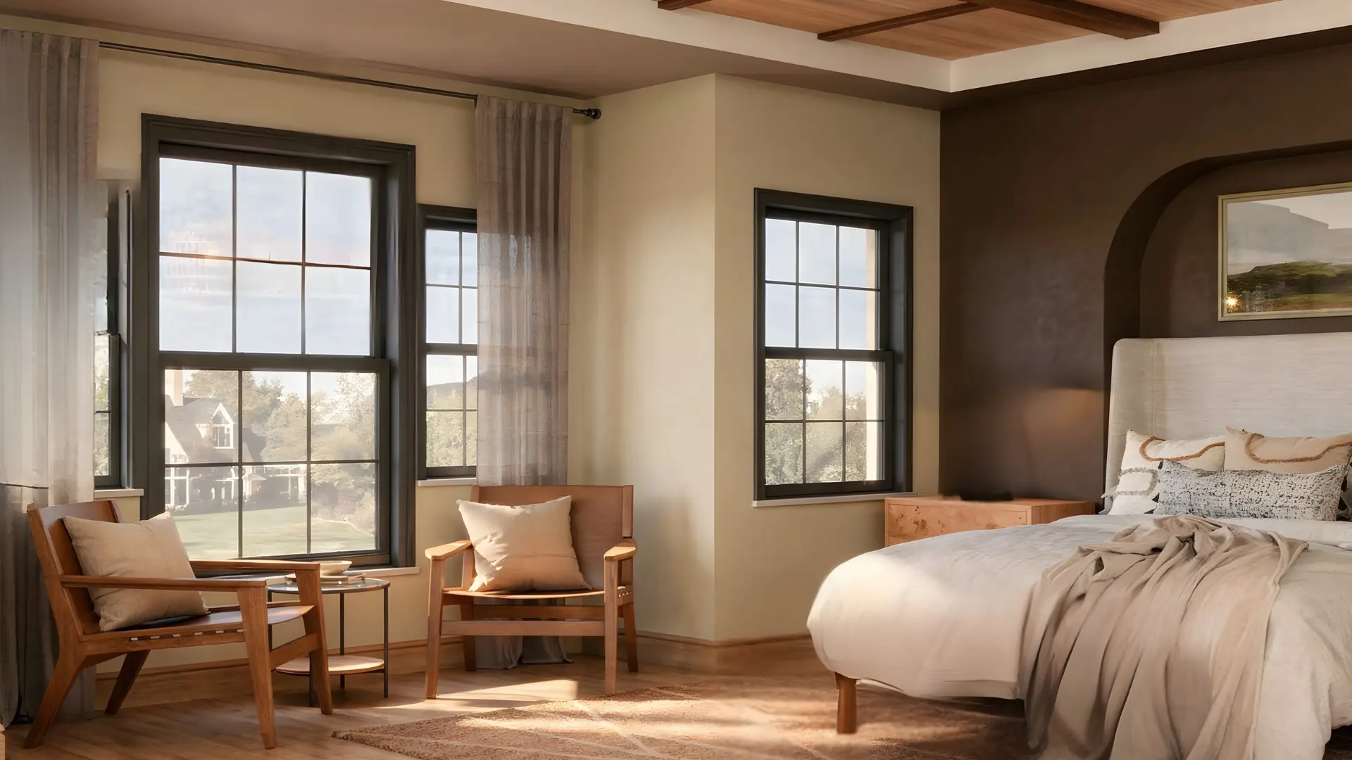
3. Bedroom
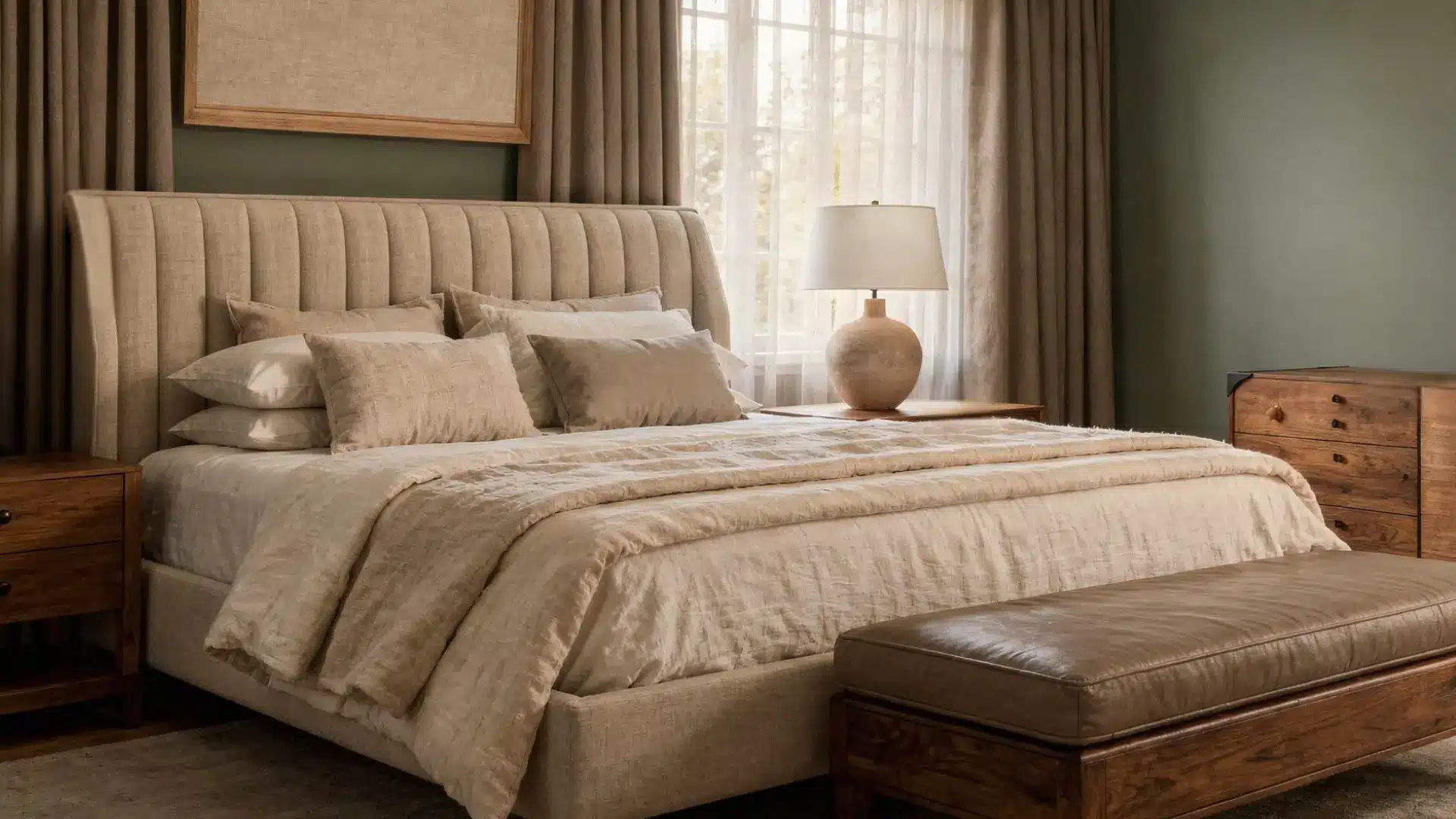
Bedrooms need the quieter side of the colors.
Dusty blue or moss green on the walls, cream bedding, taupe curtains, and warm wood in the furniture cover every layer without feeling busy.
Best shades to try:
- Sherwin-Williams: Evergreen Fog (SW 9130)
- Benjamin Moore:Healing Aloe (1562)
4. Earth Tone Colors for Walls
The direction your room faces changes how every shade reads in real life. Always test a large swatch on the actual wall before committing.
A small paint chip never tells the full story.
- North-facing: Warmer earth tone colors like terracotta or warm beige balance the cool light
- South-facing: Cooler colors like olive or slate gray work without washing out
- East and west-facing: Neutrals like taupe or sand handle the shifting light best
Best shades to try:
- Benjamin Moore: Pale Oak (OC-20)
- Sherwin-Williams:Balanced Beige (SW 7037)
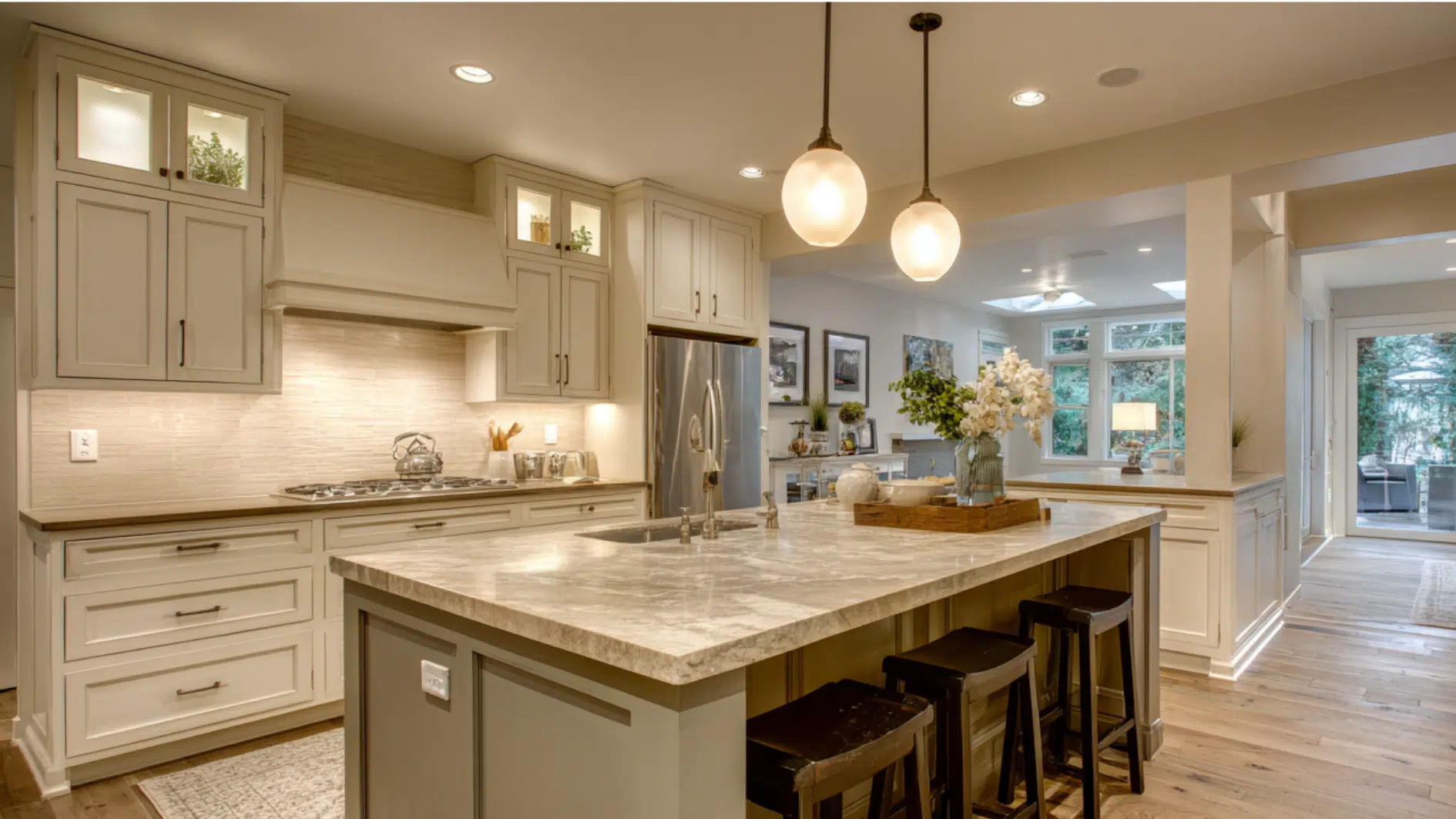
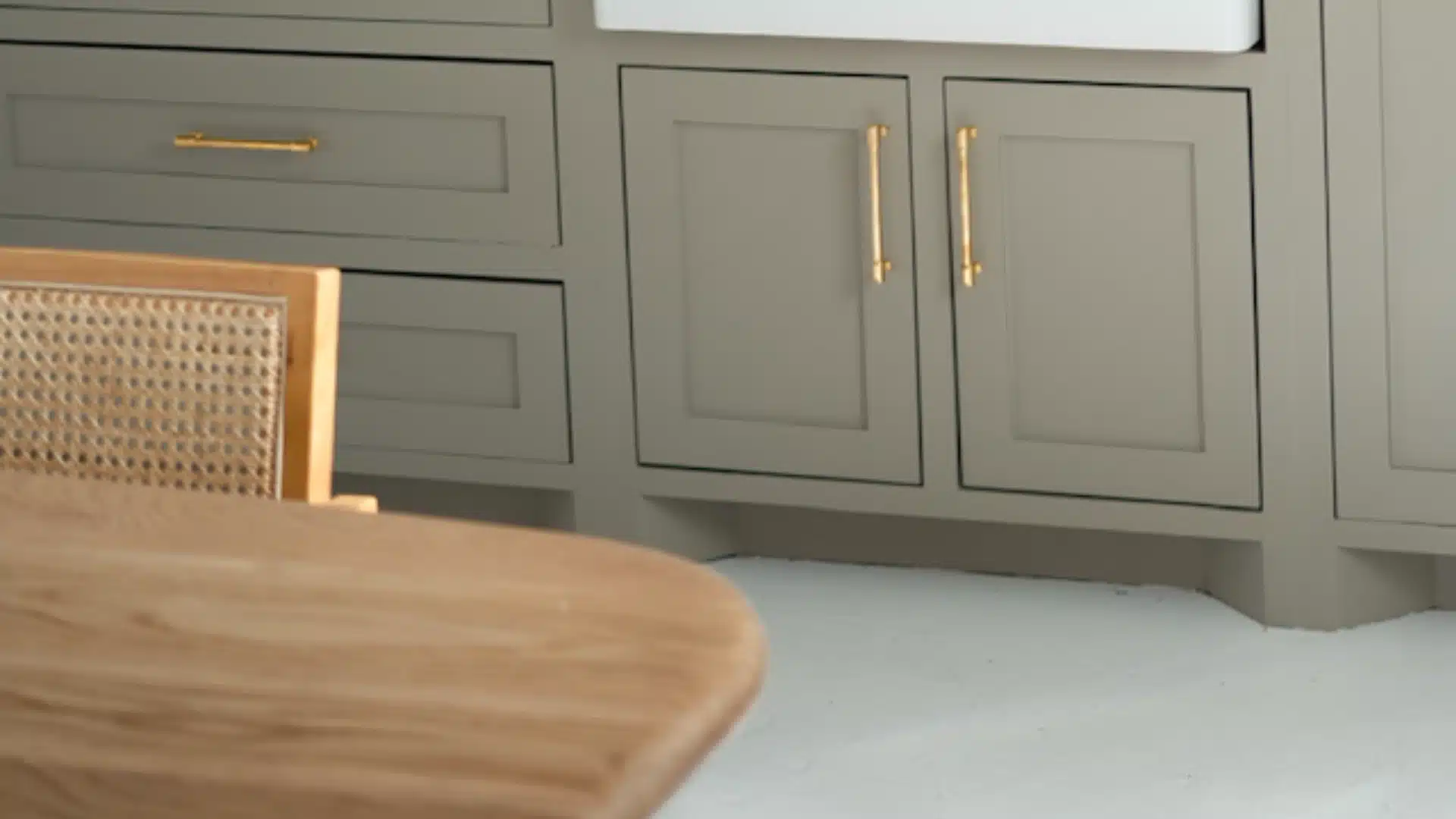
5. Kitchen
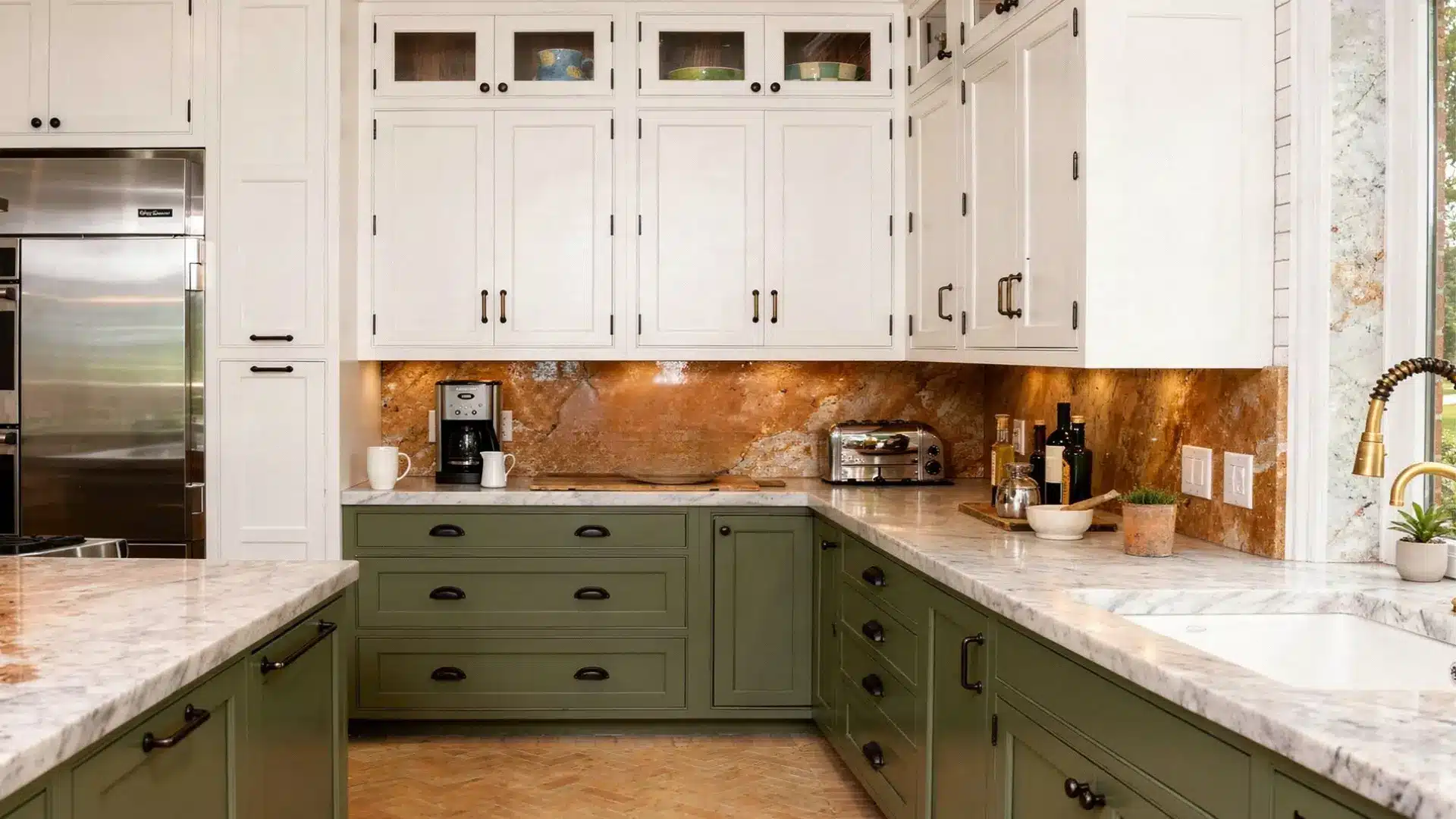
Kitchens have a lot going on. Cabinets, countertops, backsplash, and hardware all share the same space, and the trick is to make them feel connected without looking muddy.
Start with cream or warm white on the upper cabinets, bring in olive green, taupe, or warm gray on the lowers, and finish with a natural stone or terracotta backsplash.
Matte black or brushed brass hardware ties it all together cleanly.
Best shades to try:
- Sherwin-Williams: Alabaster (SW 7008)
- Benjamin Moore:Saybrook Sage (HC-114)
How to Build a Palette That Actually Balances
Start with three layers. A light base like cream or sand, a mid-tone like taupe or olive, and one darker anchor like rust or walnut brown. That structure gives any room depth without feeling overdone.
Do not stick to only warm or only cool shades. Mixing warm terracotta with cool slate gray keeps the color palette from looking flat.
Every shade should still have some brown or gray in it so the palette stays connected.
A simple starting point: cream base, olive mid-tone, rust anchor, and natural wood texture. Earth tone colors work best when layered, not matched.
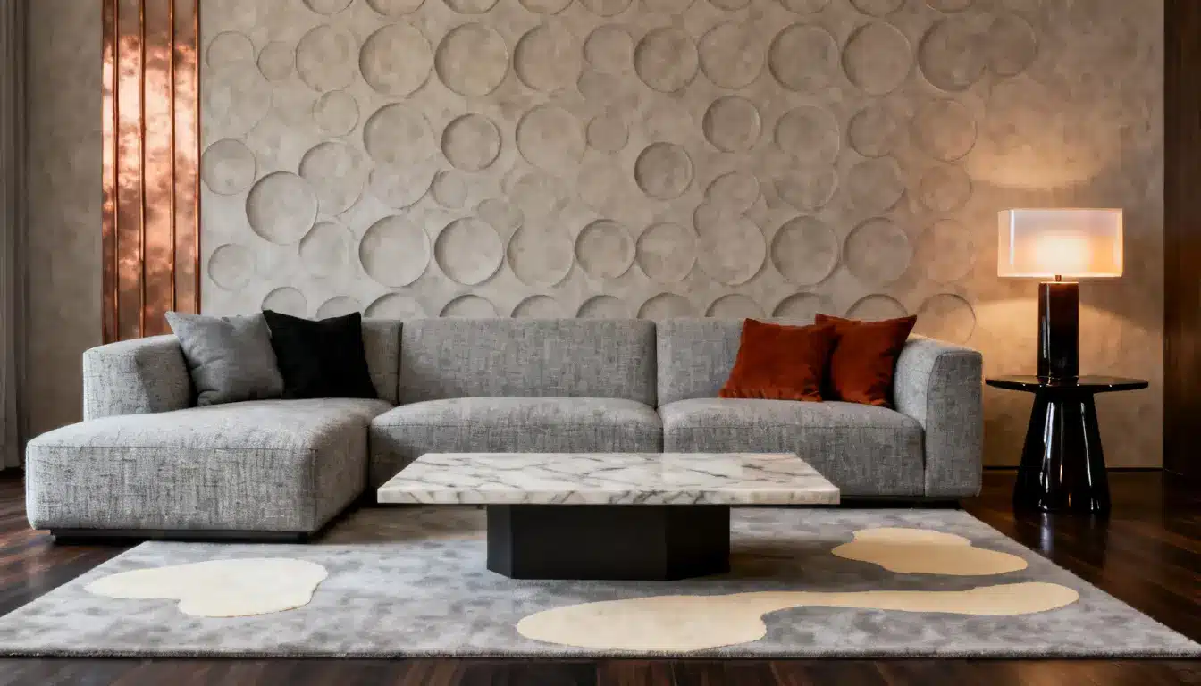
Best Color Combinations With Earth Tones
Earth tone colors rarely work in isolation. What makes an earthy palette look pulled-together is what you pair it with.
The right combination adds contrast, prevents the palette from feeling heavy, and gives the eye a place to rest.
| Combination | Example Pairing |
|---|---|
| Earth Tones + White | Terracotta walls + crisp white trim |
| Earth Tones + Black | Taupe cabinets + matte black hardware |
| Earth Tones + Pastels | Dusty blue + sage green + cream |
| Earth Tones + Metallics | Rust accents + brushed brass fixtures |
1. Earth Tones + White
It creates breathing room without competing.
A terracotta wall with crisp white trim feels grounded but never heavy. Works best in kitchens and living rooms where you want the space to feel open.
2. Earth Tones + Black
Black sharpens everything.
Soft taupe cabinets with matte black hardware look intentional and precise. Use it sparingly through fixtures and frames. Too much and it overpowers it underneath.
3. Earth Tones + Pastels
This is the softest combination. Dusty blue, sage green, and soft lavender blend naturally with earthy colors without clashing. Keep the pastels muted, not bright.
A bright pastel next to a deep, earthy shade will look mismatched.
4. Earth Tones + Metallics
Brushed brass next to rust or mustard feels cohesive because both share golden undertones. Stick to one metal finish throughout the room.
Mixing brass, chrome, and copper in the same space breaks the natural flow of the color palette.
Wrap Up
Earth tone colors are one of the few color families that deliver in real life as well as on a mood board.
They layer naturally, hide wear well, and pull a room together with minimal effort.
You can go all in with terracotta walls and olive accents, or keep it simple with a rust rug and a few sand-toned cushions.
Either way, an earthy color palette rewards you.
Start small if you need to. Test a wall. Try a rug. See how the light hits it. Once you see how easily these colors settle into a space, you will want more of them.
Frequently Asked Questions
1. Do Earth Tone Colors Work in Small Spaces?
Yes, lighter earthy shades like cream, sand, and taupe actually make small spaces feel bigger and less closed in.
2. Can You Mix Earth Tones With Bold Colors?
You can, but keep the bold color to a single element, like a single chair or a statement wall, so it doesn’t fight the palette.
3. Are Earth Tone Colors Hard to Maintain on Walls?
Not at all. Most earthy shades hide scuffs and dirt better than white or light gray walls do.
4. What Fabrics Work Best With an Earthy Color Palette?
Linen, jute, cotton, and raw wool all complement earthy colors naturally because they share the same organic, undyed quality.
5. Do Earth Tones Work in Rooms With Low Natural Light?
They do, but stick to lighter earthy shades like sand, cream, or warm beige to keep the room from feeling darker than it already is.