Paint shopping is fun until you’re standing in the aisle holding 12 samples.
And when you need a paint that goes with your furniture, your floors, your lighting – the best shot is with Sherwin-Williams.
That’s what makes Sherwin Williams greige colors so popular across American homes.
Sherwin-Williams does it really, really well, understanding the color family and giving away some really amazing shades.
Let’s look into it.
What Color is Greige?
Greige comes somewhere between gray and beige.
Let’s put it this way – it is too warm to be a true gray, but way too cool to be beige.
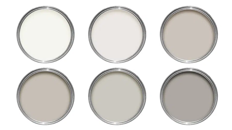
But Greige isn’t just one color. It’s a whole spectrum. Some shades lean towards sunny, with brown hints, while others feel cooler, with subtle gray undertones.
They look good in photos AND in real life.
What is the Most Popular Greige?
If you’re a big lover of aesthetic homes and have spent any time on home design Pinterest boards, you might like shade, wait for it.
Agreeable Gray (SW 7029) is the one.
It’s become the most popular Sherwin-Williams greige paint color, and it earned that title because it’s the TRUEST greige out there.
And it has a very even mix of brown and black undertones.
It strikes a perfect balance between warm and cool undertones, making it incredibly adaptable, the kind of color that works in any space and lighting conditions.
Sherwin-Williams Warm Greige Colors

Does your home get a golden afternoon light, has warm wood floors, or do you just want walls that feel like a cozy hug?
You are going to love warm, beige colors.
These shades lean into the beige side of the spectrum, bringing a soft, earthy richness that makes any room feel lived-in and welcoming.
These are the five best Sherwin-Williams warm greige colors you need to try.
1. Mega Greige (SW 7031) – The Bestselling Shade
Mega Greige is a greige-taupe paint color that flashes at both green and violet undertones.
Even in cool northern light, SW Mega Greige holds its color without falling cold, and in a south-facing room with western afternoon sunshine.
It’s a gutsy choice that works beautifully as an accent wall, on kitchen islands, or as the main color.
2. Agreeable Gray (SW 7029)
Agreeable Gray is the people’s champ.
It has an LRV of 60, placing it in the mid-light range, light enough to keep rooms feeling open, without being stark or overly bright.
It’s the kind of color that works in a dark Denver condo just as well as a sun-soaked Florida living room.
In bright natural light, it leans toward beige; in darker or north-facing rooms, the gray becomes more prominent, and that flexibility is why it’s a bestseller for years.
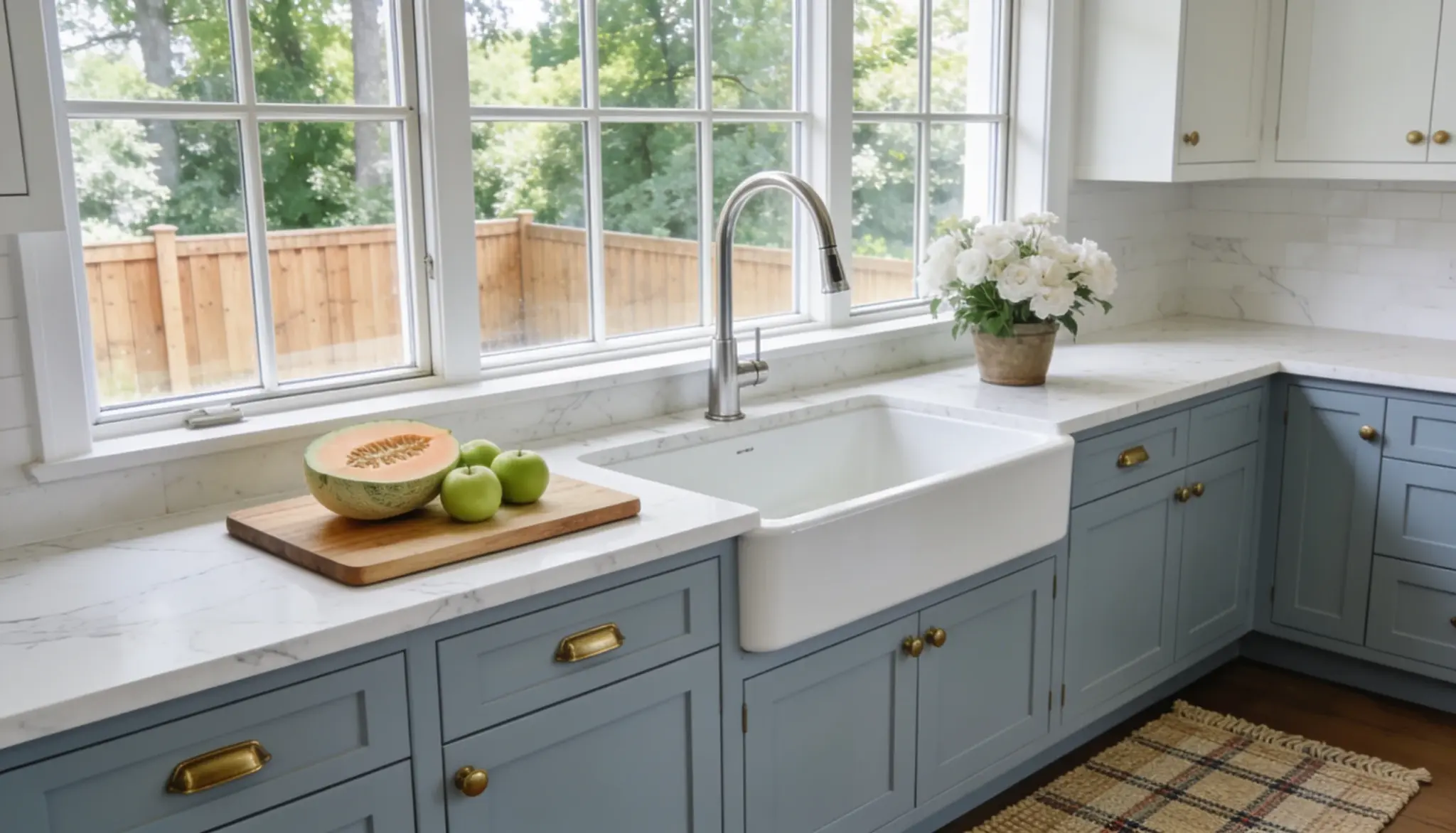
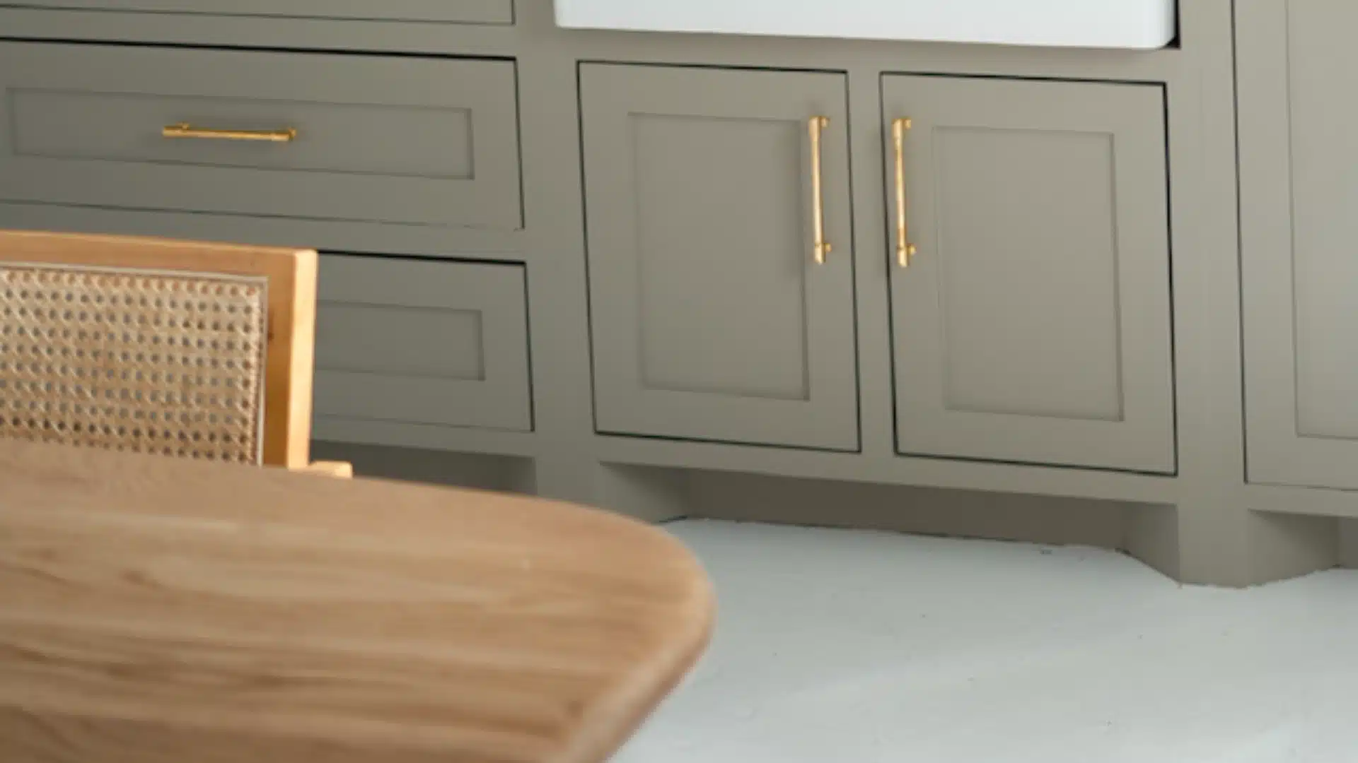
It works on walls, cabinets, trim, and exteriors – basically for everything.
3. Accessible Beige (SW 7036)
Accessible Beige has an LRV of 58, and it sits in the middle ground.
It’s light enough to keep a room feeling open, yet heavy enough to provide a crisp contrast against white trim.
It’s warmer than Agreeable Gray, making it a dream for homes with honey oak floors, dark wood tones, or traditional-style furniture.
But in south-facing rooms, it glows.
It’s one of the most popular greige choices for traditional and transitional homes across the South and Midwest, and wait…it pairs perfectly with SW Pure White.
4. Worldly Gray (SW 7043)
SW Worldly Gray doesn’t get talked about as much as Agreeable Gray, but some really do love it.
With an LRV of 57, it’s a sunny color with mild green and purple undertones, though those undertones tend to be subtle, so the color looks neutral.
It’s perfect for open-concept living spaces where you need a color that flows from room to room without feeling monotonous.
It’s also a good option if you’re worried that Agreeable Gray will look too washed out in a southern exposure.
5. Perfect Greige (SW 6073)
Perfect Greige is a medium-depth color with an LRV of 42 and a subtle taupe undertone.
It’s a step darker than most on this list, which makes it a great pick for rooms with plenty of natural light.
It’s especially popular in open-plan homes across the Sun Belt states, where bright light makes the taupe undertones really glow.
It is great for living rooms, dining rooms, and even exterior facades.
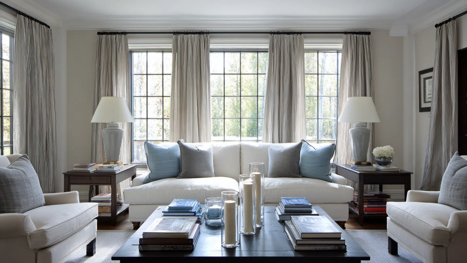
Sherwin-Williams Cool Greige Colors

If you like a modern home, your furniture runs cool, or you’re working with a north-facing room that gets that crisp, shadowy light, a cool greige is your best choice.
These shades pull slightly toward gray, giving you a clean look without going full cold or stark.
They’re a favorite in contemporary homes across the Northeast and the Pacific Northwest.
6. Repose Gray (SW 7015)
If Agreeable Gray is the friendly neighbor, SW Repose Gray is the stylish one across the street.
With an LRV of 58, it will make your room feel cozy without being too dark.
But it does have soft violet undertones that may make it appear more purple in north-facing rooms.
This is what makes it so popular in modern and transitional spaces, especially in the Pacific Northwest and Northeast, where natural light tends to run cooler.
Pair it with dark wood accents and bright white trim to keep everything balanced.
7. Mindful Gray (SW 7016)
Mindful Gray is perfectly in between warm and cool.
The LRV of Mindful Gray is 48, well into the light-medium range.
It shifts dramatically depending on light, and it can read like a refined bright gray indoors, then look intense on exterior siding in afternoon sun.
It works well in well-lit living rooms, home offices, and on exterior stucco homes in states like CA, TX, and Arizona.
8. Anew Gray (SW 7030)
If you hate those greiges that suddenly flash purple or go muddy green, SW Anew Gray might can be your thing.
It settles nicely between gray and beige. With an LRV of 47, it adds personality to your room.
It’s a favorite for kitchen cabinets and bathroom vanities.
A really dependable choice for people who want to stay neutral but not boring, if you know what it means. And if you’re one of those, then go for Anew Gray.
9. Amazing Gray (SW 7044)
Amazing Gray is a mid-toned, warm greige and one of the darker ones.
It can flash a subtle green undertone, giving it an earthy, organic feel while looking gorgeous in spaces with high ceilings and good natural light, like open-concept kitchens and great rooms.
It pairs brilliantly with medium wood tones and navy or forest green accents.
How to Choose the Right Greige for my Space?
You’ve got six Greige samples on the wall, and they all look different by 3 pm. And that left you confused.
- Start with your light. North-facing rooms get cool, bluish light all day, so you’ll want a greige with warmer undertones to balance it out.
- South-facing rooms get the most direct light, and most greiges flourish there.
- Next, look at your floors and furniture. If warm wood tones, go warmer, and vice versa.
Always test your samples in the actual room. Observe them in the morning, afternoon, and under artificial light before committing.
Conclusion
Sherwin-Williams’s greige colors are designed perfectly.
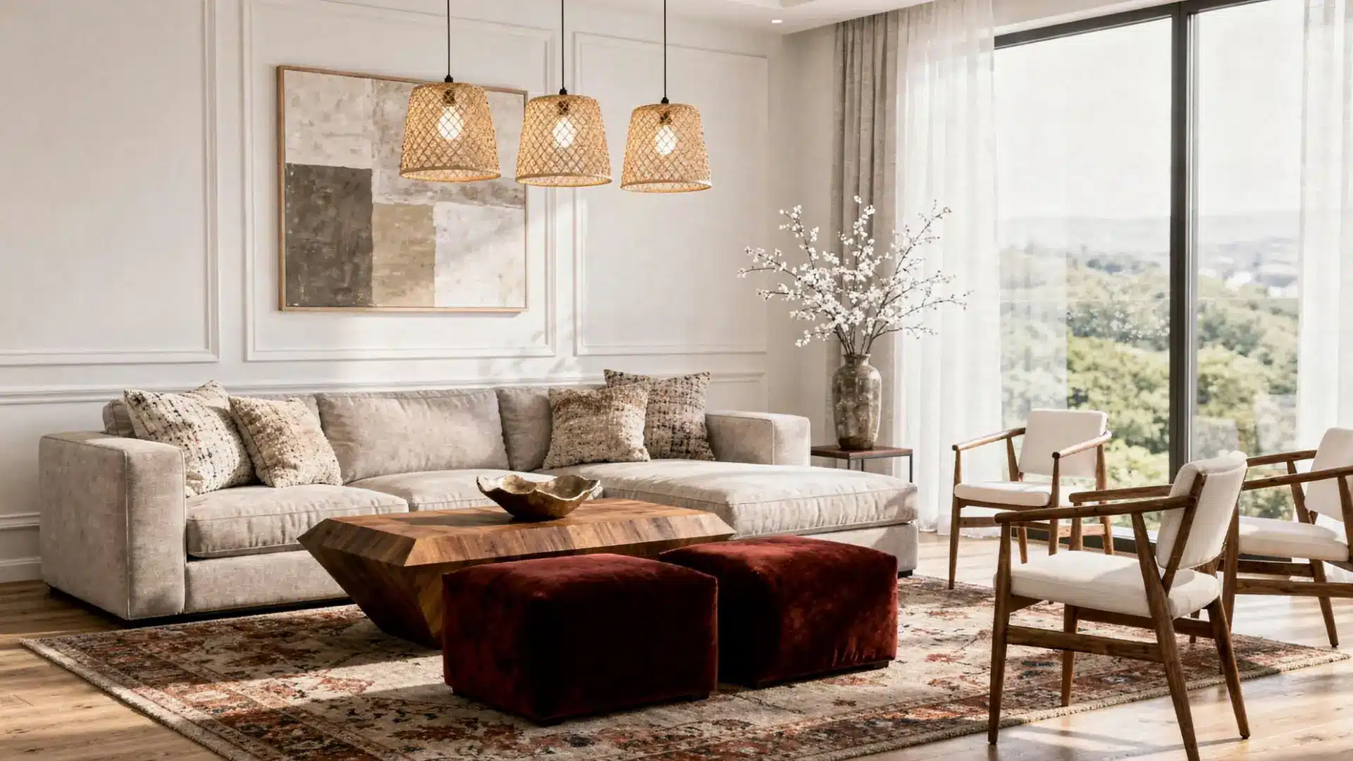
Neutral walls can be boring, but SW’s griege makes your space feel inviting, cool enough to feel current, and flexible enough to work in with any kind of space.
And if you landed on the popular Agreeable Gray, or fell for the bestselling – Mega Greige, sample them, test them, and work through the process.
And if you have any questions, comment below!
Frequently Asked Questions (FAQs)
1. What Greige Goes with Everything?
Agreeable Gray is the safest bet. Its balanced undertones work with almost any accent color you throw at it.
2. What Rooms Look Best in Greige?
Living rooms, kitchens, and open-concept spaces shine in greige. It also works beautifully in bedrooms and hallways.
3. What is Joanna Gaines’ Favorite Gray Color?
Joanna Gaines gravitates toward Sherwin-Williams Mindful Gray as a go-to neutral for main living spaces.