A room can have the best furniture and decor, but still feel cold and lifeless.
That is the problem with most spaces. The color palette is either too dark, too flat, or clashing in ways that are hard to pinpoint.
A well-built warm color palette fixes that.
Earth tone palettes, terracotta and cream combinations, amber and rust schemes, and clay-based layering are the color families that turn a visually complete room into one that actually feels good to be in.
Done right, they add depth without heaviness and richness without feeling dated.
What is a Warm Color Palette?
A warm color palette is any combination of shades built on red, orange, or yellow undertones.
That includes terracotta, mustard, and rust, as well as neutrals like cream, oatmeal, and linen that carry yellow or peachy undertones beneath the surface.
The undertone determines whether a color reads warm or cool, not the hue itself.
Mixing mismatched undertones is a mistake most people catch too late.
A yellow based terracotta sitting next to a pink-based rust will feel off, even if both colors look fine on their own.
For a deeper layer of balance, pairing your palette with the right feng shui colors can help each room feel grounded, too.
Warm Color Palettes That Actually Hold Up
Not every color combination holds up across a whole home.
These five palettes do, and each one has a distinct personality worth knowing before you commit to a direction.
1. Terracotta and Cream Palette
Terracotta has been the defining shade of warm interiors for the past few years, and it is not going anywhere.
It falls somewhere between orange and red-brown, carrying a richness that nods to Mediterranean and Indian interiors without feeling overdone.
Cream acts as the breathing room, stopping the terracotta from taking over.
Look for shades like burnt sienna, clay, and mango spice, and pair them with raw linen or warm ivory.
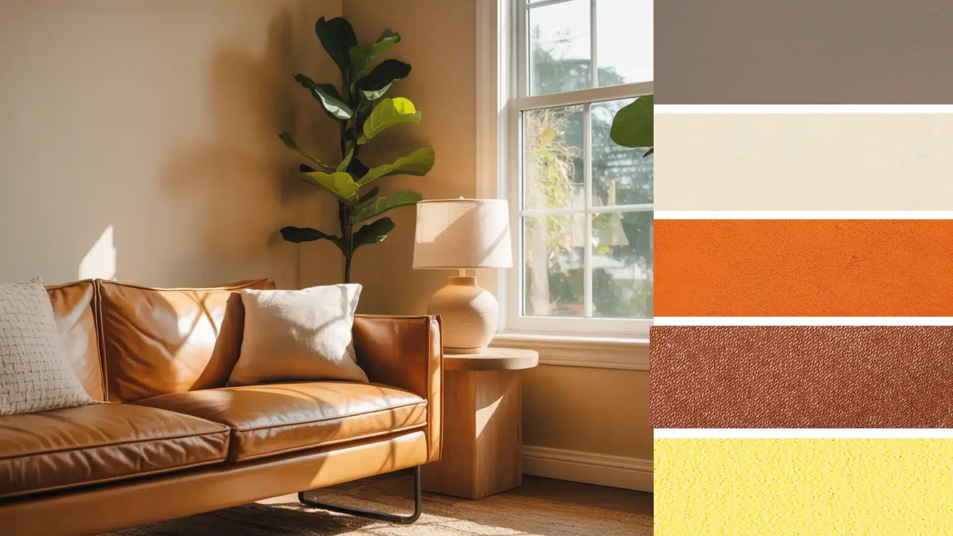
2. Amber and Rust Palette
This is the palette for rooms that need depth without going dark. Amber brings a golden, light-catching quality while rust grounds it with a deeper, more earthy tone.
Together, they sit naturally within a warm color scheme for the home, requiring little else.
Use amber in lampshades, picture frames, and smaller accessories. Bring rust in through an armchair, a rug border, or a throw.
The two tones are close enough in temperature to feel cohesive but different enough to create real visual interest.
3. Clay and Oatmeal Palette
Clay is softer than terracotta, leaning toward a muted pink-brown that works on walls without feeling heavy. Oatmeal as the base neutral keeps everything light.
This combination works especially well in bedrooms and living rooms where the goal is a relaxed feel.
Add natural wood tones and linen textiles to round it out without introducing any new colors.
4. Mustard and Warm White Palette
Mustard is the accent color that makes a warm-toned living room palette feel finished.
Against warm white walls, it reads rich and intentional rather than loud. The key is keeping mustard to around 15-20% of the room, showing up in cushions, a single armchair, or a pendant lampshade.
Warm white does the heavy lifting as the base, and mustard adds the punch.
This palette has a slight vintage quality that works well in both older and newer homes.
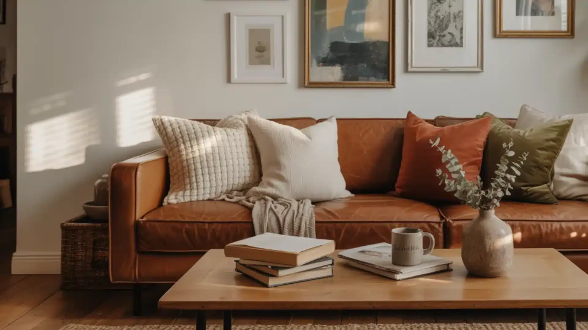
5. Brown, Caramel, and Wood Palette
Browns are the grounding force in any earth tone color palette home. Natural wood furniture, leather seating, jute rugs, and woven baskets all belong here.
Caramel sits lighter than chocolate brown and works better as a wall or upholstery tone without tipping into heaviness.
The wood element ties everything together, adding organic texture that no paint color can replicate on its own.
Use deeper browns as furniture and accent tones rather than wall colors, and let the natural wood grain do most of the visual work.
Best Warm Interior Color Combinations
Some colors belong together. A warm color scheme for the home is not about picking every rich, deep shade you like.
It is about knowing which families work together and how much of each one to use.
1. Terracotta and Rust
Terracotta falls between orange and red-brown, drawing on Mediterranean and Indian design references without feeling overwhelming.
Use it on a feature wall, in throw pillows, or as a pottery accent.
Shades to look for: burnt sienna, clay, and mango spice. Pairs naturally with cream, ivory, sage green, and natural wood tones.
2. Warm Neutrals: Cream, Ivory, and Oatmeal
These make up the 60% of your palette. A warm white with a yellow undertone creates the openness of white without the coldness.
Shades like linen, raw cotton, and oatmeal work well here. Avoid pure brilliant white against rich accent colors; it reads cold and pulls the palette apart.
3. Amber, Gold, and Mustard
These are the accent layer of any warm toned living room palette, showing up in throw pillows, lampshades, and cabinet handles at around 10 to 20 percent of the room.
Mustard brings a vintage feel. Gold reads more like contemporary luxury. Both prevent the palette from feeling flat.
4. Earthy Browns: Caramel, Chocolate, and Walnut
Browns ground any earth tone color palette in the home. Natural wood furniture, leather seating, jute rugs, and woven baskets all live here.
Use them as furniture and accent tones rather than wall colors. Too much brown on the walls tips the room into heaviness fast.
Cool-toned metals like chrome and silver pull against an earth toned color palette in a home. Brass, gold, copper, and matte black all sit far more naturally within a warm scheme.
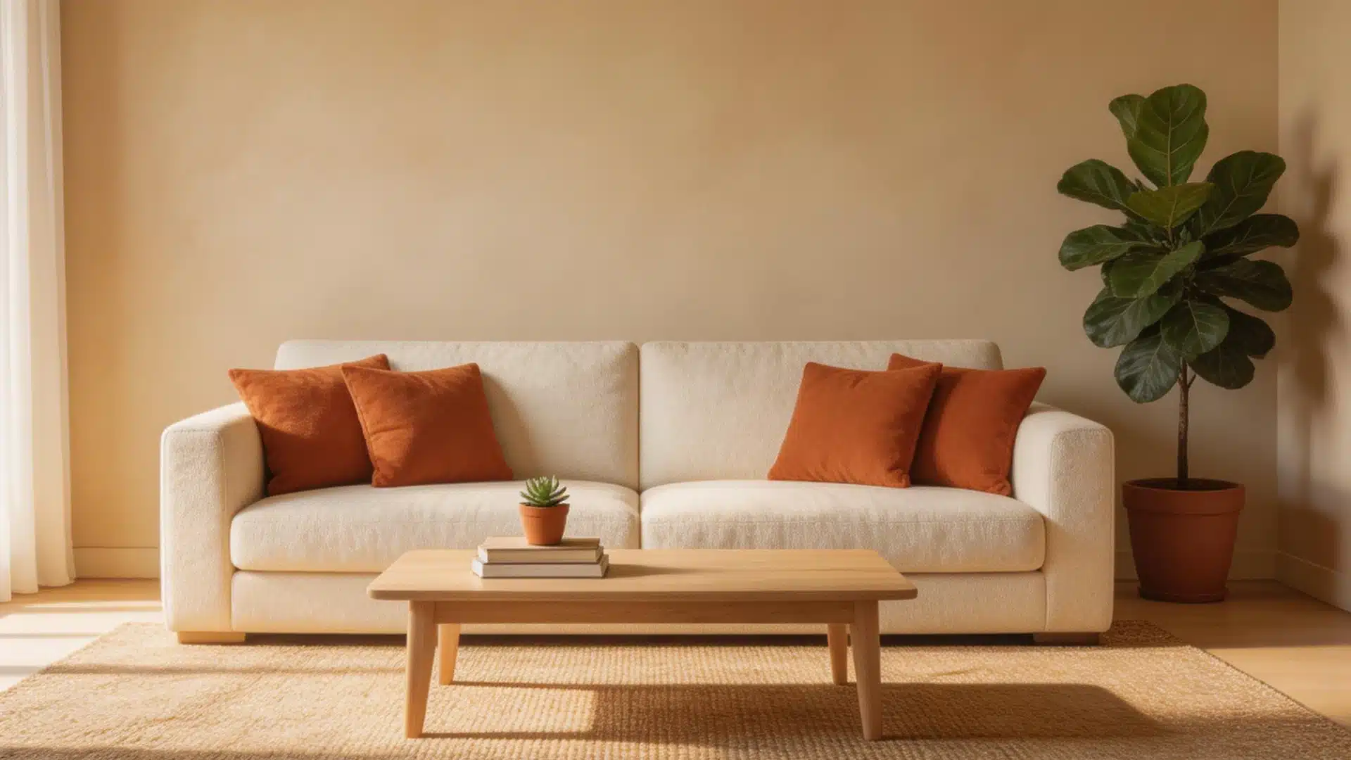
5. Warm Reds and Deep Oranges
These need a lighter hand. Burgundy, brick red, and deep terracotta add drama but only when kept to around 10 percent of the room or less.
A throw blanket, two cushions, or a single piece of artwork in these tones is enough. More than that, and the room starts to feel intense.
The 60/20 Rule: Get the Color Proportions Right
Most warm palettes go wrong because of proportion, not color choice. Use 80% soft warm neutrals like cream, oatmeal, and warm white across walls, large furniture, and floors.
Save the remaining 20% for your richest accents, the deepest terracotta, the most saturated mustard, the darkest rust.
This is what keeps a warm color palette layered rather than loud.
Keep that 20% consistent across the room, too, the same tone in different objects rather than several unrelated shades pulling in different directions.
Too many saturated colors at once make a room feel chaotic. Pick one dominant accent and repeat it across different objects.
Room by Room: Where to Use a Warm Palette
Not every room needs the same level of saturation. The living room can handle a deeper terracotta accent. The bedroom needs something softer.
Getting the balance right, room by room, is what separates a pulled-together home from one that feels busy.
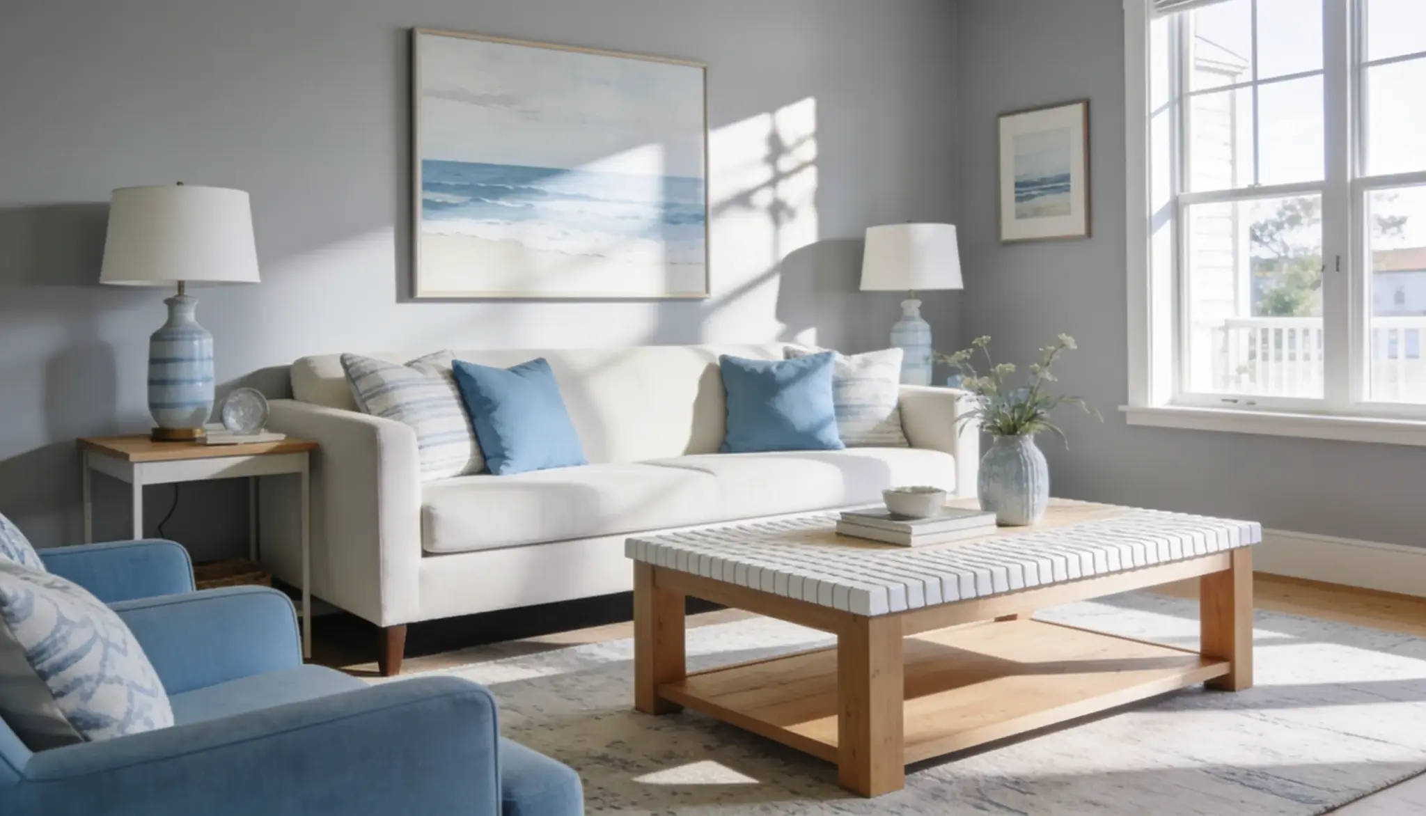
1. Living Room
The living room is the most natural fit for a warm toned living room palette. Start with cream or warm beige on the walls, then layer in warm wood floors or a jute rug.
Add one deep accent color terracotta cushions, a mustard throw, or a rust armchair.
A warm wood coffee table pulls it all together. One indoor plant adds just enough cool contrast to keep things balanced.
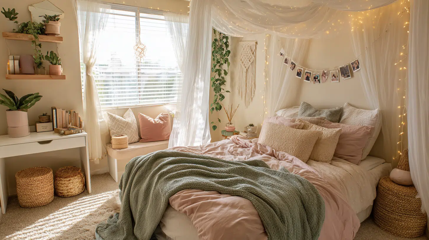
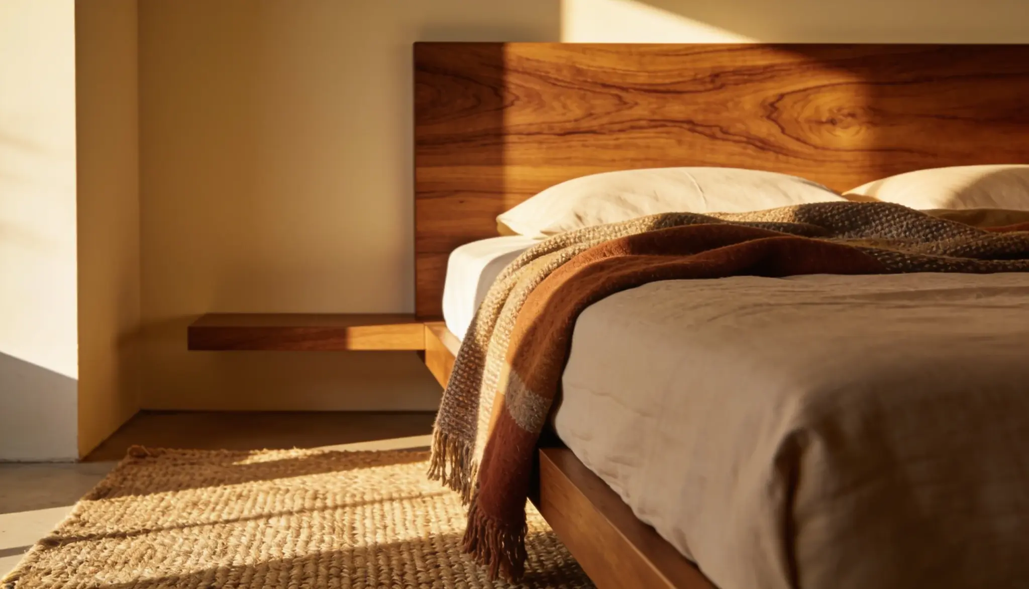
2. Bedroom
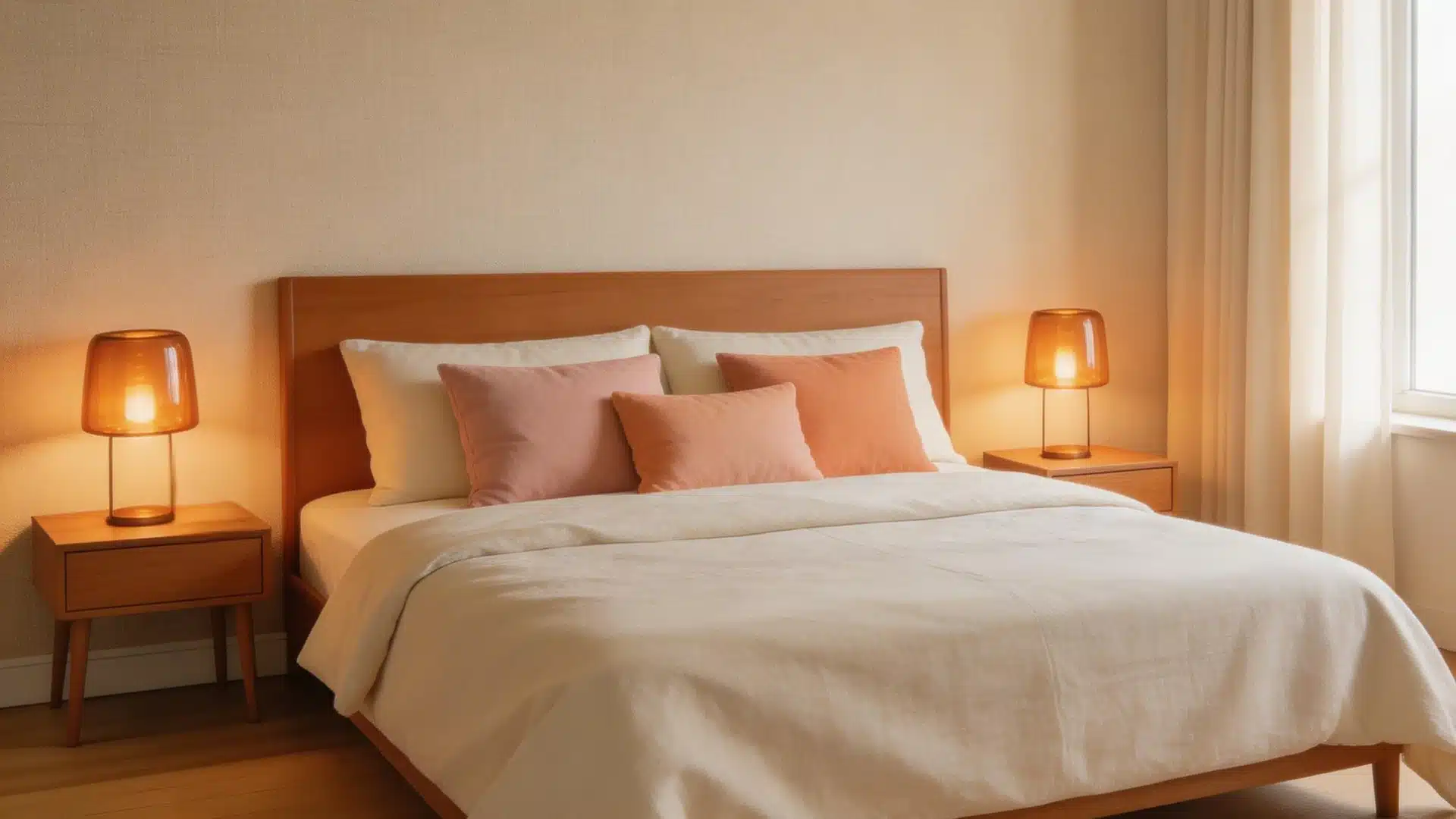
Warm bedrooms work best with lower-saturation choices. Oatmeal or linen walls, caramel or walnut furniture, and warm white bedding with soft peach or blush accents hit the right note.
Avoid saturated reds and bright oranges here; they tend to feel energizing rather than restful.
An amber bedside lamp in the evening extends the palette into the atmosphere itself.
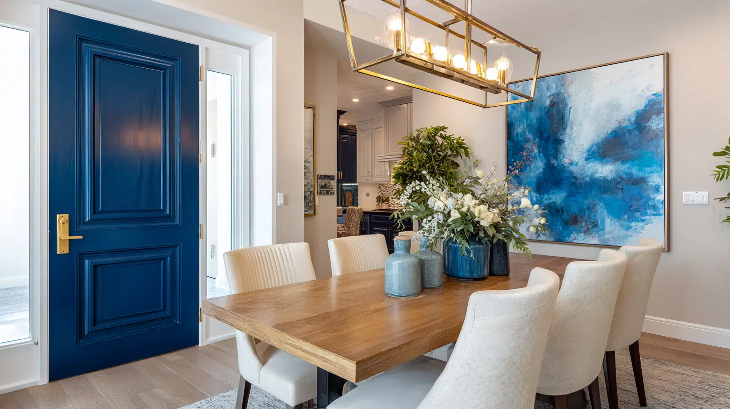
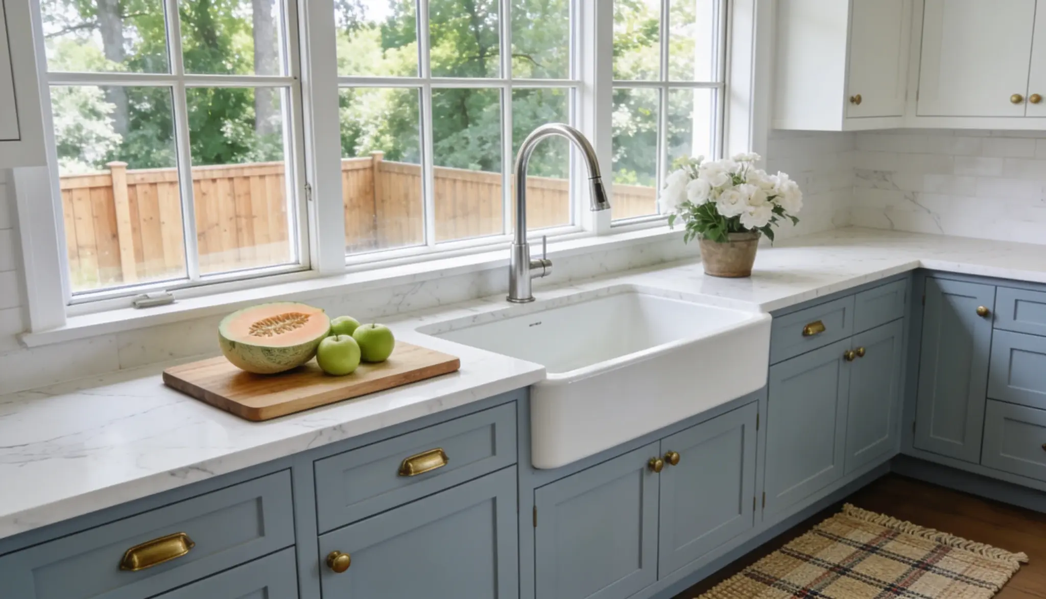
3. Kitchen and Dining Room
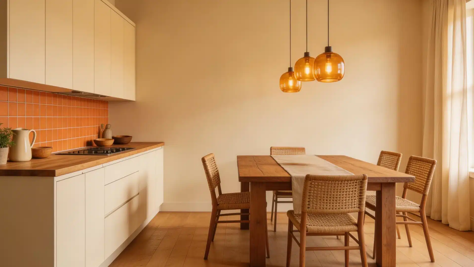
Warm interior design colors are a strong choice in the kitchen and dining room because they naturally encourage appetite and conversation.
Cream cabinets, terracotta or amber tiles, and wood countertops set a solid base.
In the dining area, a rust or mustard pendant light or table runner activates the space without tipping into excess. Saturation can run slightly higher here than in the bedroom.
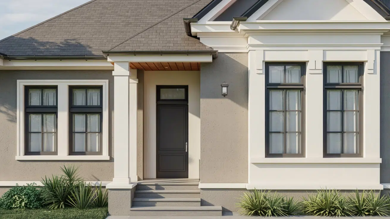
4. Entryway
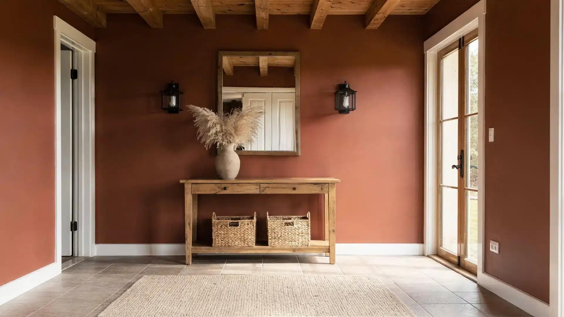
Small space, big opportunity. A terracotta or warm yellow entry wall sets an immediate tone before guests reach any other room.
Balance it with warm white trim and a natural woven mat at the door.
The shift from a warm entry into a more neutral living space creates a visual rhythm that makes the whole home feel more considered.
Final Thoughts
A warm color palette in interiors is less about picking the right shades and more about understanding how they work together.
Get the undertones right, respect the 80/20 split, and match the saturation level to each room.
The rest follows naturally. Start with one room, get the balance right there, and the rest of the home will follow.
Small changes in color temperature make a bigger difference than most people expect.
Frequently Asked Questions
1. What is the Best Base Color for a Warm Interior?
Cream, oatmeal, or warm beige work best as a base since they carry yellow undertones that hold the whole palette together.
2. Can Cool Colors Work in a Warm Color Scheme?
Yes, as long as the undertone leans red or yellow rather than blue or green, colors like sage or navy can fit right in.
3. How Do I Know if My Palette Will Work Before Painting?
Line up your paint samples, fabric swatches, and wood tones in natural light and check that every piece shares a warm undertone.