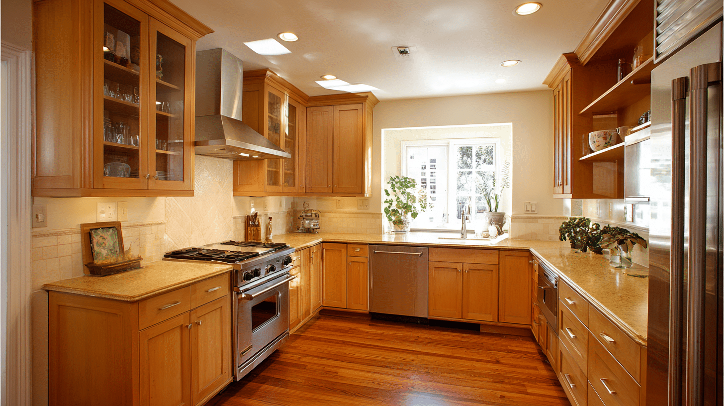
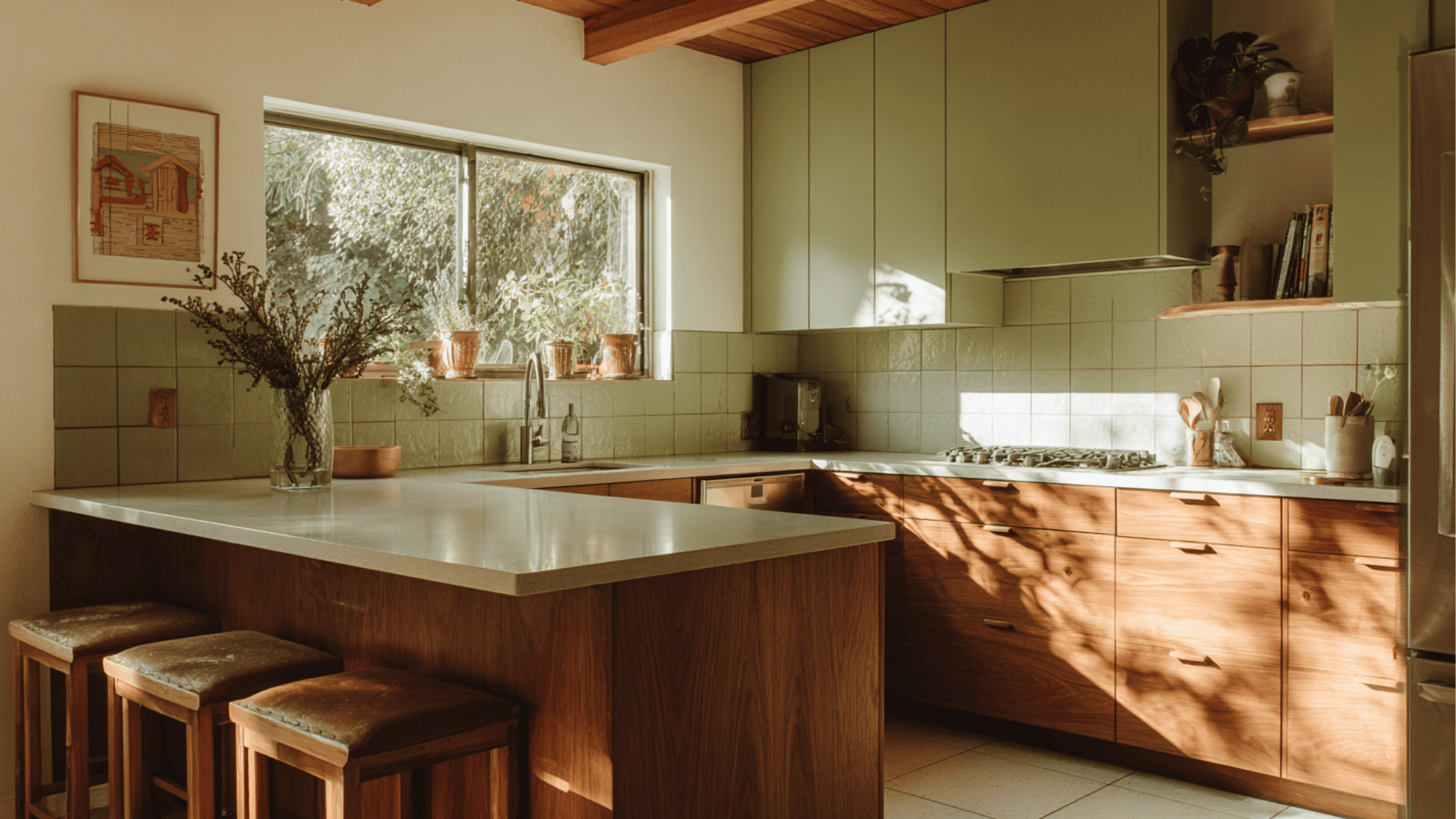
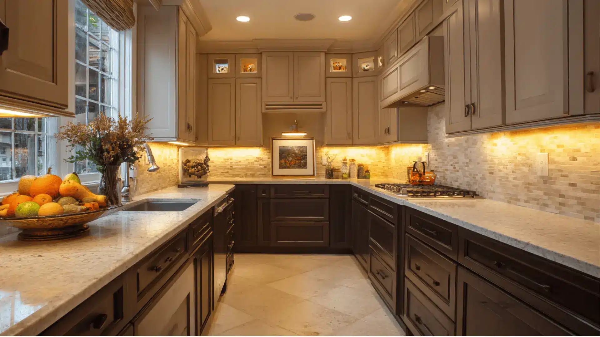
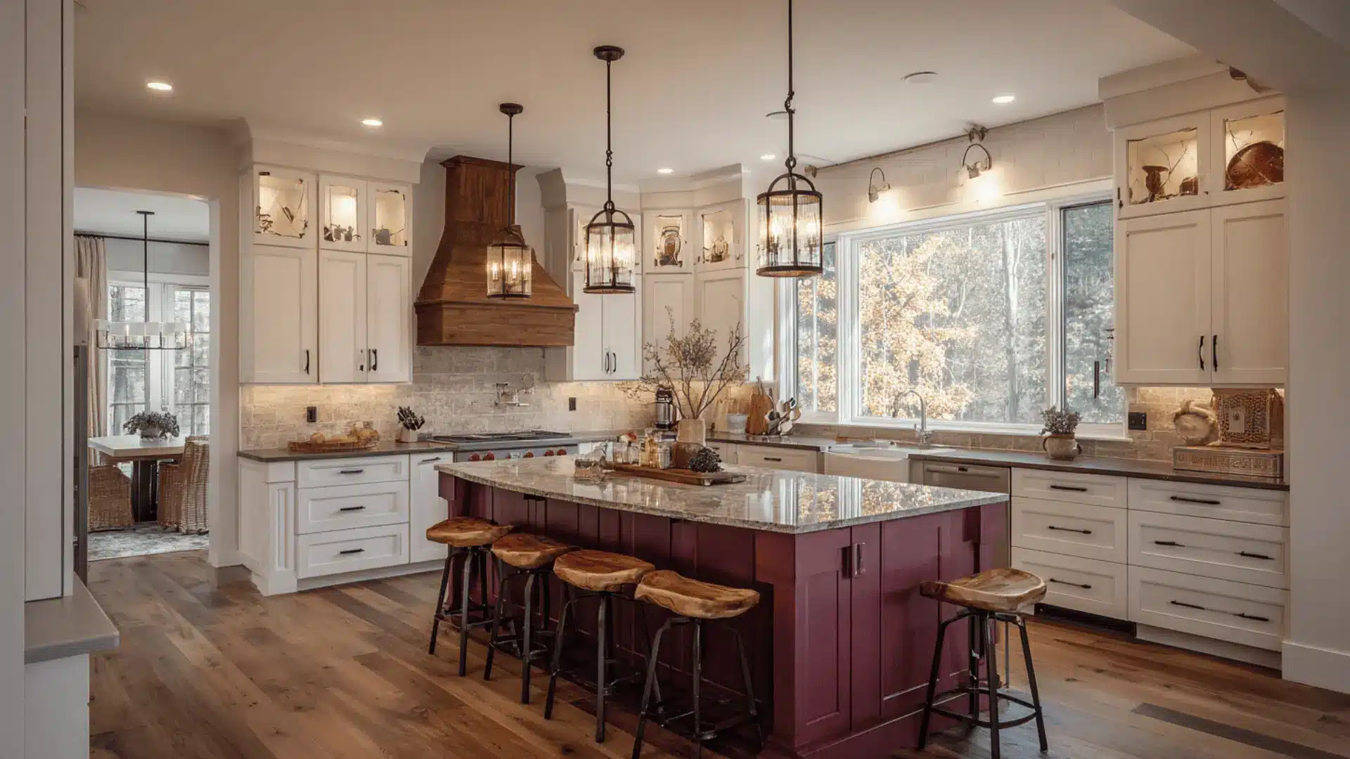
A mid century modern kitchen keeps things simple on purpose.
Clean lines, natural wood, flat-front cabinets, and layouts built around how a kitchen is actually used.
The mid century style came out of the 1950s and 1960s, when designers started pushing back against excess and focusing on function.
That thinking still holds up. The materials do the work, the layout makes sense, and nothing competes for attention.
Most kitchens either lean too retro or lose the mid century feel entirely when updated.
Getting that balance right is what separates a well done version from one that just has wood veneer and tapered legs.
How to Get a Mid Century Modern Kitchen Look Without Spending a Lot?
A mid century modern kitchen does not require a full renovation to feel right. Most of the look comes from details, not demolition.
Swapping cabinet hardware to slim brass edge pulls costs very little and changes the whole feel of the room.
Painting flat front cabinet doors in a matte earth tone is one of the most cost effective moves available.
Open teak or walnut shelving in place of upper cabinets saves money and opens the space up at the same time. Source vintage pieces from estate sales and second hand markets.
A genuine mid century credenza or pendant from an estate sale will do more for the room than anything bought new and labeled vintage inspired.
Mid Century Modern Kitchen Design Ideas
These ideas capture the balance between form and function that makes mid century design worth coming back to.
1. Walnut Slab Cabinetry as the Centerpiece
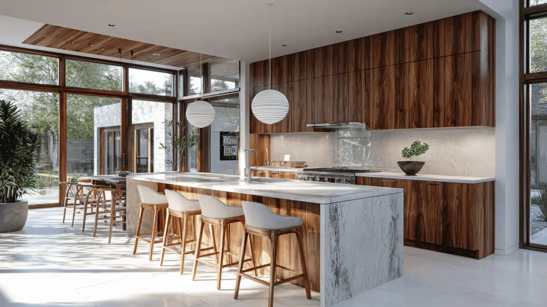
Walnut cabinets with flat, uninterrupted fronts create a furniture quality look that anchors the entire kitchen.
The rich grain becomes the main feature without needing much else around it.
This works particularly well in open floor plans where the kitchen needs to read as part of the living space rather than a separate utility room.
2. Two Tone Cabinets with Wood and Matte Color
Pairing warm wood lower cabinets with muted painted uppers adds depth without making the room feel busy.
Colors like sage, clay, or cream keep things grounded while the wood brings the warmth. It is an easy way to introduce personality without losing those clean lines.
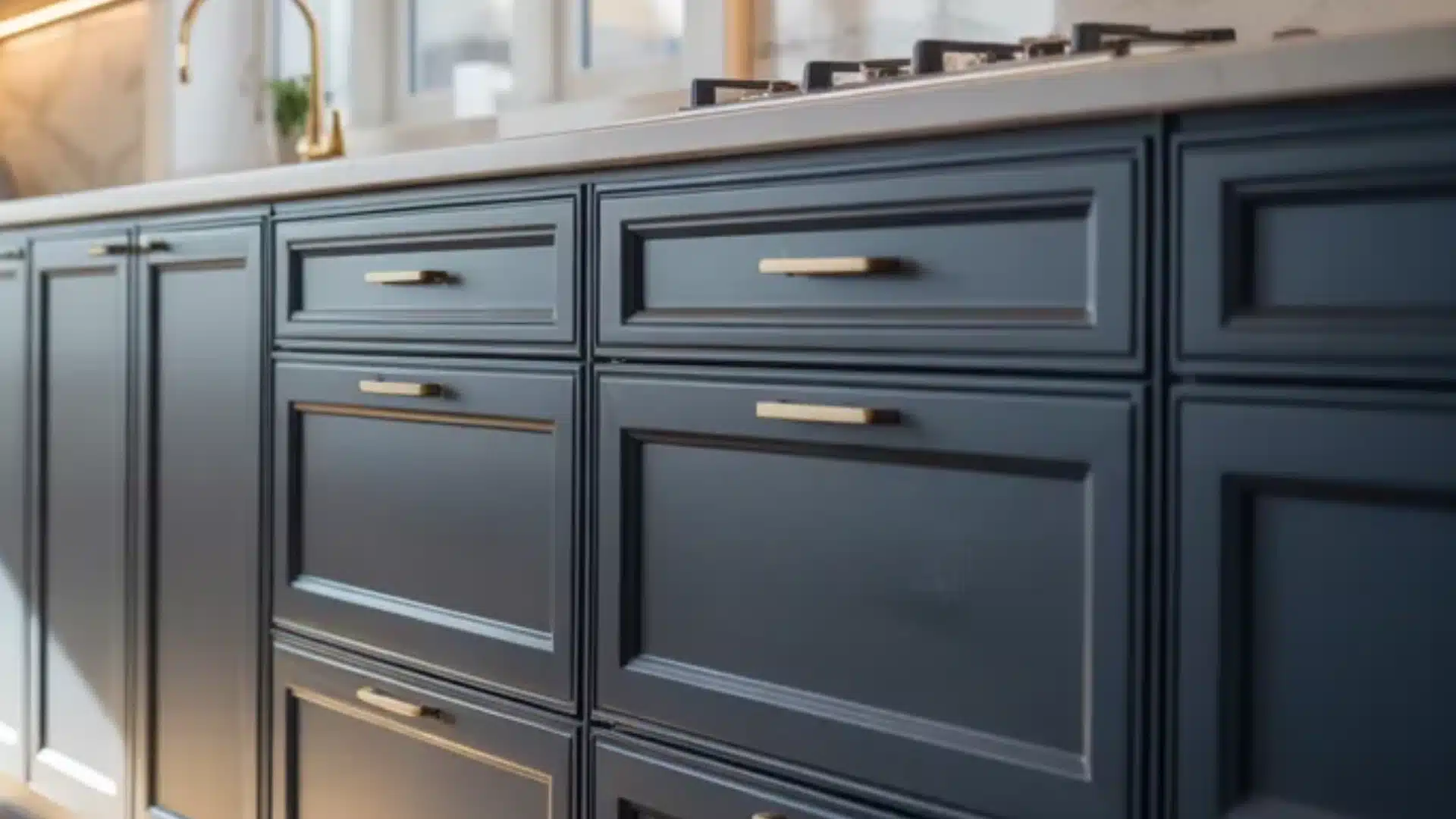
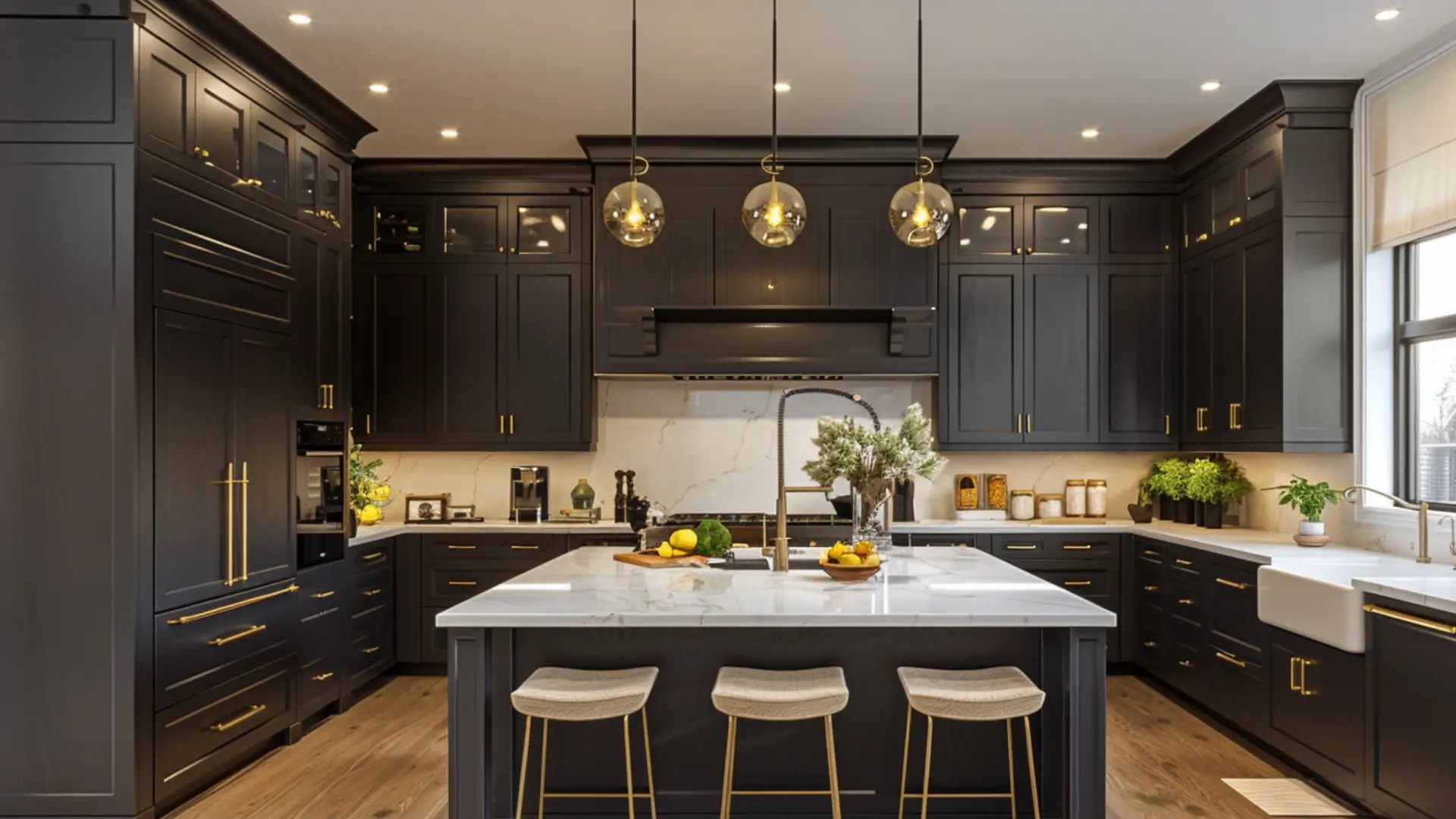
3. Slim Brass Edge Pulls Instead of Handles
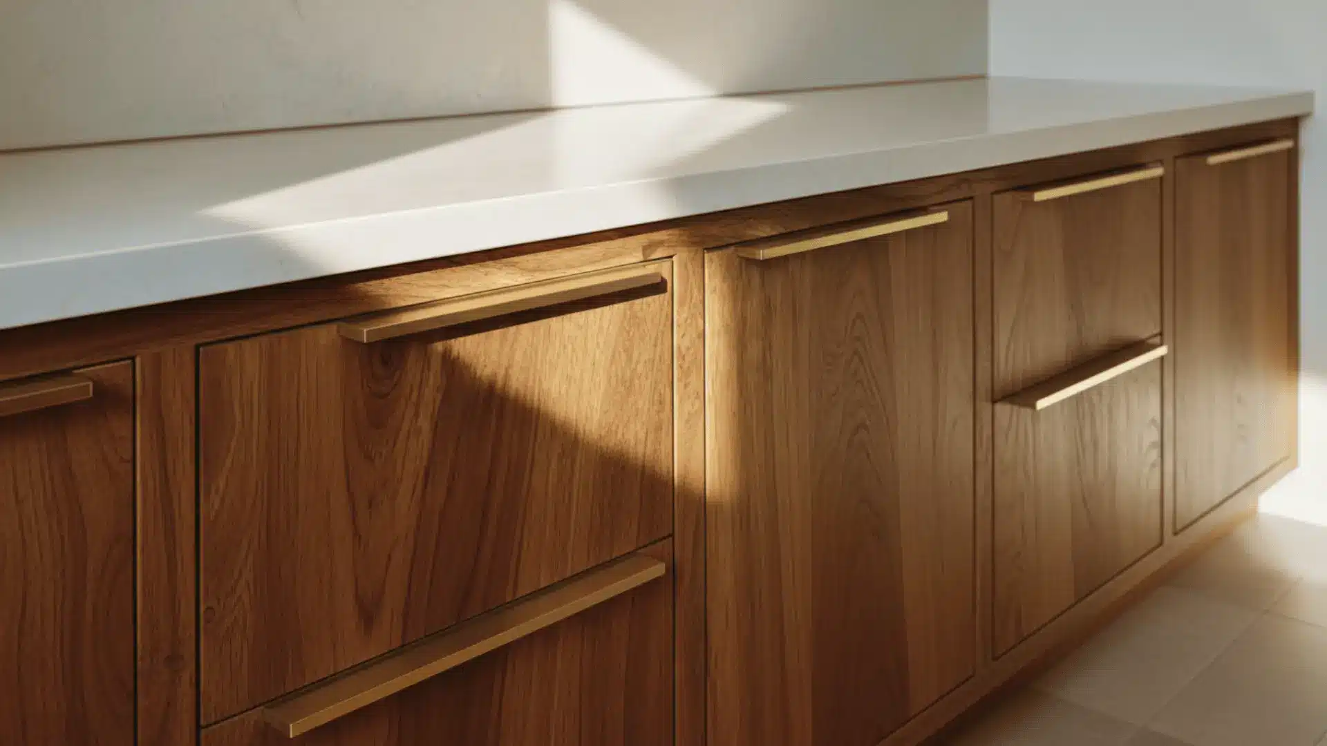
Slim brass edge pulls sit flush against the cabinet surface and add a refined, period appropriate detail without interrupting the overall look.
A few reasons they work well:
- They do not catch on clothing or bags as you move through the kitchen
- The flush profile keeps cabinet fronts looking uninterrupted
- Brass adds warmth without competing with wood tones
- They suit both upper and lower cabinets without looking mismatched
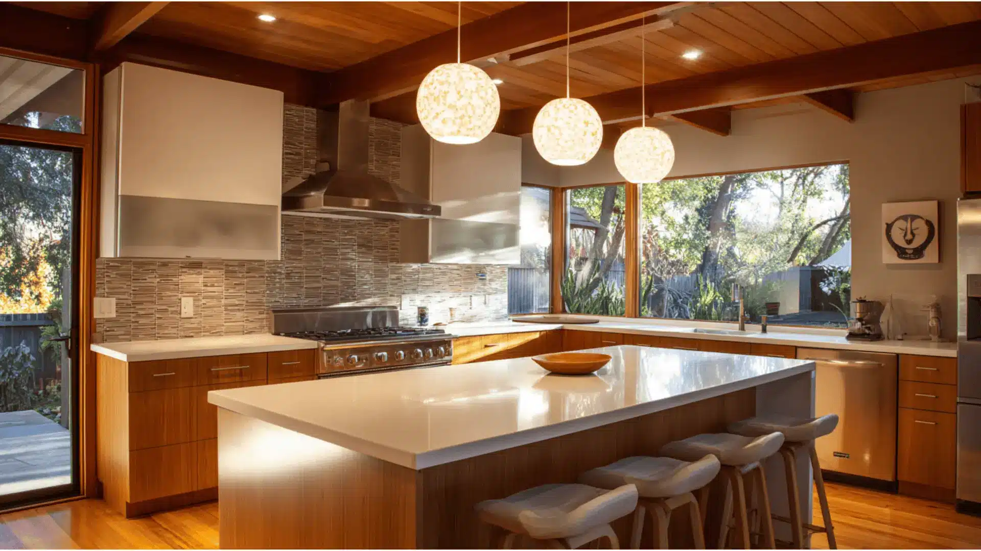
4. Statement Pendant Trio Over the Island
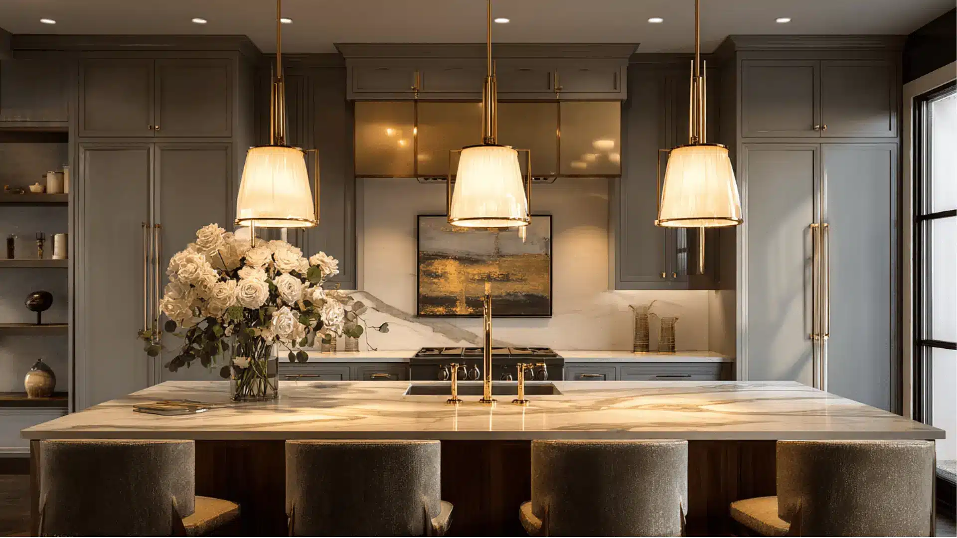
Three identical pendants hung in a row create instant symmetry and draw the eye exactly where you want it. Globe, cone, or Sputnik style fixtures all work depending on how bold you want to go.
Keep the finish consistent and let the repetition do the work.
5. Muted Earth Tone Backsplash Tiles
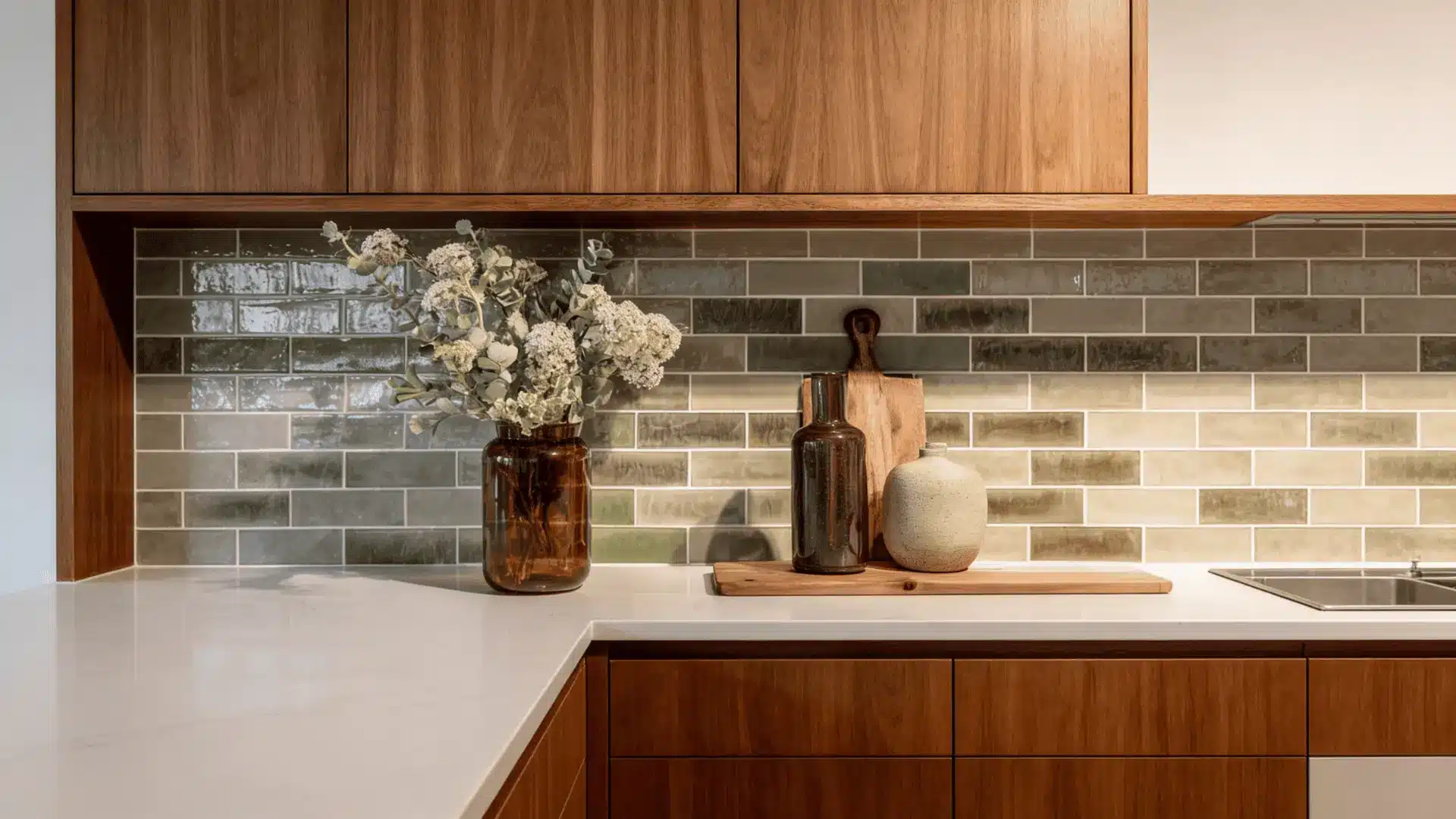
Clay, olive, or sand toned tiles echo the muted color palettes that defined mid century interiors. These shades sit comfortably with almost any wood tone and do not compete with the cabinetry.
The subtlety is the whole point.
A backsplash that quietly holds the room together does more than one that demands attention.
6. Flat Panel Cabinets Without Upper Units
Skip upper cabinets entirely and rely on lower storage to keep the walls open.
This makes smaller kitchens feel noticeably larger and draws attention to architectural details like windows or open shelving.
it requires careful storage planning but the result is a kitchen that feels far less enclosed than most.
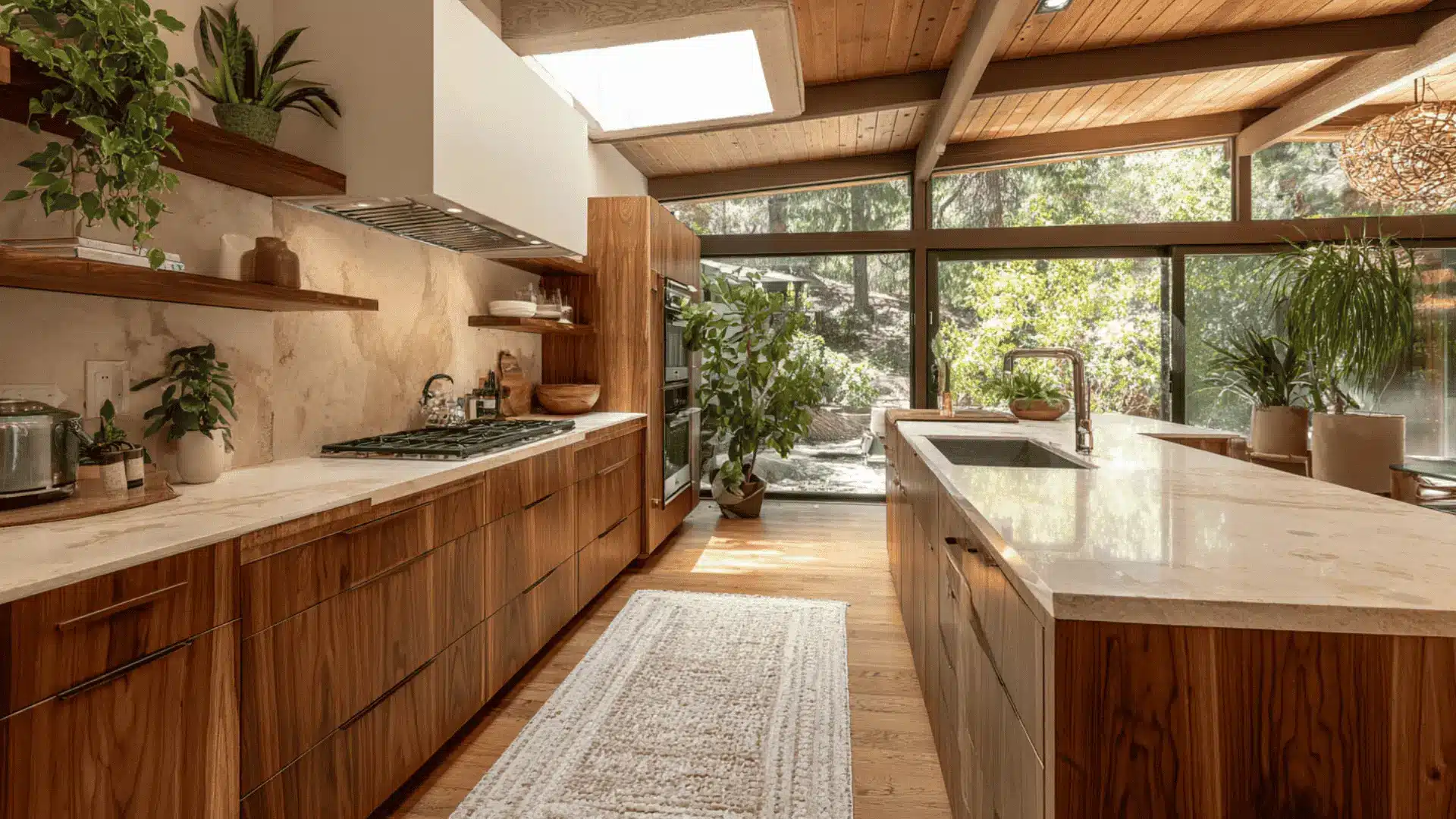
7. Teak Open Shelving for Functional Display
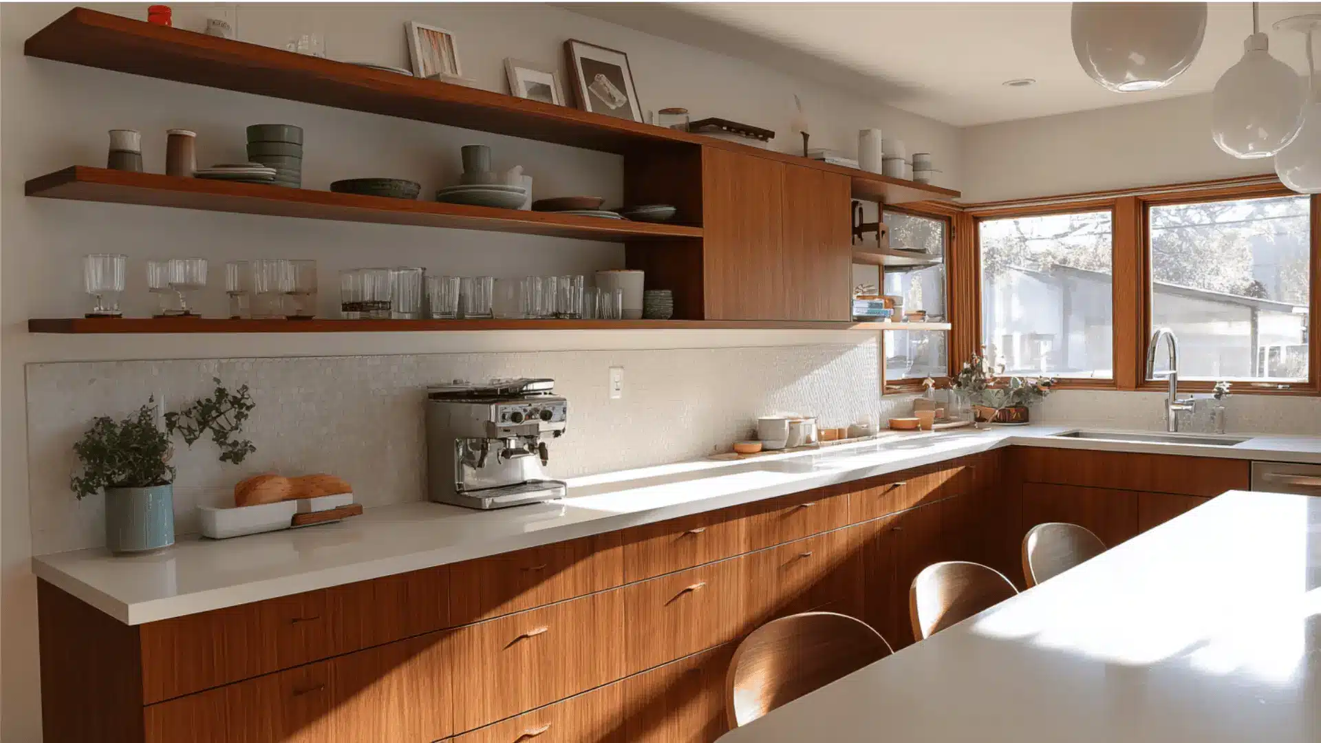
Floating teak shelves let you display ceramics, glassware, or cookbooks without adding visual weight to the walls.
The warm wood tones keep the look cohesive and the openness stops the space from feeling closed in. Keep them edited. Overloading the shelves works against the whole idea.
8. Large Window to Bring the Outdoors in
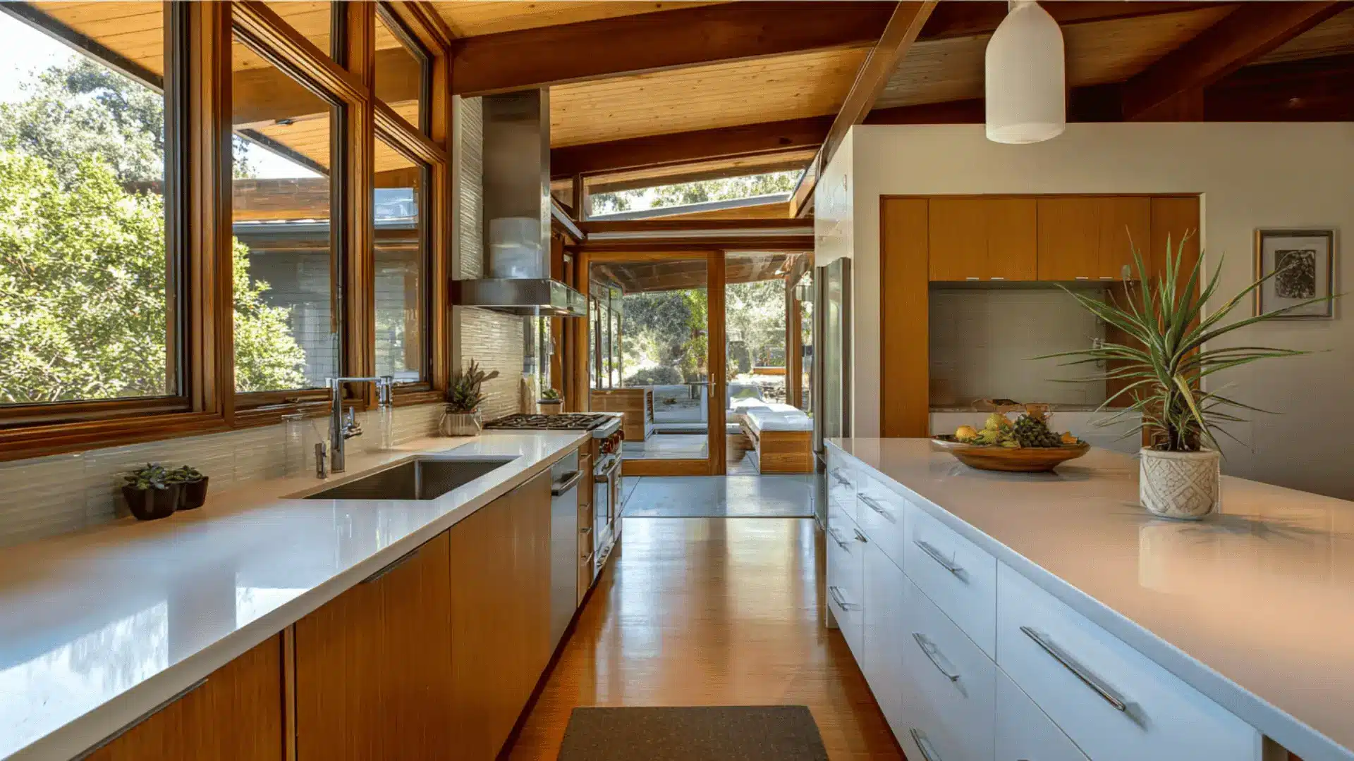
Mid century design places real value on the connection between inside and outside.
A large window over the sink or along one wall lets natural light flood in and makes greenery part of the daily view.
A few things that make this work:
- Position the window to capture the best outdoor view from the main work zone
- Keep the frame slim so the glass does most of the visual work
- Avoid heavy window treatments that block light and undercut the openness
- Let the view sit as its own feature without competing decor nearby
9. Terrazzo Flooring with Neutral Aggregate
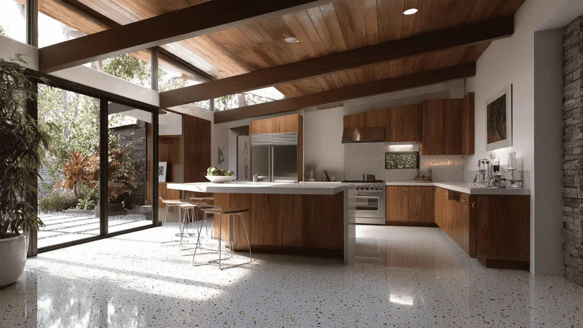
Terrazzo brings texture and subtle pattern underfoot without demanding attention. Neutral aggregates in cream, gray, or tan keep the floor grounded while adding that unmistakable mid century character.
It is durable, easy to maintain, and holds up well in a kitchen that gets real use every day.
10. Built In Wall Oven with Vertical Emphasis
Stacking the oven and microwave vertically creates a clean, organized column that keeps appliances in one place.
It saves counter space, improves workflow, and adds that structured quality mid century kitchens are known for. The vertical emphasis also draws the eye upward, which helps in kitchens with lower ceilings.
11. Vintage Inspired Globe Lighting Above Work Zones
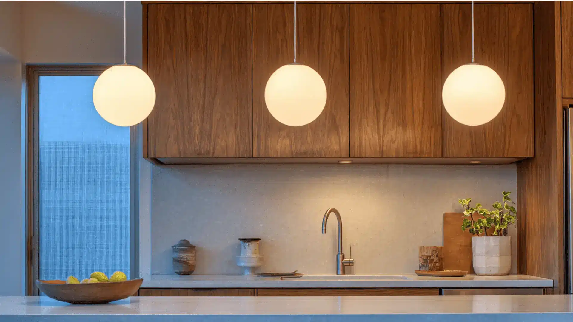
Soft globe lights above the sink or prep counter give you the light you need without harsh glare.
They add period authenticity without feeling dated and suit both task zones and casual evening use. Opal globes in particular diffuse light well and keep the tone warm across the whole kitchen.
12. Reeded or Fluted Wood Cabinet Accents
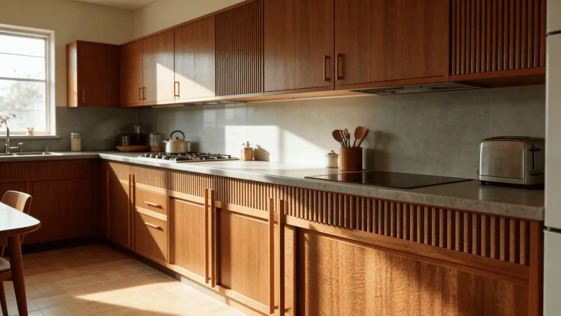
Introducing subtle vertical texture through fluted panels adds dimension while keeping the clean lines intact.
Use it sparingly on a select few cabinet doors or an island front.
The detail catches the light in a way that flat surfaces cannot and adds a quiet sense of craftsmanship without disrupting the overall calm of the room.
13. Hidden Pantry Behind Flush Cabinet Panels
Concealing pantry storage behind flat cabinet doors so the wall reads as one continuous surface is one of the cleanest moves in mid century kitchen design.
A few things worth knowing before planning this:
- The doors need precise alignment to read as seamless from across the room
- Push to open mechanisms keep the surface hardware free
- Deep pantry shelving behind flush panels can hold far more than most people expect
- This works best when the pantry sits within the main cabinet run rather than as a separate unit
14. Neutral Kitchen Anchored by One Bold Accent Color
Keep most surfaces neutral, white, beige, or wood, and introduce one bold tone in limited doses.
Rust, navy, or olive work well on a single wall, a set of bar stools, or pendant lights.
The restraint is what makes the color land. When everything else holds back, one considered choice does all the work.
15. Wood Ceiling Slats to Add Architectural Interest
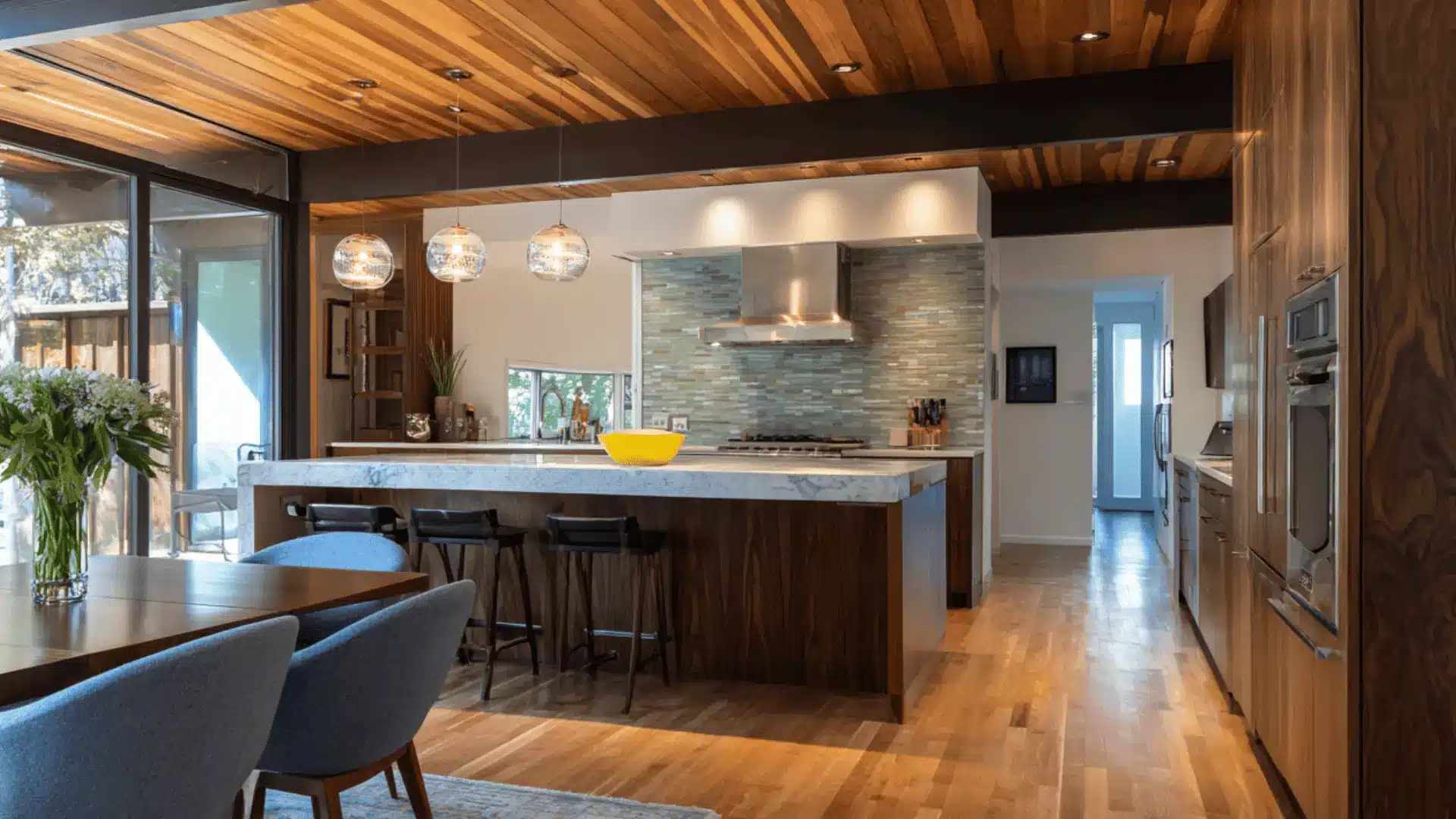
Linear wood slats on the ceiling add warmth and structure to open layouts.
They draw the eye along the length of the room and make the space feel more deliberate.
This works especially well in kitchens with higher ceilings where a flat white ceiling would otherwise feel disconnected from the warmth of the cabinetry below.
16. Freestanding Credenza Used as Kitchen Storage
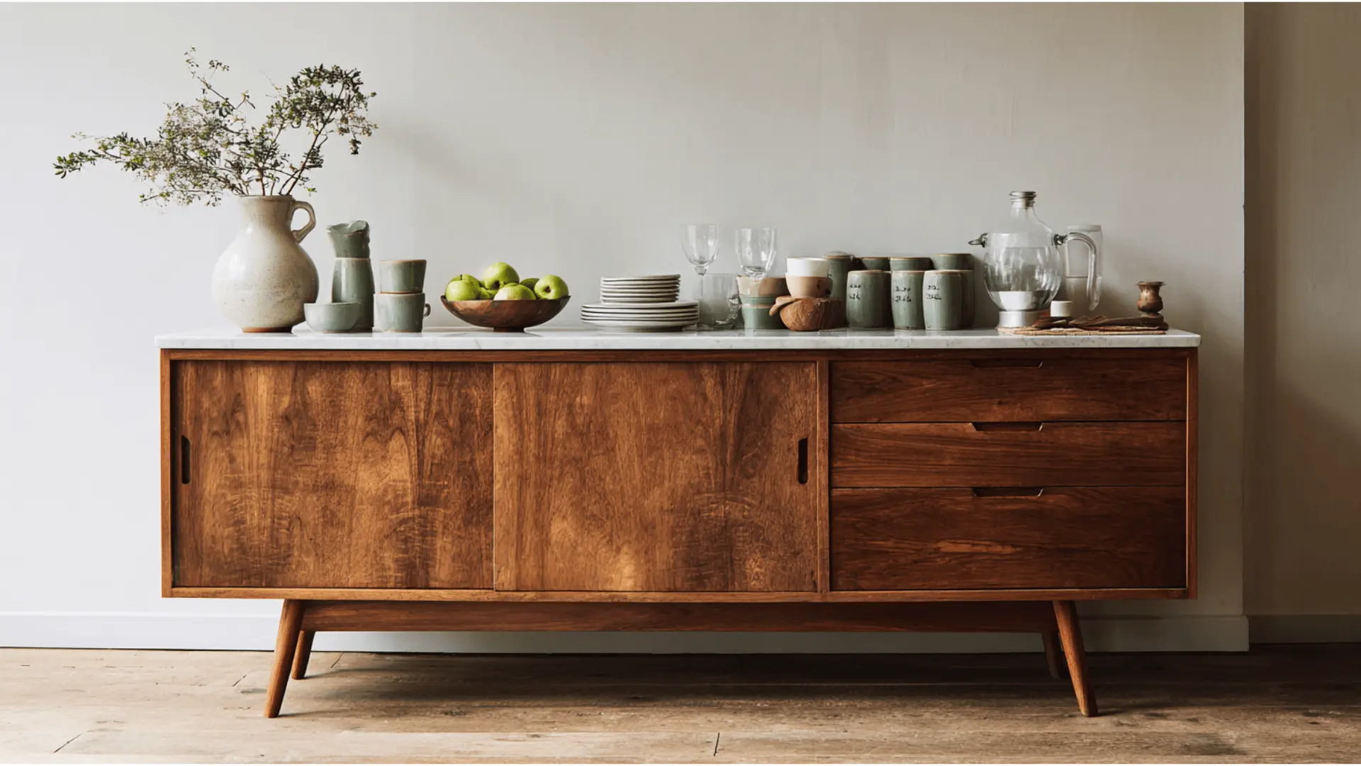
An authentic mid century credenza brings extra storage and real character that built ins cannot replicate.
Things worth considering before sourcing one:
- Estate sales and second hand markets are the best places to find pieces with genuine provenance
- Look for solid wood construction rather than veneer for longevity in a kitchen setting
- A credenza on legs keeps the floor visible and the layout feeling open
- It can double as a serving surface during meals without looking out of place
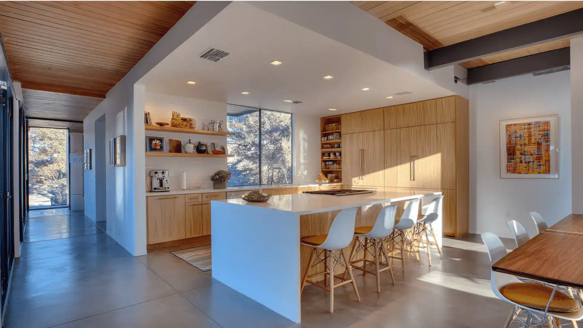
17. Open Plan Kitchen That Blends into Living Spaces
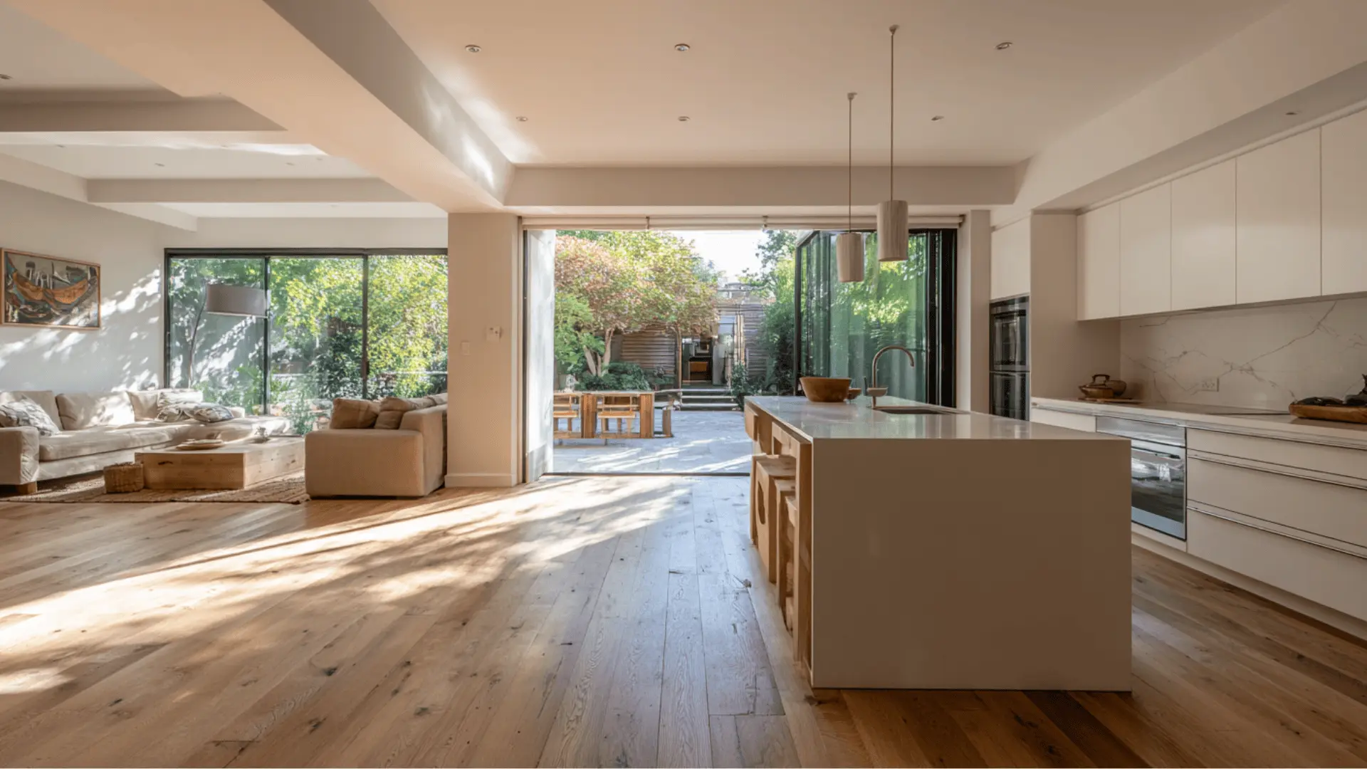
Using consistent materials and finishes across the kitchen and adjacent living areas makes the whole space feel larger and more connected.
Skip upper cabinets on the room facing side to maintain the openness.
This is exactly what mid century designers were working toward and it still holds up as one of the most considered ways to lay out a home.
Mid Century Modern Kitchen Light Fixtures
Lighting in a mid century modern kitchen is not an afterthought. It is part of the design.
The fixtures you choose should feel like they belong to the same era as the cabinetry without looking like a costume.
Sputnik chandeliers, opal globe pendants, and cone shaped task lights are the most recognized options.
Brass and matte black finishes both work well. Over an island, a trio of identical pendants hung at the same height creates the symmetry mid century design depends on.
Avoid anything too ornate or too industrial. A fixture that could have shipped from a 1960s catalog but works just as well today is exactly what you are after.
Bring it all Together
These ideas work whether you are updating a few elements or planning a full renovation.
Start with what fits your space and budget, then build from there. A mid century modern kitchen does not need to come together all at once.
Pick one or two ideas that feel right and see how much the room shifts from there.
Frequently Asked Questions
1. What Colors Work Best in a Mid Century Modern Kitchen?
Stick with warm wood tones, whites, soft grays, and muted earth tones like clay, olive, sage, or rust as accent colors.
2. Can I Mix Mid Century Modern with Other Design Styles?
Yes, mid-century modern pairs well with Scandinavian, industrial, and minimalist styles since they all value simplicity and function.
3. What Type of Flooring Is Most Authentic for a Mid Century Modern Kitchen?
Terrazzo, cork, vinyl tile, and light wood floors were all popular choices during the mid-century era.
5. Are Mid Century Modern Kitchens Practical for Families with Kids?
Absolutely, the open layouts, durable materials, and clutter-free design make them easier for families to keep clean and safe.