You’ve been staring at the Alabaster by Sherwin-Williams paint swatch for days. You like the color, but it looks different under different lighting.
It’s warm without being too yellow, clean without feeling cold. Rooms painted in Alabaster look pulled-together and easy to live in.
Keep reading, your next favorite color might already be right here.
Features of Alabaster White Paint
Alabaster SW 7008 is one of the most popular interior paint colors out there.
In fact, it held the title of Sherwin-Williams’ Color of the Year back in 2016, and it’s been the best-selling color and people’s favorite since then.
It’s a white with soft undertones that make any room feel cozy and inviting.
Undertones of Alabaster
Alabaster isn’t a pure, stark white. It carries soft, creamy yellow and beige undertones, giving it a lived-in, off-white feel.
These undertones shift depending on the room’s lighting. In spaces with limited natural light, it can pull toward a slightly beige tone.
In brighter rooms, it reads much closer to a clean white. Testing a sample on the wall before committing is always the smartest move.
Lighting According to Rooms
Light changes everything with Alabaster.
In a north-facing room, it can look slightly cool and creamy. In a south-facing room, it is a bright and warm color for home decor.
East and west-facing rooms shift between the two throughout the day. Always test a sample before committing.
LRV of Alabaster
Alabaster has an LRV of 82 out of 100.
That puts it on the higher end of the scale, meaning it reflects a good amount of light without looking too bright or stark.
It’s not the crispest white out there, but the rooms feel open and light without ever feeling washed out.
Is Alabaster More Beige or White?
This is one of the most common questions; some think it’s white, and for some it’s beige.
Alabaster sits right in the middle; it’s not a true white, nor is it a full beige.
It leans more toward white but carries just enough yellow and beige undertones to keep it from looking cold or stark on the wall.
In well-lit rooms, it reads almost white. In darker spaces, those beige undertones become more noticeable. The room’s lighting, flooring, and furniture all play a role in how it finally looks.
Before painting an entire room, test Alabaster next to the existing furniture, room lighting and flooring. It saves a lot of second-guessing and no room for error.
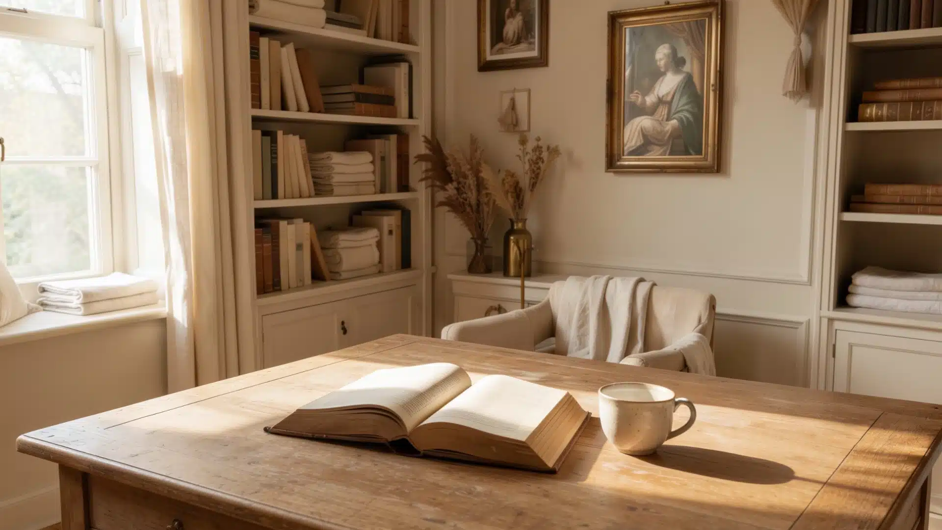
Using Alabaster in Different Rooms at Home
Alabaster works differently in every room. The way light hits the walls changes how the color looks throughout the day.
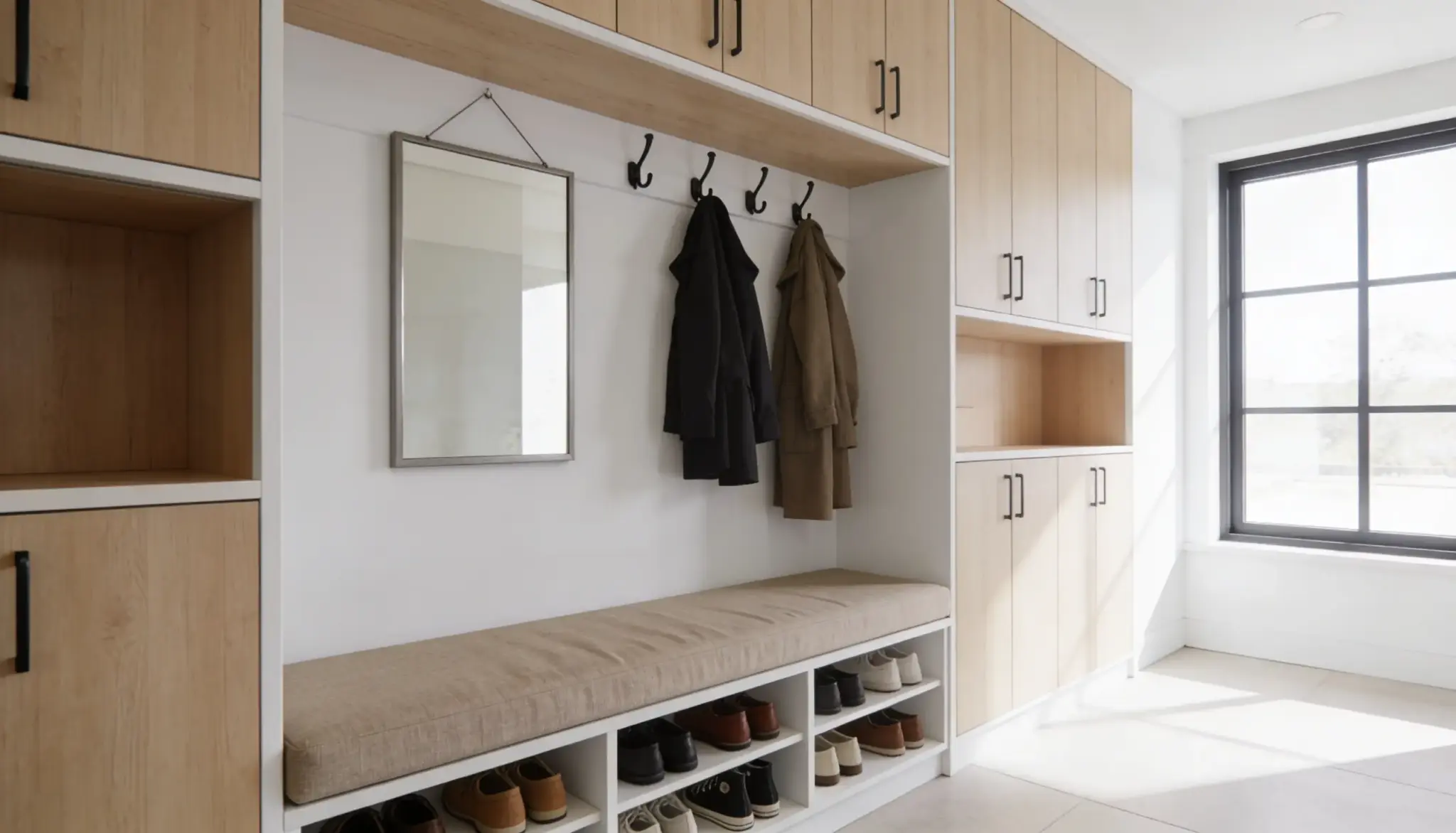
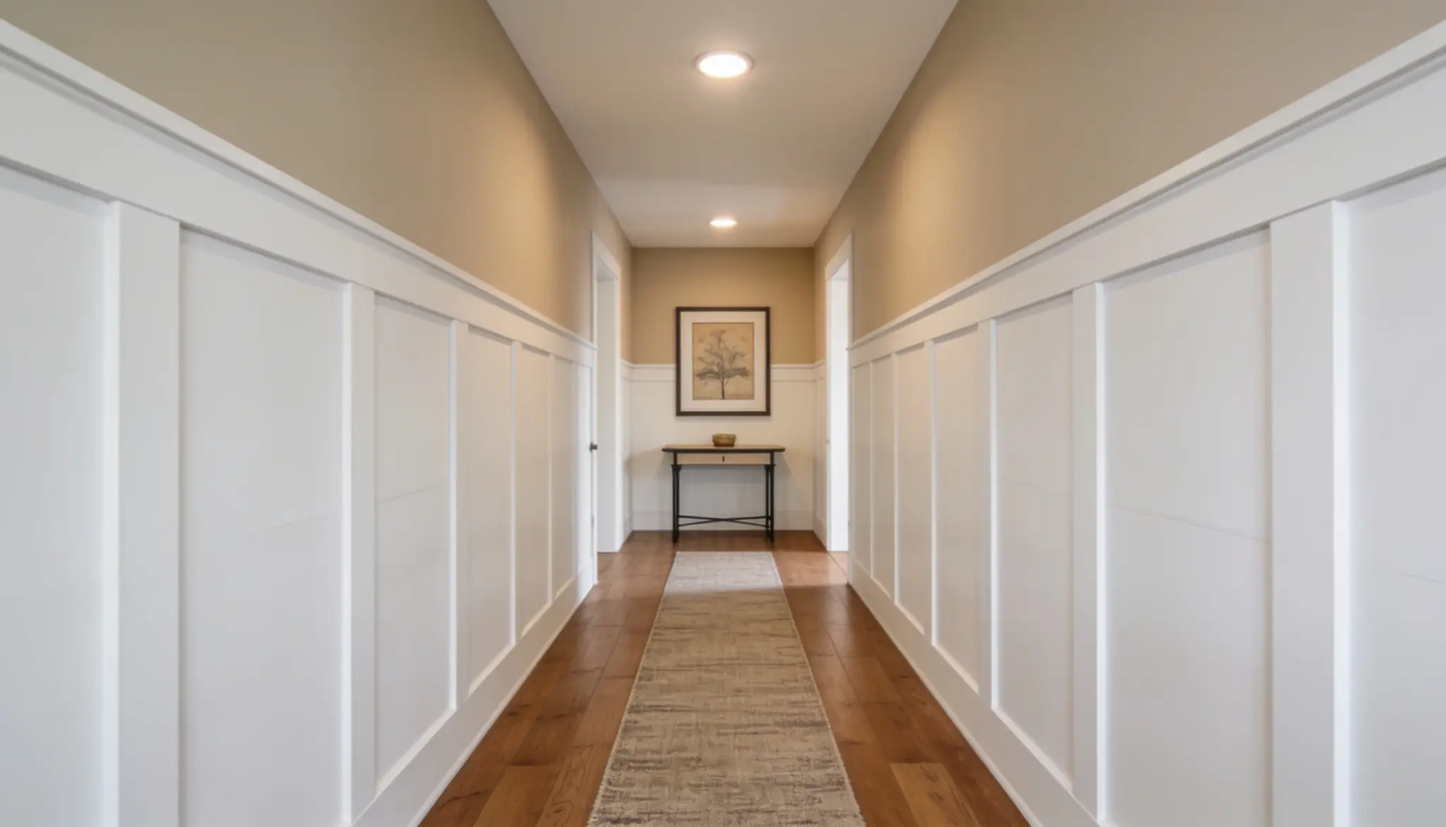
1. Entryway
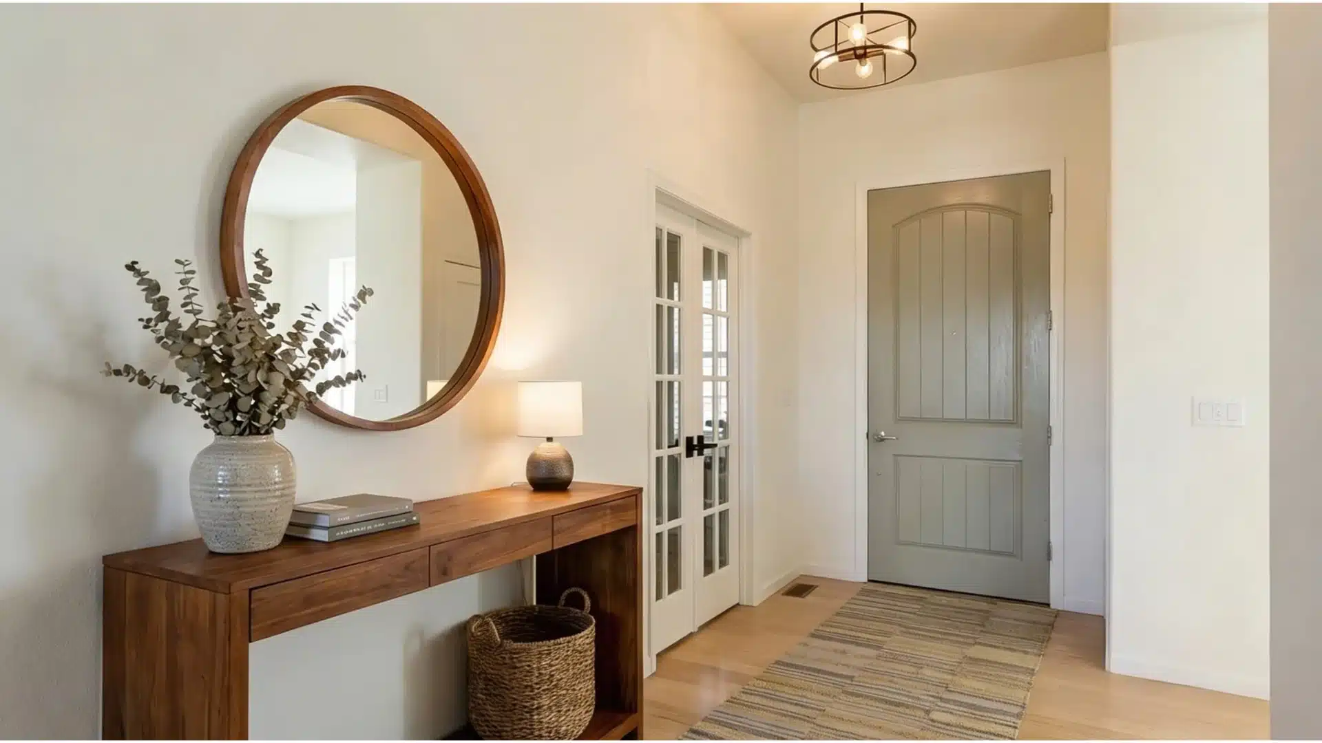
The entryway is the first thing guests notice, and Alabaster makes a quiet but strong first impression.
Its soft off-white tone keeps the space bright even when natural light is limited. Paired with dark flooring or a wooden console table, it adds just the right amount of contrast.
It’s a shade that makes any entryway feel put-together from the moment someone walks in.
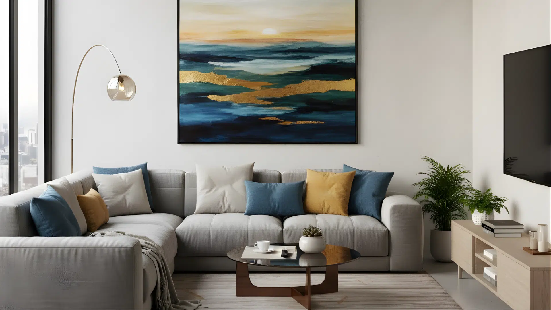
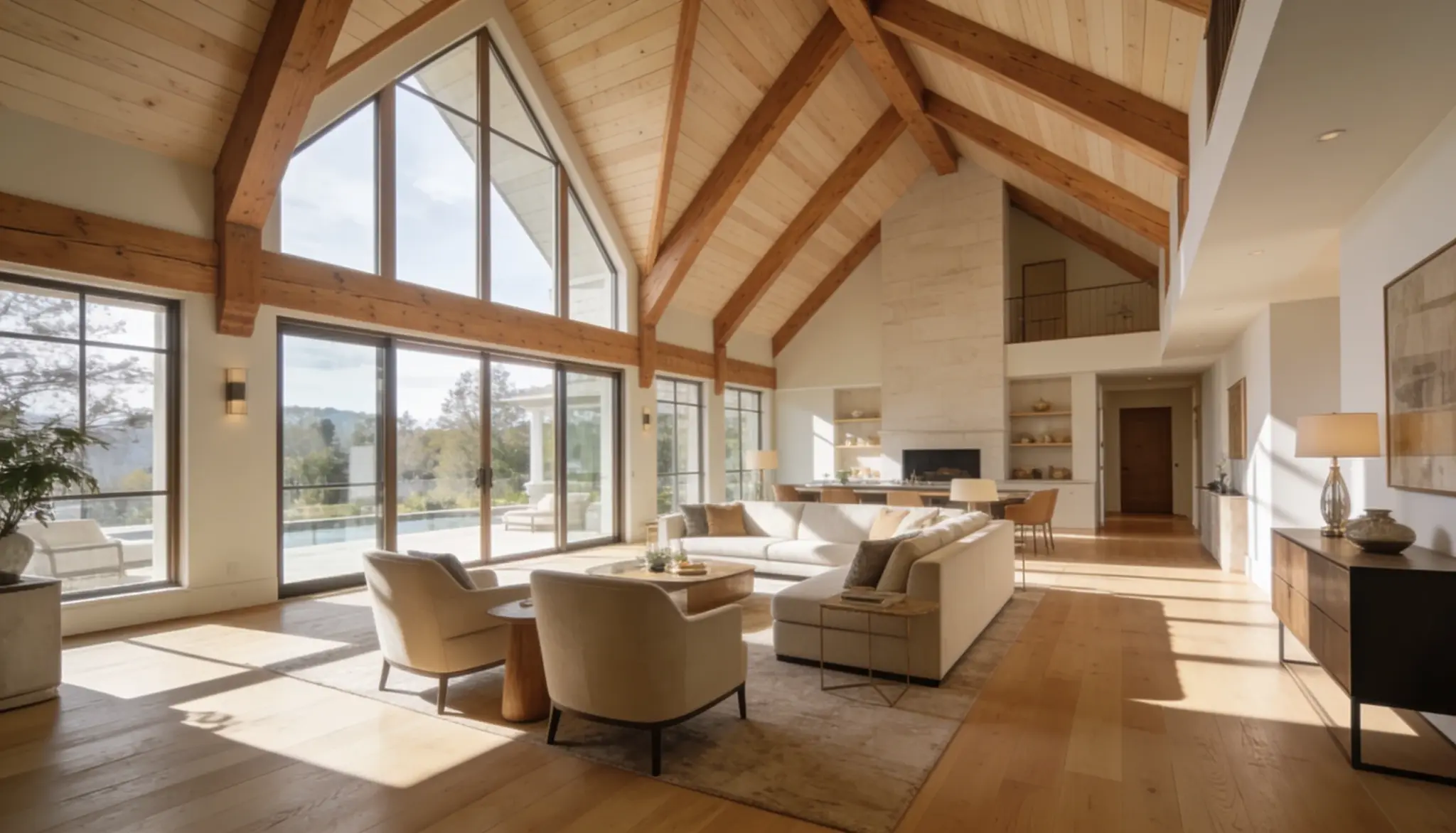
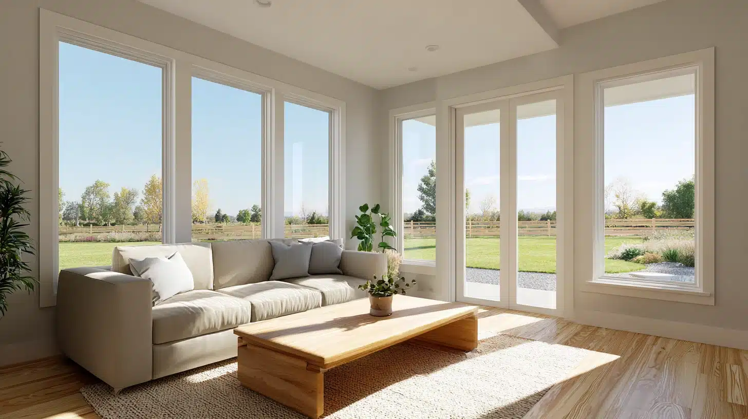
2. Living Room
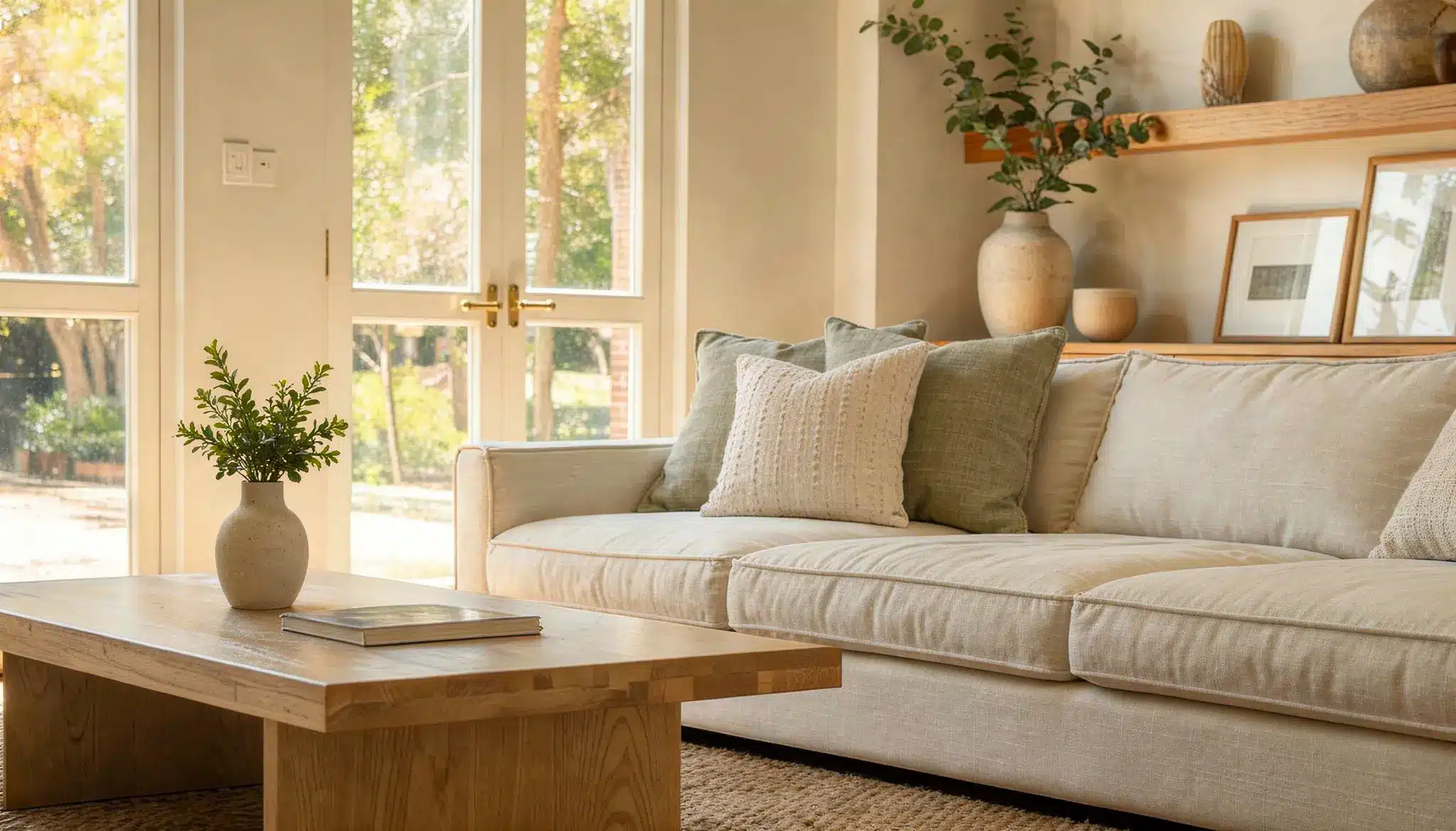
The living room is where Alabaster Sherwin-Williams interior paint truly shines.
It makes the space feel open and put-together. You can pair it with wood furniture or stone accents; it adds just the right amount of softness.
It works well with both natural and artificial lighting.
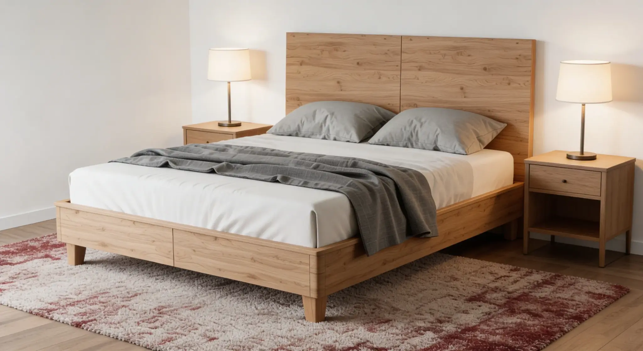
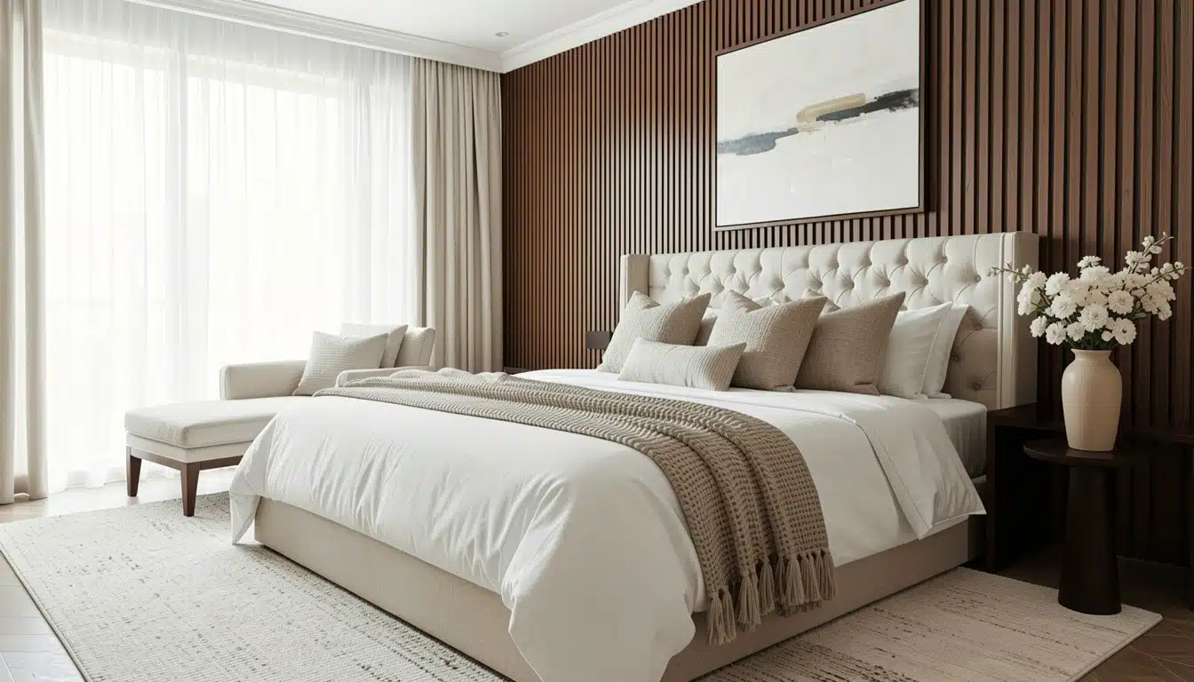
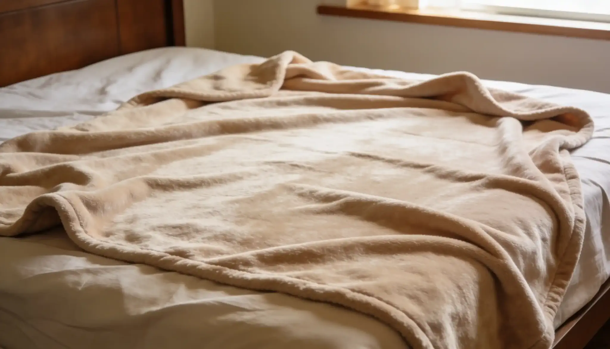
3. Bedroom
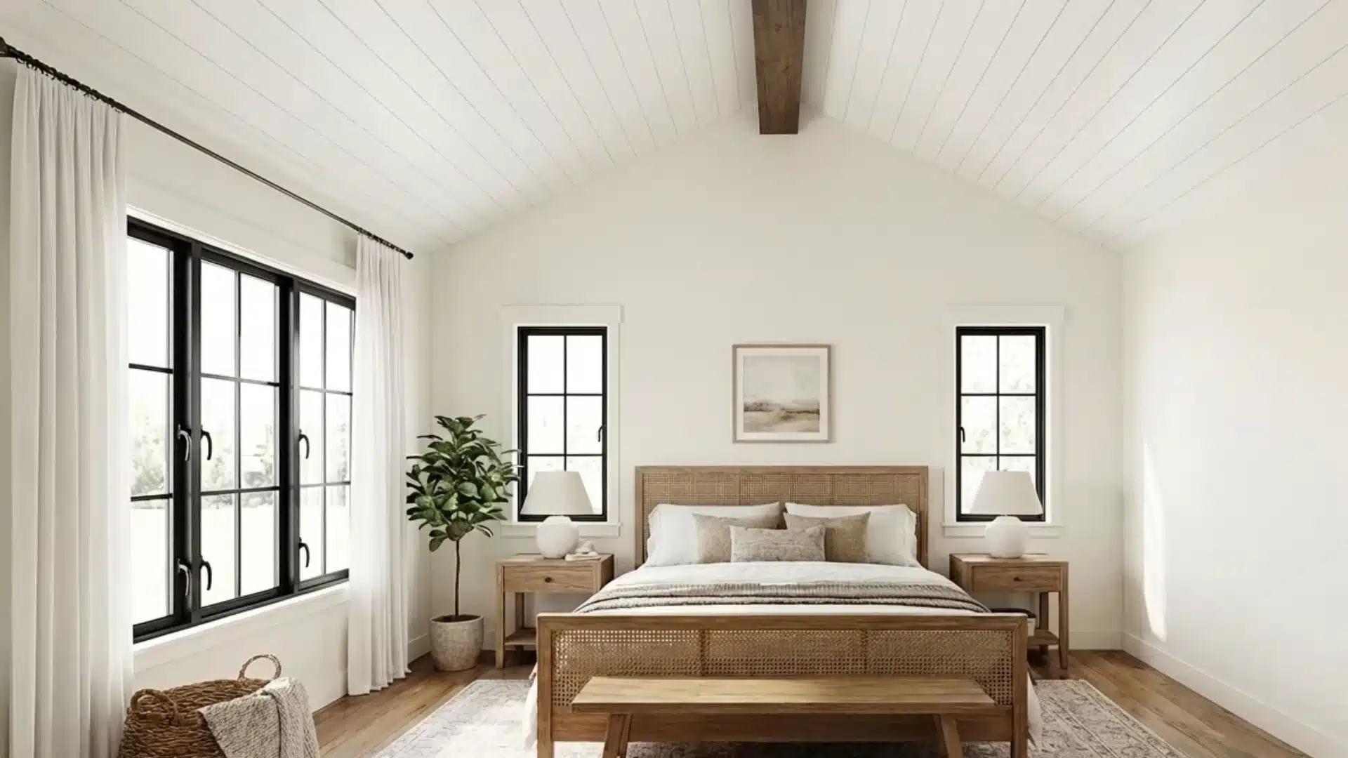
Alabaster white is a popular choice for the bedroom, too. It keeps the space feeling light without looking too cold.
It sits well next to soft bedding, wooden floors, and muted accent colors. The result is a room that feels restful, calm, and clean at the same time.
4. Kitchen
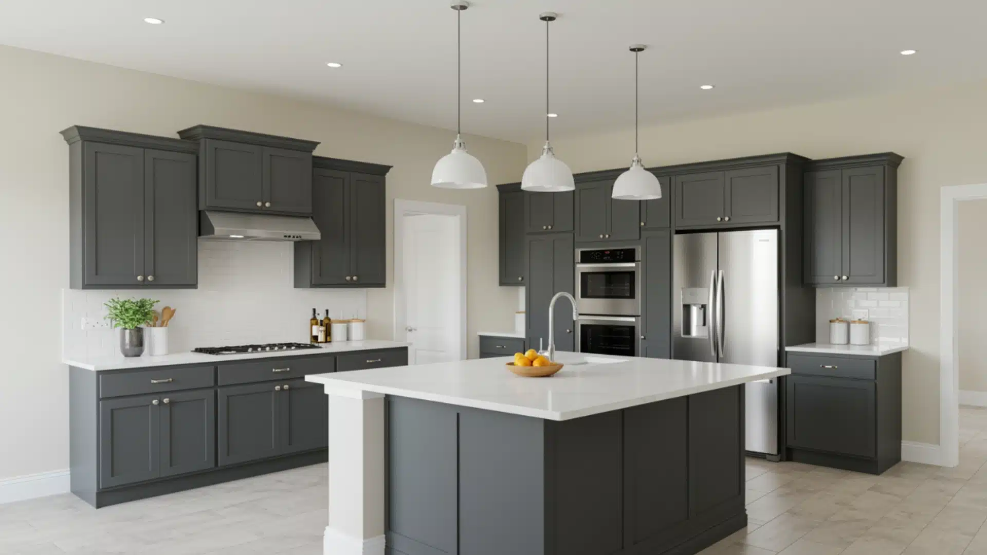
Kitchens painted with Alabaster tend to look bright and clean. The color holds up well against white, black and gray cabinets with wooden countertops, and stainless steel finishes.
It doesn’t overpower the space; it just ties everything together quietly and simply.
5. Bathroom
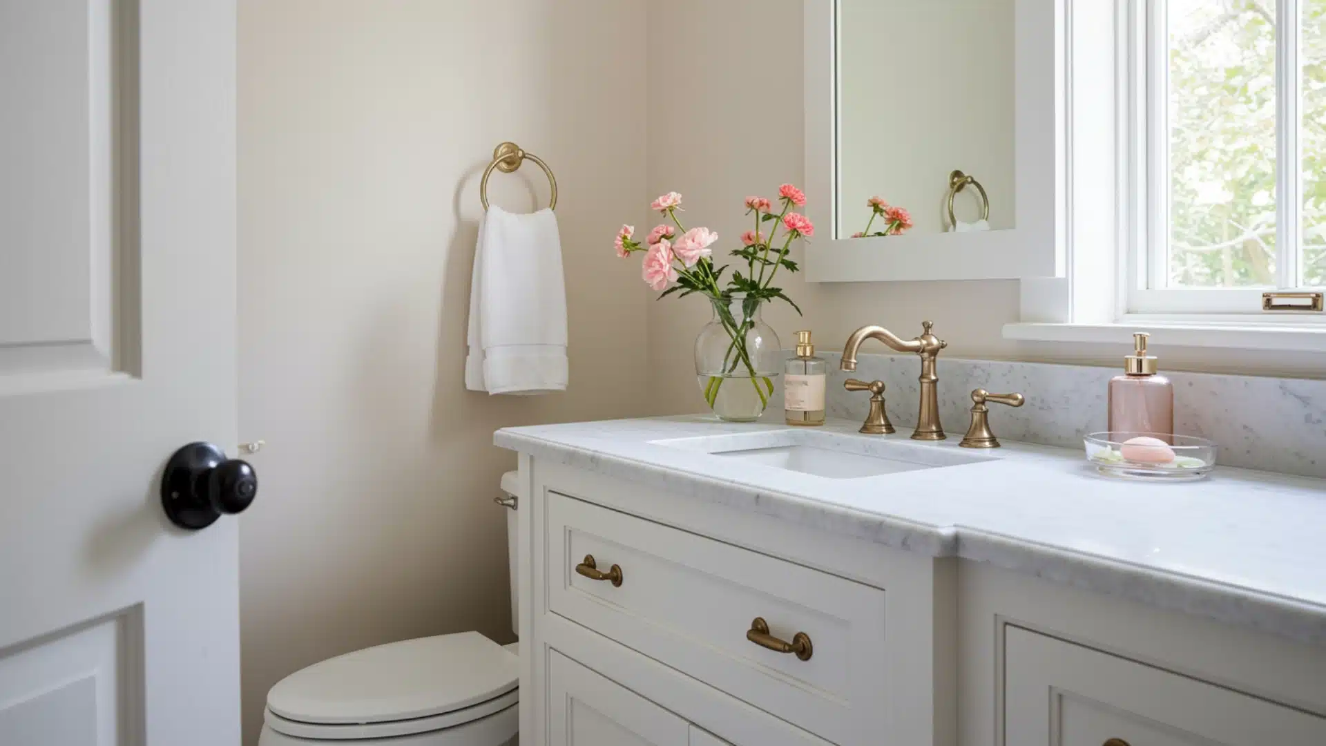
In smaller spaces like bathrooms, alabaster walls with pure white trim create a neat, put-together finish.
The slight contrast between the two shades adds depth without making the room feel busy. It’s a combination that works well in both large and compact bathrooms.
6. Dining Room
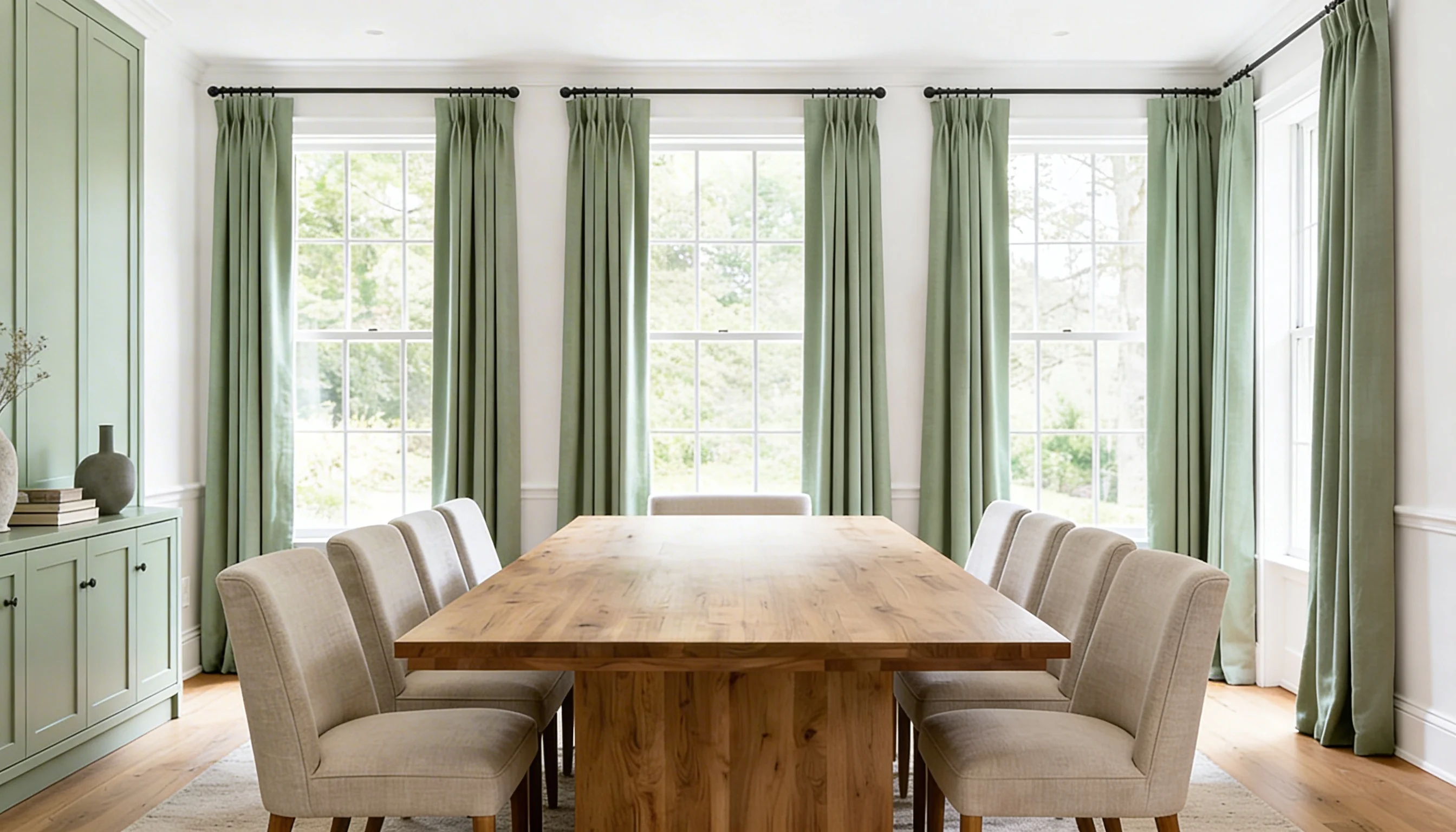
Alabaster Sherwin-Williams interior paint keeps the dining room space feeling light and open without competing with furniture or décor.
It sits well next to dark wood dining tables, warm lighting, and bold accent pieces.
Many people find that it makes their dining space feel more inviting without trying too hard.
Pros and Cons of Using Alabaster White in Your Space
Alabaster is a popular choice, but, like any paint color, it has its own strengths and limitations.
| Pros | Cons |
|---|---|
| Works well in most lighting conditions | Can pull yellow in darker rooms |
| Pairs well with a wide range of colors | Not ideal for rooms with heavy yellow tones |
| High LRV keeps spaces feeling open | May need multiple coats for full coverage |
| Works on walls, trim, and cabinets | Can look too creamy next to bright whites |
| Suits both modern and traditional styles | Shifts in color depending on natural light |
| Works well for both interiors and exteriors | May not work well in already warm-toned rooms |
How Alabaster Walls Look With Pure White Trim?
Pairing a soft off-white wall with bright trim is a classic interior choice that works really well.
The slight contrast between alabaster walls with pure white trim gives a room a clean, finished look without feeling too stark.
The trim acts as a crisp border, making the walls stand out just enough. This combination works well in living rooms, bedrooms, and hallways alike.
It’s a simple pairing that most people get right on the first try.
Alabaster vs. Other Popular White and Neutral Shades
Picking the right white or neutral shade can be tricky; how does Alabaster stack up against some of the most commonly compared colors:
Alabaster vs. Pure White Sherwin-Williams
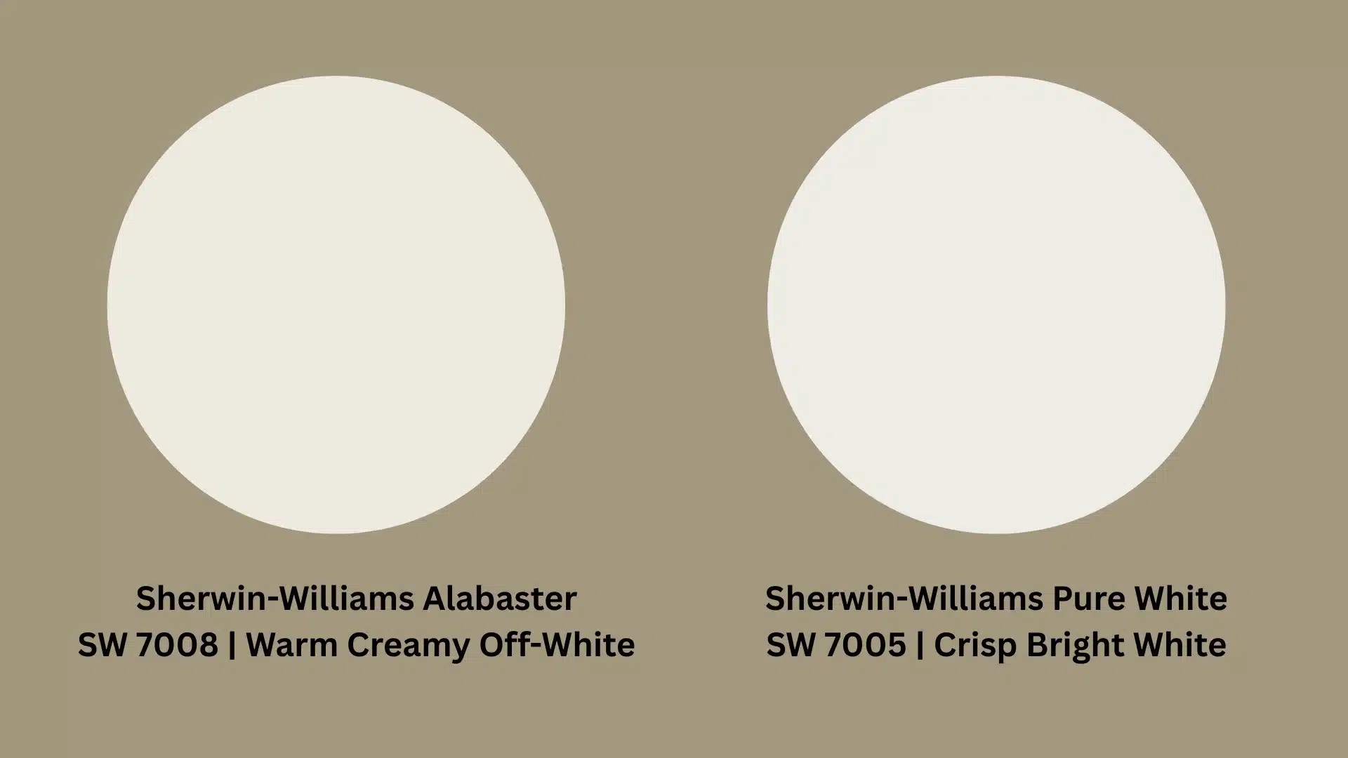
Pure White is brighter and crisper than Alabaster, and Alabaster reads softer and slightly more creamy.
Pure White works better in modern, minimal spaces. Alabaster suits homes that want a softer, less sharp finish on their walls.
Alabaster vs. White Dove Benjamin Moore
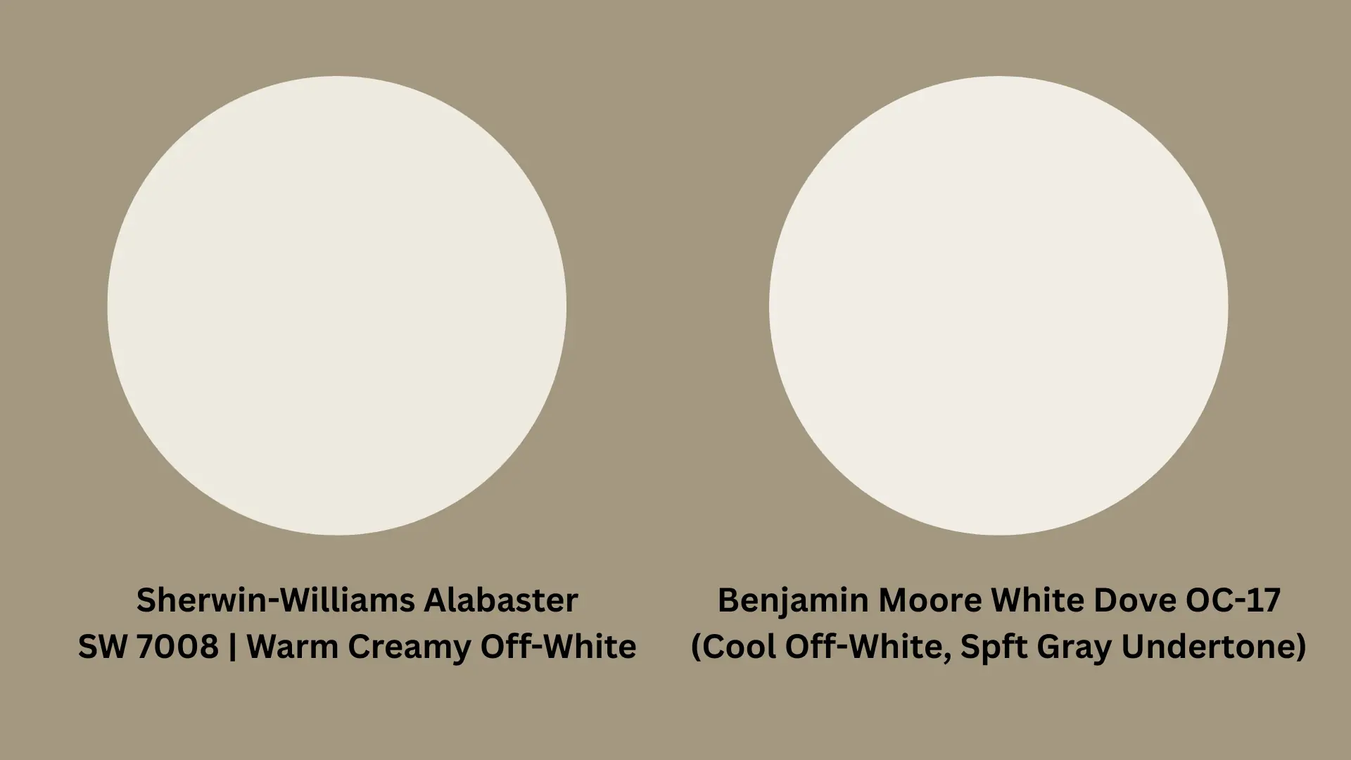
White Dove is a Benjamin Moore classic. It leans slightly cooler than Alabaster, with a faint gray undertone.
Sherwin-Williams Alabaster white, on the other hand, pulls more yellow and beige. Both are off-whites, but they suit different spaces.
White Dove works better in rooms with warmer natural light, while Alabaster fits well in most lighting conditions.
Alabaster vs. Swiss Coffee Benjamin Moore
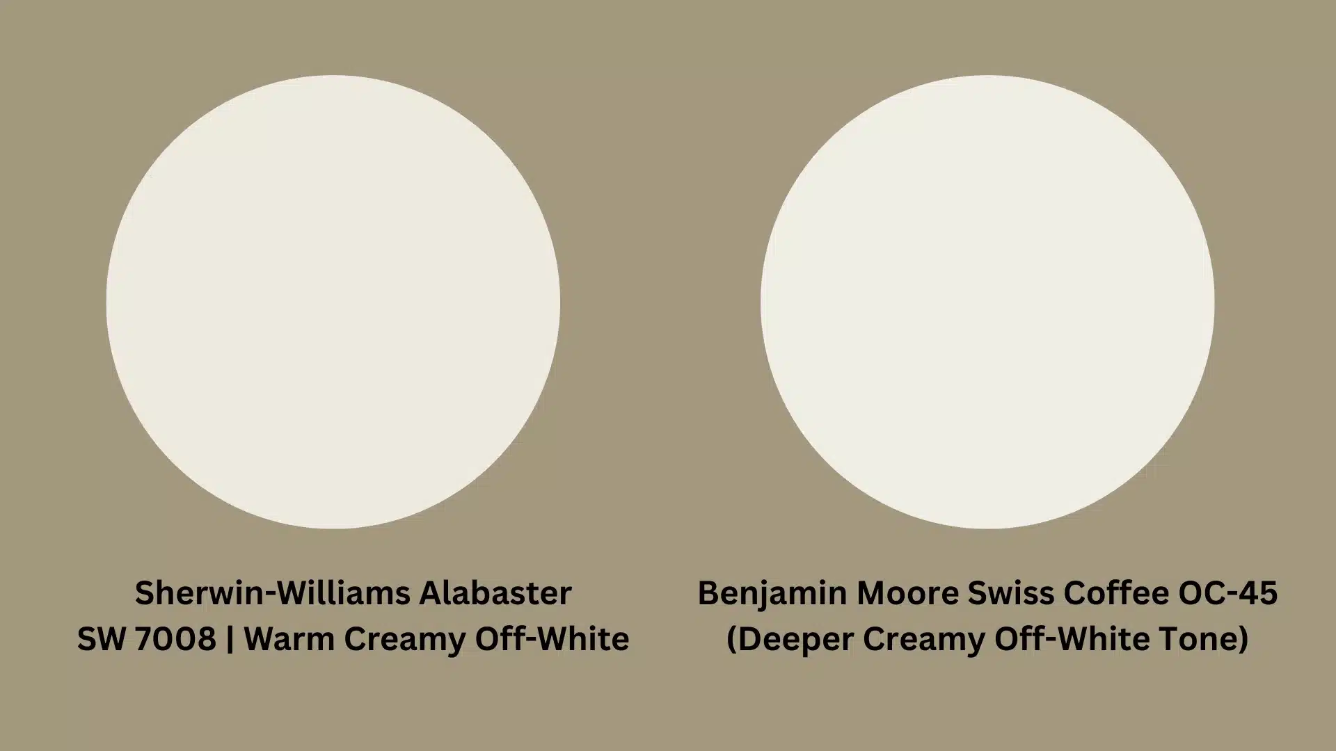
Swiss Coffee is deeper and more creamy than Alabaster.
It has stronger beige undertones that show up clearly on larger walls. Alabaster sits lighter and feels less heavy in a room.
For those who want pure white trim, Alabaster is the better pick. Swiss Coffee may look too dark next to a bright white trim.
Alabaster vs. Agreeable Gray Sherwin-Williams
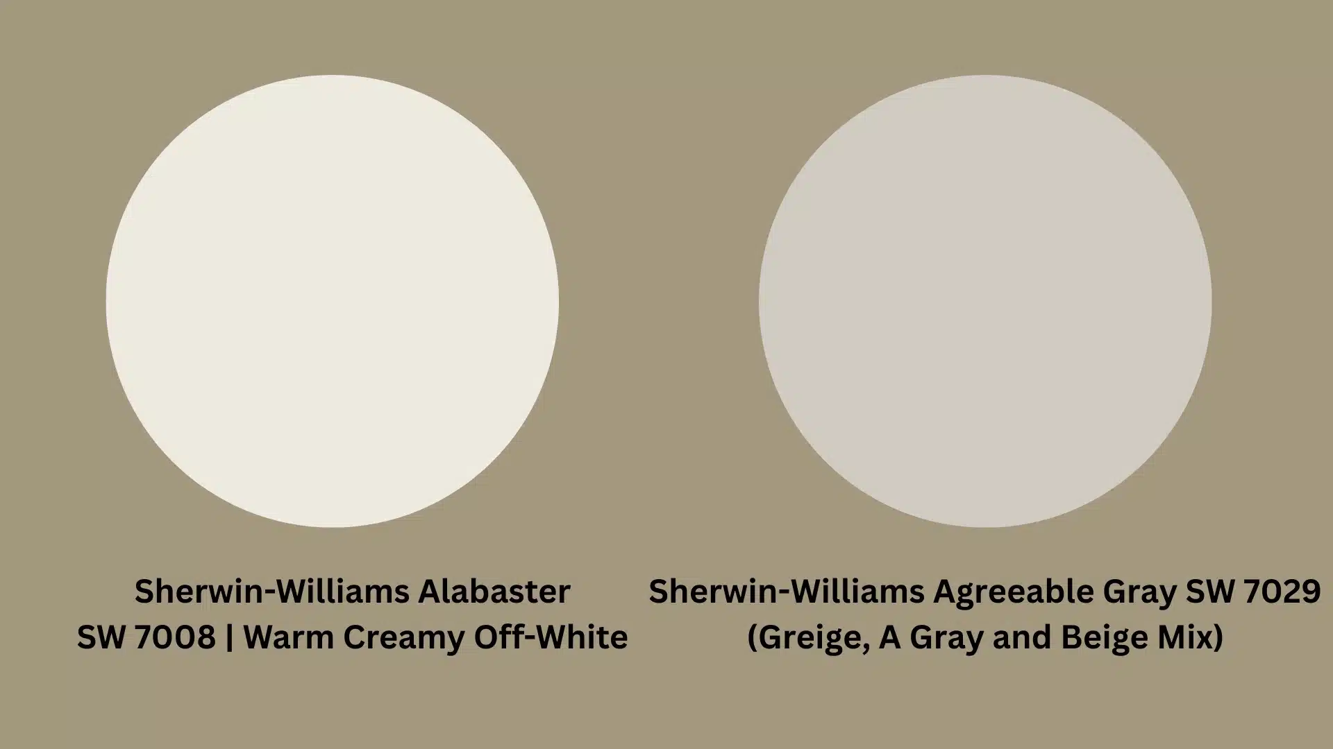
Agreeable Gray is a greige, a mix of gray and beige.
It’s noticeably darker than Alabaster and adds more color to a room. Alabaster is lighter and more neutral.
Agreeable Gray works well as an accent wall or in larger rooms. Alabaster suits those who want something softer and closer to white.
Alabaster vs. Accessible Beige Sherwin-Williams
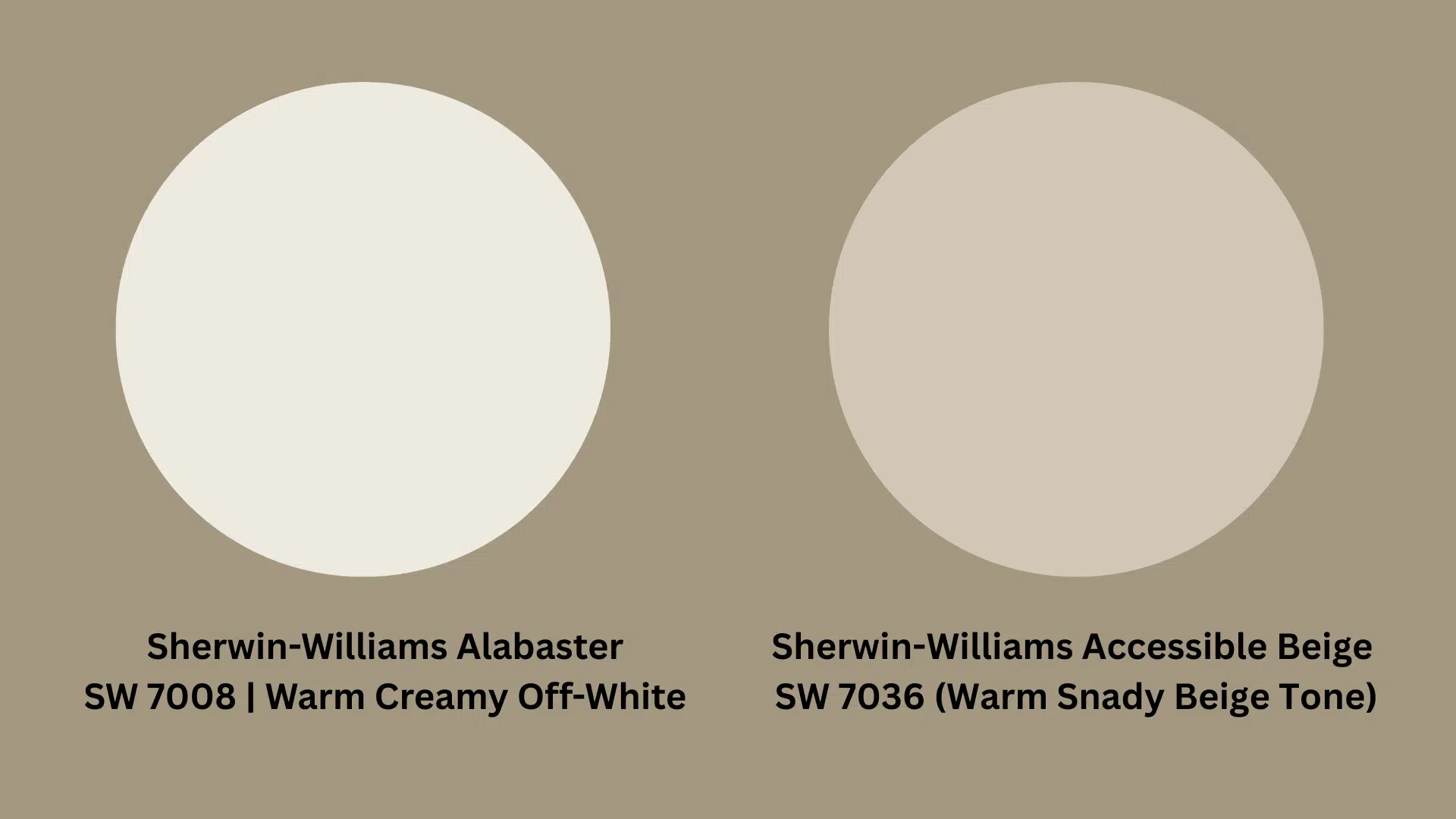
Accessible Beige sits warmer and darker than Alabaster. It has strong sandy undertones, clearly visible on the walls.
Alabaster reads much lighter in comparison. People who want a near-white finish often choose Alabaster.
Accessible Beige works better for those who want a more defined beige look in their space.
Can You Paint Your Cabinets with Alabaster?
Yes, and it looks really good. Alabaster is one of those paint colors that translates well onto cabinets, both in kitchens and bathrooms.
Its soft, off-white tone gives cabinets a clean finish without the sharpness of a bright white. It works particularly well on shaker-style cabinets and traditional wooden frames.
For best results, a semi-gloss or satin finish works better on cabinets than a flat or matte one. These finishes hold up well against daily wear, moisture, and cleaning.
Paired with brushed brass or matte black hardware, Alabaster cabinets can completely change the feel of a kitchen or bathroom without a full renovation.
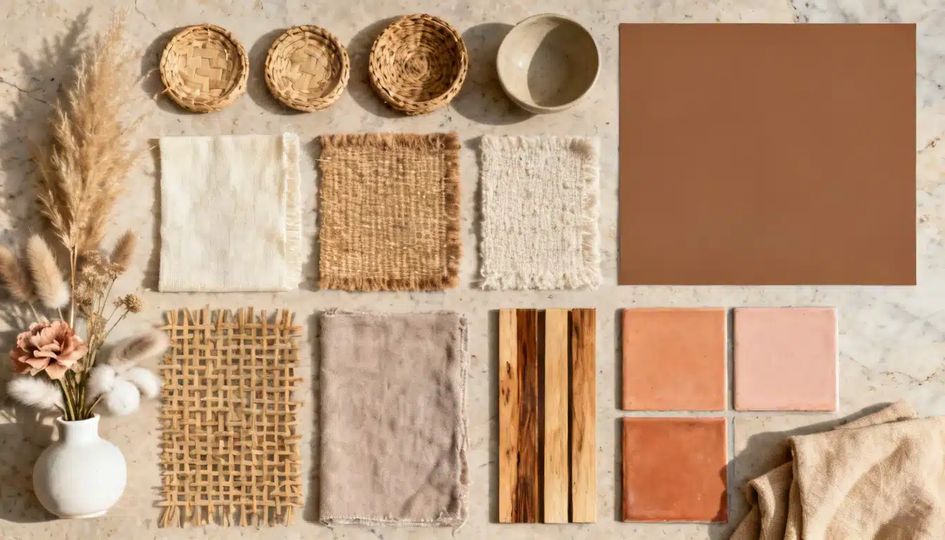
Colors that Complement Alabaster White
Alabaster is one of those shades that gets along with almost every color on the spectrum. Its soft, off-white base makes it easy to pair with both light and deep tones.
Sage Green
Sage green and Alabaster are a natural match. The muted, earthy quality of sage green sits beautifully against Alabaster’s soft off-white base.
Together, they create a calm, grounded feel in any room, especially in bedrooms and living rooms.
You can style it with natural linen, wooden furniture, and indoor plants for a look that feels fresh without being overdone.
Warm Beige
Warm beige and Alabaster share similar undertones, which makes them an easy combination to pull off.
The two colors blend without clashing, creating a soft, layered look across a room. Use warm beige on accent walls or soft furnishings while keeping the main walls in Alabaster.
It’s a pairing that feels put-together and suits homes with wooden floors and neutral décor.
Greige (Gray + Beige)
Greige adds a little more depth than a straight beige without going too dark. Paired with Alabaster white interior paint, it creates a tonal contrast that feels current and refined.
Use greige on a single feature wall to anchor the room while keeping the remaining walls in Alabaster.
It works well in living rooms and home offices where a bit of visual weight helps define the space.
Dusty Blue
Dusty blue brings a soft pop of color without overpowering Alabaster’s quiet, neutral tone.
The two colors balance each other out really well. Alabaster keeps things light, while dusty blue adds just enough character.
You can style it with brass or gold fixtures, soft white bedding, and wooden accents for a bedroom that feels collected and calm.
It also works well in bathrooms with plenty of natural light.
Charcoal Gray
Charcoal gray is for those who want a stronger contrast alongside Alabaster.
The deep, rich tone of charcoal makes Alabaster walls look even brighter and crisper in comparison. It works well as a trim color, a feature wall, or even on cabinetry.
You can style it with matte-black fixtures and light wood tones for a modern, high-contrast finish that feels sharp without being cold.
Muted Blush Pink
Muted blush pink is a softer, more subtle choice alongside Alabaster. It adds a hint of color without pulling the room in a bold direction.
Together, the two shades create a light, airy feel that works particularly well in bedrooms and nurseries. You can style it with soft white textiles, rattan furniture, and simple artwork.
It’s a combination that feels gentle and thoughtful, with little effort.
How to Pick the Right White Paint for Your Home?
The right white paint is not as simple as grabbing the brightest shade off the shelf.
For those considering Alabaster Sherwin-Williams interior paint, checking how it looks at different times of the day makes a big difference.
Every white has its own undertones, and those undertones behave differently depending on the room’s lighting, furniture, and flooring.
Before committing to any color, testing a sample on the wall is the smartest first step.
A quick guide to help narrow things down:
| Factor | What to Check |
|---|---|
| Lighting | Natural vs artificial light in the room |
| Undertones | Warm, cool, or neutral base |
| Trim Color | Does it contrast or blend? |
| Room Size | Lighter shades work better in smaller rooms |
If you prefer a sharper contrast, alabaster-white walls with pure-white trim are always a reliable combination.
Is Alabaster a Good Color for Exterior Use?
Alabaster isn’t just an indoor color. It performs surprisingly well on exterior walls, too.
Its soft, off-white tone pairs well with natural elements like brick, stone, and wood, making it a popular choice for home exteriors.
For exterior use, Alabaster pairs well with:
- Dark charcoal or black trim for a sharp, high-contrast finish.
- Soft gray accents for a subtle, tonal look.
- Brown or tan stonework for a natural, earthy combination.
- Deep green shutters for a classic, traditional feel.
One thing to keep in mind: exterior surfaces receive more direct sunlight. In bright conditions, Alabaster can look closer to a true white outside.
Overall, Alabaster is a solid exterior choice if you want a soft, clean finish that complements a variety of architectural styles.
Wrapping Up
Alabaster is more than just another white paint.
It’s a shade that works across rooms, lighting conditions, and styles without much fuss.
From LRV to undertones, every detail covered here points to one thing: this color is a reliable choice for most homes.
For anyone still deciding, testing Alabaster Sherwin-Williams interior paint on a small wall section first is always the smartest move.
Frequently Asked Questions (FAQs)
1. Is Sherwin-Williams Alabaster Too Yellow?
It depends on the lighting. In rooms with limited natural light, Alabaster can pull slightly more yellow than expected.
2. When Not to Use Alabaster?
Avoid Alabaster in rooms that already feel dark or yellow-toned. It may make the space look dull and flat.
3. What is Sherwin-Williams’ Most Popular Beige Color?
Accessible Beige is one of Sherwin-Williams’ most popular beige shades. It has strong sandy undertones and works well anywhere.