Your home should feel like you. But decorating can feel confusing, with too many choices and no clear starting point.
Interior design has a set of principles that make the whole process much easier. Once you know them, making decisions becomes a little easier.
In this post, you’ll get a clear breakdown of the core principles so you can start decorating your house to feel like the home you want.
Elements of Interior Design
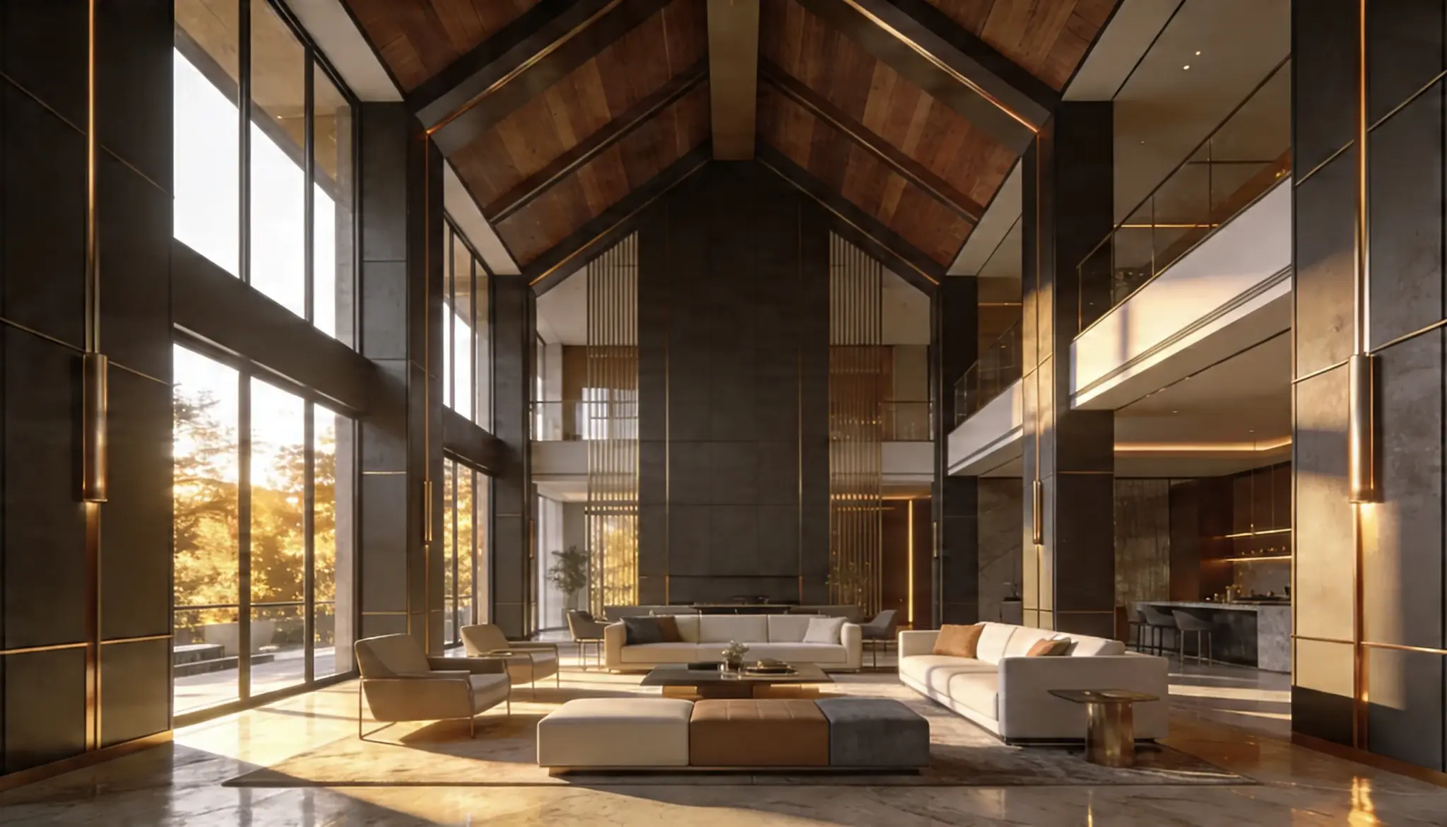
Every great room starts with the key elements. Together, they shape how a space looks and feels.
The basic elements will help you make smarter choices about your space.
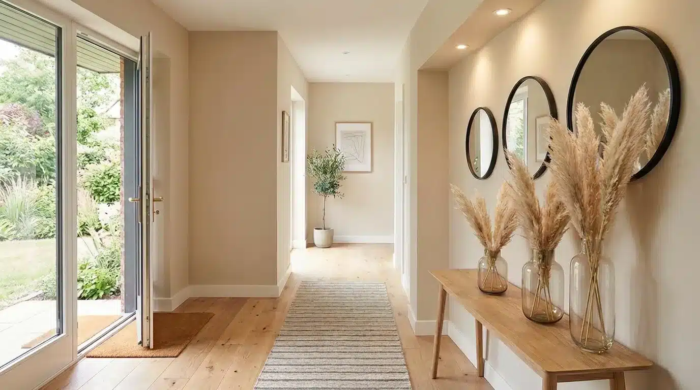
- Space: The foundation of design, it defines what goes where and how much breathing room a room has.
- Color: Influences emotions deeply, making a room feel warm, cool, big, or small.
- Line: Guides the eye. Horizontal lines calm, vertical lines add height, and diagonal lines create energy.
- Form: The shape of objects in a room; furniture, décor, and architecture all contribute to it.
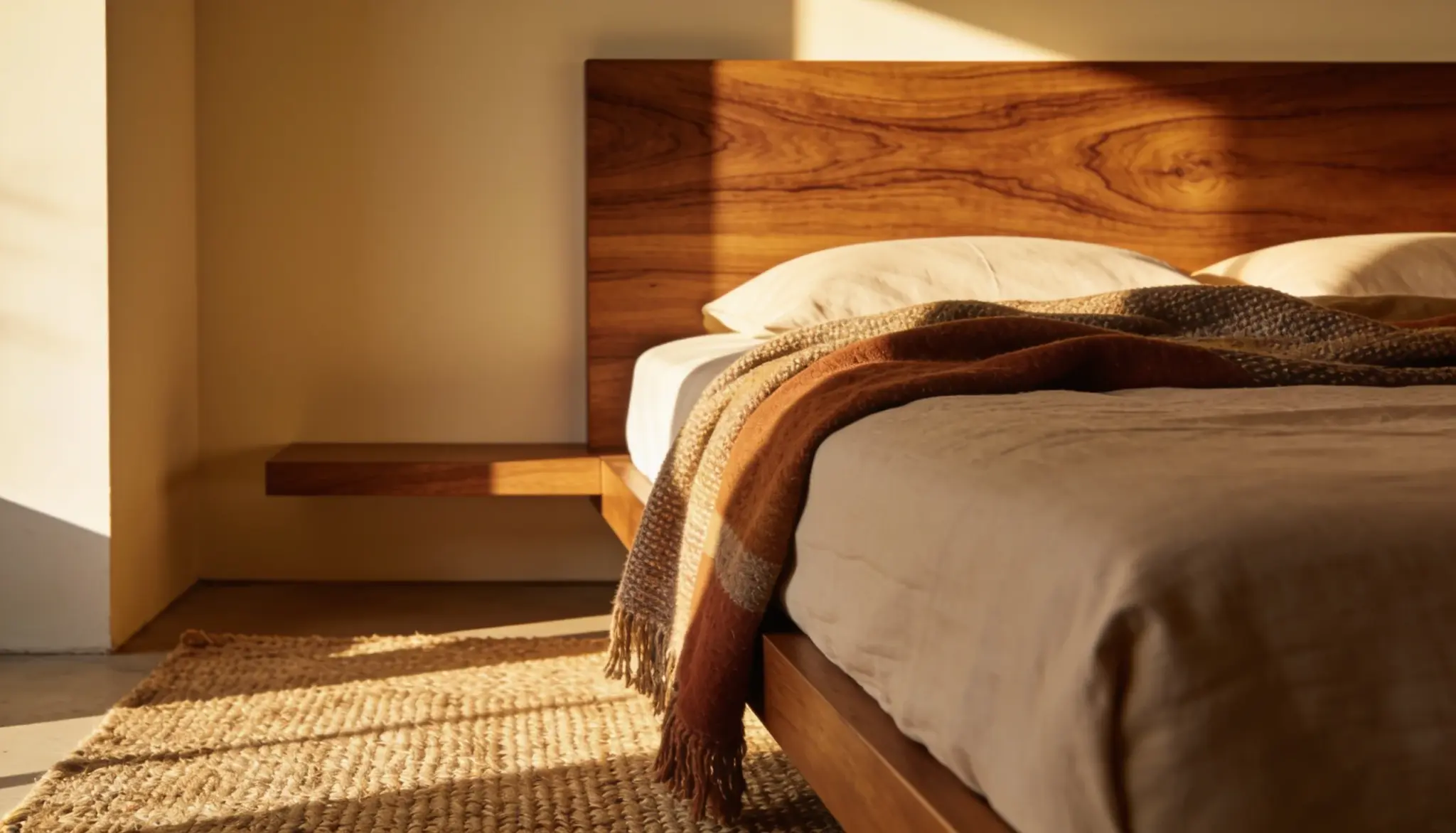
- Texture: Adds depth. Rough, smooth, or soft, each surface tells its own story.
- Light: Sets the mood. Natural or artificial, it changes how every color and texture appears.
- Pattern: Brings personality and visual interest without overwhelming the space.
Getting these seven elements right is what separates a room that looks good from one that truly feels like home.
The Principles of Interior Design
Good design isn’t just about picking pretty things; it follows a set of clear principles. These work behind the scenes to make a space feel right.
1. Balance
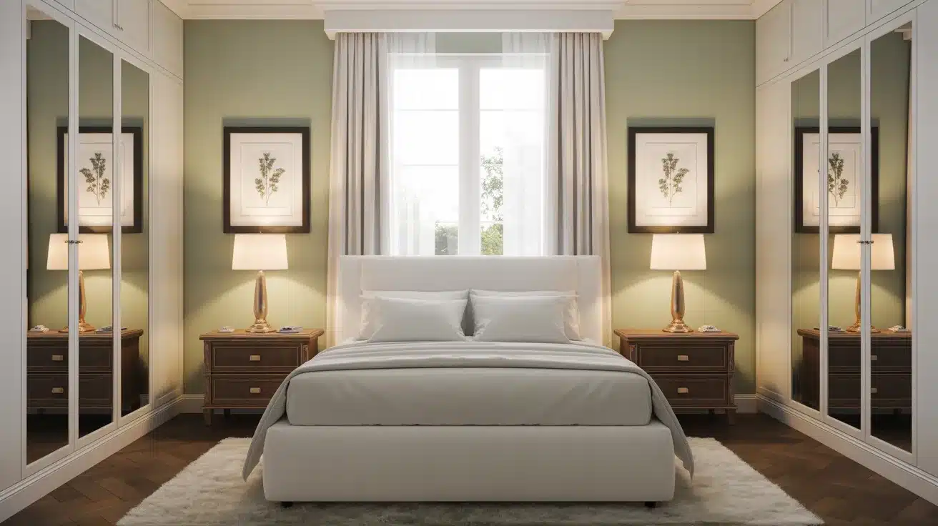
Adding balance makes a room feel visually stable and even. It spreads the visual weight of furniture, colors, and objects across a space.
There are three types: symmetrical, asymmetrical, and radial, each creating a different kind of order and calm.
| Type | How It Works | Best Used In | Feel |
|---|---|---|---|
| Symmetrical | Mirrors objects on both sides of a central point | Formal living rooms, bedrooms | Orderly, calm, structured |
| Asymmetrical | Uses different objects of similar visual weight on each side | Modern, casual spaces | Relaxed, creative, informal |
| Radial | Arranges elements outward from one central focal point | Dining rooms, lounge areas | Flowing, connected, and dynamic |
2. Rhythm
Rhythm in design creates a sense of movement and flow throughout a space.
It repeats colors, shapes, patterns, or textures to guide the eye from one area to the next.
Good rhythm makes a room feel connected and intentional, rather than a random collection of unrelated pieces thrown together.
Repeating one color in three different spots around a room is one of the easiest ways to create rhythm.
3. Emphasis
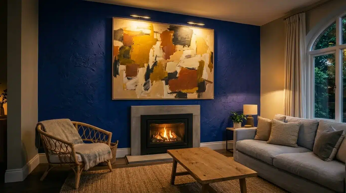
Every well-designed room has one focal point that draws the eye first. That’s emphasis.
It could be a bold feature wall, a fireplace, or a standout piece of furniture. Everything else in the room supports that room rather than competing with it.
Without emphasis, a room can feel directionless and flat.
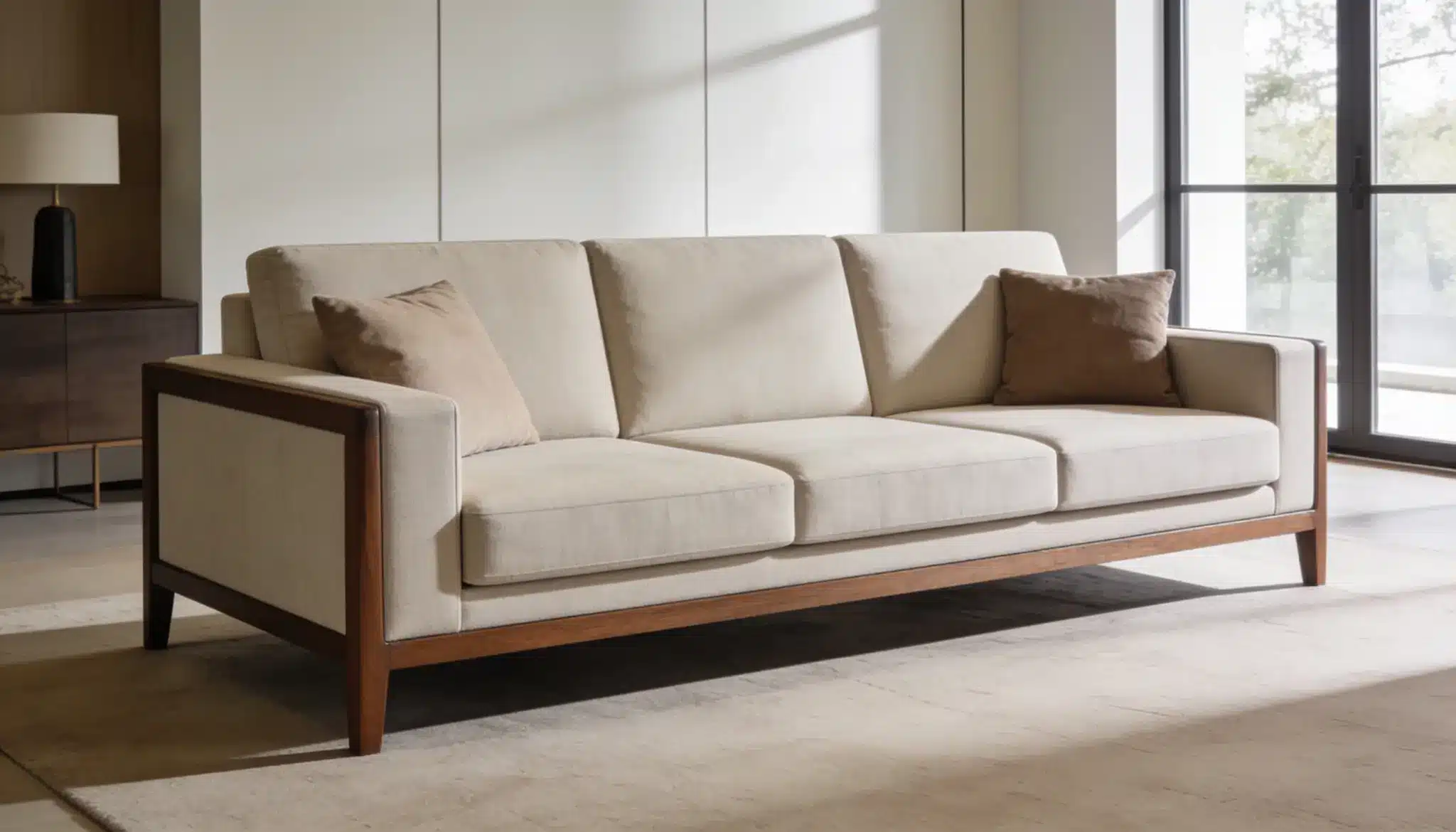
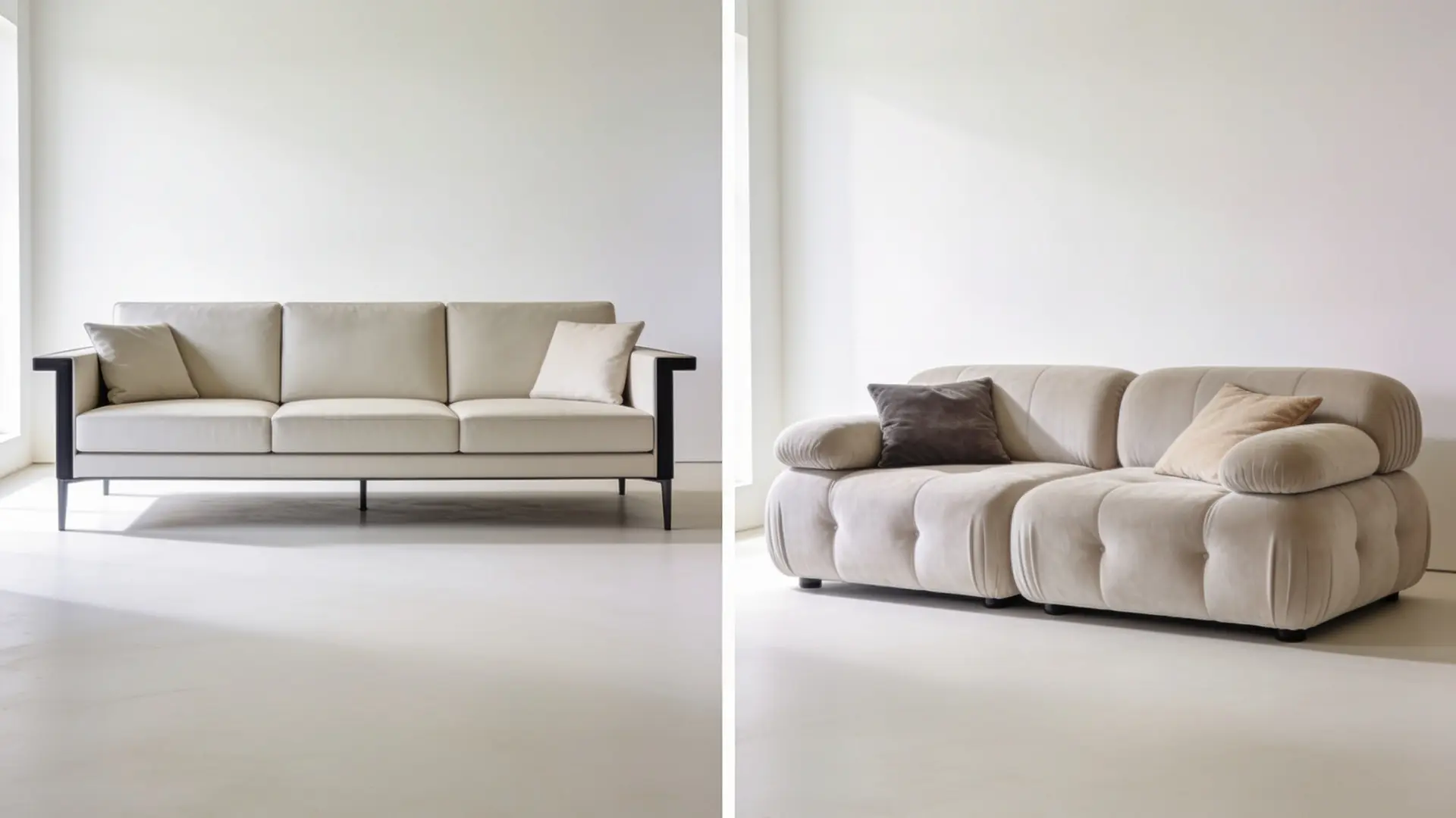
4. Scale & Proportion
Not everything that fits in a room actually belongs there. Scale is about how an object’s size relates to the room. Proportion is how pieces relate to each other.
Getting scale and proportion right ensures that every piece of furniture feels like it genuinely belongs in the space.
Always measure before buying furniture, a piece that looks great in the store can overwhelm a small room completely.
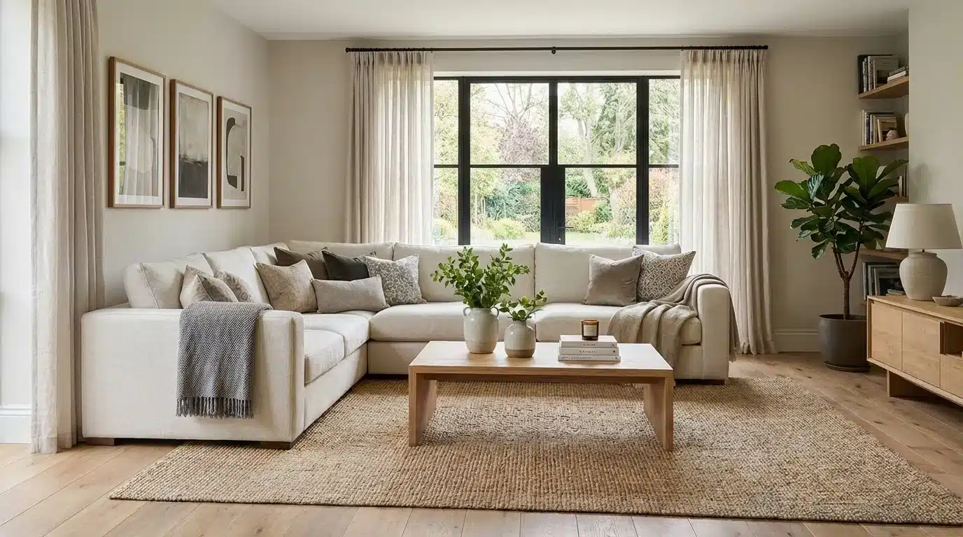
5. Harmony and Unity
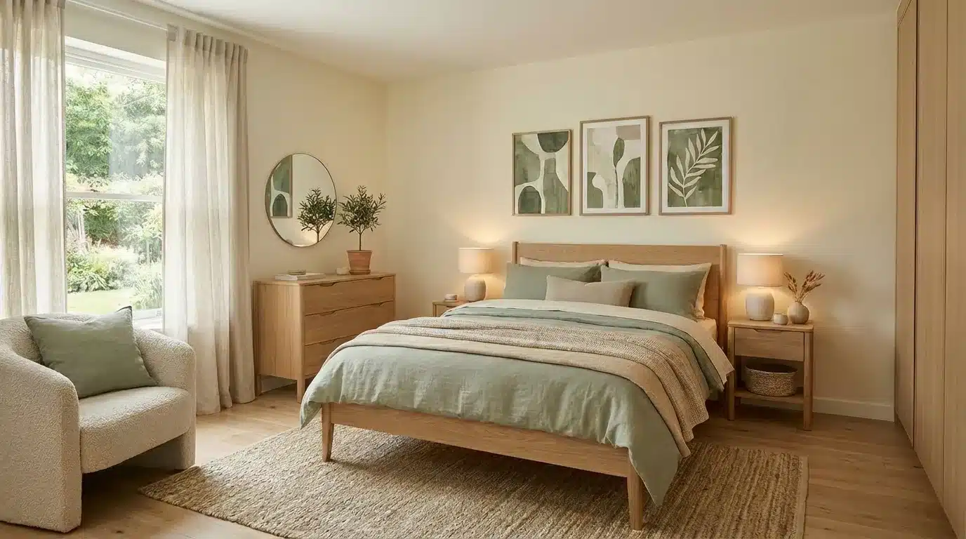
Harmony and Unity ties all the elements of a room together into one look.
It doesn’t mean everything has to match perfectly; it means everything feels like it belongs together.
Using a consistent color palette, repeating shapes, or sticking to one style helps create a space that feels calm, complete, and visually satisfying.
6. Contrast
Contrast adds energy to a space. It pairs opposites, dark against light, rough against smooth, large against small.
Without some contrast, a room can feel dull and flat. The trick is not overdoing it.
A few well-placed contrasting elements are enough to make a space feel alive and engaging.
7. Details
Details are the finishing touches that make a space feel complete and personal.
Think decorative trims, throw pillows, artwork, or a carefully chosen vase. They may seem small, but they add character and warmth.
A room without details can feel cold and unfinished, no matter how well the bigger elements are arranged.
Never rush the details; sometimes, one well-chosen accessory is all a room needs to finally feel like home.
How to Apply These Principles in Your Home?
Knowing the principles is one thing, but putting them to work in your own home is where the work begins.
It doesn’t have to be complicated or expensive. These simple steps make the whole process much easier to manage.
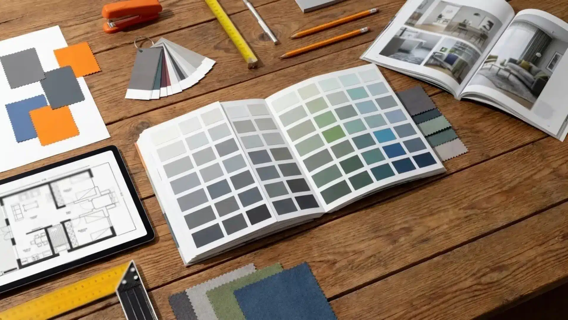
Define Your Style
Start by figuring out what style feels right. Browse magazines, Pinterest, or design blogs for inspiration.
Do clean, minimal spaces appeal? Or warm, layered ones?
Knowing the answer upfront saves time, money, and the frustration of buying pieces that simply don’t work together.
Save images that catch your eye, patterns will emerge, and that’s your personal style telling you something important.
Plan the Layout
Before moving any furniture, sketch out the room on paper. Mark doors, windows, and fixed features.
Think about how people will move through the space.
A well-planned layout makes a room feel open and functional, not blocked or awkward, regardless of how large or small the space actually is.
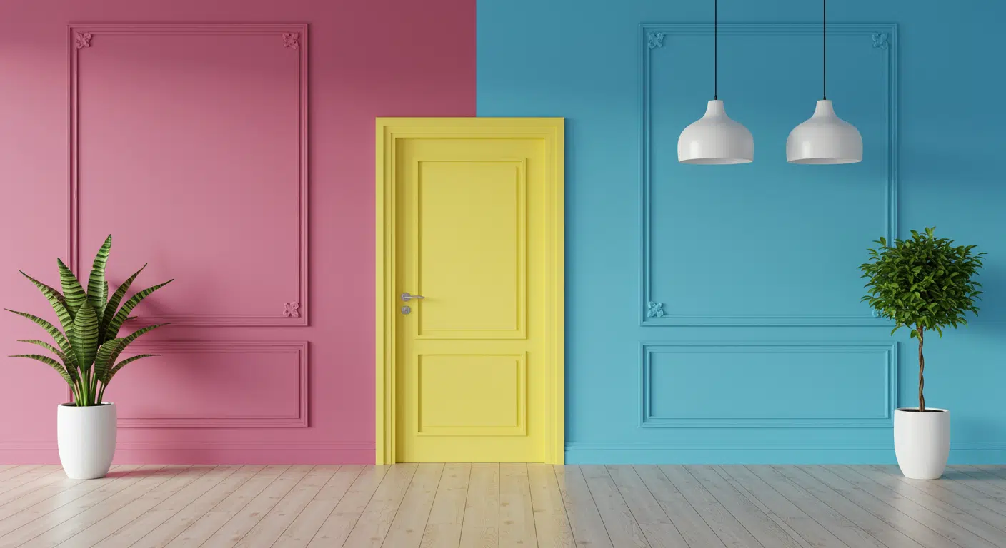
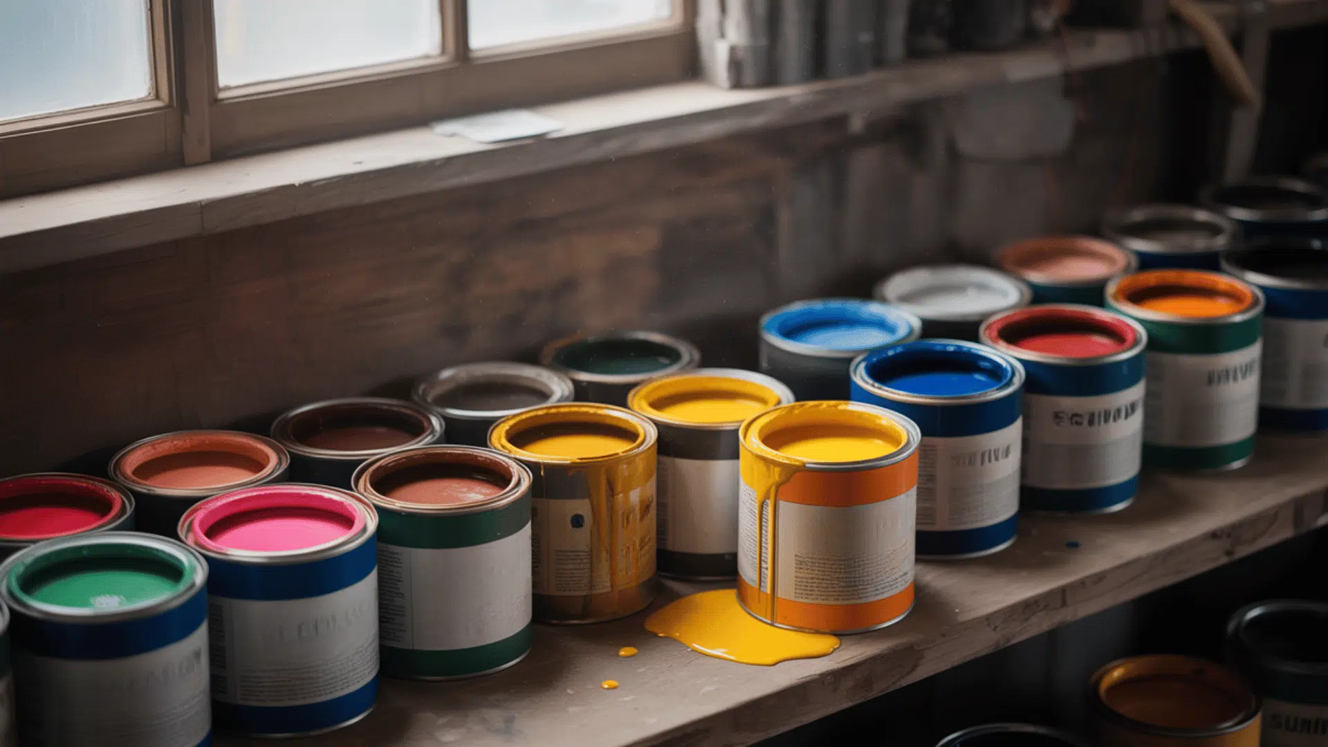
Choose a Color Scheme
Color sets the mood for the entire room, so choose carefully.
Start with one main color, then add one or two supporting shades. Keep the palette consistent across walls, furniture, and accessories.
A well-chosen color scheme ties the whole room together and makes every element feel like it genuinely belongs.
Test paint colors on the wall first, as colors look very different under artificial light than they do in the store.
Focus on Lighting
Never treat lighting as an afterthought.
Layer three types, ambient, task, and accent lighting, to give the room depth and flexibility. Natural light should be maximized wherever possible.
The right lighting makes colors look truer, textures stand out more, and the overall space feels warmer and more welcoming throughout the day.
Select Functional Furniture
Choose furniture that looks good and works hard. Every piece should serve a clear purpose in the room.
Avoid buying items just because they look nice in isolation. Think about size, comfort, and how each piece interacts with everything else.
Functional furniture makes daily life easier while keeping the space well-put-together.
Multi-purpose furniture, like storage ottomans or sofa beds, is a smart move, especially in smaller homes or apartments.
Balance Scale and Proportion
Always match furniture size to the room’s dimensions.
A large sectional works in a spacious living room but overwhelms a small one. Use rugs to define zones and anchor furniture groupings.
Getting scale and proportion right makes every piece feel intentional and ensures the room never feels too empty or too crowded.
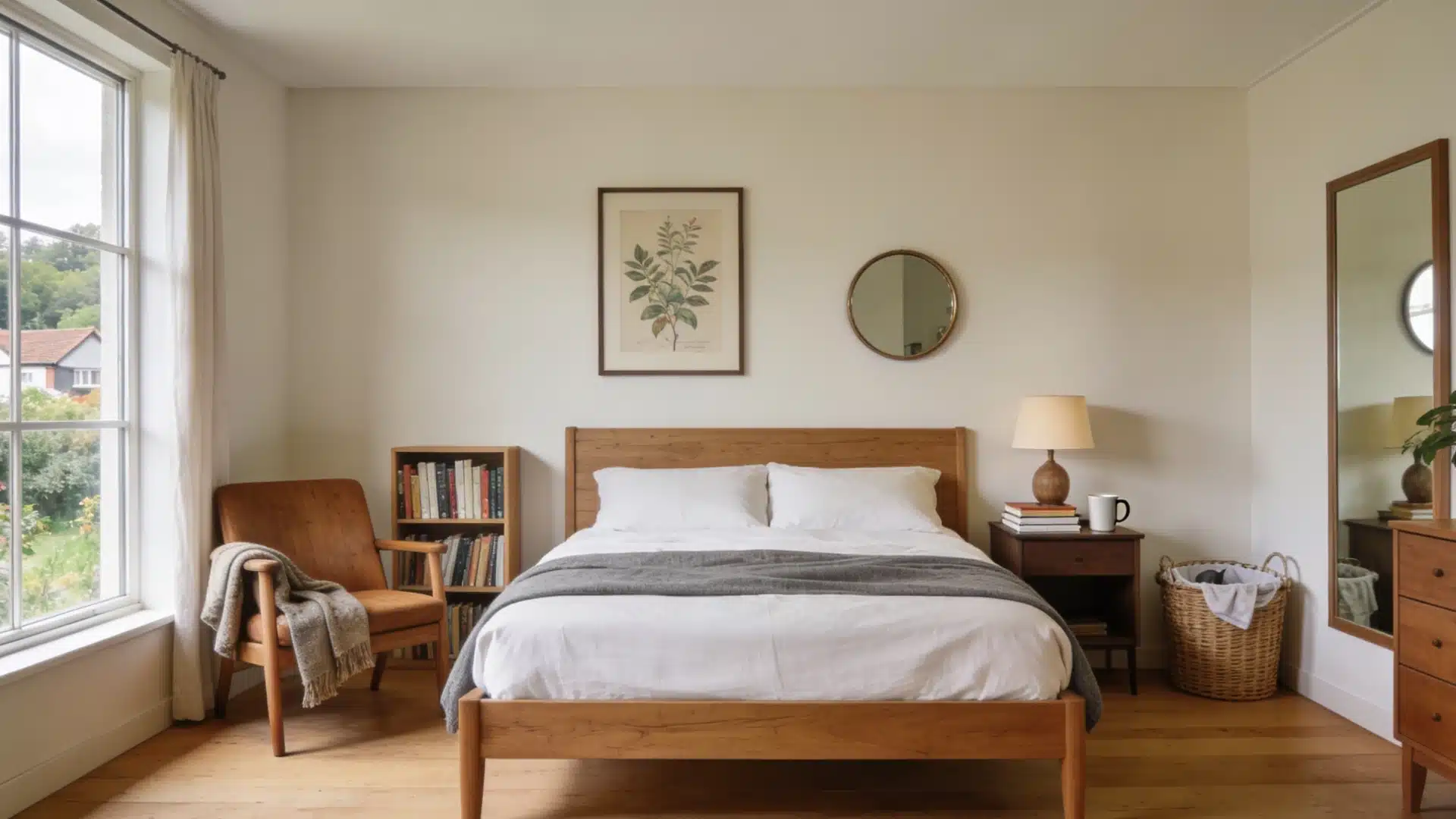
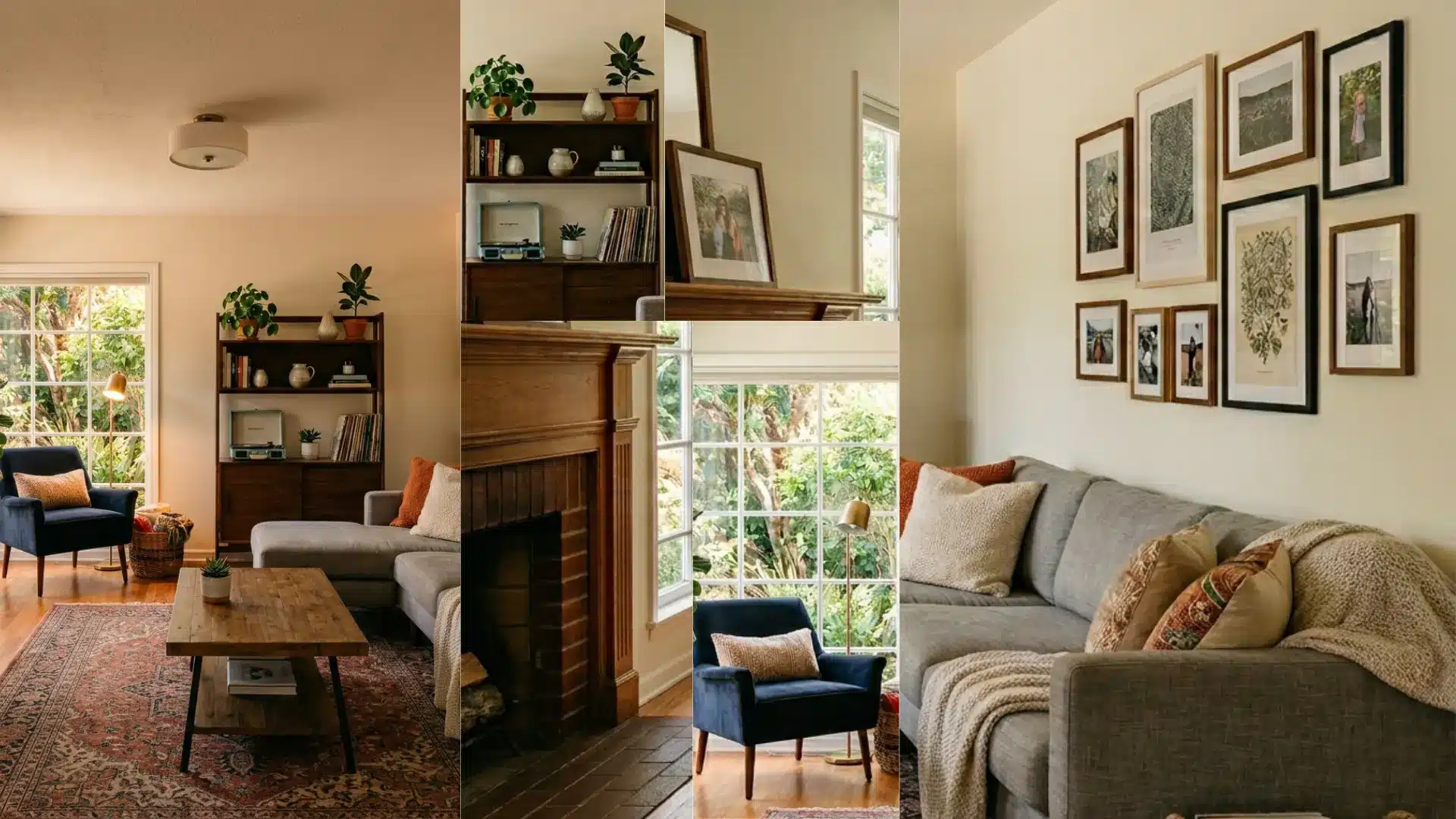
Personalize the Space
A well-designed room should still feel like the person living in it. Add personal touches, family photos, travel souvenirs, books, or artwork that mean something to you.
These details give a room its character and warmth.
Without them, even the most carefully designed space can feel more like a showroom than an actual home.
Don’t be afraid to break a design rule or two; personal touches are what make a house feel like a real home.
Color Combinations that Make Your Space Feel Rich
Color is one of the most powerful tools in interior design. The right combination can make a space feel expensive, warm, and well put-together.
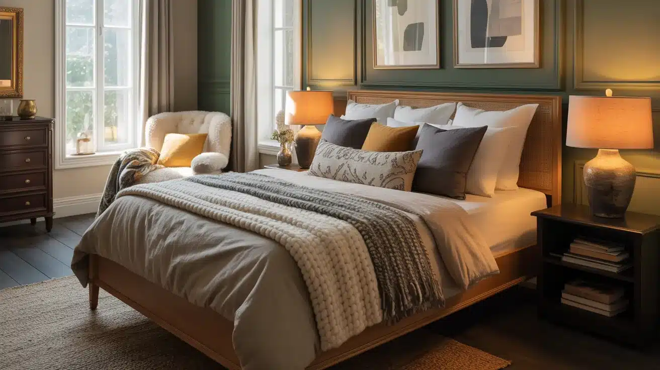
Teal, Purple, and Taupe

Teal brings boldness, purple adds depth, and taupe keeps everything grounded.
Together, they create a space that feels sophisticated without trying too hard.
Use taupe as the dominant wall color, then layer in teal and purple through accessories and soft furnishings.
This combination works beautifully in a bedroom; it feels calm and rich at the same time, which is a rare balance.
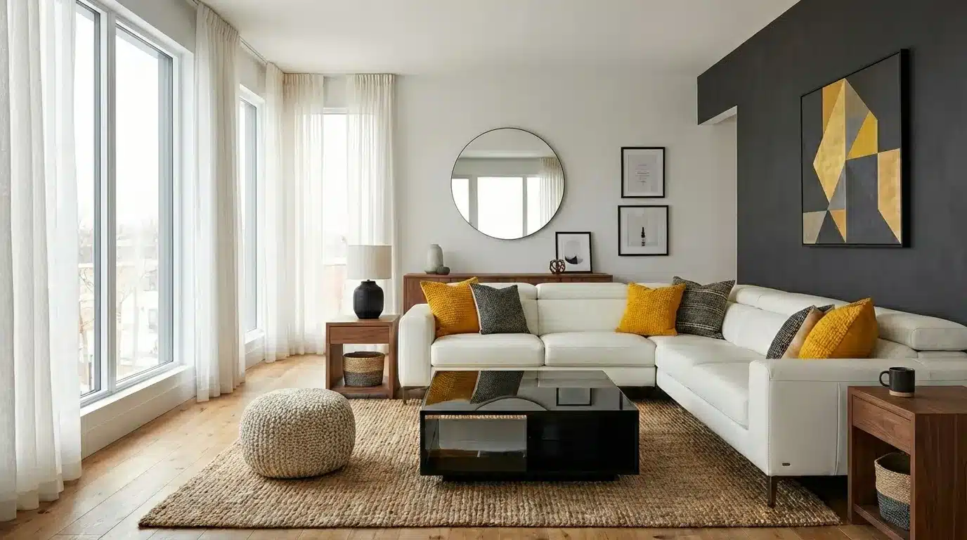
Burgundy, Coral, and Golden Yellow

This warm, earthy trio feels inviting and full of character. Burgundy anchors the palette, coral adds a fresh lift, and golden yellow brings warmth and energy.
It works especially well in living rooms and dining spaces where a welcoming, lively atmosphere is the goal.
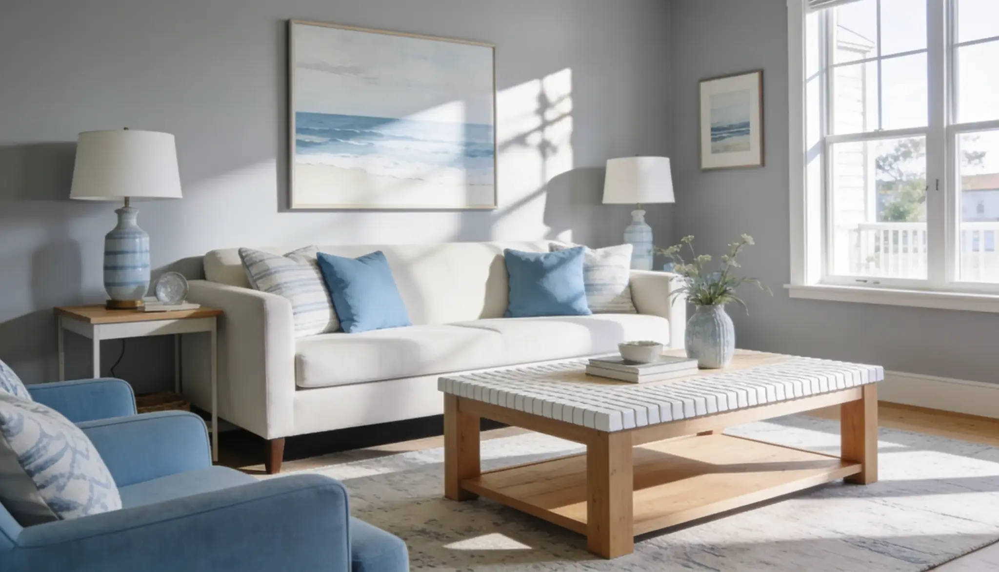
Navy Blue, White, and Wood

Navy blue, white, and natural wood is a classic combination that never feels tired.
Navy adds depth, white keeps things fresh and light, and wood brings warmth and texture.
It works across kitchens, living rooms, and bedrooms without ever feeling overdone or too predictable.
Brown, Green, and Mustard Yellow

This earthy trio pulls straight from nature and feels genuinely warm and grounding.
Brown provides a rich base, green adds life, and yellow brings a sunny warmth to the mix.
Together, they create a space that feels cozy, organic, and full of natural character.
Add real plants to this color scheme, and the whole room comes alive. Greenery ties the palette together better than anything else.
Charcoal Grey, Blush Pink, and Brass

Charcoal grey gives this palette a strong, moody foundation. Blush pink softens it considerably, and brass accents add warmth and a touch of refinement.
Together, they strike a near-perfect balance between bold and soft.
This combination works equally well across bedrooms, bathrooms, and living spaces.
Brass light fittings and handles are an easy way to introduce this palette without committing to a full room redesign straight away.
Outdated Decor that Can Clutter Your Space
Some design choices that felt fresh years ago now make a space look tired and dated.
Holding onto them can quietly drag down the whole look of a home.
1. Popcorn Ceilings
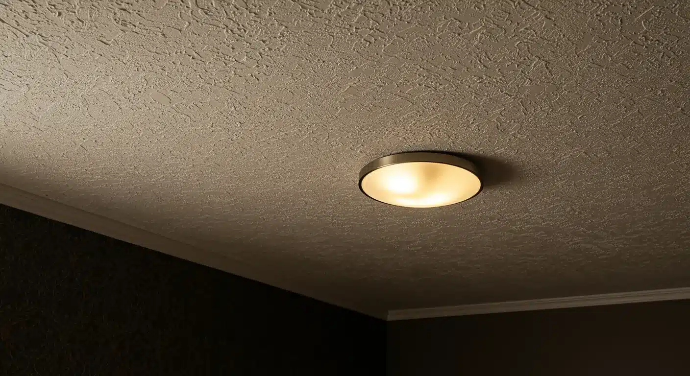
Popcorn ceilings were popular for hiding imperfections, but they now make any room feel old and neglected.
They trap dust, look heavy, and date a space instantly.
Smooth ceilings feel cleaner, brighter, and far more current, regardless of the overall style of the room.
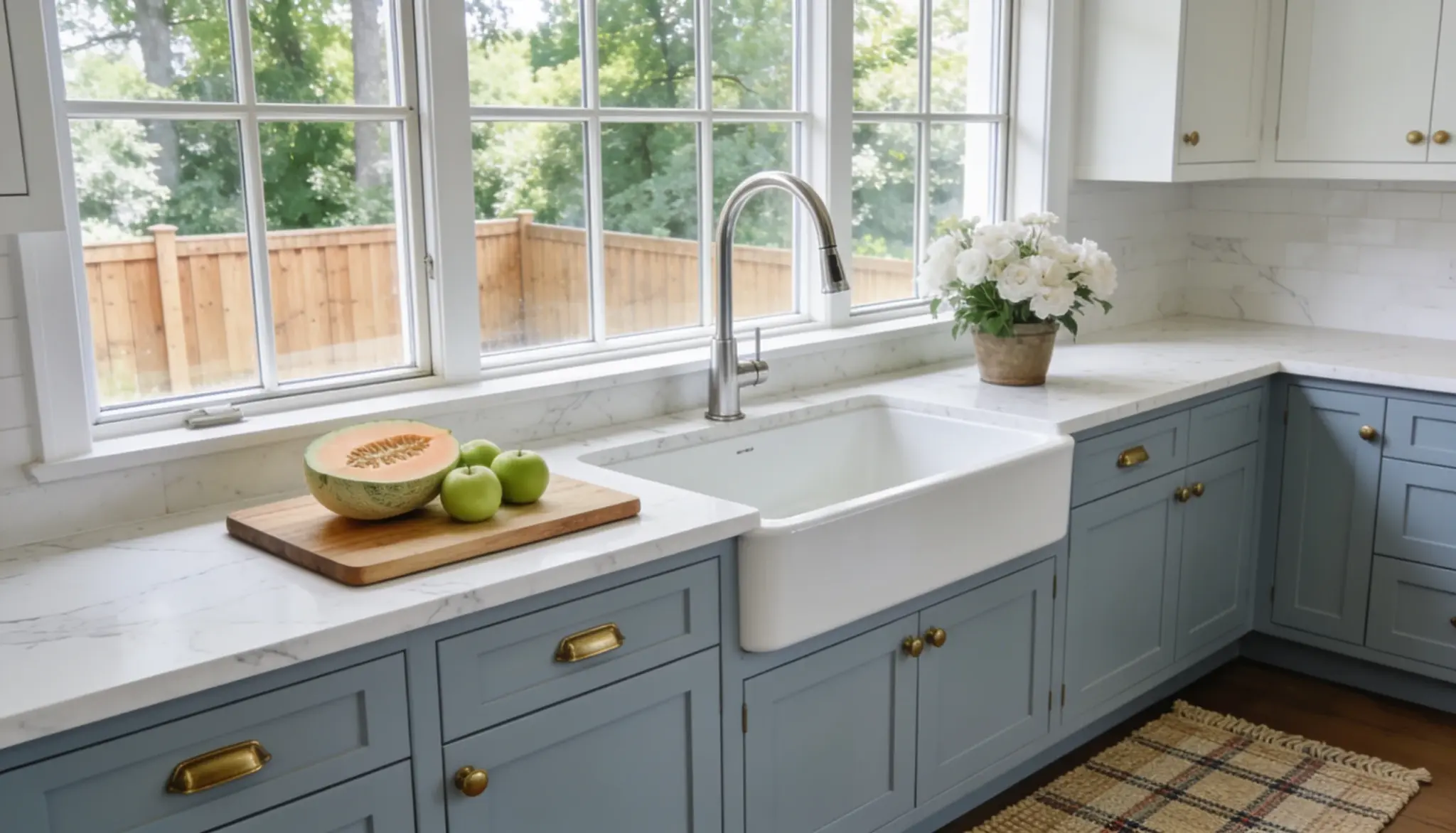
2. Tile Countertops
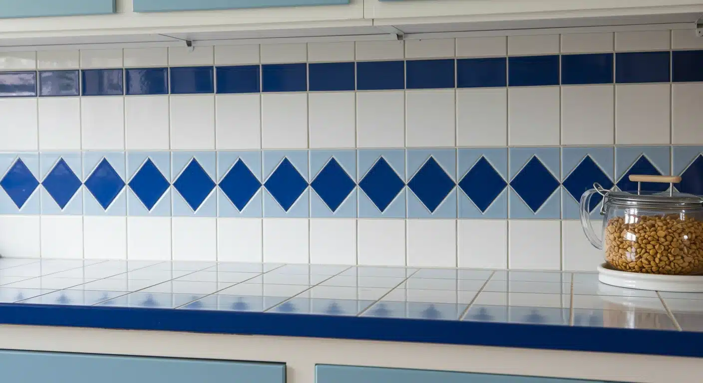
Tile countertops had their moment, but grout lines that collect dirt and staining make them impractical and unattractive today.
Solid surface options like quartz or butcher block look cleaner and more current. They are also far easier to maintain and keep looking good over time.
Swapping out old tile countertops can completely transform a kitchen; it’s one update that adds real value to a home.
3. Word Art
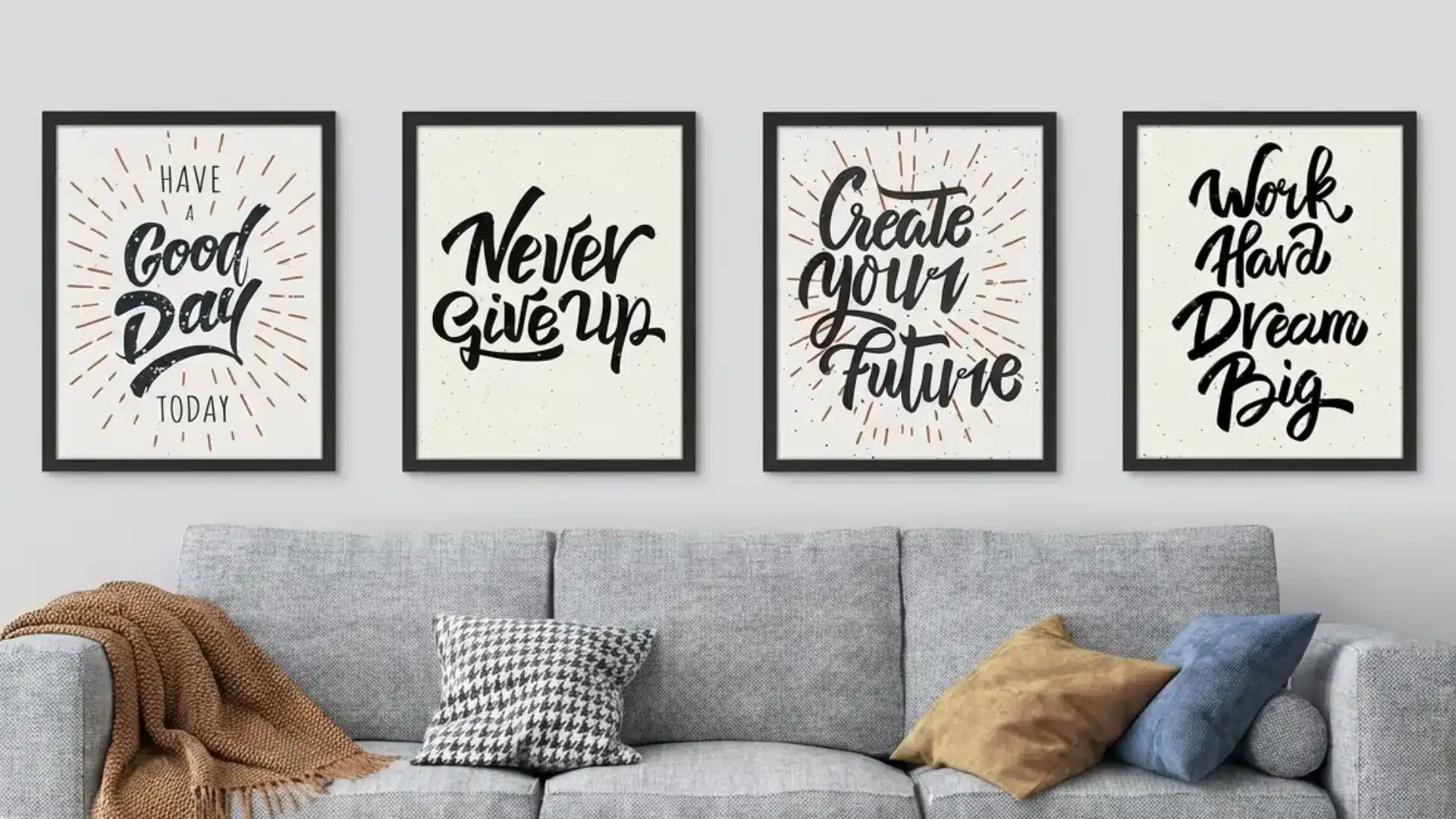
“Live, Laugh, Love” signs had their moment, and that moment has firmly passed.
Word art on walls feels generic and adds little value to a space.
Replacing them with original artwork, framed prints, or a gallery wall of personal photos adds far more element and makes a stronger visual statement.
Swap word art for something personal and meaningful; a framed photo or original print says far more about who you really are.
4. Vertical Blinds
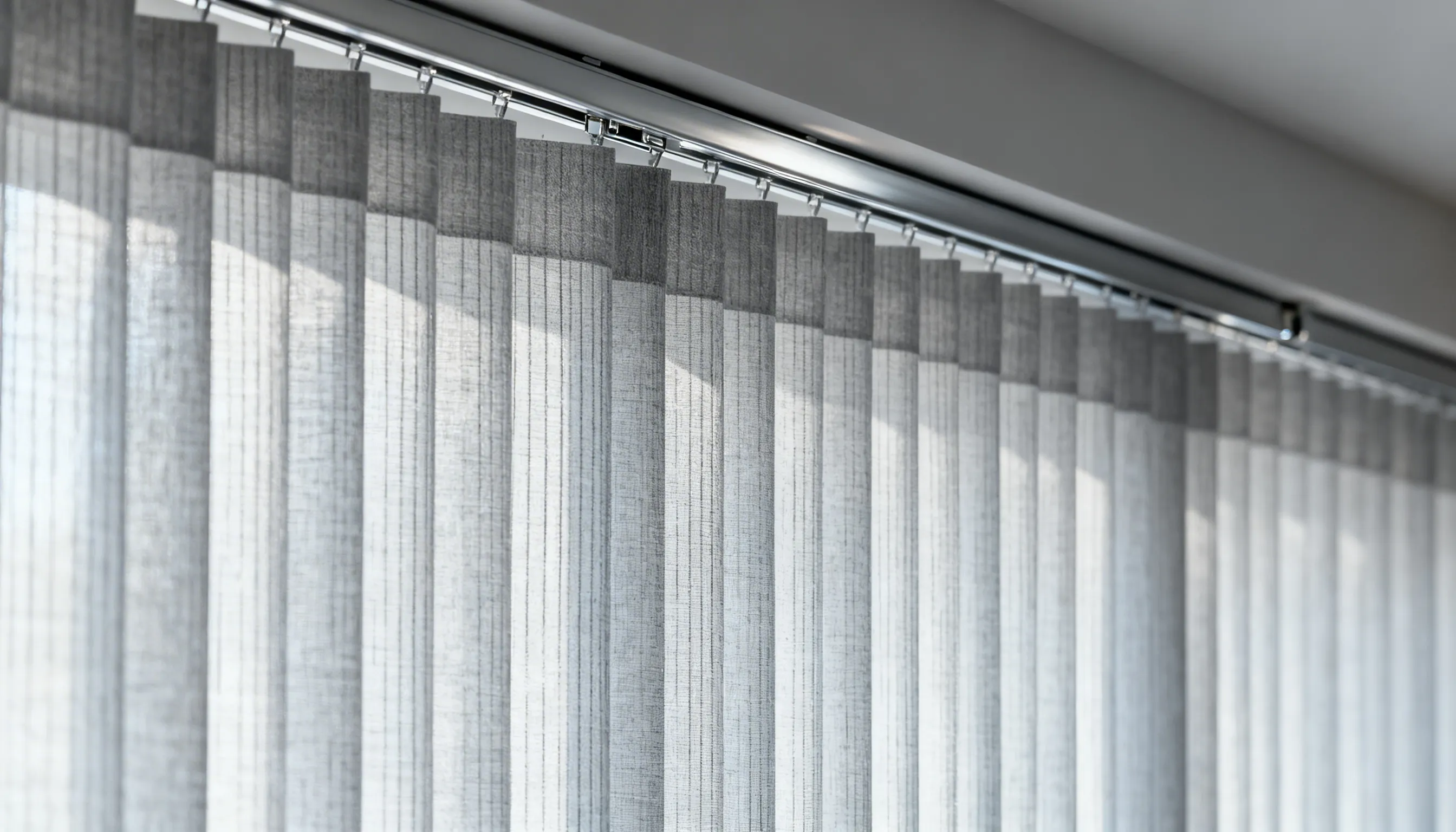
Vertical blinds are a relic of office waiting rooms and 80s apartments.
They look cold and clinical. Roller blinds, Roman shades, or simple linen curtains are far better options that add clean look to any window.
Replacing vertical blinds is one of the quickest and most affordable upgrades anyone can make in a rental or owned home.
5. Chenille Fabric

Chenille sofas and armchairs had a strong run through the 90s. Today, they look dated and collect dust easily.
Linen, velvet, or performance fabric upholstery looks sharper, wears better, and fits more comfortably into modern interior design schemes.
If replacing upholstered furniture isn’t an option right now, quality slipcovers can make an outdated sofa look surprisingly current and fresh.
6. Pine Furniture
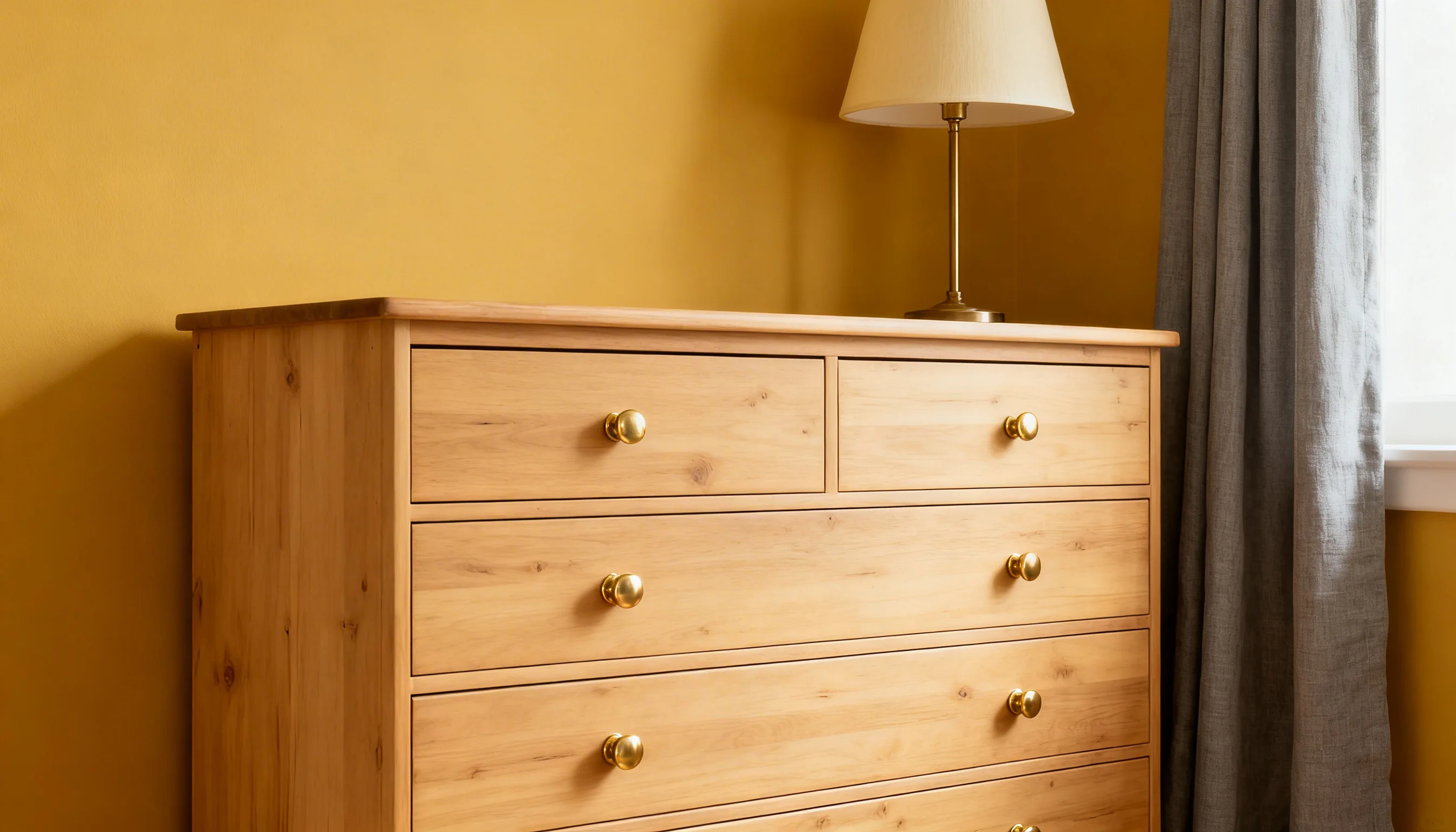
Light pine furniture feels very much of its time, specifically, the late 90s and early 2000s. It can make a room look cheap and unfinished.
Darker wood tones, painted finishes, or mixed-material furniture feel far more current and intentional by comparison.
7. Shag Carpeting
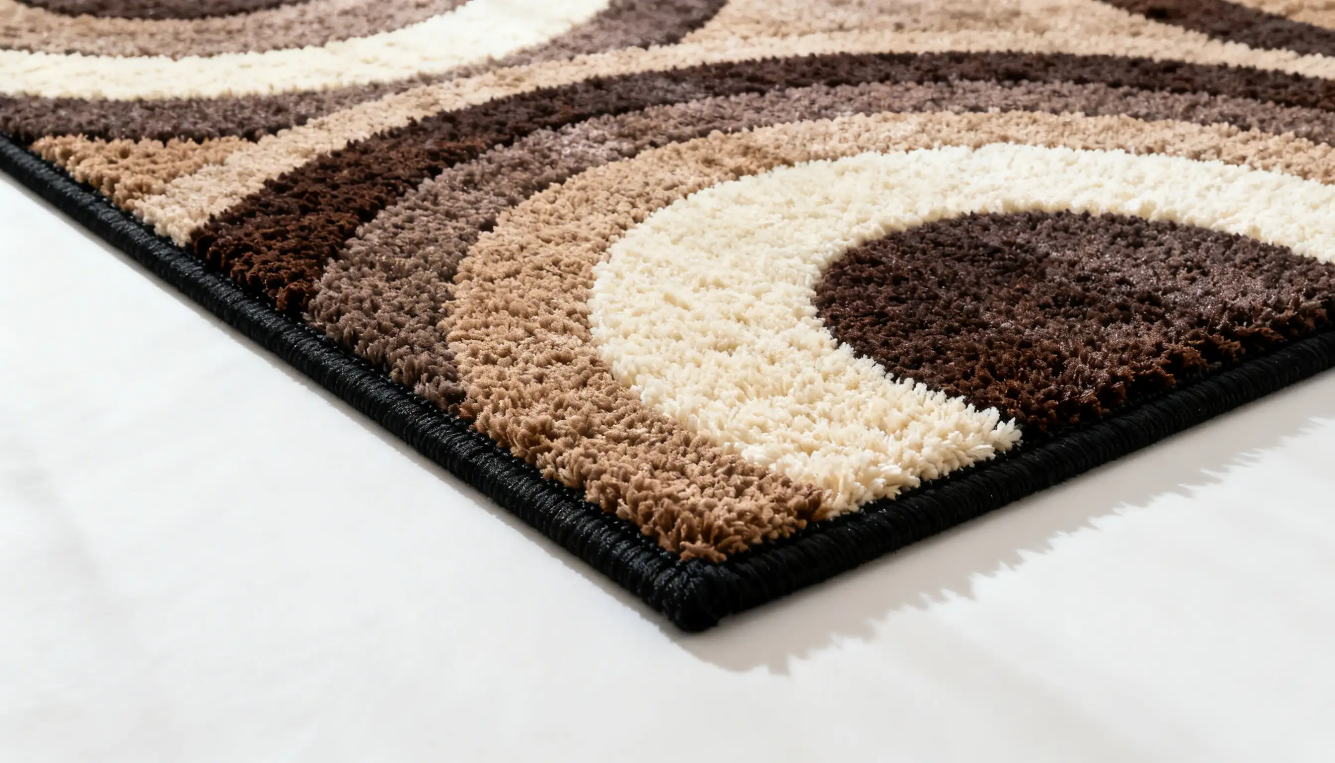
Shag carpeting traps dust, allergens, and odors like no other material. It’s also nearly impossible to keep clean.
Hard flooring with a well-chosen area rug gives a much cleaner, more modern result. It looks better, ages better, and is far easier to maintain long-term.
To Wrap Up
Good design doesn’t have to be complicated. Once you understand the basic principles, decorating your home starts to feel a lot less overwhelming.
Start small. Fix the one thing in a room that’s been bothering you. Maybe it’s an oversized rug, or furniture pushed against every wall.
And if something still feels off? Trust that feeling. Good design is also about listening to what a space needs.
Now, go ahead and decorate your home, and let us know how it went.
Frequently Asked Questions (FAQs)
1. What is the 3-5-7 Rule for Decorating?
Group decor items in odd numbers: three, five, or seven. Odd groupings look more natural and visually balanced than even ones.
2. What is the 70 20 10 Rule in Decorating?
Use 70% of the dominant color, 20% of the secondary color, and 10% of the accent color in a room. This split keeps the space balanced without looking too flat or too busy.
3. What is the 80/20 Rule in Decorating?
Keep 80% of your space simple and neutral. Use the remaining 20% for bold choices, a statement chair, bold artwork, or a rich color.