Colors do more than sit on walls. They change your heart rate, sharpen your focus, and even affect how well you sleep.
Research published in the Journal of Environmental Psychology confirms that color influences us physically as well as visually.
Most people pick shades based on trends or personal taste.
But understanding color psychology in interior design means every room in your home can be designed with purpose, not just preference.
Defining Color Psychology
Color psychology looks at how colors affect the way people think, feel, and act.
It is a mix of science and culture. Different colors can trigger different emotions, often without people even noticing. Blue tends to feel calm and peaceful. Red can feel urgent or exciting.
These reactions are not random. They are shaped by biology, personal memory, and cultural background.
Designers, marketers, and researchers use this knowledge to make better choices.
They pick colors that match the mood they want to create, whether for a product, a website, or a room.
Some color reactions are widely shared across different countries and cultures. Others depend on a person’s background and life experiences.
Warm vs. Cool Colors: The Foundation You Need First
Before going room by room, it helps to understand the basic framework behind color theory in home decorating.
Warm colors like red, orange, and yellow raise arousal levels, stimulate appetite, and make spaces feel energized and intimate.
Cool colors like blue, green, and purple do the opposite.
They lower blood pressure and make rooms feel larger and more restful. Neutrals sit in the middle, letting accent colors carry the mood.
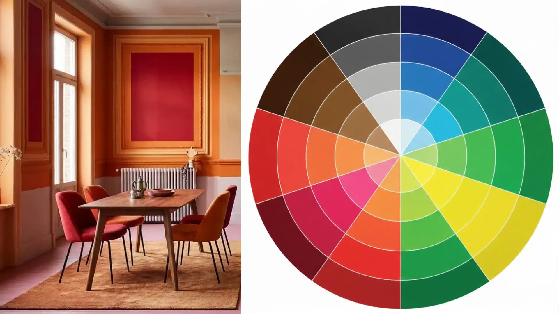
Color selection has always been tied to more than aesthetics.
Ancient design systems like feng shui built entire room layouts around specific colors and the energy each one carries, and modern psychology has since confirmed many of those instincts.
Psychology of Color in Home Design
This is where color and emotion in interior design get specific.
Each color below includes what it does to the body, what research says, and exactly where to use it at home.
1. Red
Red is the most physiologically activating color. It raises heart rate, increases blood pressure, and stimulates appetite, which is exactly why fast food chains rely on it.
In a home, that energy is an asset in dining rooms and kitchens. Use it as an accent wall rather than an all-over color.
In bedrooms, a little goes a long way, but too much will disrupt sleep.
- Best rooms: Dining room, kitchen.
- Avoid: Bedrooms as a dominant color
2. Orange
Orange shares red’s appetite-stimulating quality but with less intensity. It creates social energy and optimism without tipping into aggression.
Burnt orange and terracotta tones feel grounded and inviting, making them ideal for family rooms and dining areas.
Skip it in home offices and bedrooms where overstimulation works against you.
- Best rooms: Family room, dining area.
- Avoid: Home office, bedroom
Pro Tip: Terracotta is one of the most forgiving shades in this family. It reads as earthy and settled rather than loud, even on a full accent wall.
3. Yellow
The brain processes yellow faster than any other color. It triggers serotonin and boosts mental alertness.
The catch is that bright, saturated yellow can cause eye strain and anxiety over time.
Muted versions like butter yellow, ochre, and mustard keep the happiness association without the agitation.
Use it in kitchens, entryways, and darker spaces that need a lift.
- Best rooms: Kitchen, entryway, and small spaces lacking natural light.
- Avoid: Dominant bedroom color
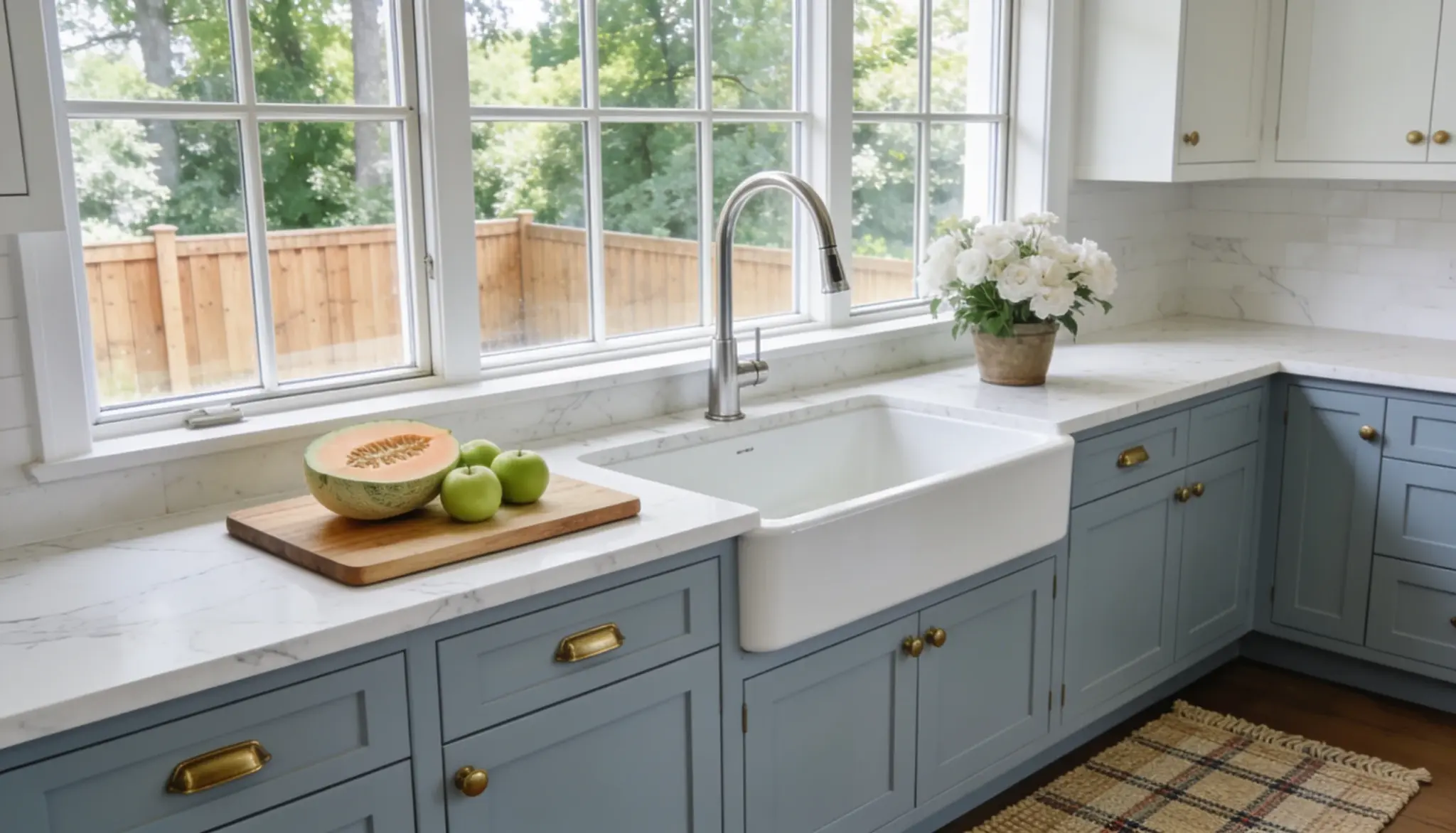
4. Green
Green is the most versatile color in color psychology and interior design.
Research from the University of Georgia found that green environments lead to longer and more meaningful social interactions.
The body also reads green as a signal of safety, which lowers cortisol and blood pressure.
Sage and olive work beautifully in bedrooms and living rooms. Deeper forest green suits studies and libraries.
- Best rooms: Every room, adjust the shade by function.
- Avoid: No significant caution
Pro Tip: If you want one color that works across the whole house without clashing, a muted sage is the most universally effective option in this category.
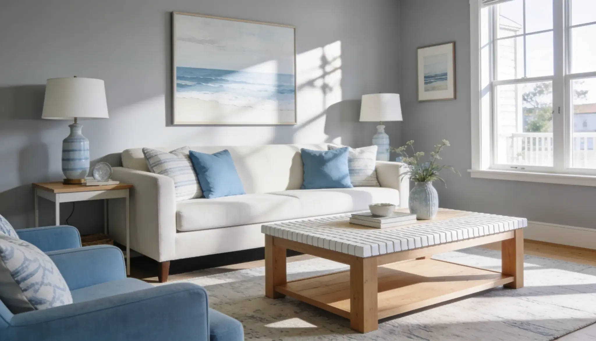
5. Blue
Blue is the most studied color in environmental psychology.
The National Sleep Foundation found that people sleep nearly 2 hours longer in blue rooms than in purple ones.
It also slows the heart rate and lowers blood pressure.
Light blue suits bedrooms; navy works well in home offices where focus is the priority.
- Best rooms: Bedroom, home office, bathroom.
- Avoid: Dining room, kitchen
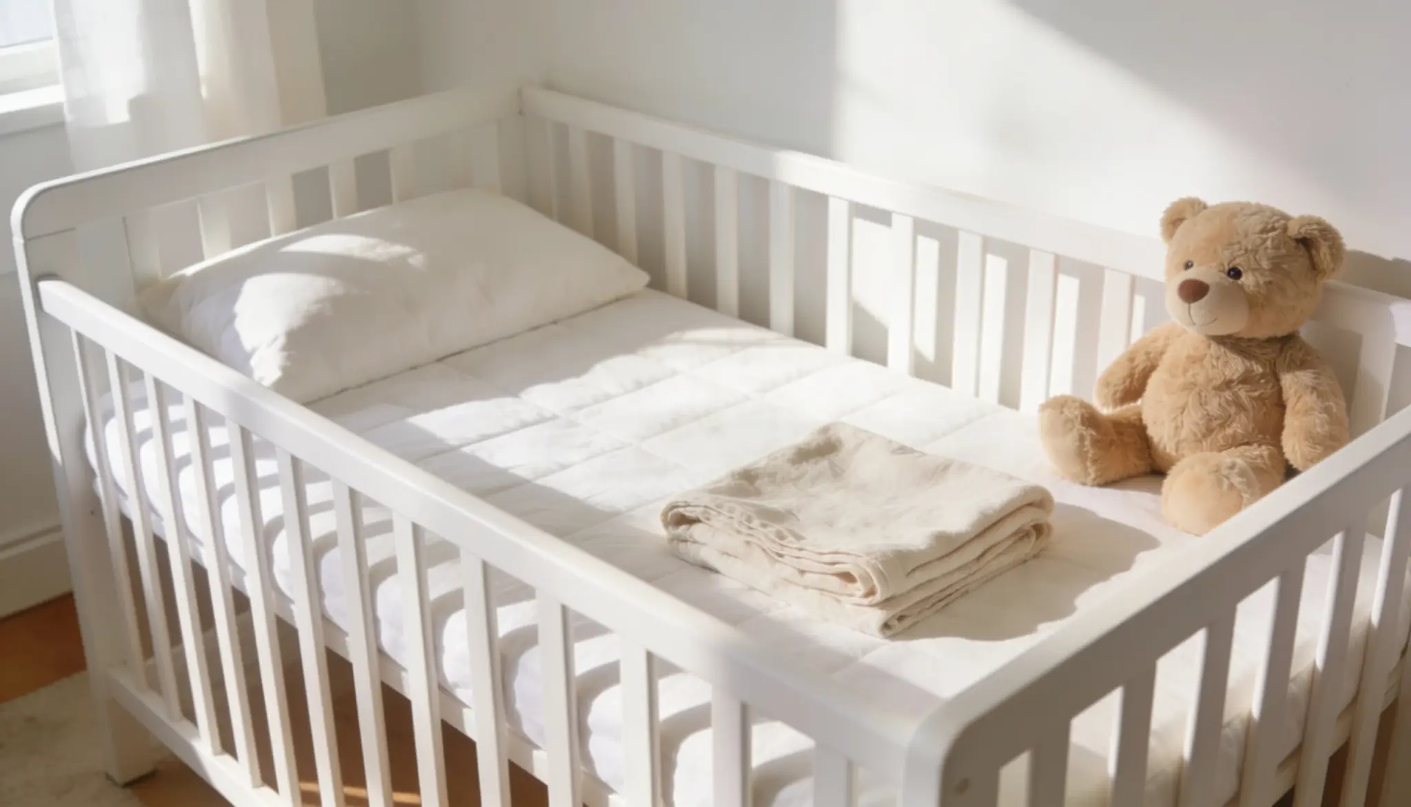
6. Purple and Lavender
Deep purple stimulates creativity and imagination, making it a natural fit for art rooms and meditation spaces.
Lavender functions closer to blue, with strong calming and sleep-supporting properties.
Children are the demographic most drawn to purple, so it works well in kids’ rooms. In adult spaces, use deep purple as an accent only.
As a dominant wall color, it can feel heavy and closed-in.
- Best rooms: Kids’ room, creative studio, meditation space.
- Avoid: Full-room adult bedrooms in deep tones
Pro Tip: Lavender in a bedroom is one of the few colors backed by both design practice and sleep research. It calms without the coldness that pale blue can sometimes carry.
9. White
White creates a sense of cleanliness, clarity, and space. It visually expands a room more than any other color, making it the go-to for small rooms and low ceilings.
The risk is that pure white in a north-facing room can feel cold and sterile.
A white with yellow or pink undertones keeps the openness while adding comfort. It works as a base layer in every single room.
- Best rooms: Every room has a base.
- Avoid: Pure white in rooms with cool, limited natural light
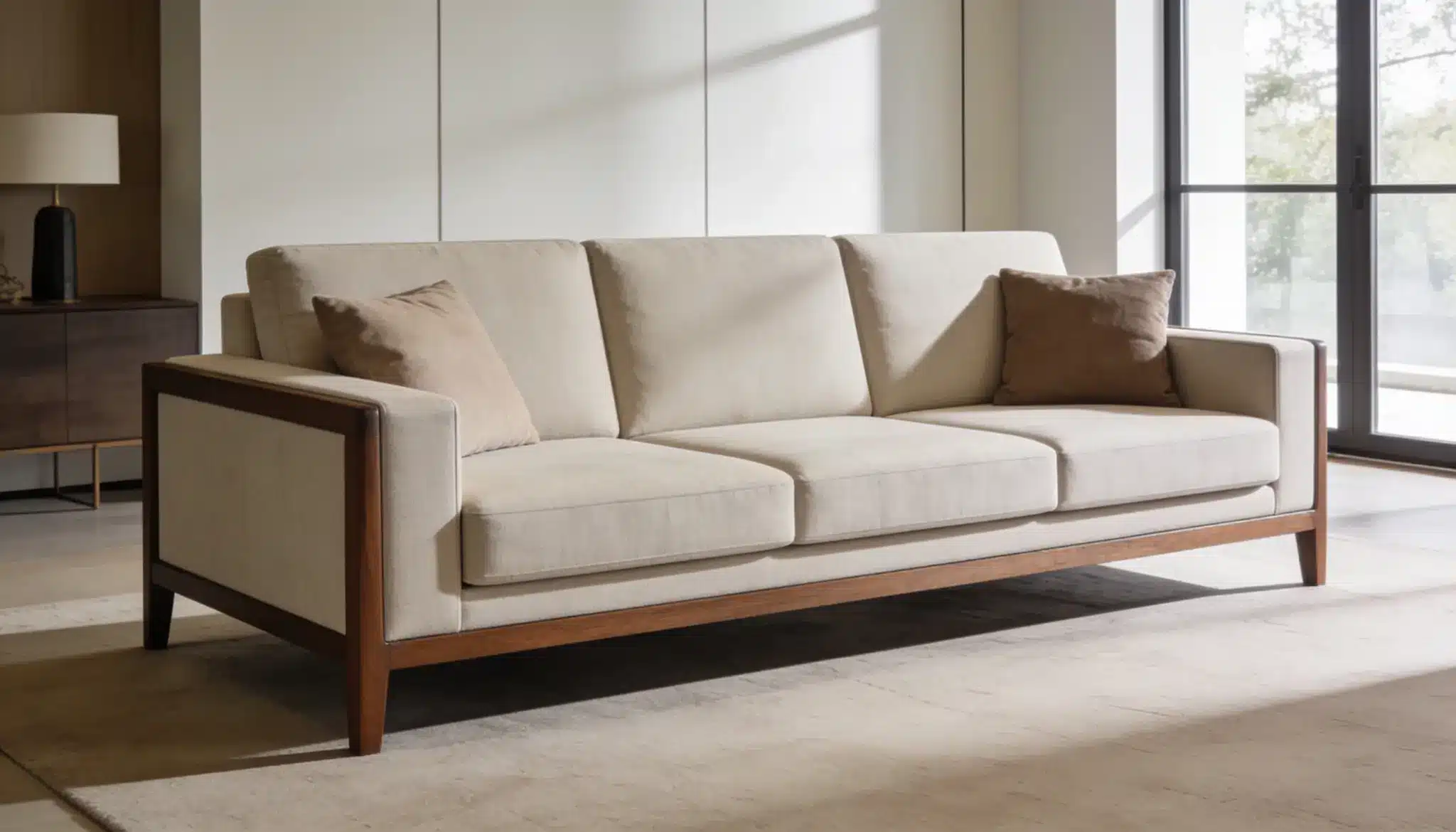
10. Gray and Neutrals
These colors create stability without pulling attention in any direction.
It is neither energizing nor calming, making it ideal for spaces where emotional neutrality matters, such as home offices, hallways, and bathrooms.
The risk is flatness. A room that is all gray can feel lifeless fast. Ground it with wood tones, textured fabrics, or one accent color that adds some visual weight.
- Best rooms: Home office, hallway, bathroom.
- Avoid: Using gray alone without texture or contrast
Pro Tip: Warm-toned gray, sometimes called “greige,” avoids the coldness problem entirely. It reads as neutral but never feels clinical.
Room by Room: Which Colors Actually Work
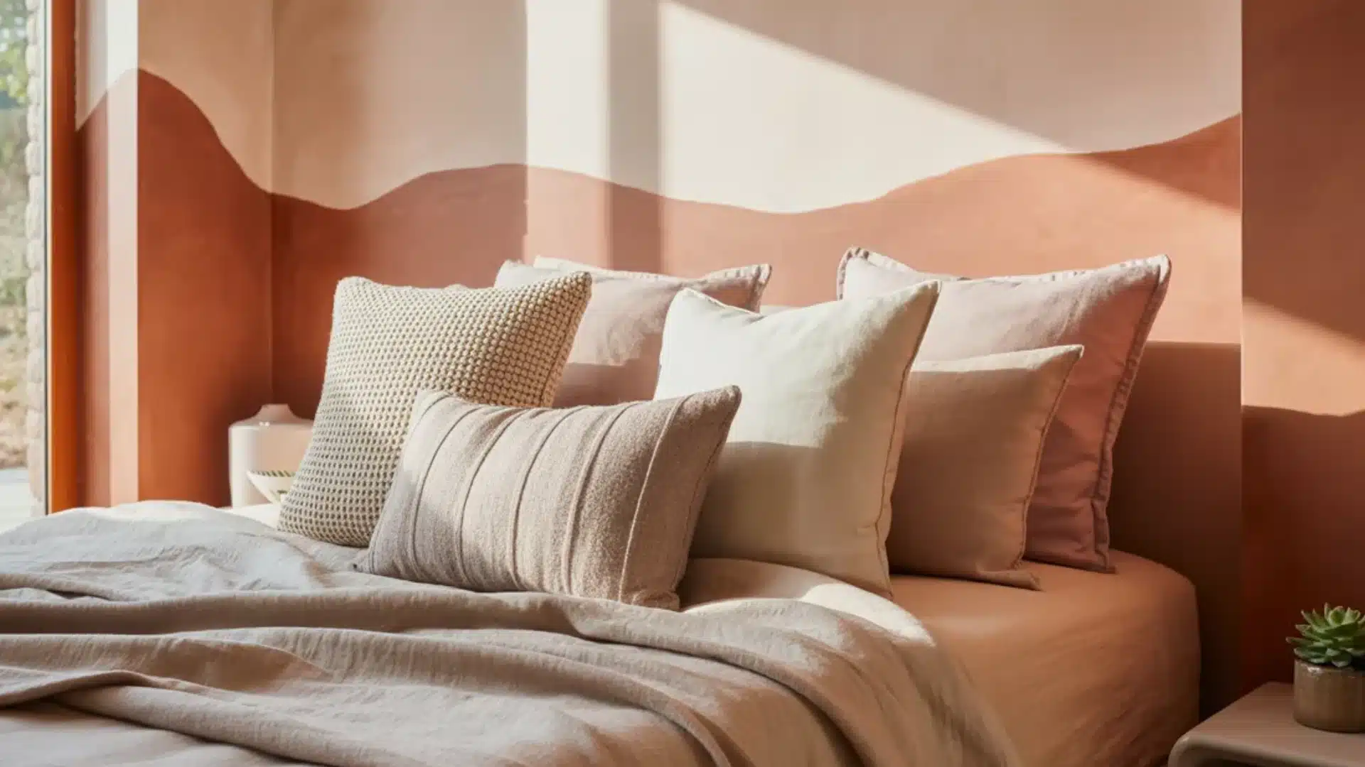
The bedroom, bathroom, and entryway are where color does the most work.
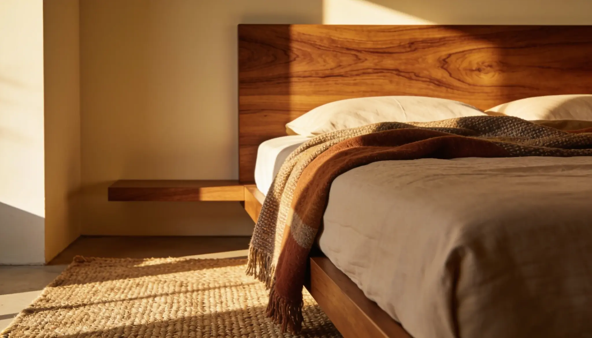
Blues, greens, and lavender support rest in the bedroom.
Blues, aqua, and white reinforce calm in the bathroom.
In the entryway, yellow, soft green, and warm white create an uplifting first impression.
For the rest of the home:
- Living room: Sage green, warm beige, and terracotta build a sense of connection and comfort.
- Kitchen and dining room: Warm yellows, reds, and oranges stimulate appetite and energy.
- Home office: Deep blue sharpens focus, green supports creativity, and white keeps the mind clear.
- Children’s room: Soft blues and greens calm an active mind, yellow lifts mood, purple encourages imagination.
Color Psychology is a Framework, Not a Rule
Universal color psychology is a strong starting point, but personal association matters just as much.
If a color carries a negative memory for you, that response will override any scientific benefit. Studies back this up.
The best color for your space is one that aligns with both the principles covered here and how you personally respond to it.
Treat this as a starting point, not a strict prescription.
How Colors Affect Mood in a Room
The function of the room comes first. Ask what you need the space to do, then pick a color that supports that goal.
Test paint samples under different lighting conditions before committing, as colors shift significantly between morning and evening light.
Light changes everything in color and emotion in interior design.
Natural north-facing light makes cool colors feel colder. Warm bulbs in the evening push yellows and reds toward a sense of comfort.
LED daylight bulbs keep blues crisp and focused. The same paint color can read completely differently depending on the light hitting it.
Final Thoughts
Color is one of the most practical tools in interior design, and it costs nothing extra to get right.
Every shade you put on a wall sends a signal to the brain.
Color psychology in interior design gives you the knowledge to leverage those signals to your advantage.
Pick with purpose, test in real light, and trust your own response as much as the science.
Frequently Asked Questions
1. What is the Best Color for a Relaxing Bedroom?
Blues, soft greens, and lavender are backed by sleep research as the most effective options for rest.
2. Can Color Really Affect Appetite?
Yes. Red and orange are proven to stimulate hunger, which is why they dominate restaurant and fast food branding.
3. Is White a Good Color for Small Rooms?
White visually expands a space more than any other color, but choose an undertone that complements your lighting.