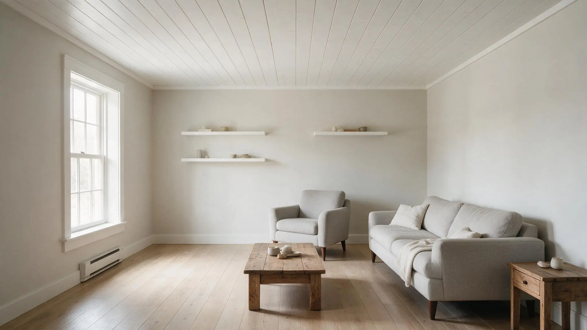
A simple white ceiling often goes unnoticed. One that is painted stands out. Although the ceiling is one of the largest surfaces in any room, most homes treat it as an afterthought.
The color of the ceiling affects how the space feels as soon as someone enters.
This guide offers fresh ceiling paint color ideas for various rooms and styles, along with the information you need to choose the ideal shade.
This guide has a ceiling paint color idea for every space and homeowner, from subtle neutrals to bold statement hues.
How to Choose the Best Ceiling Paint Color?
Once you understand a few fundamentals, selecting the ideal ceiling paint color doesn’t have to be tough.
Use contrast to make the ceiling stand out as a design element or match it to the walls for a matching look. Consider the amount of natural light in the space: lighter hues work better in darker areas, while deeper hues work better in bright areas.
The height of the ceiling is also important. Higher ceilings can accommodate deeper, richer tones, while lighter colors keep low ceilings feeling airy.
Finish matters as much as color. The best option is a smooth or matte surface because glossy materials tend to draw attention to flaws and uneven areas.
A little prep before painting results in a cleaner, more polished finish.
Best Ceiling Paint Color by Mood
The right hue fills space and sets the overall mood of the area. Instead of choosing a hue at random, grouping shades by mood makes it easier to shortlist options that fit the vibe a room is meant to convey.
1. Calming and Soft
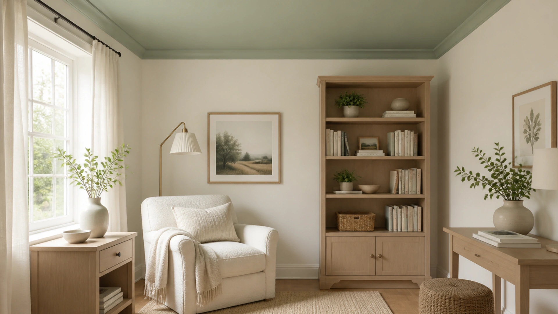
Off-white, powder blue, and sage green work well for serene areas. These colors softly reflect light and never overpower a space.
When comfort is the top goal, they function well in living rooms, bedrooms, and reading nooks. Most furniture and wall colors complement this scheme and don’t clash.
Sherwin-Williams Sea Salt and Benjamin Moore Guilford Green both convey this delicate, airy texture without providing extra visual weight.
2. Cozy and Dramatic
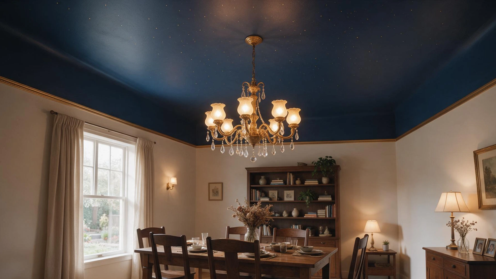
Charcoal, navy, and deep espresso add warmth and depth to a ceiling. These darker colors create intimacy and groundedness, especially in spaces with high ceilings or plenty of natural light.
They work particularly well in living areas, dining rooms, and bedrooms that want a bold, enclosed feel.
While Kendall Charcoal offers a softer, smoky edge, Benjamin Moore Hale Navy provides that moody navy look.
3. Bright and Airy
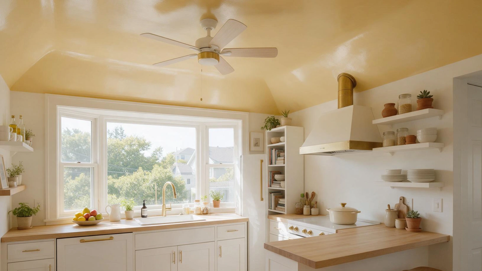
Warm white and soft butter yellow keep an area feeling light and spacious. These colors successfully reflect light, creating the illusion that darker or smaller areas are larger.
They work well in bathrooms, kitchens, and hallways where light and a tidy, welcoming space matter more than a striking design element.
Benjamin Moore Chantilly Lace makes the white crisp rather than flat, while Sherwin-Williams Butter Up adds warmth without feeling heavy.
4. Bold and Modern
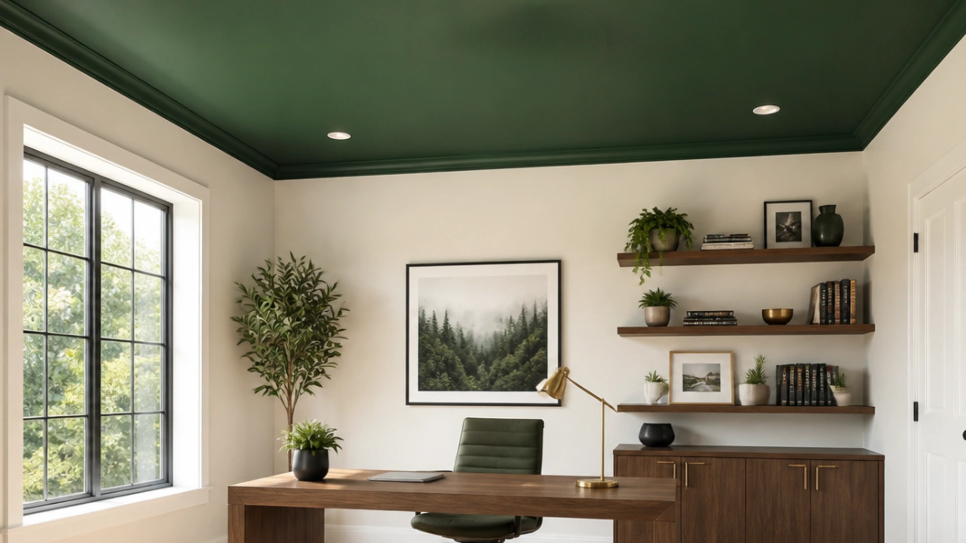
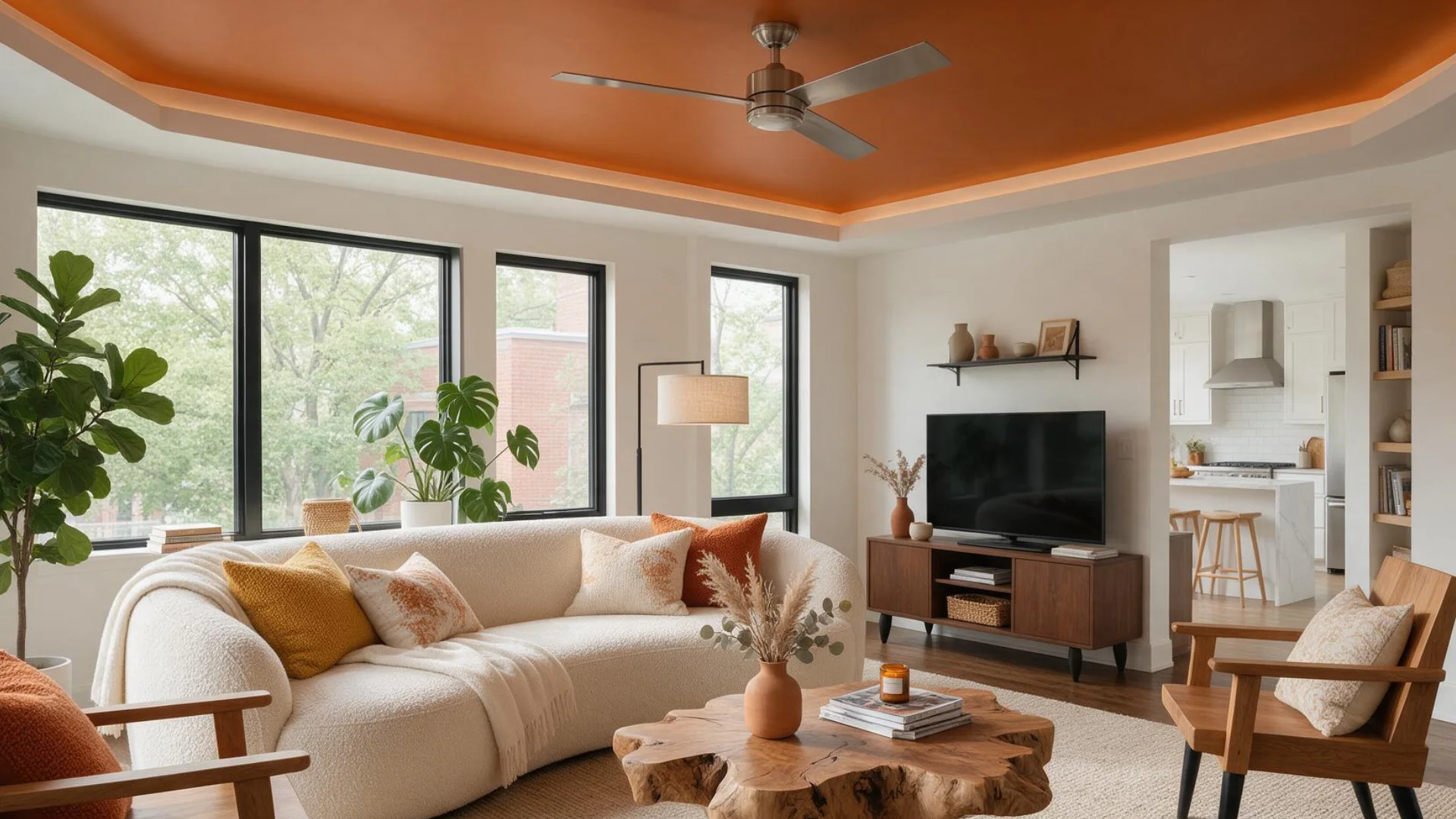
Terracotta, forest green, and dusty pink add flair to an otherwise plain ceiling. These colors are an excellent choice for people who want their space to stand out.
They look great in living rooms, home offices, or accent areas that could use a little uniqueness.
While Benjamin Moore Forest Green works for a livelier, punchier accent overhead, Sherwin-Williams Cavern Clay leans into the terracotta trend.
Painted Ceiling Ideas by Room
The ideal painted ceiling design depends on the space it is used in. In a kitchen, a tint that works in a bedroom could feel entirely out of place.
When a room’s color scheme aligns with its intended use, the space feels more planned and unified.
5. Living Room
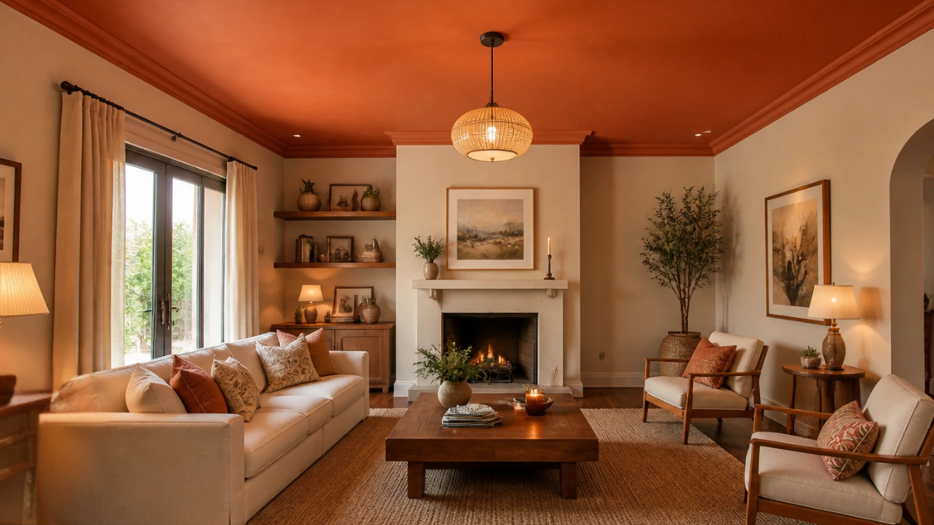
The living room ceiling’s warm tone instantly creates coziness and unity. Especially when paired with lighter walls, hues like espresso or terracotta add depth without overpowering the space.
This works well in living rooms meant for both social events and leisurely evenings.
Benjamin Moore Bittersweet Chocolate delivers that espresso richness, and Sherwin-Williams Rookwood Terra Cotta softens the look for a warmer, earthier finish.
6. Bedroom
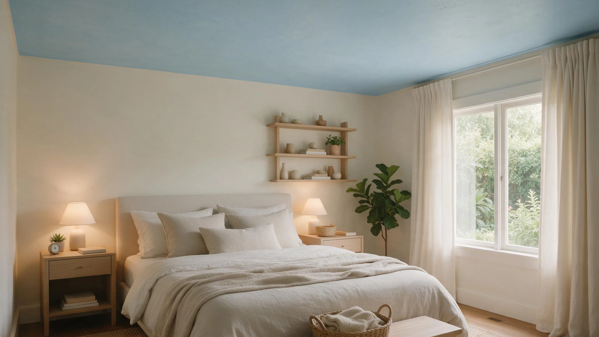
Soft blues or muted greens above provide a tranquil, sleep-friendly atmosphere. These gentle colors are easy on the eyes and create a peaceful, rather than stimulating, atmosphere.
These hues work nicely with soft lighting and neutral bedding, so in the end, the bedroom seems like a real retreat.
Benjamin Moore October Mist is mild enough for this type of calming overhead treatment without detracting from the overall atmosphere.
7. Kitchen
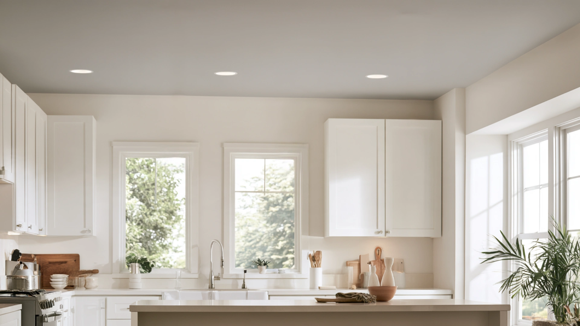
Crisp white or light gray can keep a kitchen ceiling neat and bright. Because kitchens deal with steam, grease, and frequent use, lighter colors also make it easier to spot dirt and smudges early.
This combination preserves the space’s sense of utility and freshness.
Benjamin Moore Gray Owl offers a light gray finish with just the right warmth, while Sherwin-Williams Extra White keeps the ceiling bright and shows dirt or smudges early; pair it with an eggshell finish for better moisture resistance.
8. Bathroom
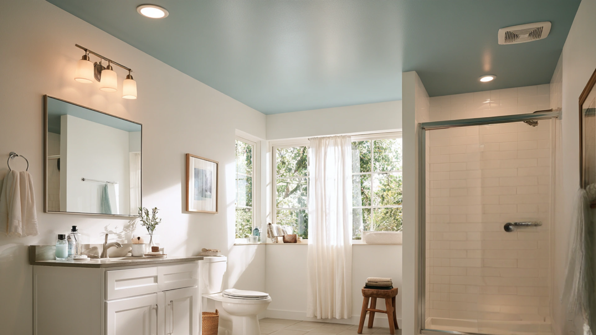
Light, moisture-friendly colors are best for bathroom ceilings, where humidity is a constant. Pale colors help create an impression of lightness and space, even in small bathrooms.
Over time, choosing paint made for moisture-prone areas can help prevent mold, peeling, and bubbling.
Benjamin Moore Palladian Blue reads as a serene, light hue that suits the wet conditions of a bathroom ceiling, while Sherwin-Williams Rain offers a similarly soft, moisture-friendly blue.
9. Nursery or Kids’ Room
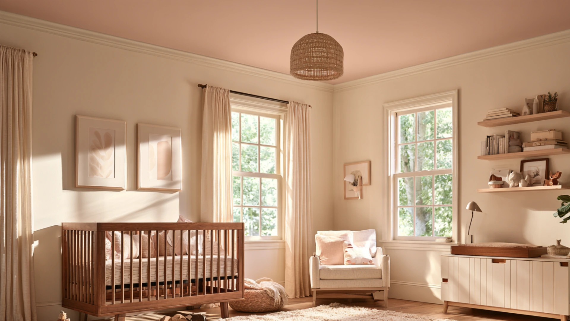
Gentle pastels can add a whimsical touch to a nursery or children’s room without being too loud or stimulating.
Soft pinks, blues, or yellows work beautifully here. These colors produce a cheerful, comfortable area that is calm enough for naps and evening rituals.
Benjamin Moore Hawthorne Yellow gives a cheery touch without going overboard, while Benjamin Moore Pale Pink Cheeks remains mild enough for naps.
10. Hallway or Entryway
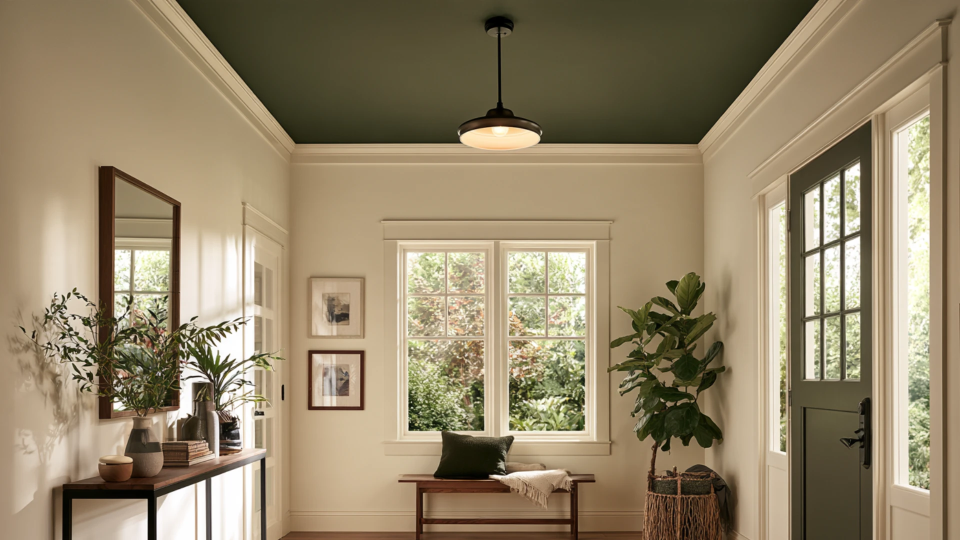
An eye-catching accent color on the ceiling makes a corridor or doorway instantly memorable. Since these spaces are usually smaller and you move through them quickly, a brighter shade adds personality without committing to it throughout a larger room.
Sherwin-Williams Naval offers a slightly more subdued, moodier rendition of the same concept, while Benjamin Moore Caliente brings bold energy to an entryway.
Either choice can transform a hallway into a brief yet memorable moment.
Creative Techniques Beyond a Single Color
You can modernize a ceiling in ways beyond a single paint hue. Without extra construction work, a few inventive methods add visual interest.
For people who want their ceiling to feel like a true design choice rather than just a finishing touch, these options are ideal.
11. Ombre or Gradient Ceilings
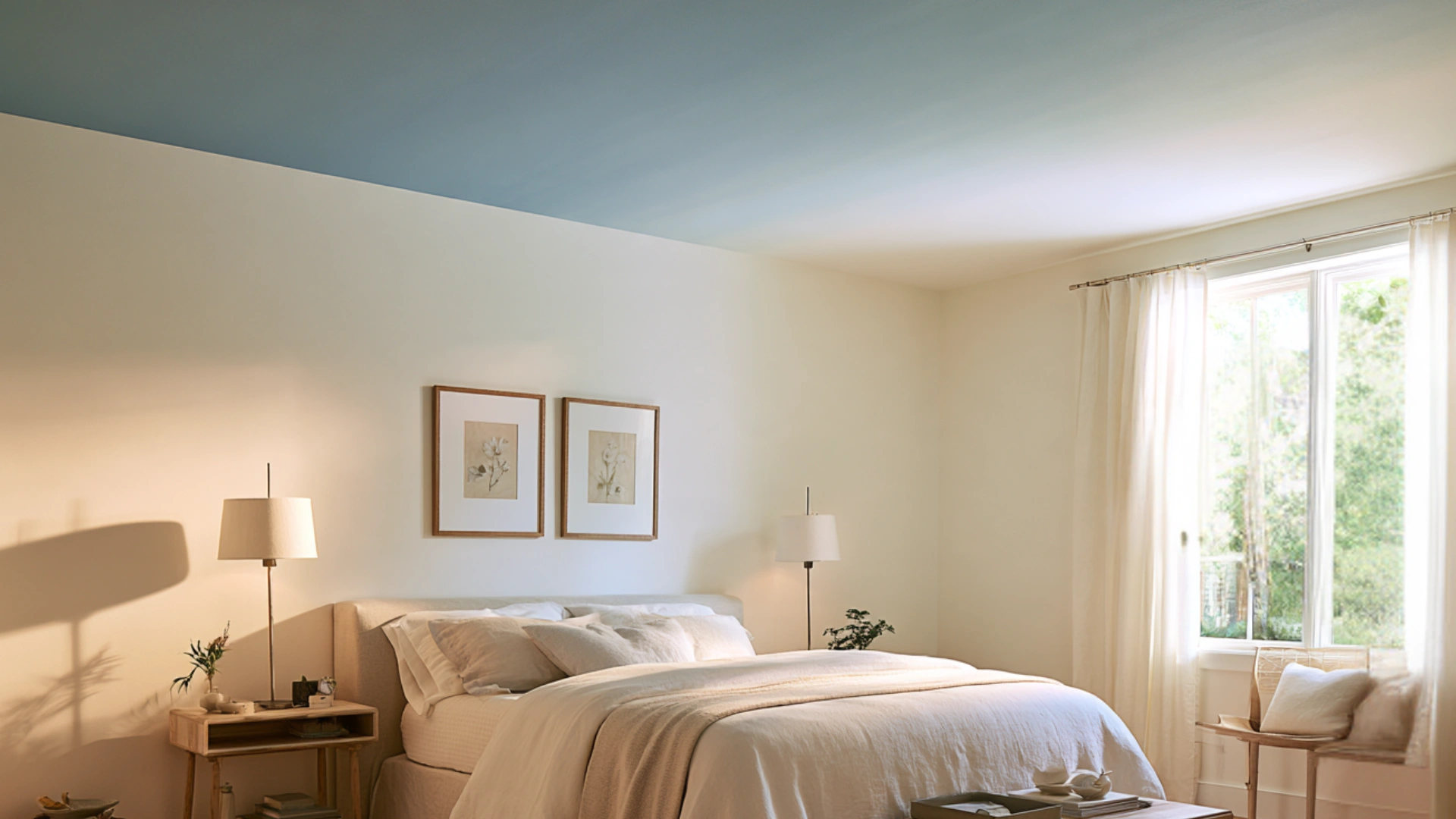
An ombre or gradient effect skillfully blends two or more colors throughout the ceiling. This creates a delicate, dreamy look that adds depth without being overly dramatic.
It works especially well in living rooms and bedrooms when you want a simple yet eye-catching accent overhead.
This effect is well captured by a gentle transition from Benjamin Moore Wythe Blue to Simply White, or for a similar effect, try Sherwin-Williams Rain fading into Sherwin-Williams Alabaster.
12. Stripes or Geometric Patterns
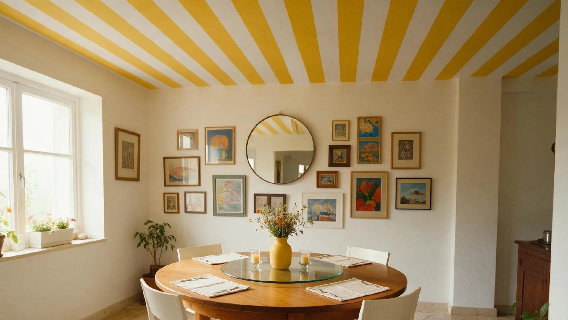
A simple ceiling can be given a modern, structural touch with stripes or geometric forms. For modern homes or minimalist spaces looking for a new design element, this technique is perfect.
It also leads the eye upward, making the area feel brighter and more structured.
Benjamin Moore Chantilly Lace and Hale Navy stripes maintain the pattern’s sharpness.
13. Stenciled Designs
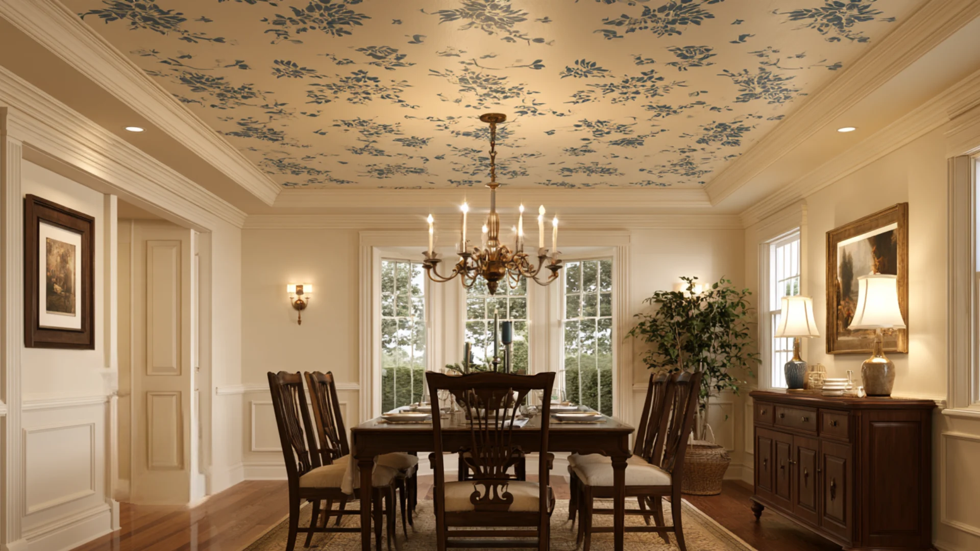
Stenciled designs can mimic the look of wallpaper without the cost or effort of installation. For traditional or vintage-style homes looking for overhanging embellishment, this technique works nicely.
You can fully customize the pattern, spacing, and color combination to suit the available space.
The Benjamin Moore Wrought Iron detailing on a Sherwin-Williams Alabaster base creates a clear contrast for stenciled patterns without making them appear overly heavy.
14. Two-Tone Ceilings with Trim
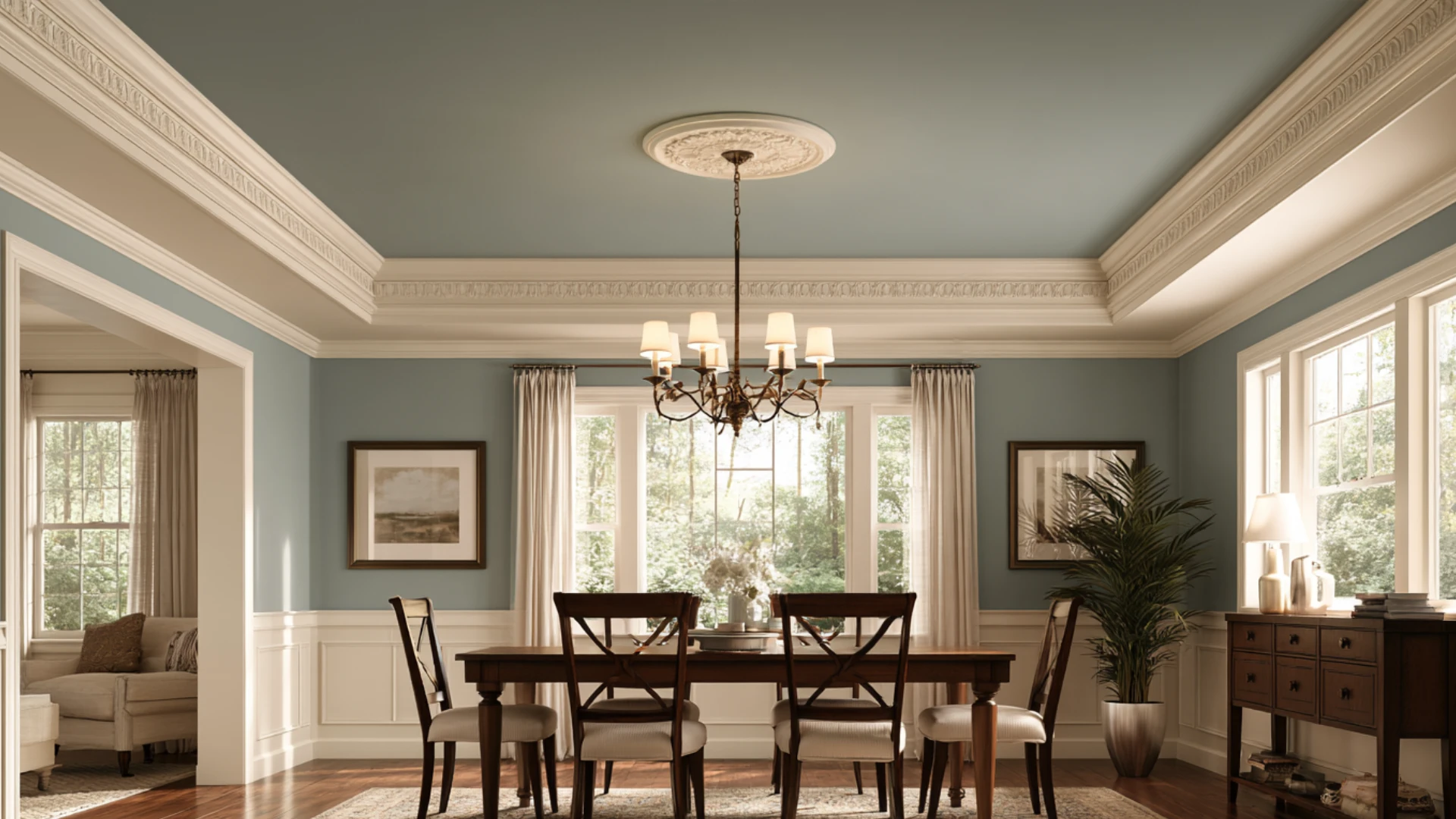
Pairing the dominant ceiling color with a contrasting trim adds polish and definition.
This technique draws attention to architectural elements like molding or beams and makes the ceiling appear more purposeful.
It looks especially nice in living rooms and dining rooms that already have decorative trim.
Sherwin-Williams Peppercorn against Pure White creates a bolder version of the same concept.
15. Metallic or Textured Paint
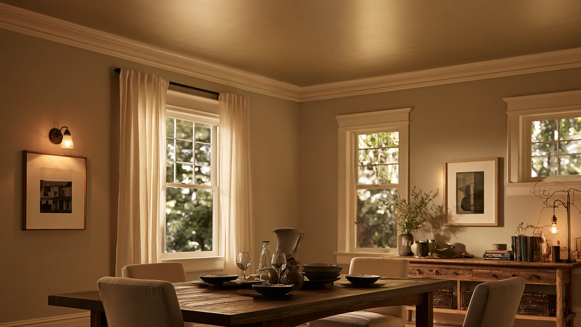
Metallic or textured paint adds depth and a subtle gloss to an otherwise flat ceiling. This choice works nicely for those who want a little glitter or dimension but don’t want a strong hue.
It looks great in foyers, dining rooms, or any space that should feel a little more sophisticated.
Sherwin-Williams Silver Fox provides a similar look with a bit more sheen, while Benjamin Moore’s Aura line in a gentle pewter metallic shade works well here.
What Paint Finish is Best for Ceilings?
For the majority of ceilings, flat or matte paint is still the best option since it conceals tiny drywall seams, uneven textures, and defects rather than highlighting them.
The lack of shine on a matte surface is rarely a problem because ceilings don’t often get as much direct light as walls do.
Although it has more texture than a completely flat finish, eggshell can be used in a kitchen or bathroom, where a slightly washable surface helps with humidity and light discoloration.
Because a greater sheen reflects light and highlights every dip, seam, or roller mark overhead, satin and semi-gloss are best reserved for trim, beams, or ornamental moldings rather than the ceiling itself.
Maintaining a flat or matte finish keeps the attention on the color rather than the surface beneath it.
Cost and Tips for a Better-Looking Ceiling
The size of the space, the quality of the paint, and whether a professional or a DIYer does the work all affect the cost of ceiling painting.
Knowing these aspects beforehand makes it simpler to set a budget and avoid surprises once the project starts. With a little perseverance and the right preparation, a ceiling can look neat, uniform, and expertly finished.
Single-Color Ceilings
Basic single-color ceilings are the most economical choice, since they require less time, fewer materials, and no special technique.
Multi-Tone or Patterned Ceilings
Two-tone, ombre, and stenciled ceilings cost more, since they require more labor, precision, and often higher-quality paint for a clean finish.
Tips for a Cleaner Finish
- Use painter’s tape along the edges where the ceiling meets the walls.
- Apply two coats for consistent color and full coverage, especially with bolder or deeper shades.
- Let each coat dry completely before applying the next.
Conclusion
The color of the ceiling paint affects how a room feels, looks, and works, so it’s by no means a minor issue. The first steps in selecting the best ceiling paint color are matching it to the walls, considering natural light, and choosing the right finish.
From there, there are countless painted ceiling ideas, such as a soothing color for a bedroom, a bold accent for a foyer, or an inventive method like stenciling or ombre.
Rather than fading into residual white paint, the ceiling should feel specific to the room.
The right ceiling color can turn an otherwise overlooked surface into a memorable one.
Frequently Asked Questions (FAQs)
1. Can Wall Paint Be Used on a Ceiling?
Yes, but ceiling-specific paint gives smoother, more even coverage.
2. Should Ceiling Paint Match Wall Paint or Be Lighter?
Lighter is safest, but matching works for a cozy, blended look.
3. Does a Dark Ceiling Make a Room Feel Smaller?
Yes, slightly, but it also adds coziness and depth.
4. What’s the Most Popular Ceiling Paint Color Right Now?
Soft white and warm neutral tones remain the top picks.