When you eventually painted the walls sage green, it appeared flawless for a brief while.
After you added the rug, drapes, and sofa, something didn’t feel right. The majority of sage green rooms come apart in that space between your favorite color and the surrounding hues.
It takes more than taste to know what colors go with sage green.
It is about picking the right supporting cast so the whole room feels pulled together instead of accidental.
Love Sage Green? This is Why
Sage green has become a favorite for a simple reason. It adds color to a room without feeling too bold.
It has soft yellow and earthy tones underneath, so it can look a little richer in daylight. Under artificial light, its touch of grey may make it look cooler.
Another reason people love sage green is that it does not feel tied to one trend. It works with different styles, furniture, and colors, making it easy to live with for years.
Best Colors That go With Sage Green
1. Blush Pink
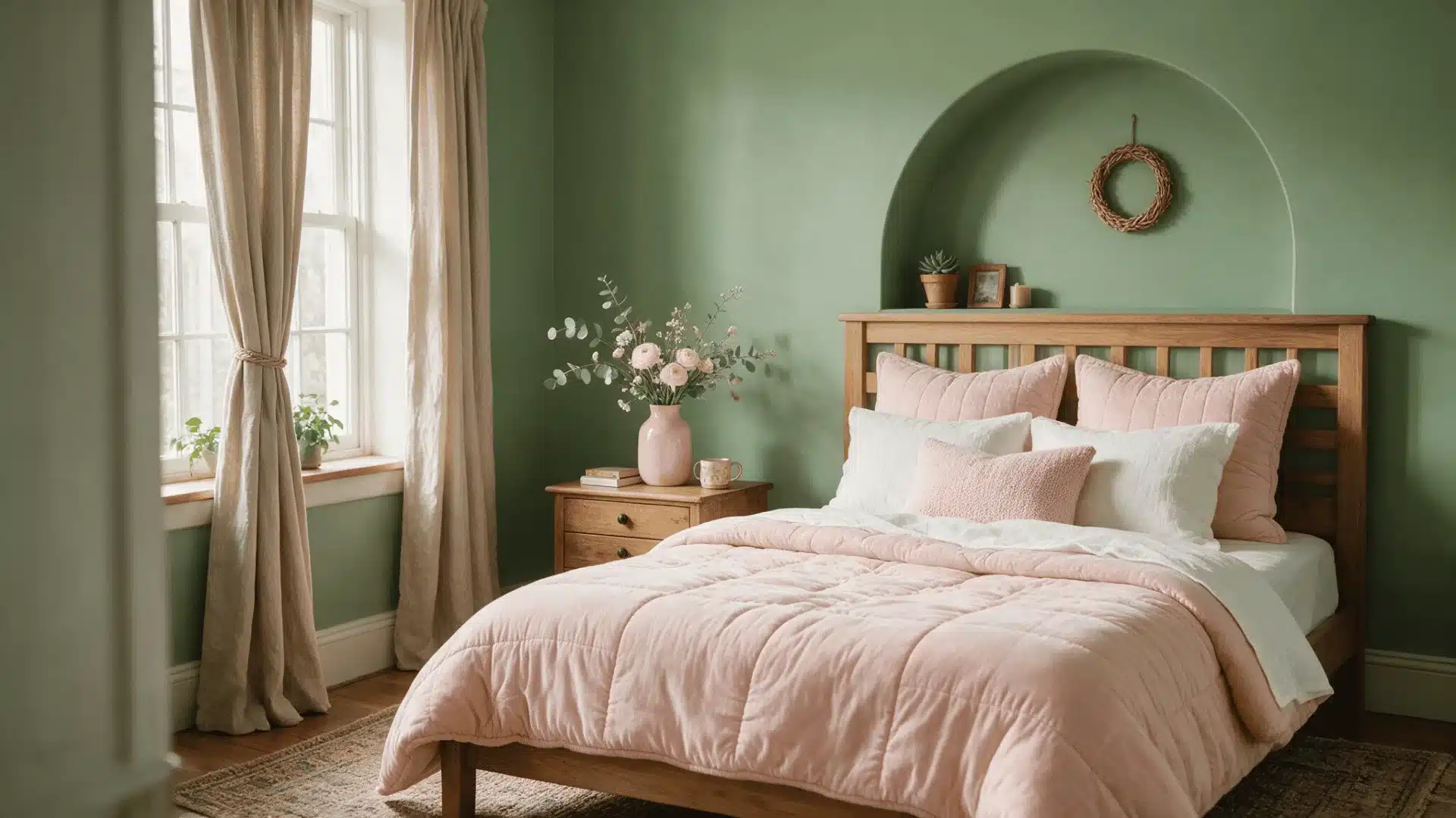
Blush pink softens sage green and gives a room a romantic, gentle feel. This pairing works well in bedrooms or reading corners where you want a calm, soft mood rather than a bold statement.
2. Terracotta
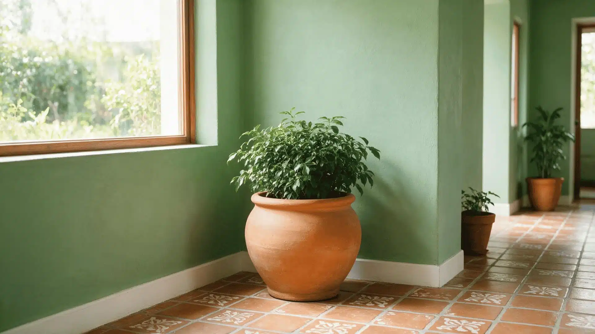
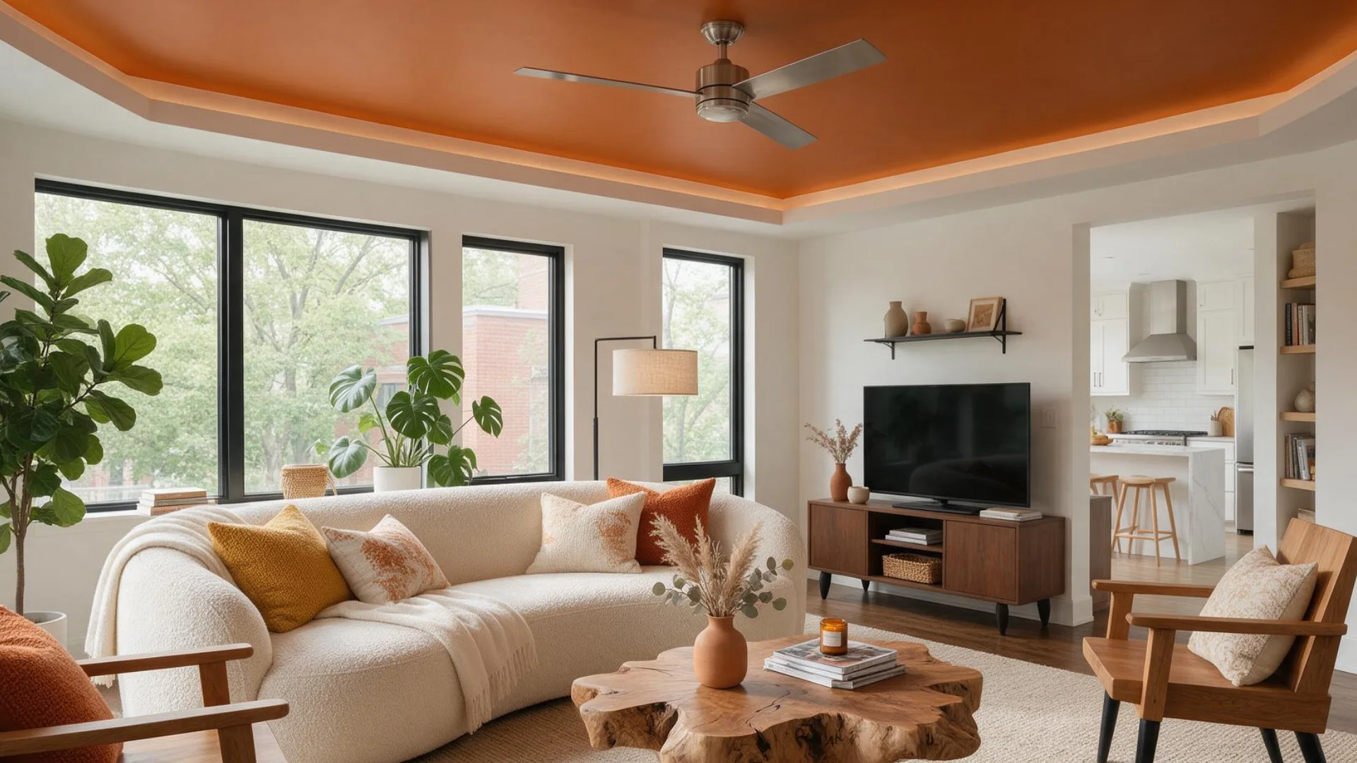
Terracotta brings out the earthy side of sage green while adding a nice bit of contrast. The reddish orange tone keeps sage from looking too muted.
Use this pairing in kitchens or sunrooms with terracotta planters, floor tiles, cushions, or a runner.
3. Lilac or Lavender
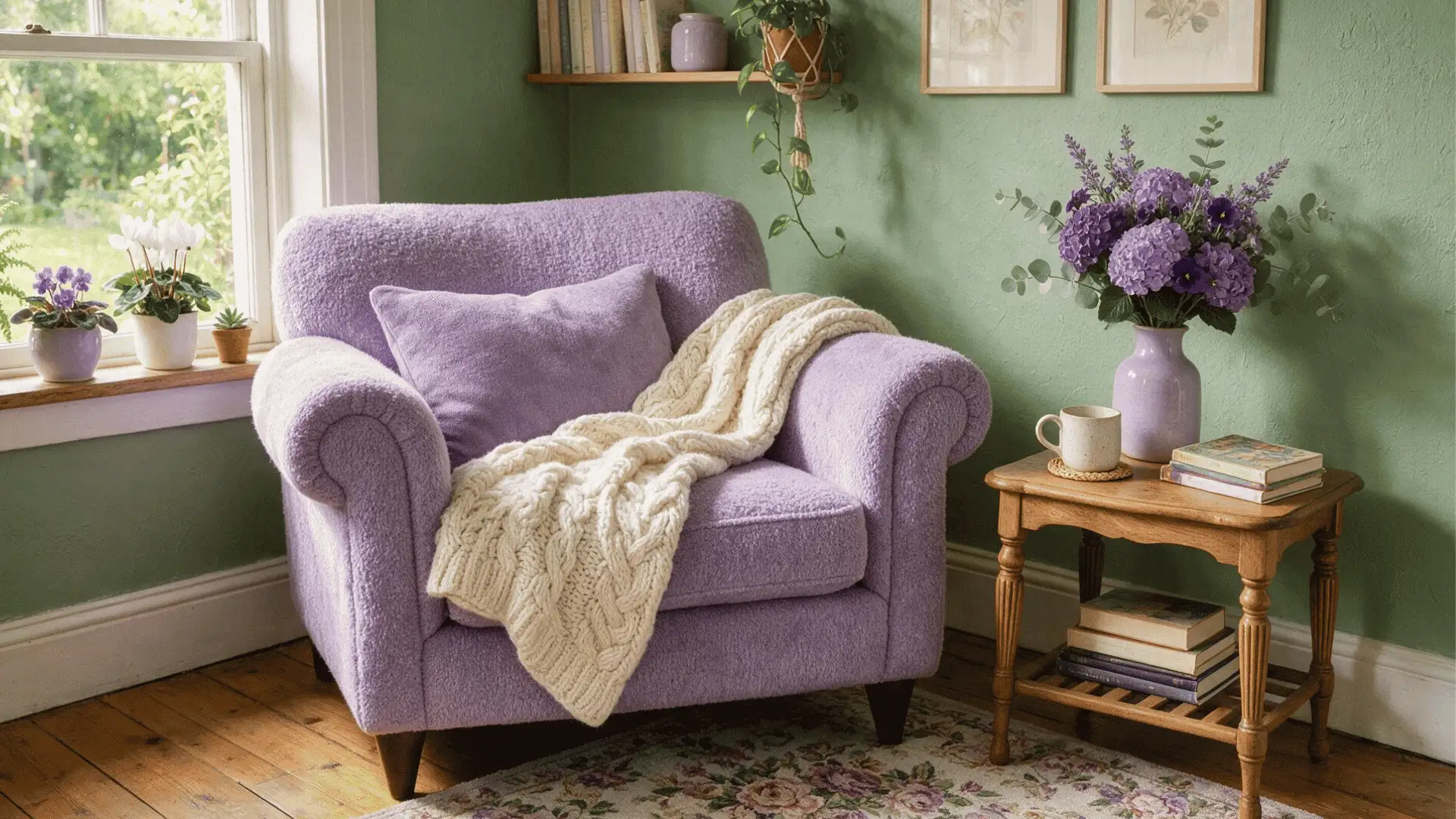
Lilac shares the same muted, greyed quality as sage, which is why the two sit together so easily without one fighting for attention.
One thing to look for is lighting. In a north-facing room, lilac can look flat next to sage, so adding a cream pillow or throw helps keep the pairing from feeling dull.
This combination suits bedrooms and nurseries where a soft mood matters most.
4. Light Blue
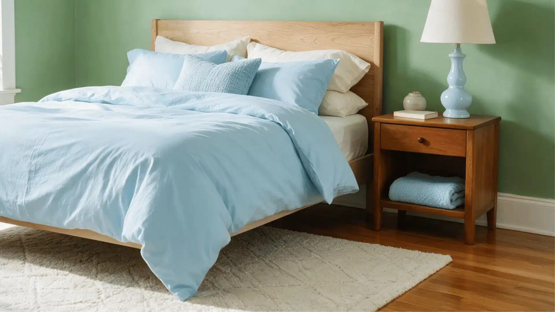
Light blue pairs well with sage because both colors carry a similar grey base, which is what keeps this pairing feeling calm instead of mismatched.
To maintain some grounding in the room, it helps to anchor it with a wood floor or piece of wood furniture, because too much bright blue can overpower sage’s earthy side.
It shows up often in bathrooms and coastal-style bedrooms.
5. Cream
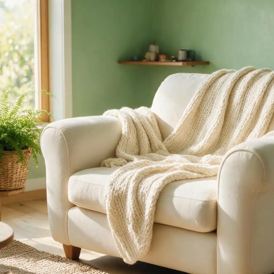
Cream is effective because it has a faint yellow foundation that complements rather than contrasts with the earthy undertone of sage.
Because of this, cream is among the safest options for practically every room, particularly little areas that require brightness without the starkness of pure white.
6. Mustard Yellow
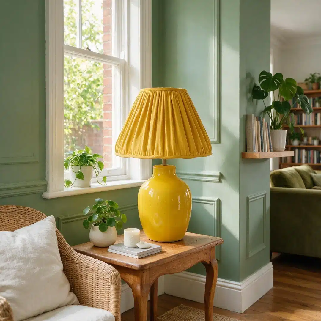
Mustard next to green reads distinctly retro, which is part of why it can start to look dated if overused.
Keep mustard to a lamp shade, a vase, or a throw pillow in a living room or dining space.
Covering a full sofa or accent wall in mustard next to sage tends to push the room toward an outdated look rather than a current one.
7. Dusty Rose
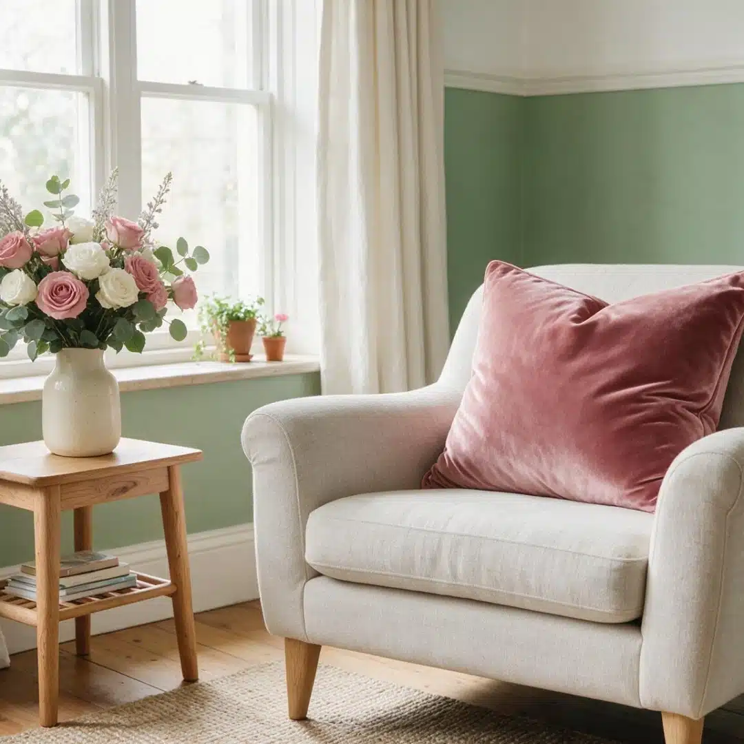
Dusty rose works because it sits at a similar saturation level to sage, which means neither color overpowers the other.
This makes it a strong choice for primary bedrooms or living rooms that want a soft, considered feel.
To keep the pairing from reading as too soft overall, add one metallic touch, like a brushed brass lamp or mirror frame, to break up the pastel tones.
8. Monochrome
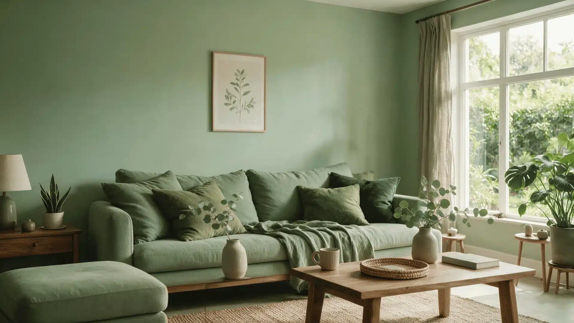
A monochrome scheme means layering different green shades, like olive or forest green, instead of introducing a new color at all.
This works well in open-plan spaces or reading nooks.
The risk is flatness if every surface lands at the same tone. Varying the finish, such as a matte wall against a glossy trim, keeps the layered greens from blurring together.
9. Denim Blue
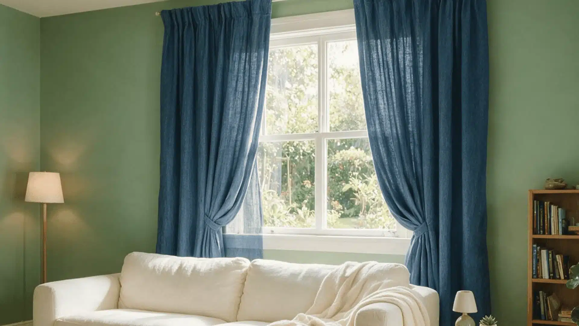
Denim blue is softer than navy but still adds contrast. It has that faded, worn-in look, which matches Sage’s own quiet vibe instead of fighting it.
This pairing works great in family rooms or kids’ rooms where things do not need to feel too formal. It also looks best as actual fabric, like a slipcover or curtains, rather than paint.
The texture of real denim does more for the room than the color alone ever could.
10. Burnt Orange
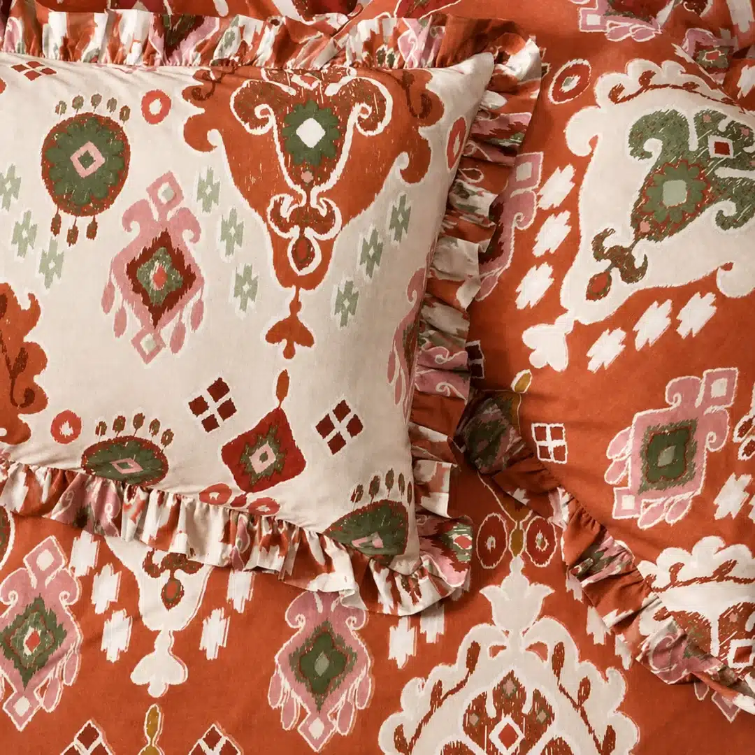
Because burnt orange is more saturated and deeper than terracotta, it gives sage an autumnal, grounded contrast instead of a vivid pop.
This combination works well in dens, libraries, or any space that has a layered, comfortable vibe.
Keep burnt orange to a single surface, such as a chair or curtain panel, rather than dispersing it over several pieces in the same space, as both sage and burnt orange can have visual weight.
11. Wood Brown Tones
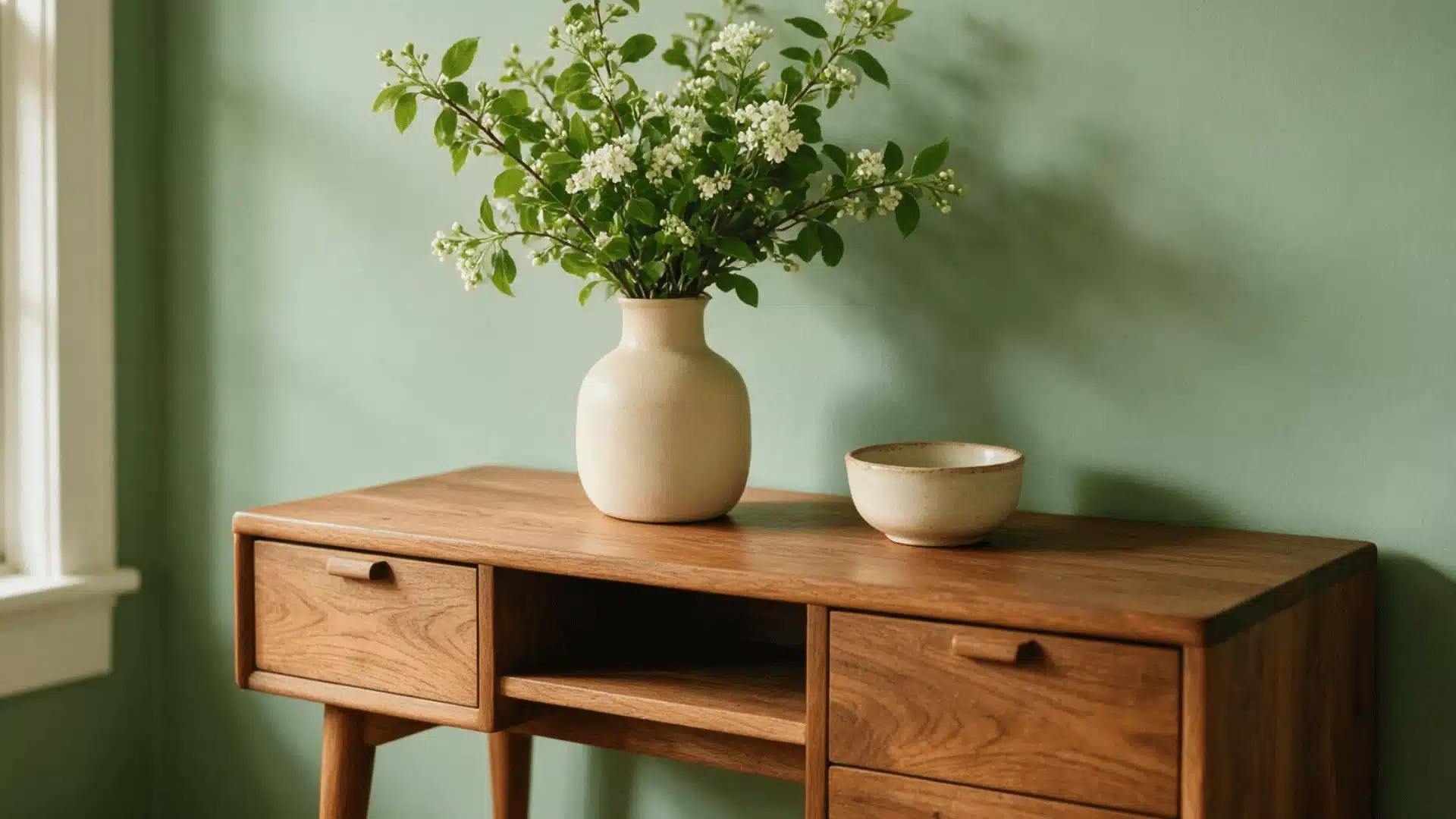
Wood tones work with sage because both come from natural materials, so the pairing never feels forced.
This shows up everywhere, from flooring to furniture to trim. Its undertone is one thing that people generally miss.
A cooler-toned wood, like white oak, matches sage’s greyer base better than an orange-leaning wood like pine, which can pull the room in two different directions at once.
Bedrooms bring their own version of this question, since bedding adds another layer of color to plan around.
What Colors Go With Sage Green Bedding?
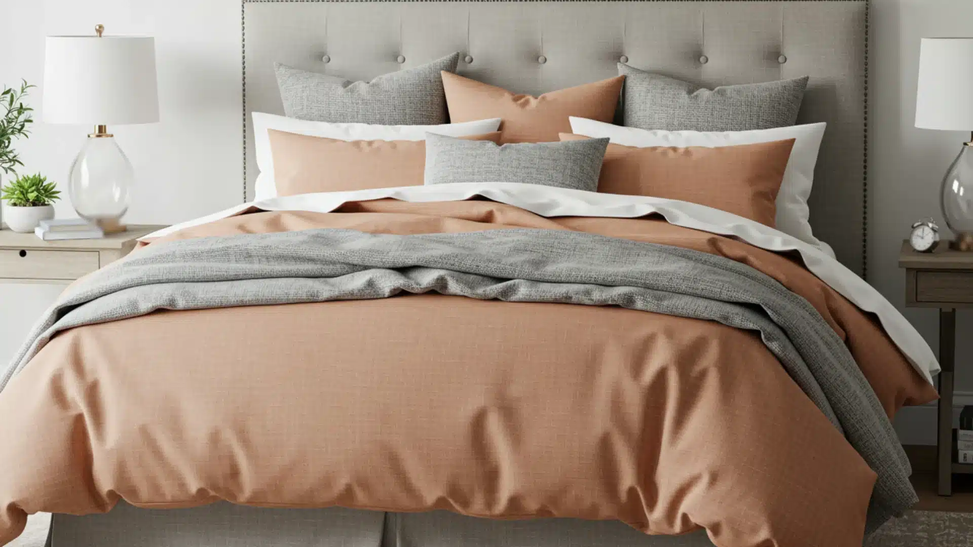
For bedding specifically, the most reliable pairings are white, cream, and soft blush tones, since they keep the room feeling calm. If you want more contrast, a navy or charcoal accent pillow works well without overwhelming the room.
Beyond bedding color, the furniture finish in the room matters just as much.
12. White Furniture
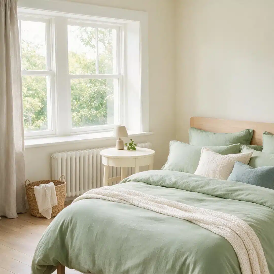
Keeps a sage green bedroom feeling light instead of heavy, which matters most in smaller rooms.
Choose a slightly creamier white rather than a stark, cool white, since a true white can make sage look dull by comparison.
13. Black Furniture
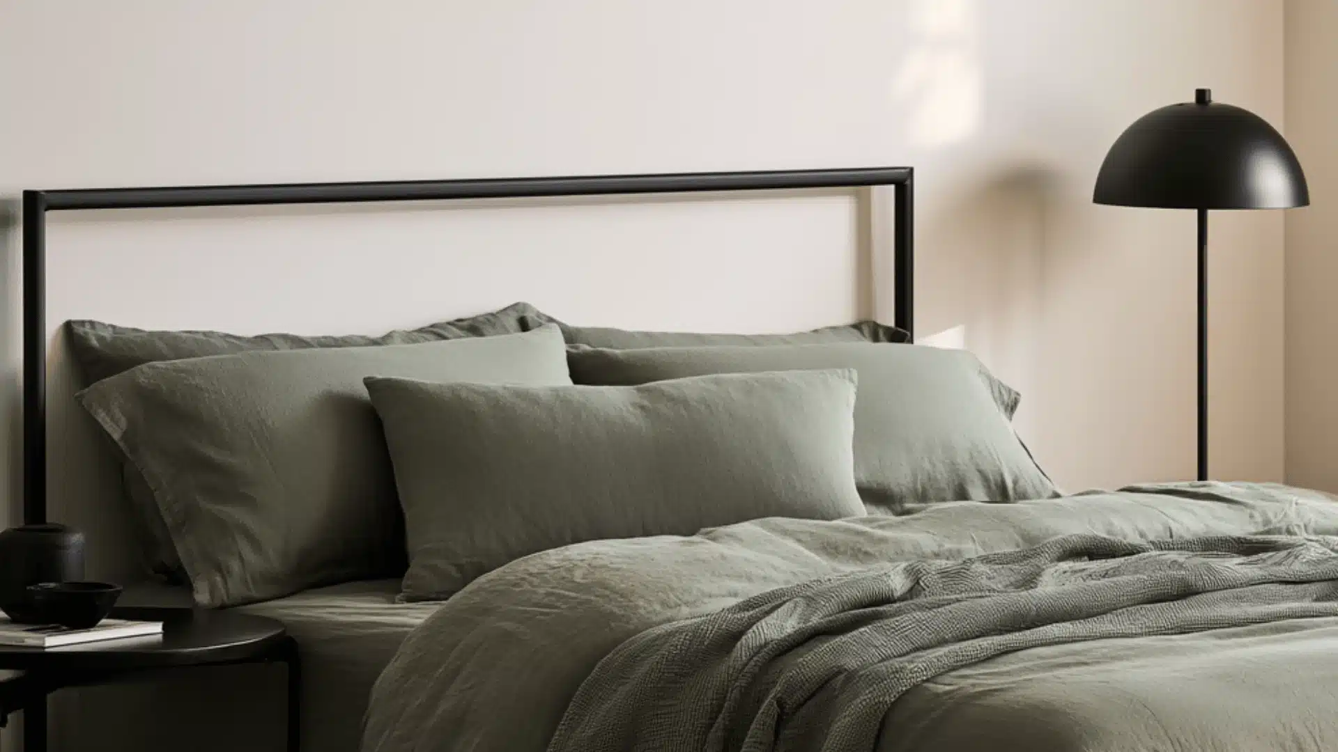
Adds a defined edge to a room that might otherwise feel too soft. This works well in bedrooms with more natural light to balance the contrast.
Stick to matte black finishes rather than glossy, since shine tends to fight with sage’s quiet, understated tone.
14. Leather Furniture
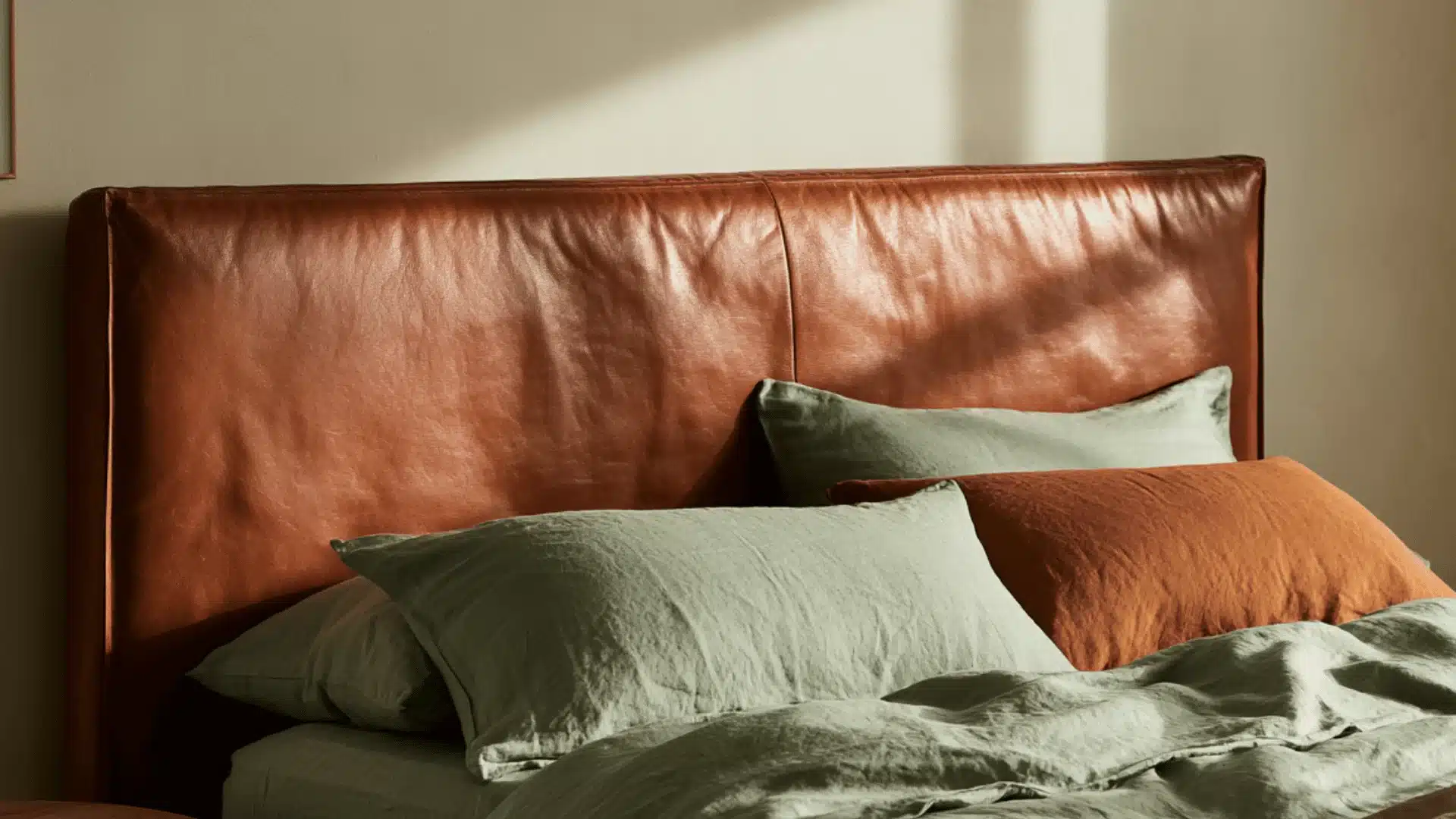
Tan or cognac leather echoes sage’s natural, earthy undertone, which is why the two pair so easily in headboards or reading chairs.
Leather can shift more orange or more grey depending on how it was tanned, so it is worth testing a leather swatch next to your exact sage sample before buying.
Colors That Go With Sage Green Walls
15. Deep Teal
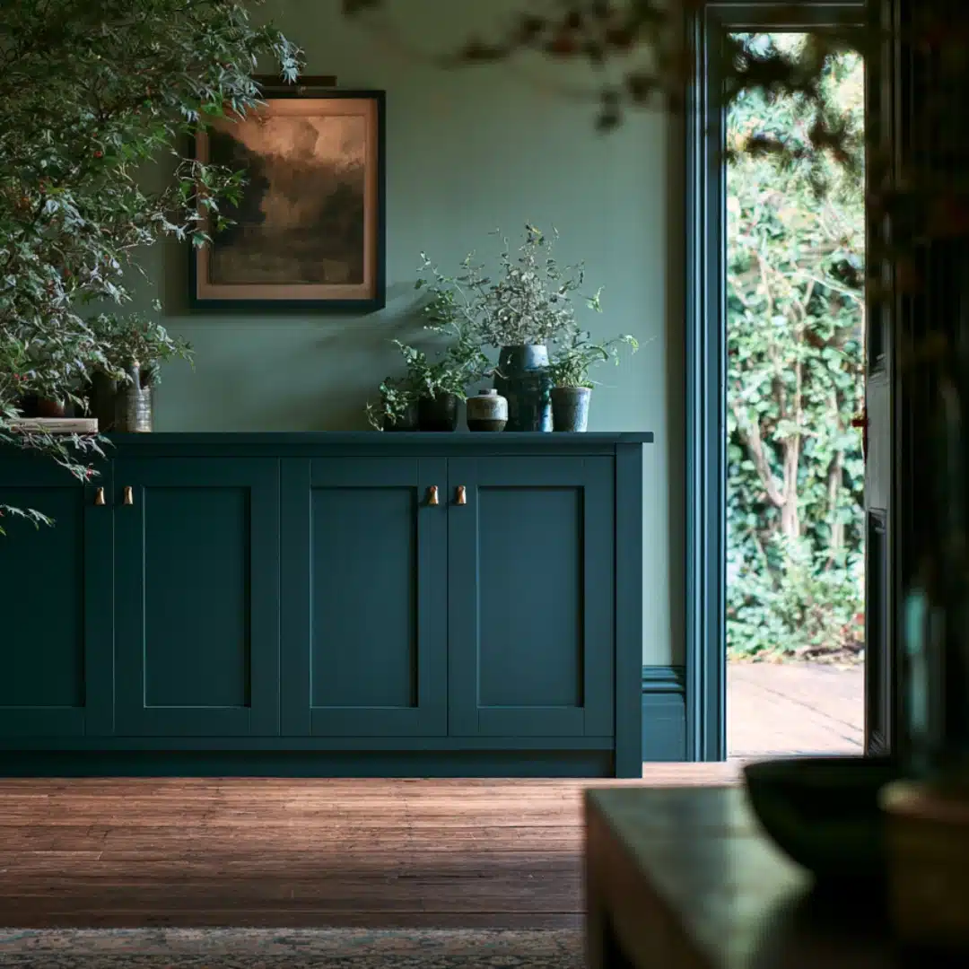
Deep teal works because it has that same soft, greyish quality as sage, so the two colors feel like they belong together instead of being thrown in by chance.
This works best as an accent wall or through cabinetry rather than covering an entire room in both colors. Keep both shades in a matte finish so neither one competes for shine.
What finish do you prefer for the kitchen cabinets?
16. Burgundy
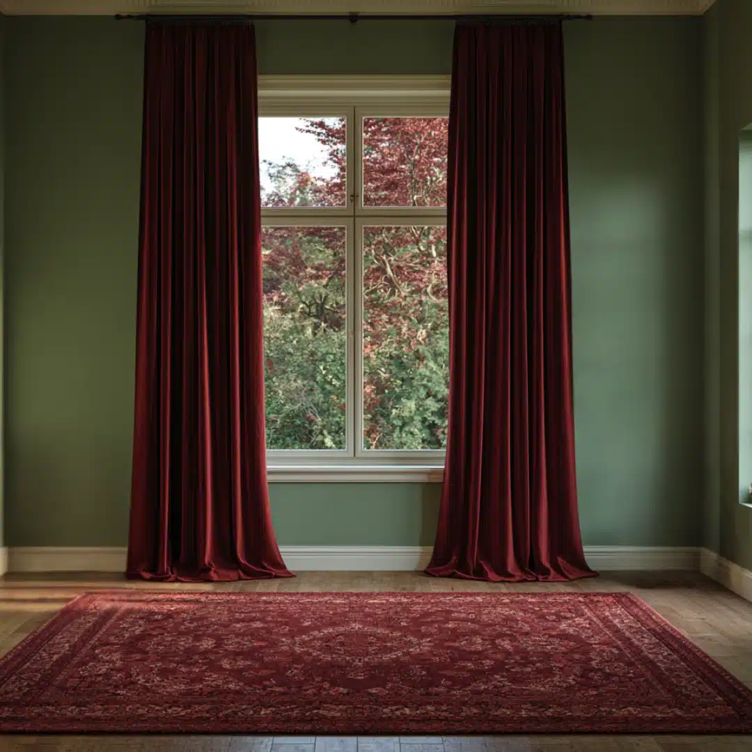
Burgundy and sage look great together, but the lighting in the room can make or break this pairing. Yellow-toned bulbs can make this pairing look muddy, so natural light or daylight bulbs will show it off at its best.
Add Burgundy in through curtains or a rug rather than a second wall color, since a small dose goes a long way here.
17. Camel
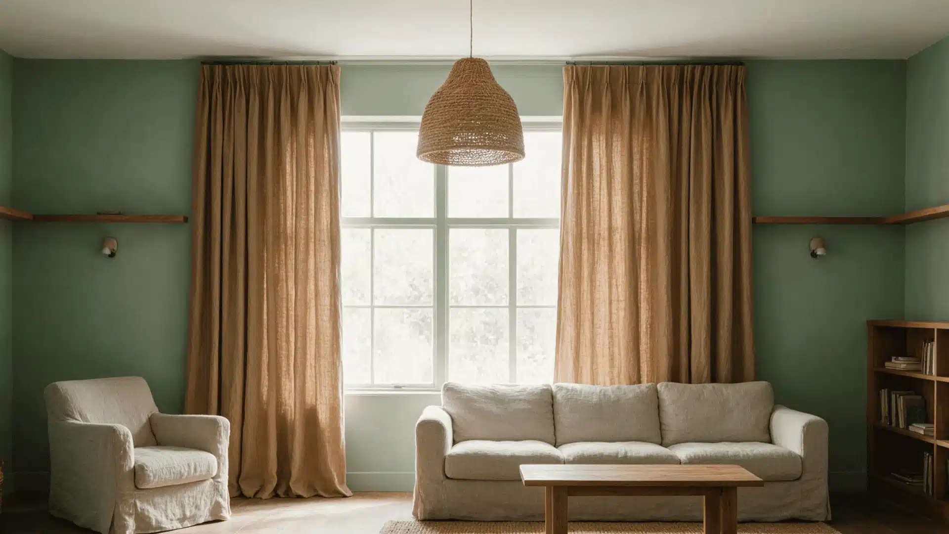
Camel bridges sage and any existing wood tones in a room, since it carries a similar yellow base to both. This shows up well in upholstery or curtains in living rooms with a natural, understated feel.
Also read about if curtains should touch the floor or not.
18. Gold Accents
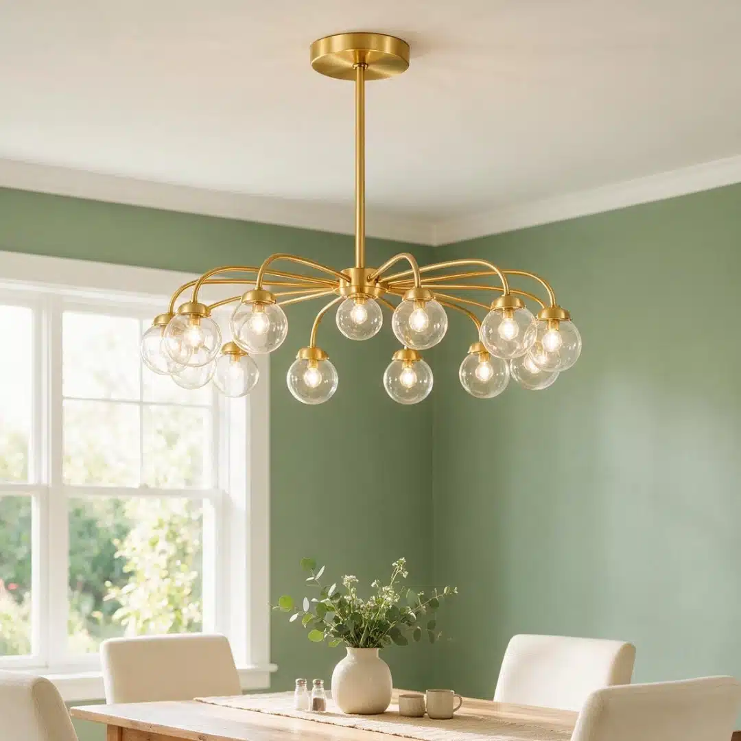
Gold accents catch light in a way flat paint never will, which is useful in a color as matte and grounded as sage.
This works especially well in hardware, lighting, and frames. Brushed gold reads better here than polished gold, since a high-shine finish can feel out of place against sage’s quiet base.
19. Charcoal Grey
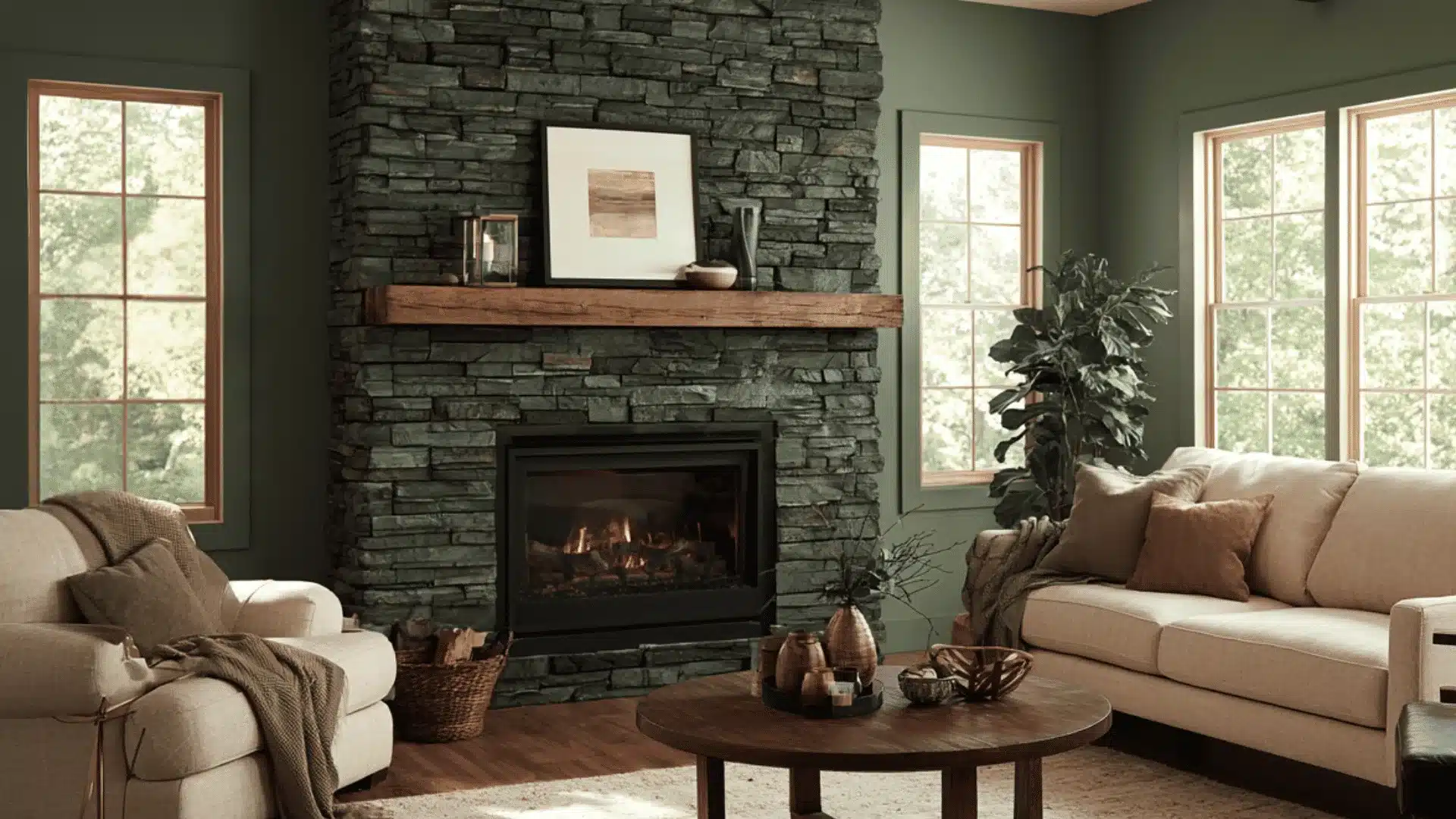
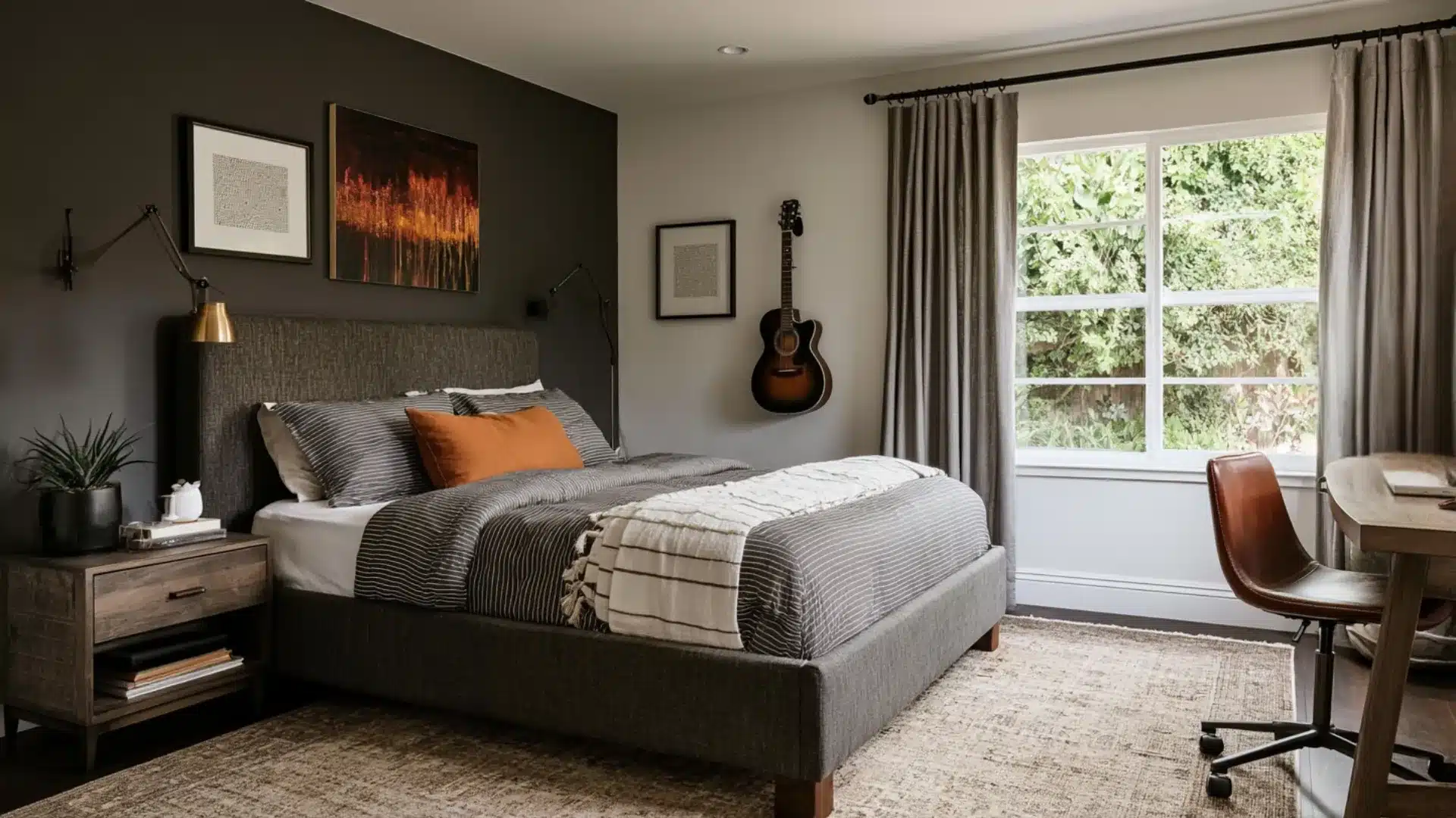
Sage green and charcoal grey work well together because neither color feels too bright. Use charcoal on furniture, trim, or one wall to add contrast.
Lighter colors on the ceiling and nearby walls will help balance the darker shade.
Final Thoughts
Sage green works with a wide range of colors, but the pairing that works best usually depends on how much contrast you want and how much natural light your room gets.
Testing a sample swatch or a small textile before committing to a full room is still the most reliable way to know if a pairing will actually work in your space.
Frequently Asked Questions
1. Is Sage Green Considered Warm or Cool?
Sage green can look warm or cool. Its earthy tones feel warmer, while its gray side becomes clearer in low light.
2. What Trim Color Looks Best with Sage Green Walls?
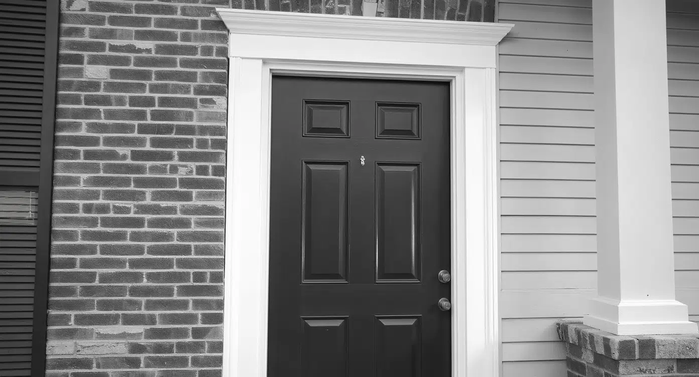
Soft white and creamy white trim pair nicely with sage green, giving the walls a clean look without too much contrast.
3. Can Sage Green Work in Small Rooms?
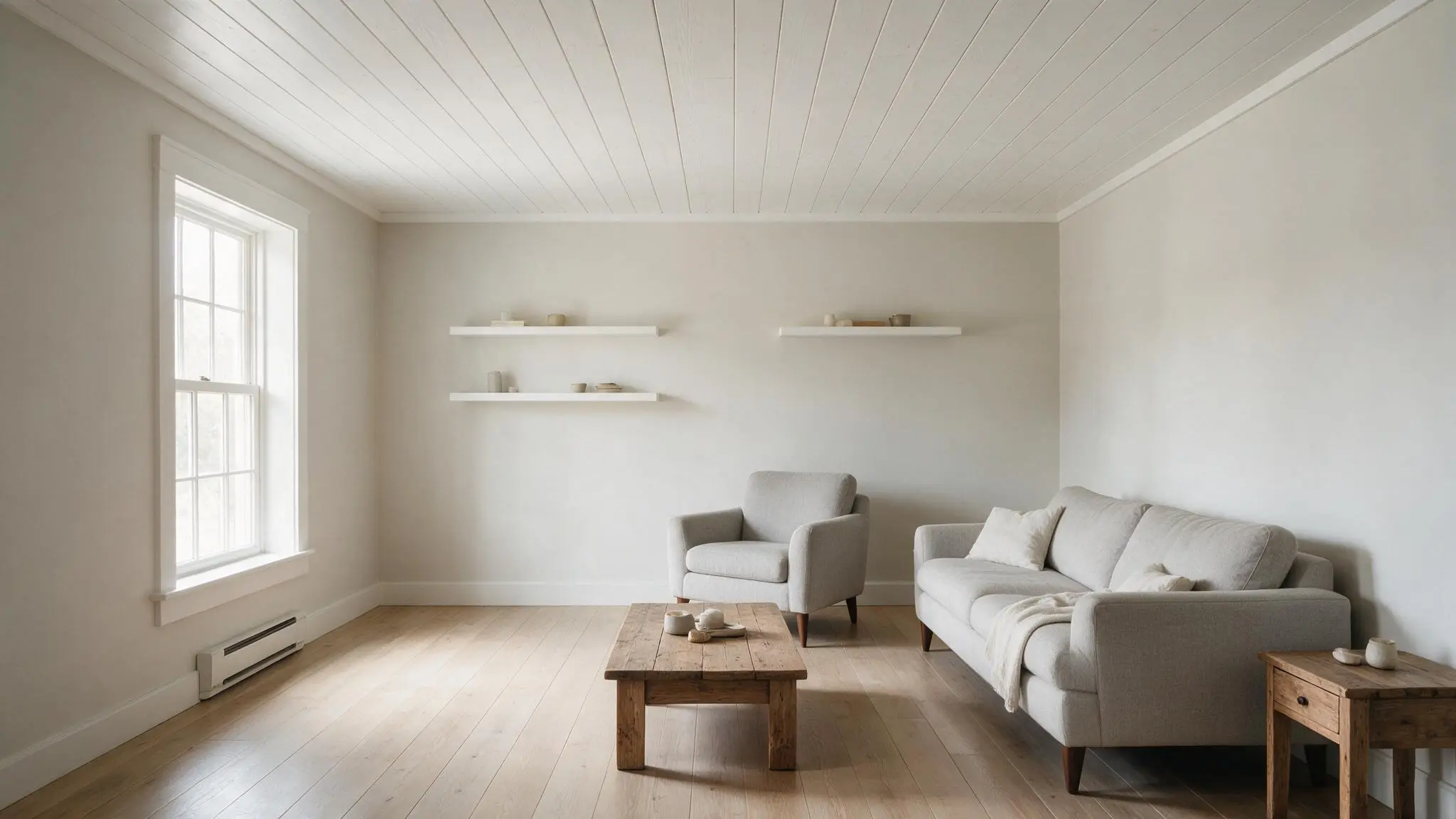
Yes. Light sage green can work beautifully in small rooms, especially with pale furniture, light trim, and plenty of daylight.