Have you ever walked into a room and felt instantly calm, even though you couldn’t pinpoint why?
The secret often lies in gradation, a design technique that creates smooth transitions between colors, textures, and elements. Most homeowners struggle with making their spaces feel balanced.
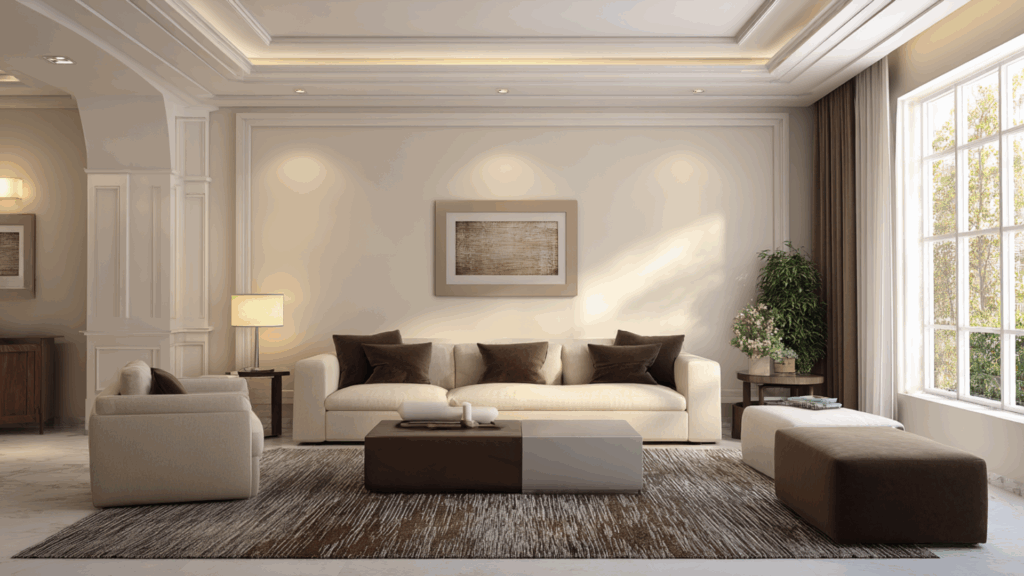
Master gradation to make rooms flow naturally, creating depth and visual interest without overwhelming. Guests will notice a professional, polished look of expensive designer homes.
In this blog, we will show you exactly how to use gradation in interior design. You’ll learn simple techniques that work in any room, regardless of your budget or style preferences.
What is Rhythm in Interior Design?
Rhythm in interior design is like a beat. It’s what makes a room feel alive and connected. Think of it as the visual flow that guides your eye around a space.
Just like music has a steady beat, your room needs repeating elements that create harmony. This could be colors that appear throughout the space, similar shapes, or patterns that echo each other.
It’s the difference between a space that looks professionally designed and one that seems hurriedly assembled.
Main Types of Rhythm in Interior Design
Knowing different rhythm types helps you create spaces that feel intentionally designed rather than randomly decorated.
Each type offers unique ways to guide the eye.
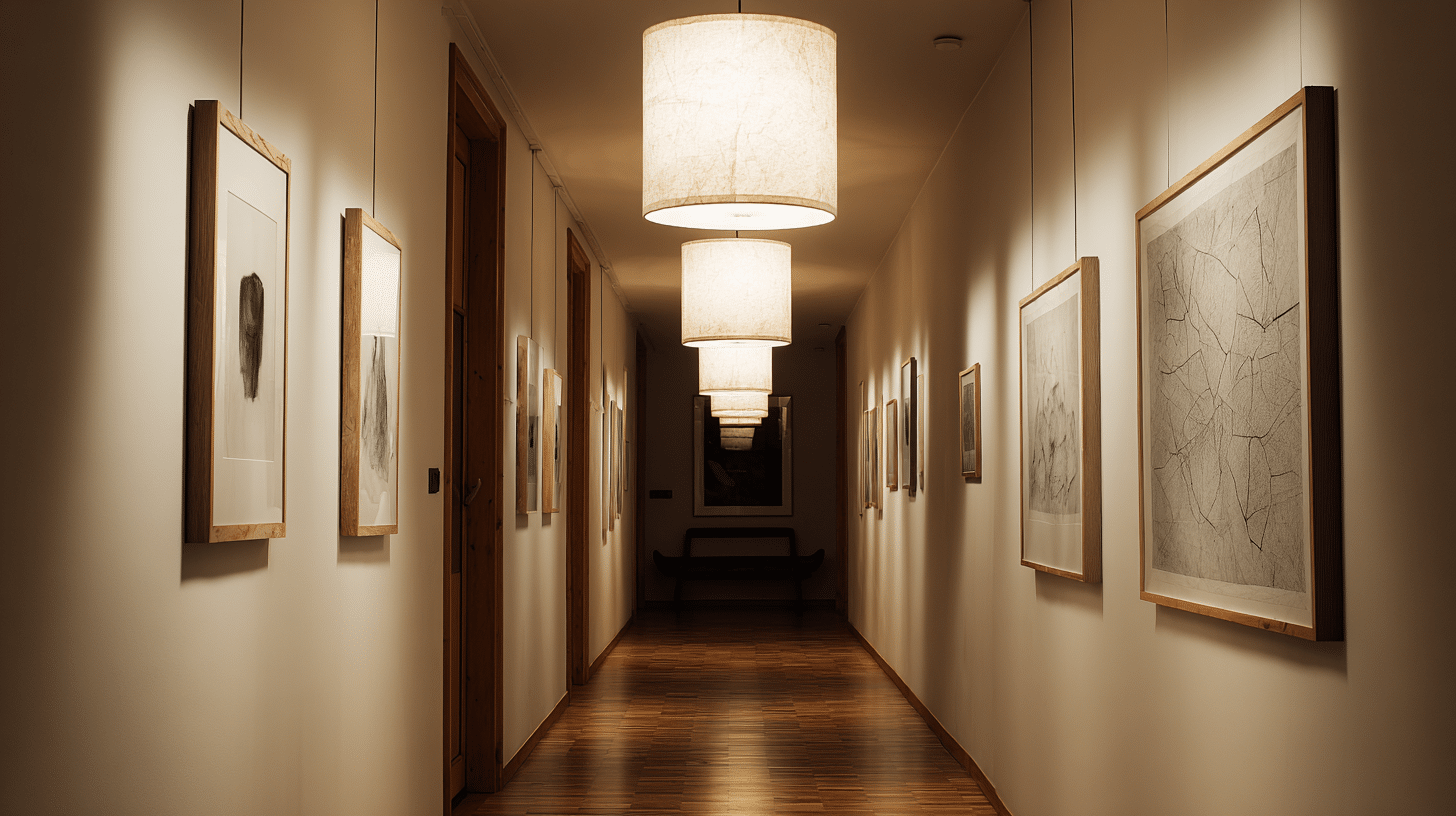
Repetition Rhythm
Uses the same element repeatedly, such as identical pillows, matching lamps, or similar artwork, creating predictable, comfortable, and unified visual patterns.
Alternation Rhythm
Creates a pattern by alternating two elements, like checkerboard floors, picture frames, or accessories. This movement adds visual interest while keeping order.
Progression Rhythm
Elements gradually change in size, color, or intensity. You might arrange books from shortest to tallest, or use paint colors that shift from light to dark across a wall.
Transition Rhythm
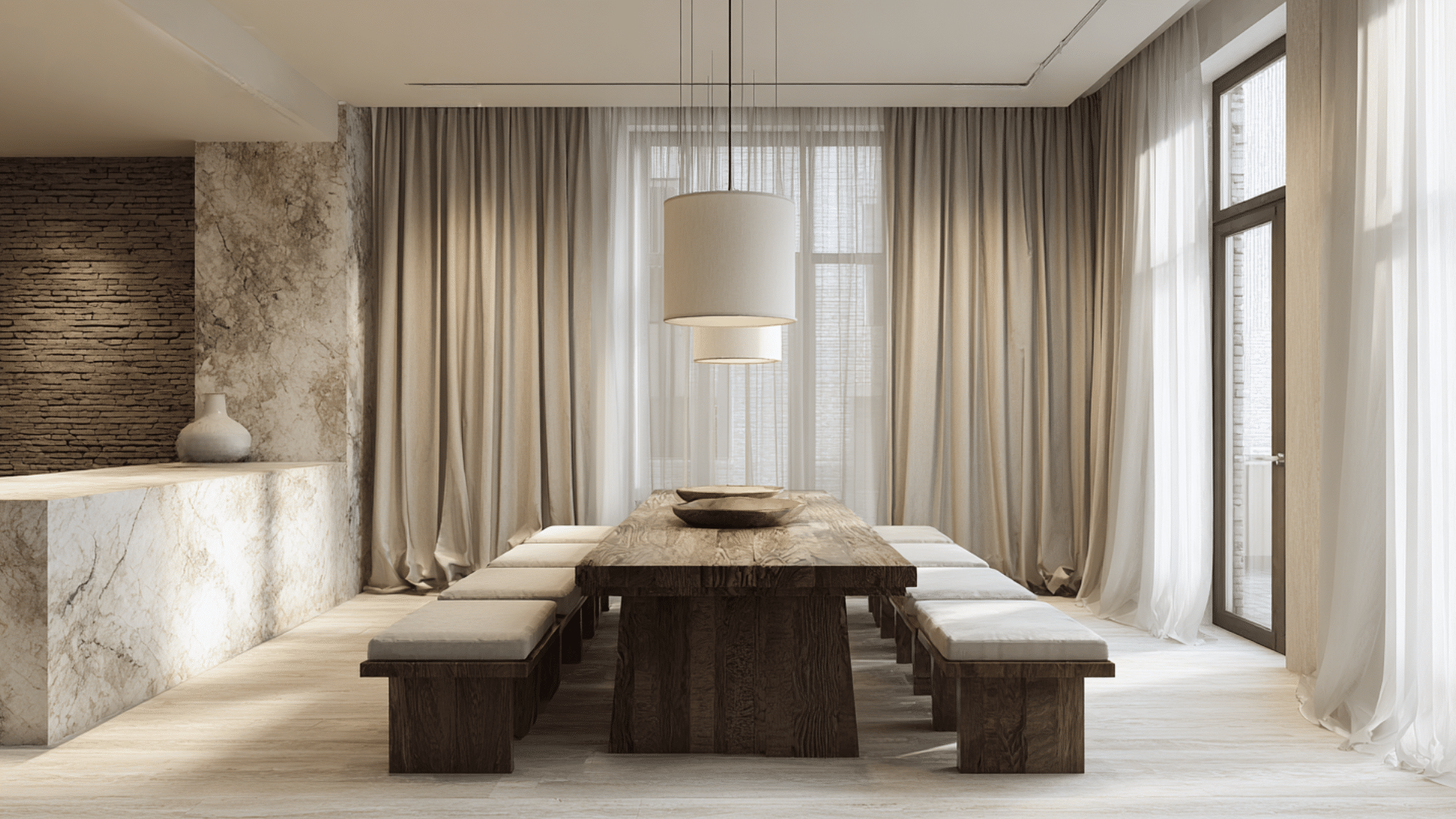
Smooth, curved lines guide your eye gently around the room. Archways, spiral staircases, or flowing curtain drapes create this soft, continuous movement that feels natural and calming.
Radiation Rhythm
Elements spread outward from a central focal point like sunburst mirrors, circular rugs, or chandelier arms. This creates energy and draws attention to important areas in your room.
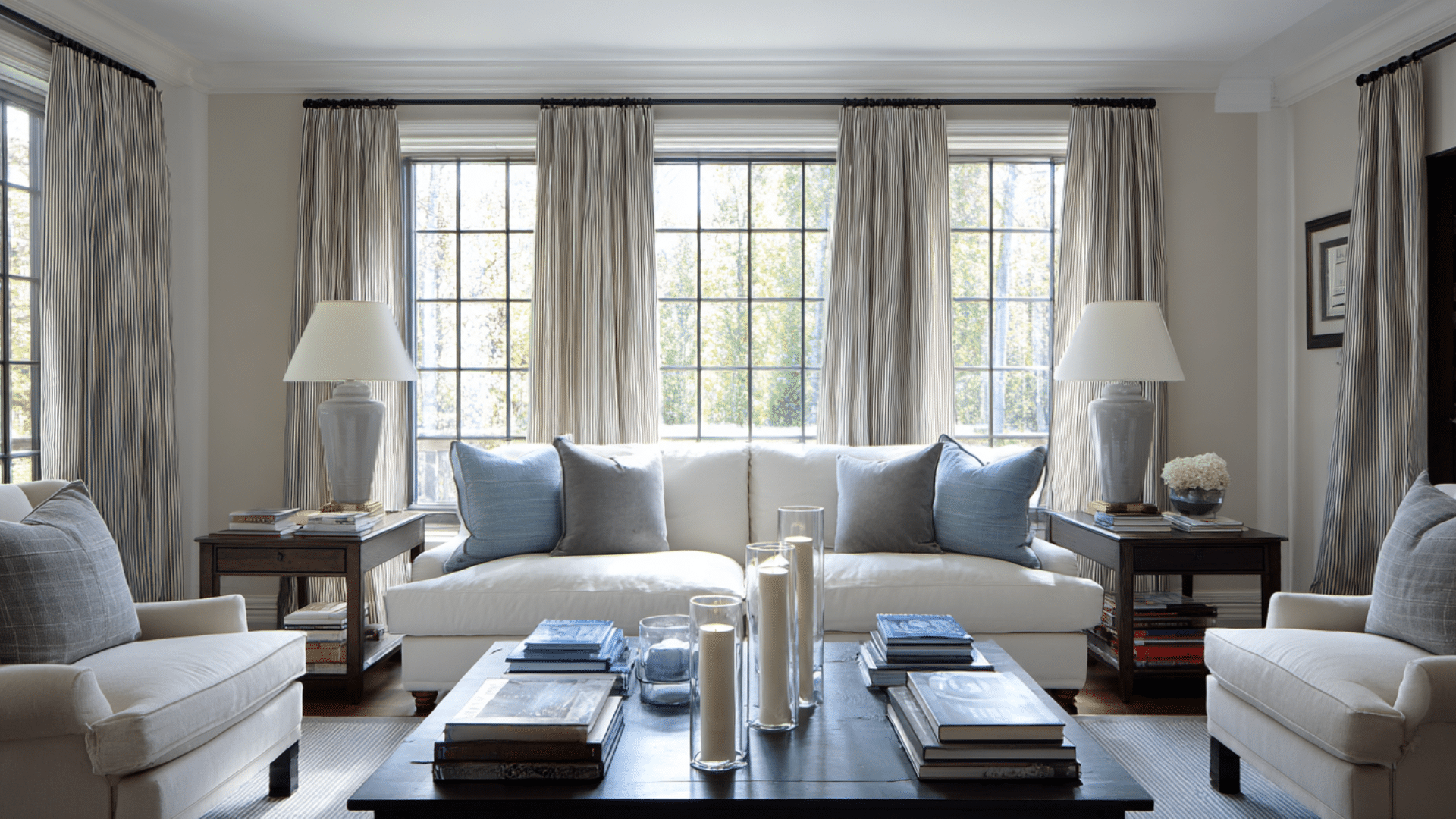
Gradation as Part of Rhythm
Gradation in interior design creates rhythm by establishing a smooth, predictable flow in your space. Gradually shifting from light to dark colors or from small to large patterns guides your eye naturally, like a steady drumbeat.
This visual movement prevents rooms from feeling static or choppy. Instead of jarring jumps between elements, gradation offers your eye a comfortable path to follow.
Think of how sunset colors blend from yellow to orange to pink; that smooth transition creates the same calming rhythm in interior design.
These rhythm types and gradation in interior design work together to create a professionally designed space.
Techniques to Apply Rhythm and Gradation
Here are practical methods to bring rhythm and gradation into your home. These techniques are effective in any room and suitable for any budget.
| Technique | Method | Example |
|---|---|---|
| Color Gradation | Use one color in different shades | Light blue pillows → medium blue curtains → deep blue art |
| Size Progression | Arrange items from small to large | Nesting tables, graduated candles, books by height |
| Texture Transitions | Move from smooth to rough gradually | Silk pillows → linen throws → burlap accents |
| Pattern Scaling | Same pattern in different sizes | Large florals on curtains → medium on pillows → tiny on accessories |
| Light Intensity Variation | Layer bright to dim lighting | Overhead lights → table lamps → candles |
How Rhythm and Gradation Shape the Feeling of A Space
Rhythm and gradation don’t just make rooms look good, but they actually change how spaces feel. These design principles can make small rooms feel larger, chaotic areas feel calm, and boring spaces come alive.
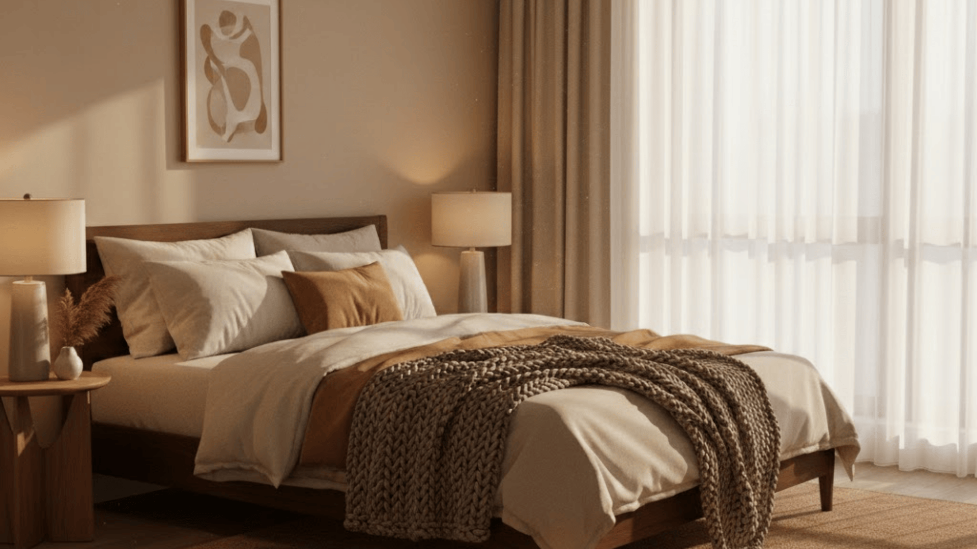
1. Establishing Cozy Intimacy
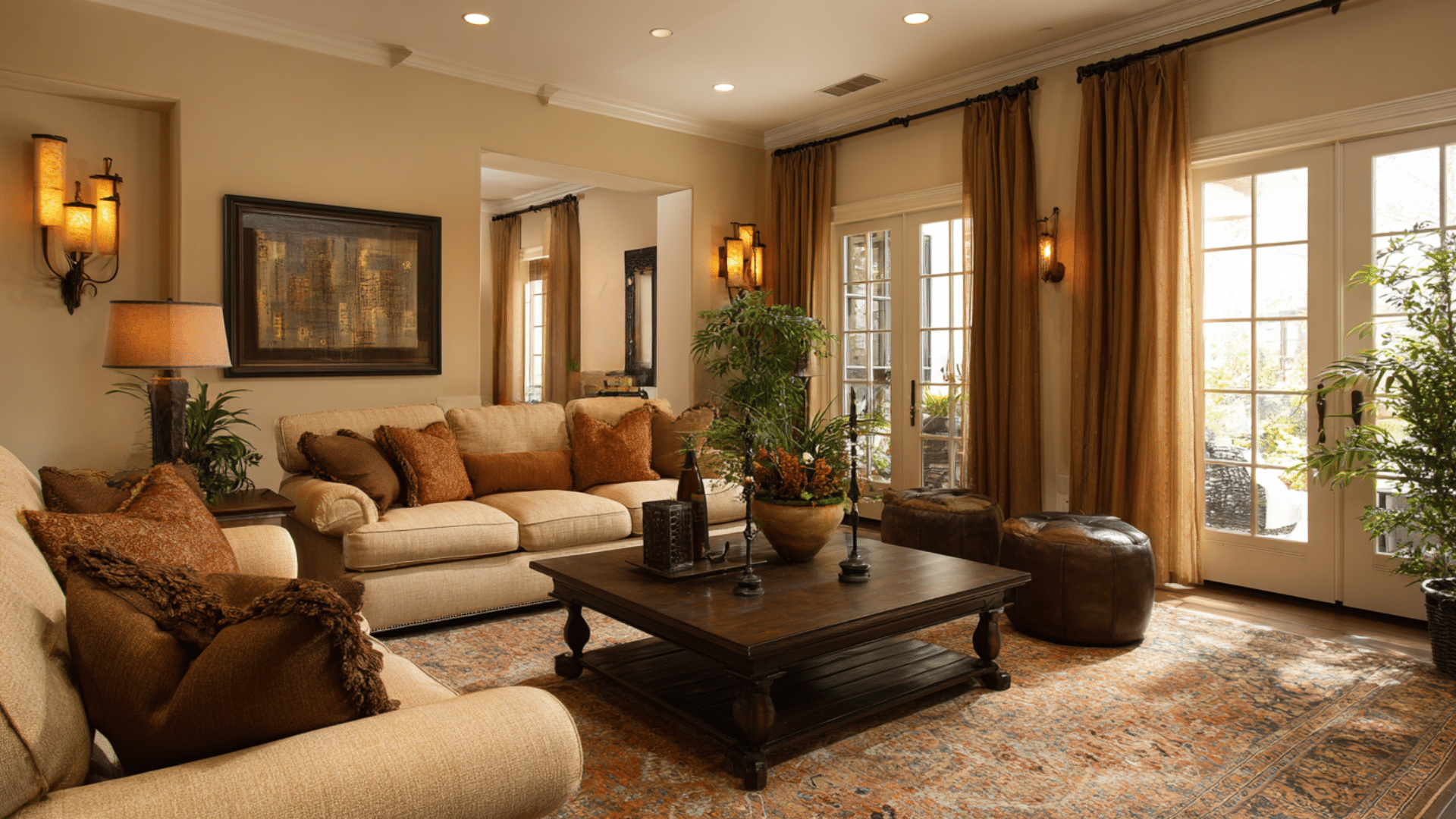
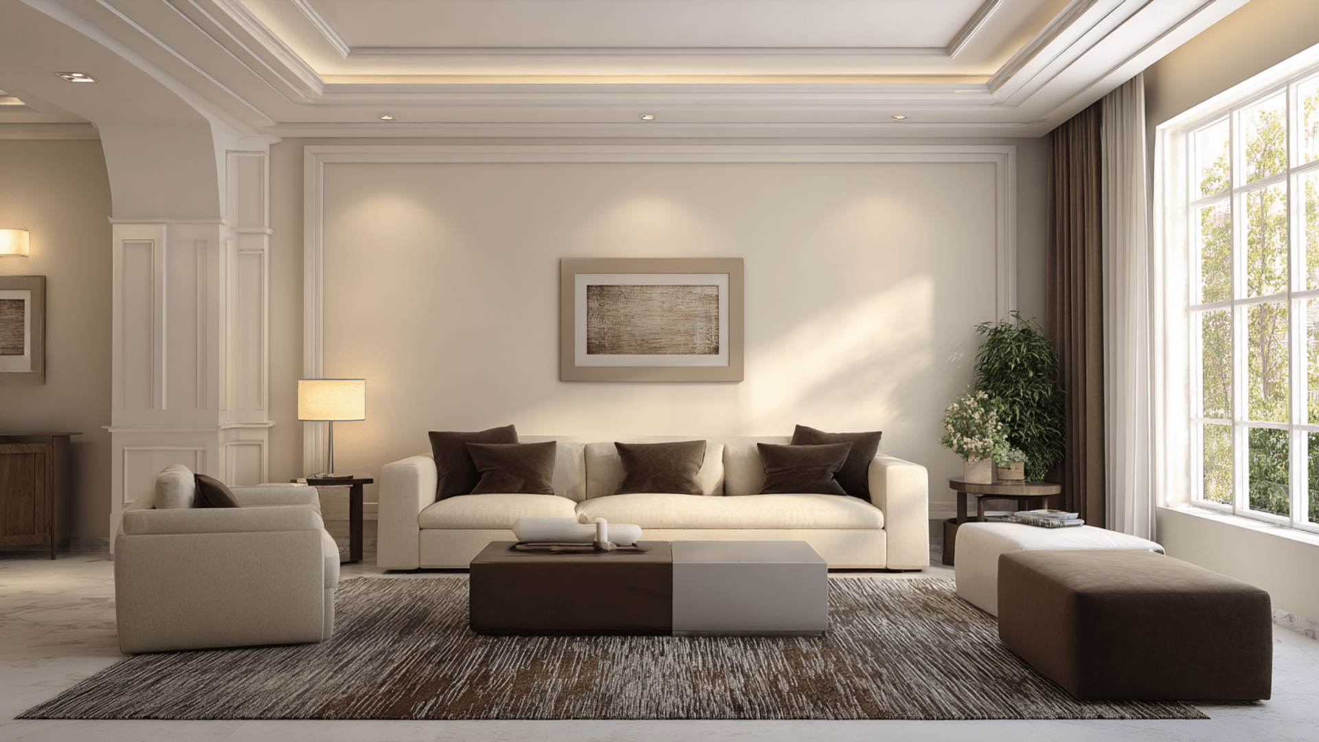
Warm color gradation makes large rooms feel more intimate. Start with light cream walls, add medium caramel furniture, then deep chocolate accents.
This progression draws people closer together and creates comfortable conversation spaces.
2. Creating Calm in Busy Areas
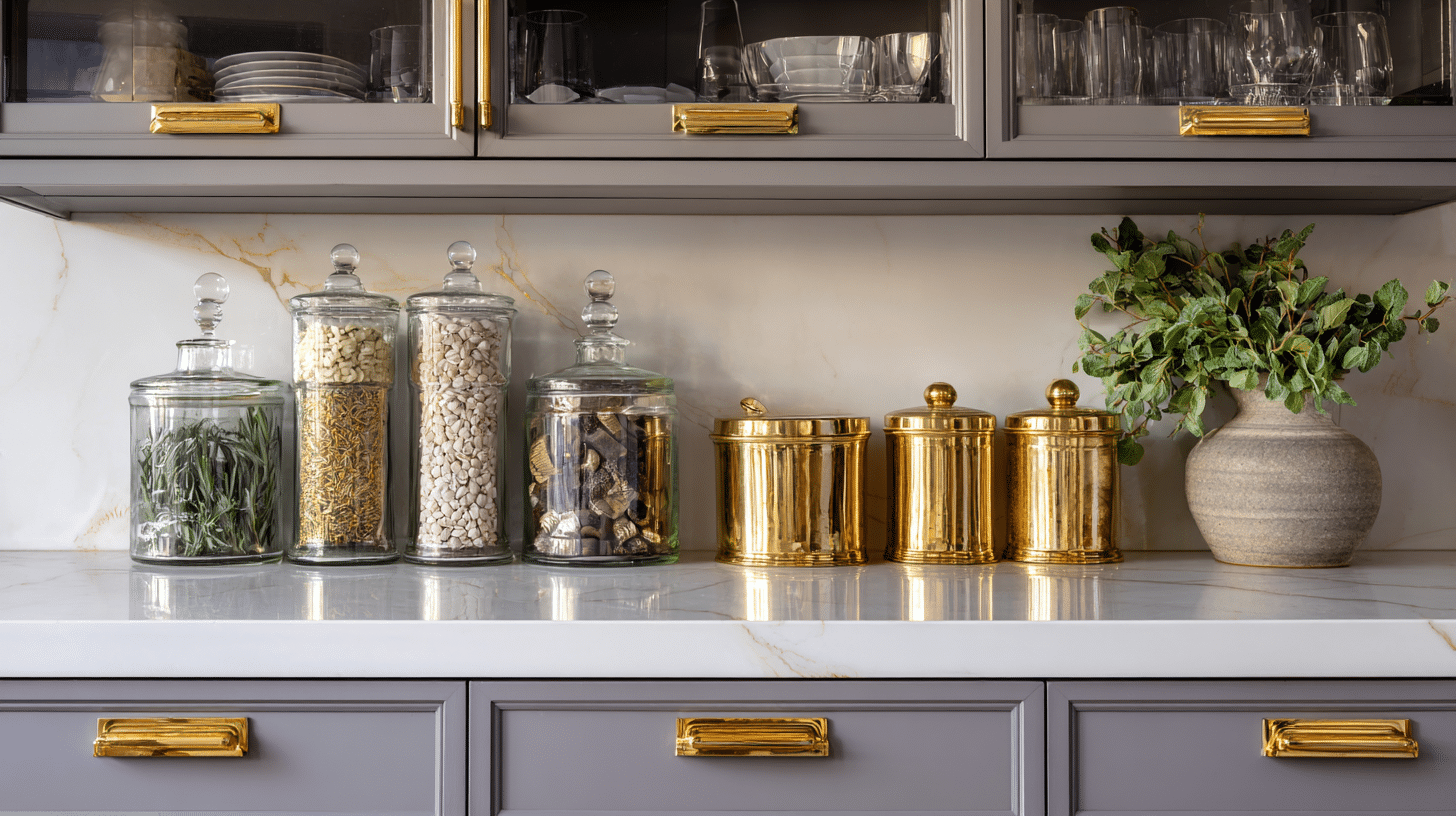
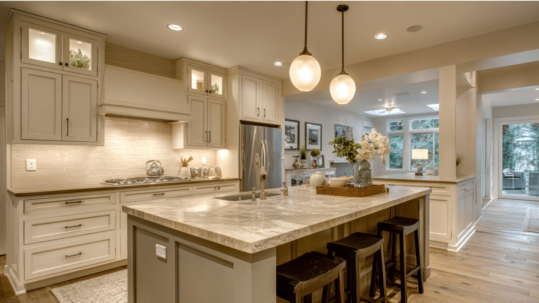
Repeated elements bring order to chaotic spaces. In busy kitchens, matching cabinet hardware, similar-sized containers, and consistent countertop styling create a peaceful rhythm.
Your eye stops jumping around and settles into comfortable patterns.
3. Adding Energy to Boring Rooms
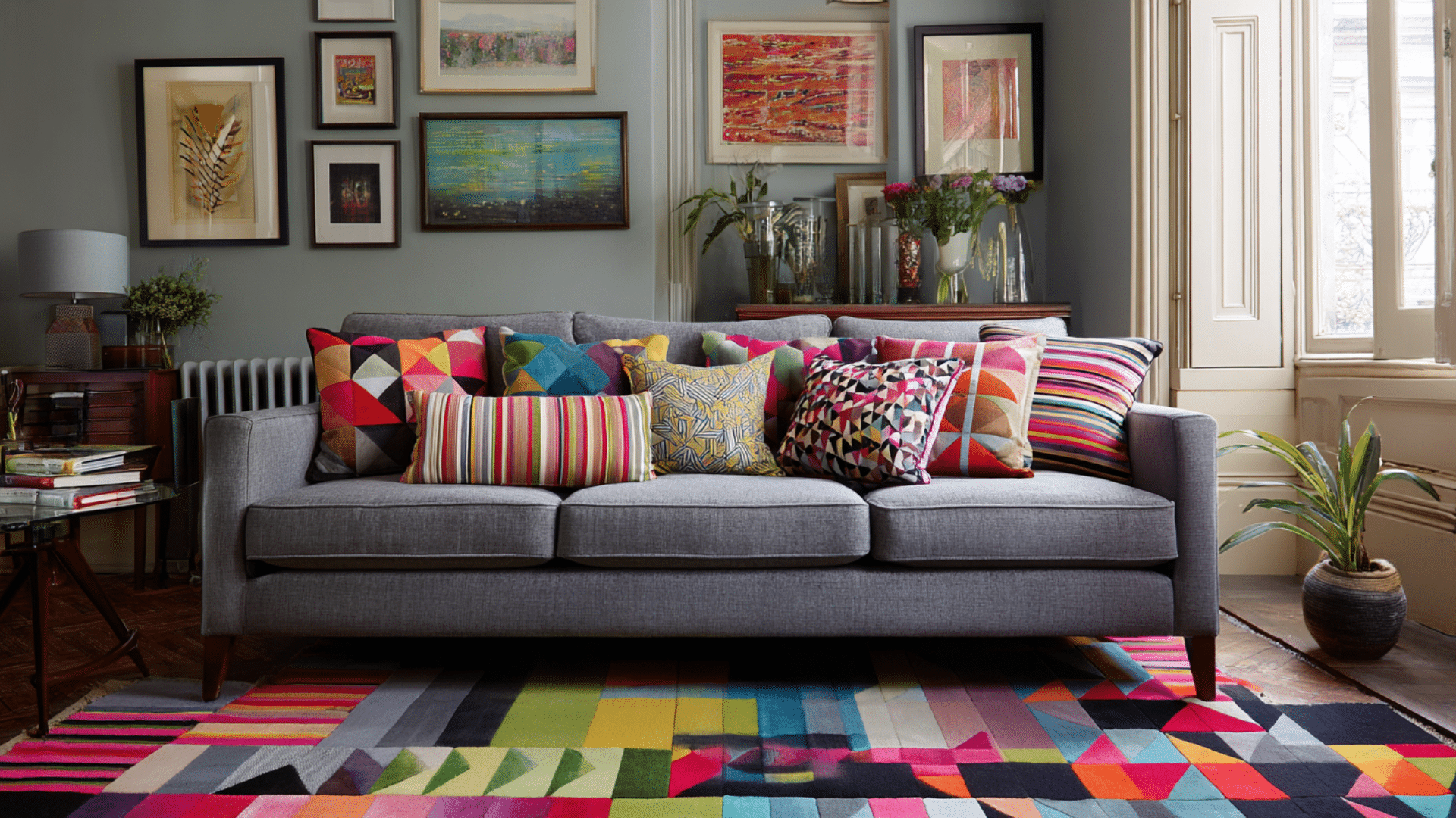
Alternating patterns instantly enliven dull spaces. Mix striped pillows with solid furniture, then add geometric rugs.
This back-and-forth rhythm creates visual excitement without overwhelming the room’s overall balance and harmony.
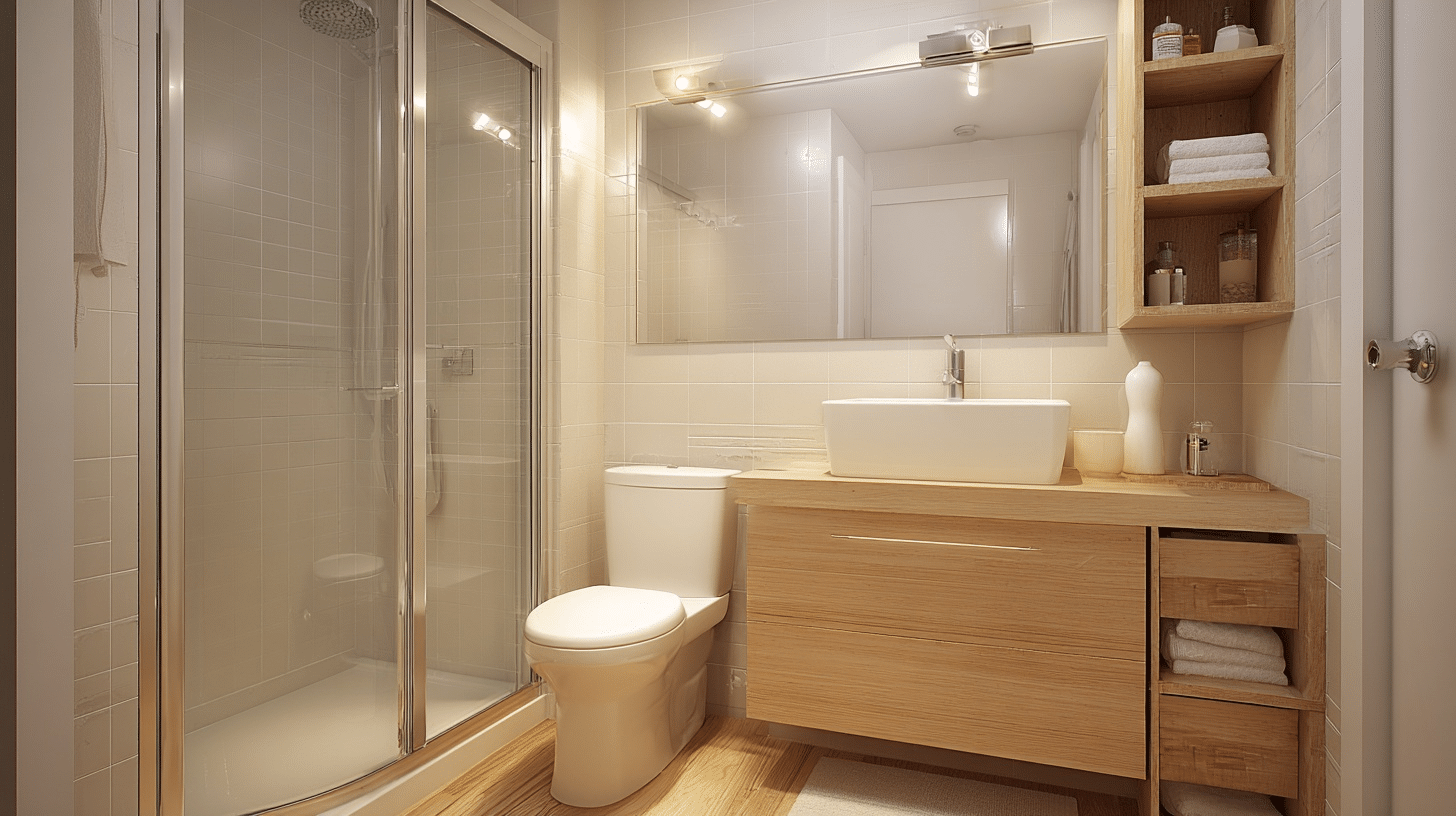
4. Making Small Spaces Feel Larger
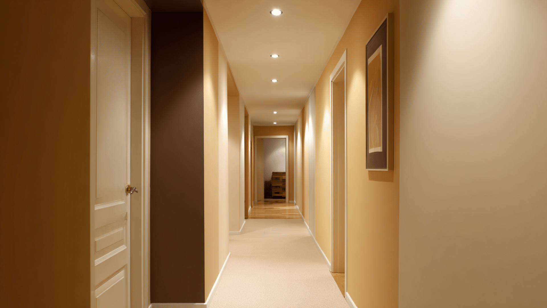
Gradual color transitions from light to dark create visual depth. Light walls, flowing into medium furniture and darker accents, trick the eye into perceiving more space.
This technique works especially well in tiny apartments and narrow hallways.
5. Connecting Different Areas

Gradual transitions help open floor plans feel cohesive rather than scattered. Kitchen blues flow into living room grays, then bedroom whites.
This color progression unifies separate areas while maintaining each space’s individual character and function.
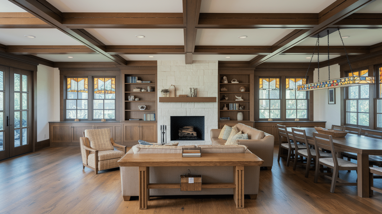
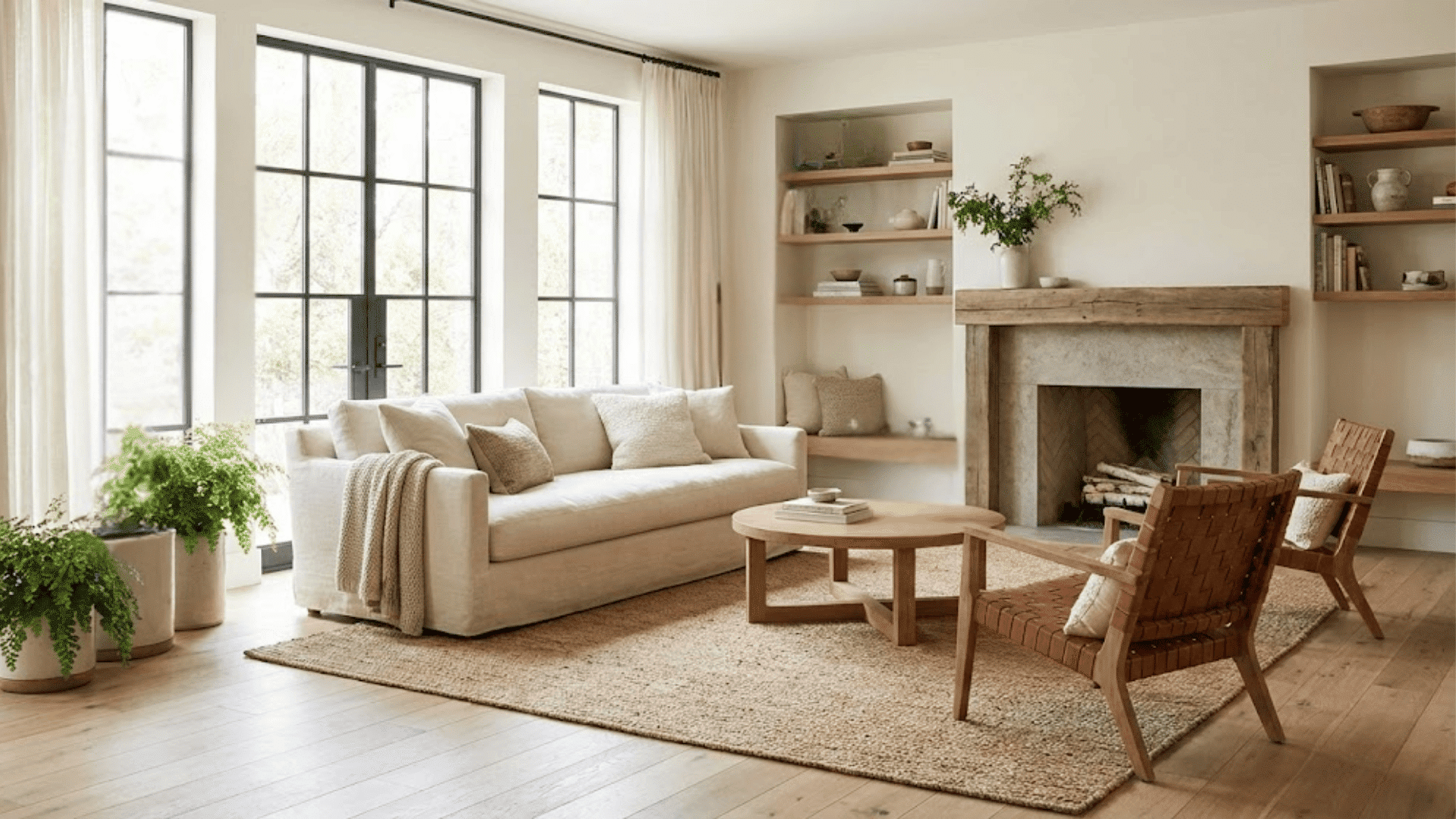
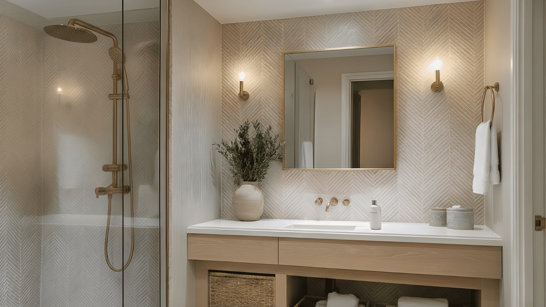
6. Building a Refined Experience
Subtle texture gradation elevates the calm level of any room. Layer smooth marble counters with soft linen curtains and rough natural wood.
This careful progression creates expensive-looking depth that impresses without trying too hard.
7. Guiding Traffic Flow
Strategic placement of repeated elements naturally directs movement through homes.
Matching light fixtures, similar artwork heights, or consistent flooring materials create invisible pathways that feel intuitive and help guests move comfortably.
Knowing these effects helps you create intentional moods and solve common design problems in your home.
Mistakes to Avoid
- Avoid creating jarring jumps between elements, as this disrupts the rhythm and makes rooms feel chaotic. Avoid using too many different patterns or colors without gradual transitions.
- Skip overdoing repetition, which creates boring, monotonous spaces. You need variety within your rhythm to keep things interesting.
- Don’t ignore scale relationships. Tiny patterns next to huge ones without medium-sized bridges look disconnected and awkward.
- Avoid placing all your dark or light elements in one area. This creates visual weight imbalances that feel uncomfortable and unplanned.
- Most importantly, don’t rush the process; building a good rhythm takes time and careful consideration.
Tips for Getting It Right
Getting rhythm and gradation right takes practice, but these insider tips will speed up your success and help you avoid common pitfalls.
- Start with three elements, then build gradually
- Trust your instincts. If something feels off, adjust
- Take photos to spot rhythm problems you missed
- Walk through your space multiple times before finalizing
- Mix warm and cool tones within your gradation
Rhythm and gradation aren’t just fancy design terms – they’re what make some homes feel effortlessly beautiful while others feel scattered and uncomfortable.
You now have the tools to convert any space.
Whether organizing books by height, creating color flows, or layering textures, these techniques create a polished, cohesive look.
The difference between a house and a home often comes down to rhythm.
When your spaces feel harmonious, you’ll notice how much more comfortable and happy you feel every day.