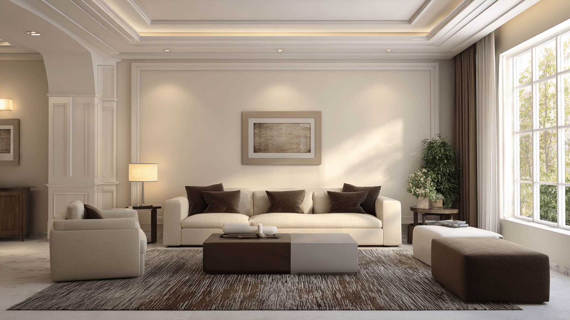
You’ve probably seen those jaw-dropping rooms where walls, trim, and ceiling all share the same rich color. It looks bold. It looks modern.
But you might be wondering if it’s something you can pull off in your own space.
I’m here to show you that color drenching is easier than you think. And the results can completely change how a room feels.
In this blog, I’ll break down everything you need. You’ll learn the best colors, pros and cons, and simple steps to try it yourself
What is Color Drenching?
It is a painting technique where you cover an entire room in one color. That means walls, ceiling, trim, and sometimes even the floor get the same shade or tones from the same color family.
It creates a wrapped, cocooned effect. Instead of breaking up the space with white trim or contrasting ceilings, everything flows together.
The result is a room that feels more unified and often more spacious. It’s bold but surprisingly easy to execute.
| Pros | Cons |
|---|---|
| Makes small rooms feel larger by removing visual breaks | Can feel overwhelming if you choose the wrong color |
| Creates a sophisticated, designer look | Requires more paint since you’re covering everything |
| Hides architectural flaws and imperfections | Mistakes are more noticeable with one dominant color |
| Works with any color, light, dark, or bold | May decrease resale appeal for conservative buyers |
| Adds depth and mood to boring spaces | Needs good lighting to avoid a cave-like feel |
| Easier than coordinating multiple paint colors | Touch-ups must match exactly, or they’ll stand out |
| Makes furniture and decor pop as focal points | Commitment can feel intimidating for beginners |
The Psychology of Color Drenching
Color drenching has a greater impact on how we feel in a space than traditional painting does.
When one color surrounds you, it creates an immersive experience.
Blues calm the mind and lower stress levels. Greens bring nature indoors and promote relaxation. Warm tones like terracotta make rooms feel cozy and inviting.
The monochromatic approach removes visual clutter, which helps the brain relax. Your eyes don’t jump from color to color.
Instead, everything feels unified and peaceful. That’s why color-drenched rooms often feel more comfortable than expected.
How to Color Drench Your Room?
Color drenching might sound complicated, but it’s actually one of the simpler paint projects you can tackle.
Let me walk you through the steps.
1. Choose Your Color Carefully
Start by picking a color you truly love. You’ll be seeing it everywhere. Test paint samples on different walls and watch how the light changes throughout the day.
Consider the room’s purpose and the mood you want to create before committing.
2. Prep the Space Properly
Remove furniture or move it to the center and cover it with drop cloths.
Clean the walls, ceiling, and trim to remove dust and grease. Fill any holes or cracks with spackling compound. Sand rough spots smooth.
Good prep makes painting easier and results better.
3. Pick the Right Finish
Different sheens work for different surfaces.
Matte or eggshell finishes hide imperfections on walls and ceilings. Semi-gloss works well on trim since it’s more durable and easier to clean.
You can use the same color in multiple finishes to add subtle dimension and visual interest.
4. Start with the Ceiling
Always paint the ceiling first to avoid drips on freshly painted walls.
Use a roller with an extension pole to reach without a ladder. Cut in around the edges with a brush first, then fill in the middle sections.
Let it dry completely before moving on.
5. Paint the Walls Next
Once the ceiling is dry, tackle the walls using the same cut-in-then-roll technique.
Work in sections from top to bottom. Apply two coats for even coverage, letting the first coat dry fully before adding the second.
Consistency matters when you’re covering this much surface area.
6. Finish with the Trim
Paint all trim, baseboards, door frames, and window frames last.
Use a small, angled brush for precision and control. Tape off adjacent areas if needed, but a steady hand often works better.
The trim pulls the whole look together, so take your time here.
7. Add Complementary Accents
Once everything is dry, bring in furniture, artwork, and decor that complements your chosen color.
Neutrals, metallics, and natural textures work beautifully against a color-drenched backdrop. These accents will pop against the monochromatic background and complete the look you’re after.
Best Colors for Color Drenching
Not all colors work equally well for color drenched room. Some shades create the depth and mood you want, while others can fall flat.
1. Navy
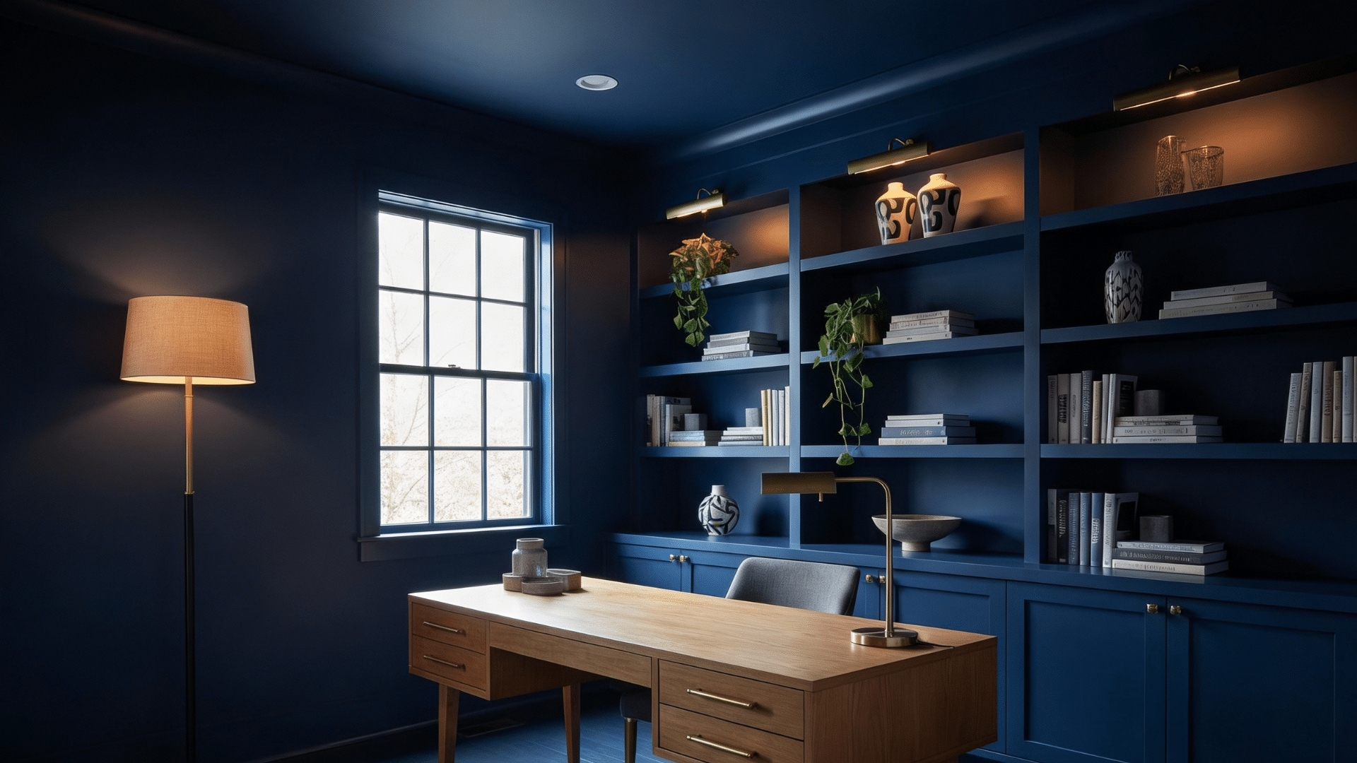
Navy creates a calming atmosphere that feels both classic and modern. It works beautifully in rooms where you want depth without darkness.
The color has enough richness to make a statement but remains flexible enough to pair with almost any decor style or accent color.
- Best Rooms: Bedrooms, home offices, libraries, dining rooms
- Texture Layering: Velvet cushions, linen curtains, wool throws, leather furniture
- Accent Furniture: Brass or gold hardware, natural wood pieces, white marble tables
- Lighting Tips: Use warm bulbs to soften the coolness, add table lamps for cozy corners
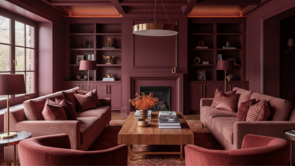
2. Maroon
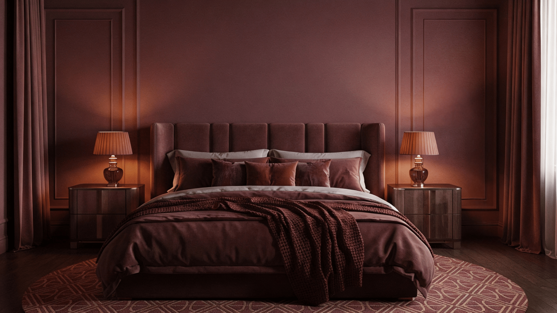
Maroon brings warmth to any space. It’s bold but not overcluttered, creating a comfortable feel.
This color works particularly well in rooms where you want intimacy and comfort. The deep red undertones add richness that makes everything feel more luxurious and intentional.
- Best Rooms: Dining rooms, dens, home theaters, master bedrooms
- Texture Layering: Silk pillows, chenille throws, suede accents, textured wallpaper on one wall
- Accent Furniture: Dark wood pieces, antique brass fixtures, cream upholstered chairs
- Lighting Tips: Install dimmer switches, use candles for ambiance, and add wall sconces
3. Black
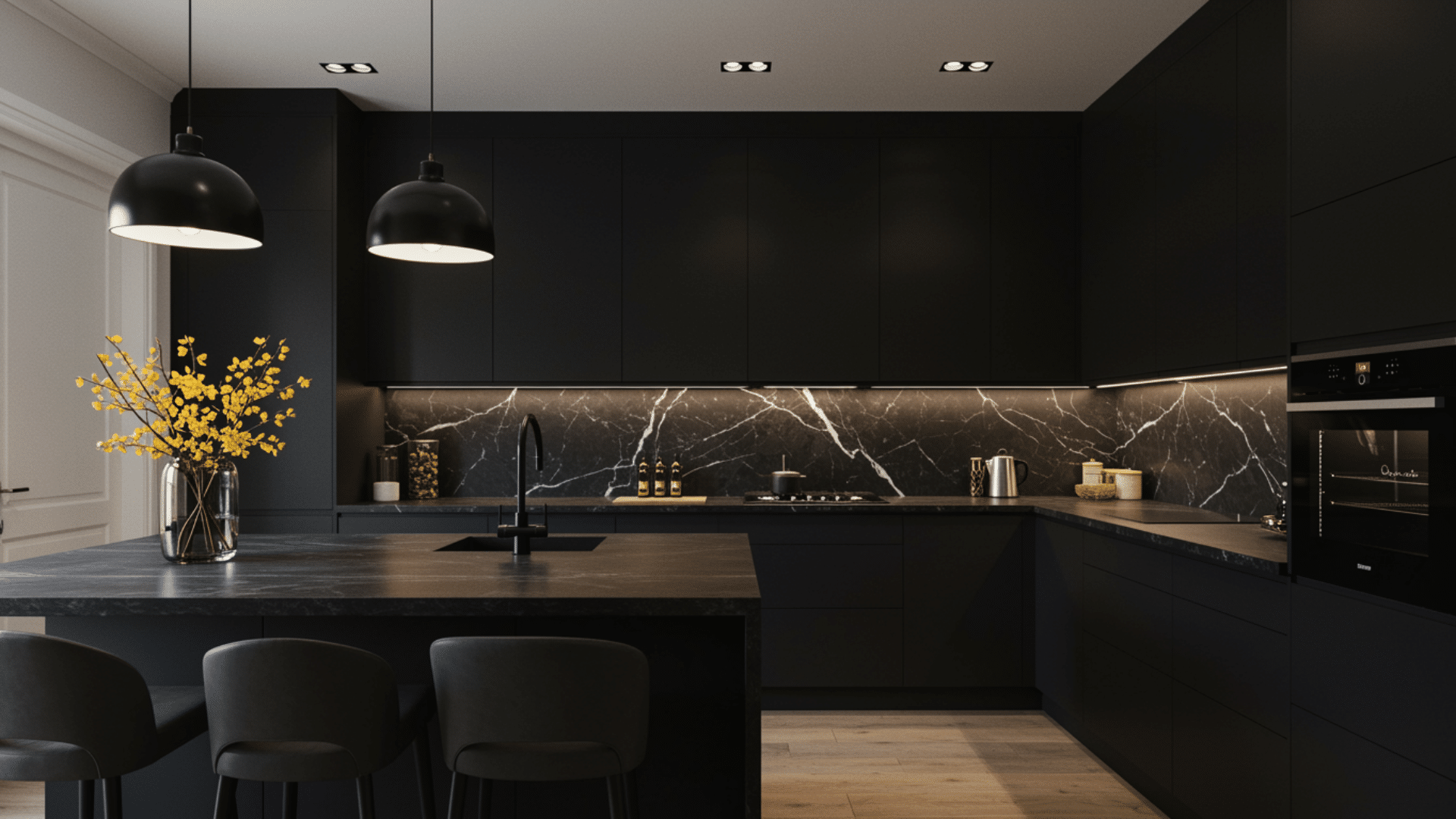
Black might seem extreme, but it creates incredible drama and makes rooms feel larger, not smaller.
The key is using matte or flat finishes that absorb light rather than reflect it. Black backgrounds make artwork and furniture stand out like they’re in a gallery, giving everything more visual impact.
- Best Rooms: Powder rooms, hallways, media rooms, modern kitchens
- Texture Layering: Matte and glossy black combinations, concrete, metal accents, glass elements
- Accent Furniture: White or cream pieces, colorful art, chrome or silver hardware
- Lighting Tips: Layer multiple light sources, use bright bulbs, and add mirrors to bounce light
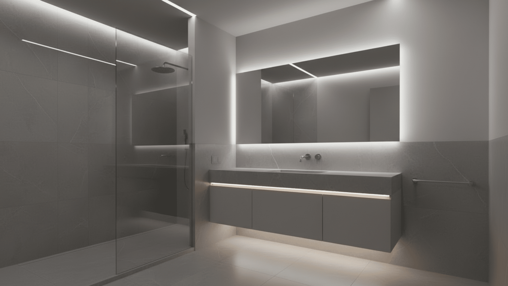
4. Flat White
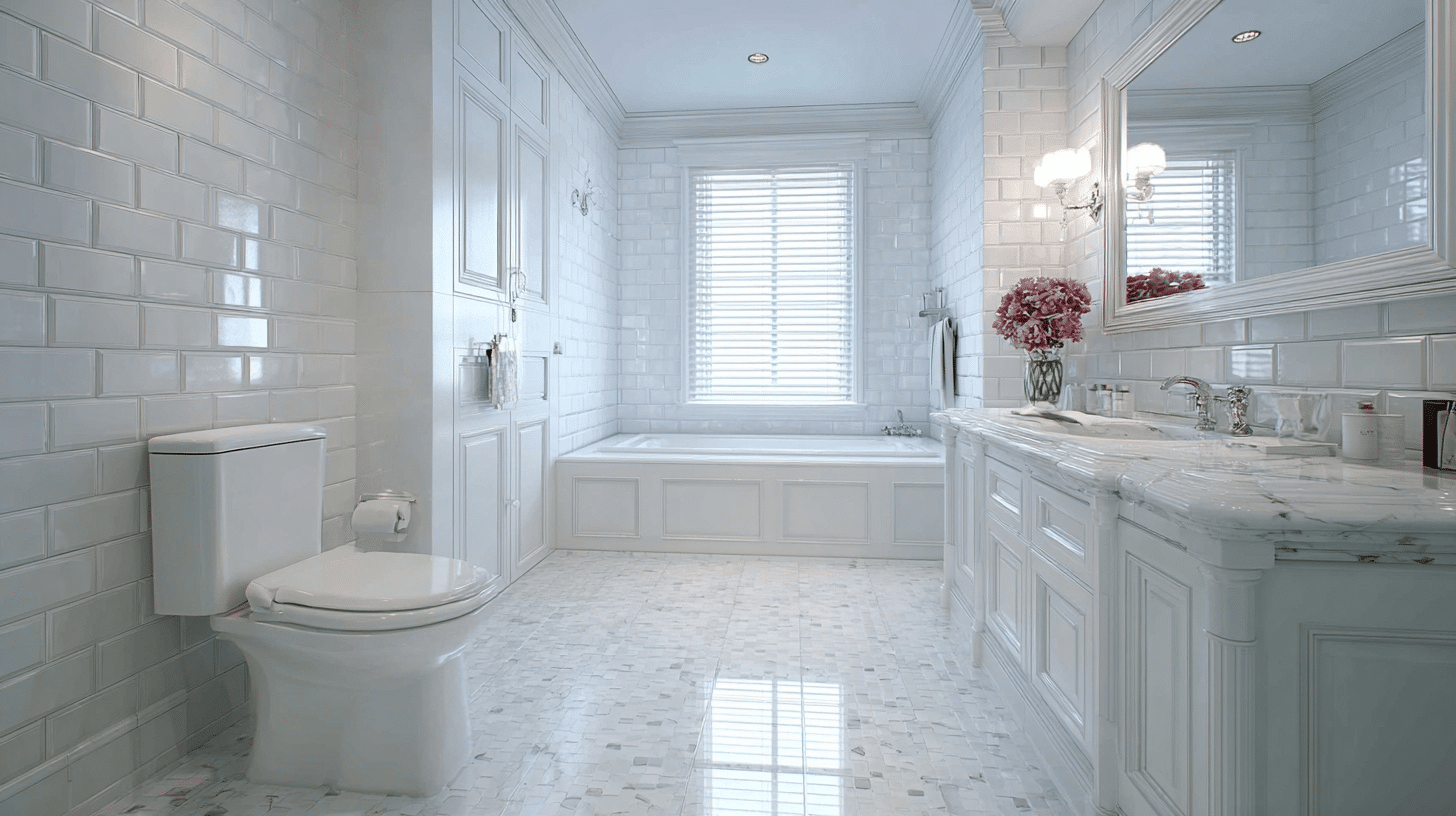
Flat white creates a clean, gallery-like space that feels modern and classic. It’s not stark or cold like bright white; it has warmth and depth.
This color makes rooms feel larger and brighter while providing a perfect canvas for your furniture and art to become the focal points.
- Best Rooms: Living rooms, galleries, minimalist bedrooms, bathrooms
- Texture Layering: Linen, cotton, natural wood, concrete, plaster finishes, ceramic
- Accent Furniture: Any color works, natural wood tones, black metal, colorful upholstery
- Lighting Tips: Use layered lighting to prevent flatness, add statement fixtures, and natural light shines here
5. Sky Blue
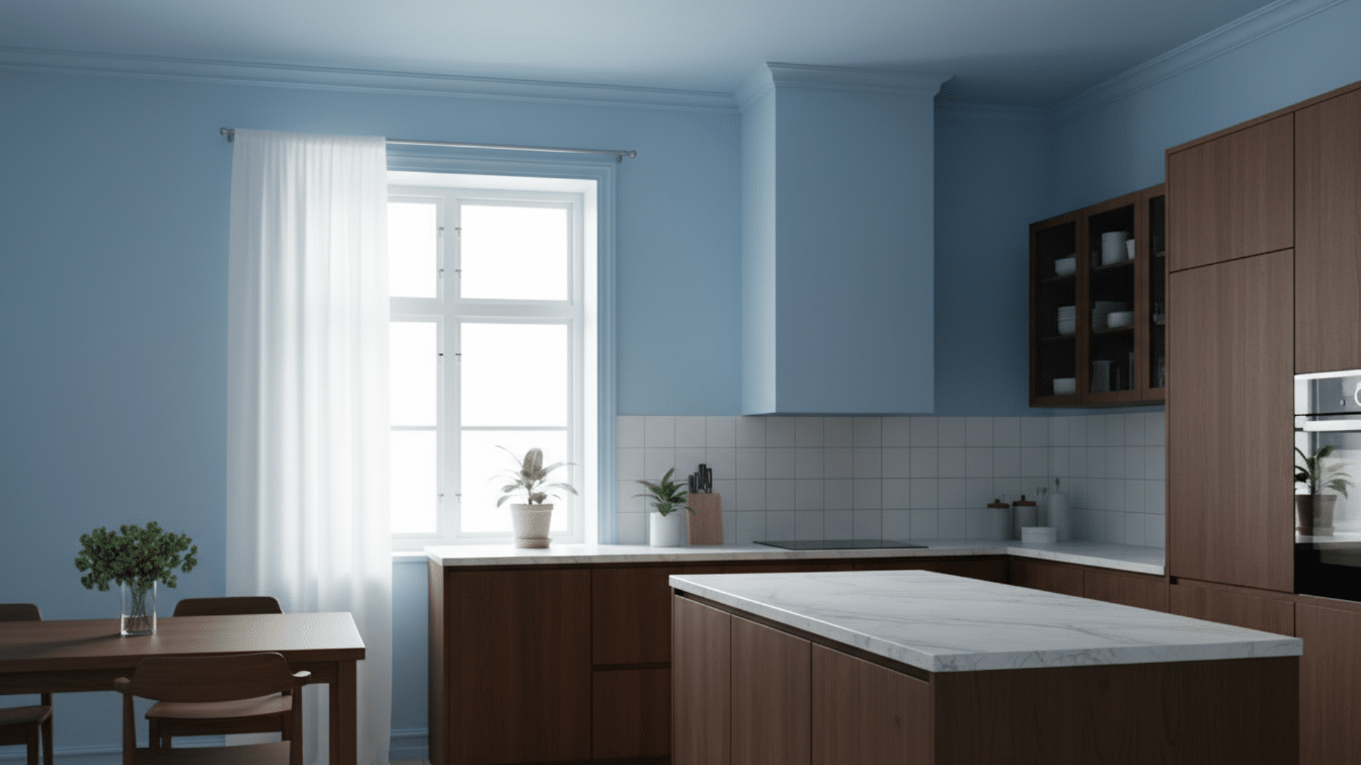
Sky blue creates an airy, open feeling that makes rooms feel bigger and brighter. It’s cheerful without being childish and calm without being boring.
This shade works particularly well in spaces with limited natural light because it brings its own sense of brightness and openness to the room.
- Best Rooms: Bathrooms, kitchens, sunrooms, children’s rooms
- Texture Layering: White linens, jute rugs, ceramic accessories, wood accents
- Accent Furniture: White furniture, light wood tones, wicker pieces, clear glass
- Lighting Tips: Maximize natural light, use bright bulbs, and add skylights if possible
6. Pink
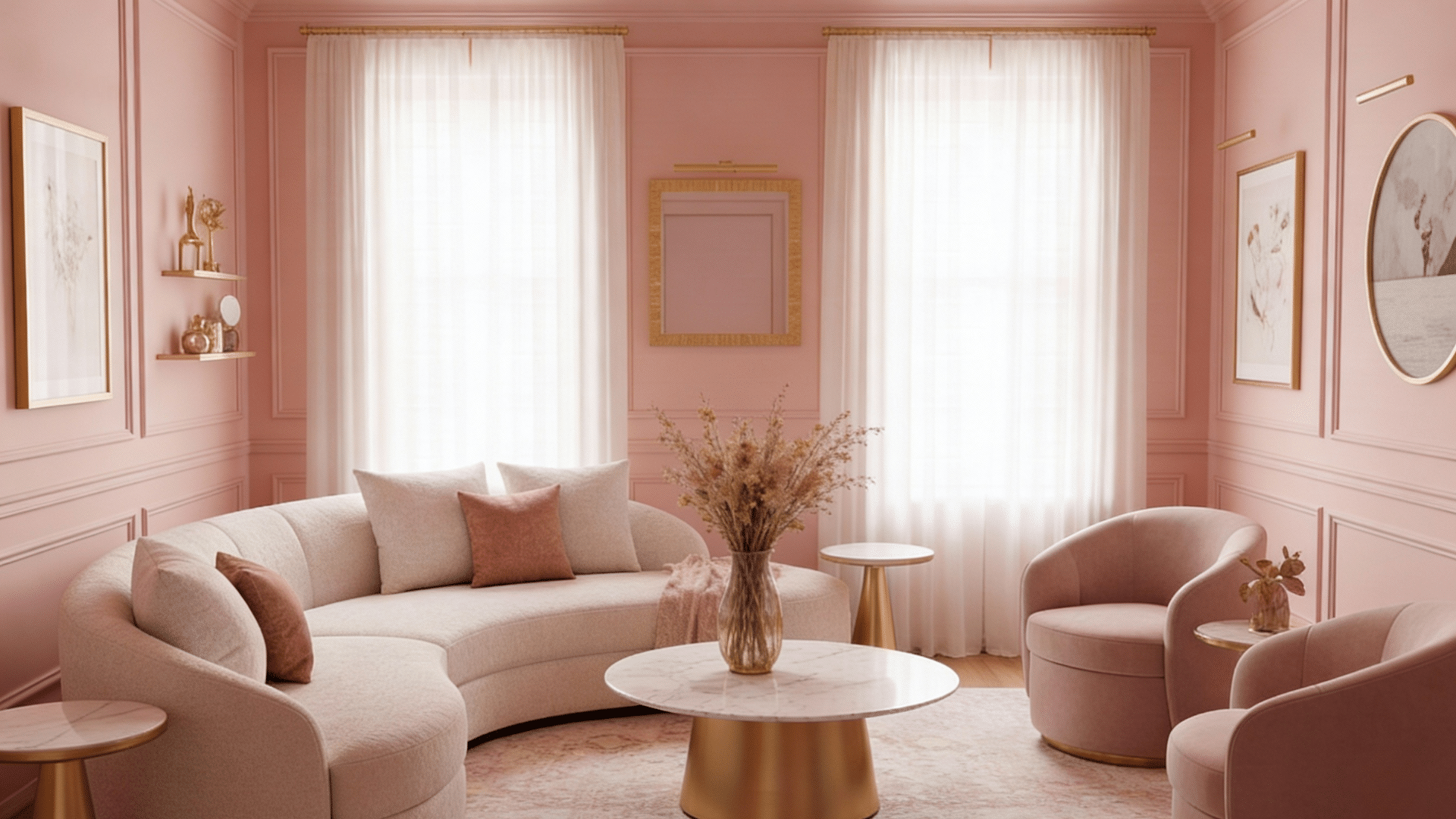
Pink has evolved beyond nurseries and now works in every space.
Deeper shades like dusty rose or terracotta pink create personality.
This color makes rooms feel welcoming and happy. It pairs beautifully with both modern and traditional decor, offering more flexibility than you might expect.
- Best Rooms: Bedrooms, dressing rooms, home offices, living rooms
- Texture Layering: Velvet, faux fur, knitted throws, satin pillows
- Accent Furniture: Gold or rose gold hardware, green plants, marble surfaces
- Lighting Tips: Use warm-toned bulbs, add pink-tinted shades, and layer ambient lighting
7. Rich Green
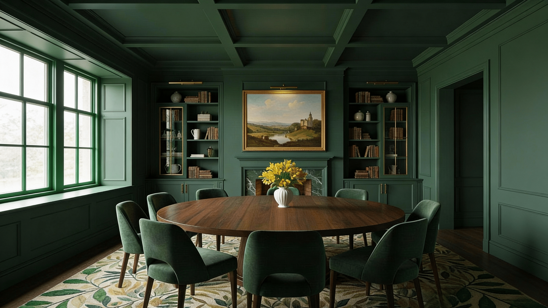
Rich green brings the outdoors in and creates a grounding, natural atmosphere. Think forest or sage, not lime. This color feels fresh and timeless at once.
It works especially well in modern and traditional homes alike, making it one of the most versatile options for color drenching.
- Best Rooms: Living rooms, bedrooms, dining rooms, home offices
- Texture Layering: Leather, wood, plants, stone accents, linen fabrics
- Accent Furniture: Natural wood, brass fixtures, cream or tan upholstery
- Lighting Tips: Use warm bulbs to enhance coziness, add floor lamps, and maximize natural light
8. Soft Grey
Soft grey is one of the best colors for drenching because it feels neutral yet intentional. It creates a calming backdrop that works with any decor style.
This shade adds depth without being heavy or dark, making rooms feel polished and pulled together effortlessly.
- Best Rooms: Bedrooms, living rooms, bathrooms, offices, modern kitchens
- Texture Layering: Knitted throws, linen curtains, marble, concrete, faux fur, wool rugs
- Accent Furniture: White pieces, natural wood, pops of color, metallic finishes
- Lighting Tips: Use warm bulbs to avoid coldness, layer ambient and task lighting, and add dimmers
9. Warm Burnt Orange
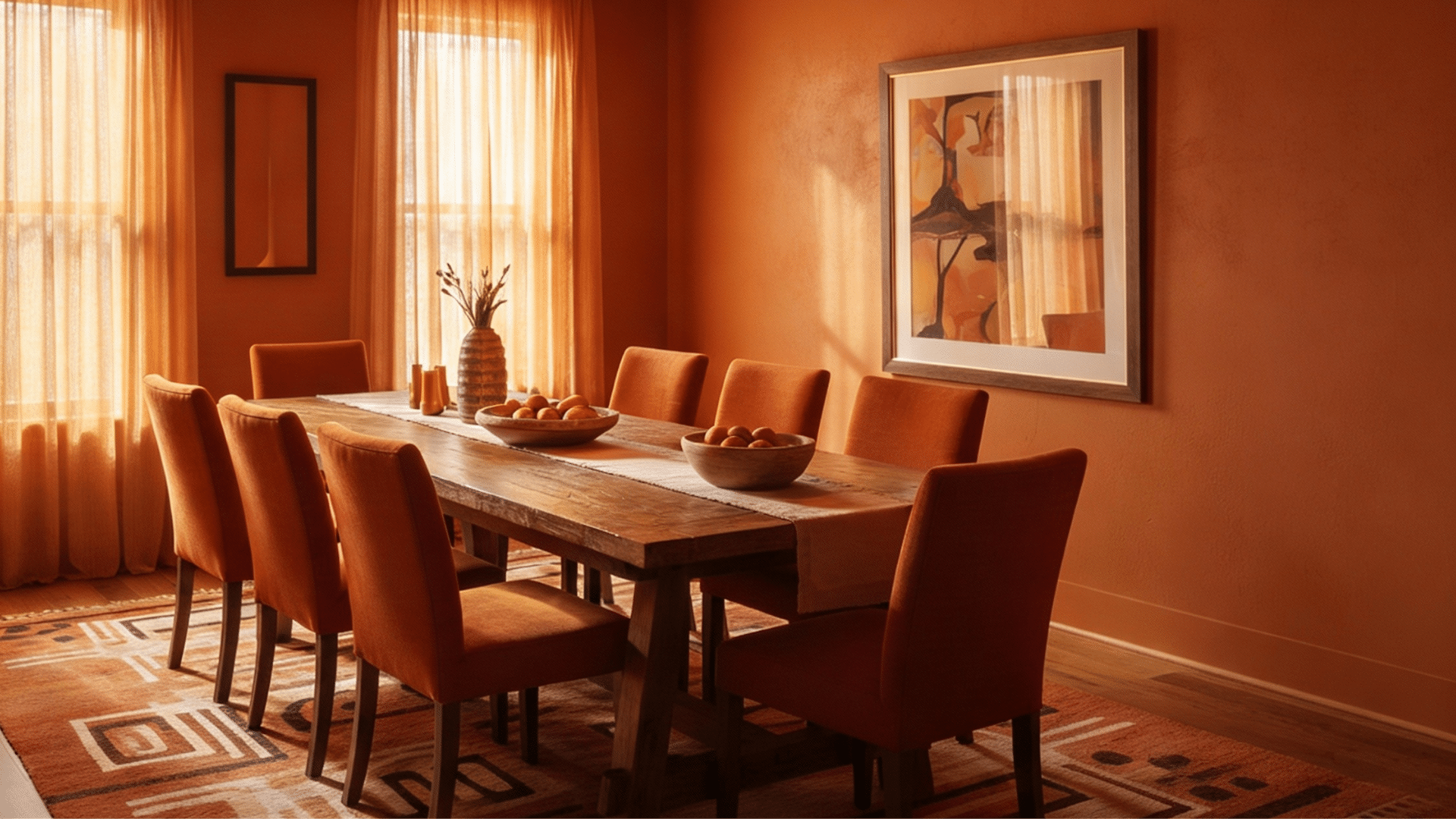
Burnt orange adds energy and warmth without being too aggressive. It’s earthy and grounding, creating an atmosphere that feels both retro and current.
This color works particularly well in rooms where you gather and socialize. The warm tones make everyone look good and feel comfortable.
- Best Rooms: Dining rooms, kitchens, lounges, creative studios
- Texture Layering: Terracotta pots, woven textiles, wood, ceramic tiles, macramé
- Accent Furniture: Dark wood, black metal, cream or tan fabrics, vintage pieces
- Lighting Tips: Use Edison bulbs for warmth, add pendant lights, and golden hour glow
10. Charcoal
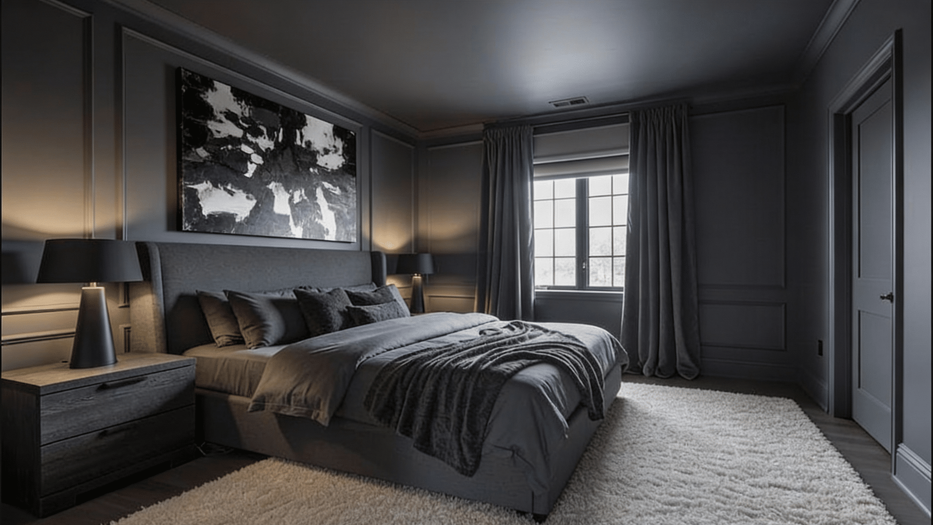
Charcoal is softer than black but still delivers intensity and refinement.
It’s easier to live with than pure black while maintaining that moody, cocooned feeling.
This color hides imperfections well and creates a perfect backdrop for lighter furniture and bold artwork to really shine and pop.
- Best Rooms: Bedrooms, home offices, basements, accent walls in open spaces
- Texture Layering: Wool, concrete, metal, matte and glossy combinations, and industrial elements
- Accent Furniture: Light wood, white pieces, pops of color, metallic accents
- Lighting Tips: Add multiple light sources, use bright task lighting, and incorporate floor lamps
11. Golden Yellow
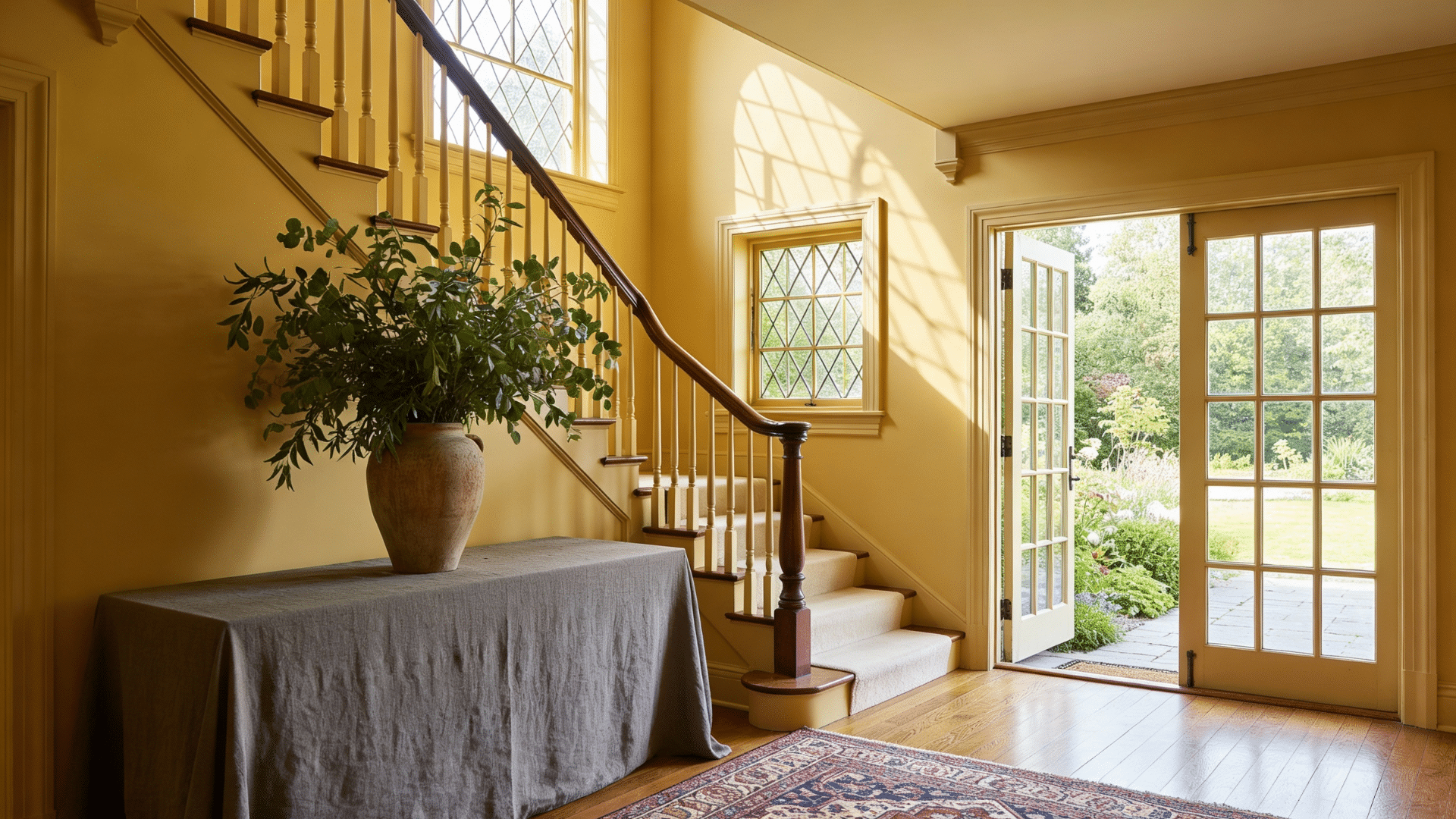
Golden yellow brings sunshine into any room and creates instant happiness. It’s warm without being too bright or harsh.
This color makes spaces feel cheerful and energized. The golden undertones add refinement that prevents it from feeling too youthful or intense in larger applications
- Best Rooms: Kitchens, breakfast nooks, entryways, creative spaces
- Texture Layering: Natural fibers, wood, brass, ceramic, woven elements
- Accent Furniture: White furniture, natural wood, green plants, gray accents
- Lighting Tips: Use warm white bulbs, maximize natural light, and add statement fixtures
Dos and Don’ts in Color Drenching
Color drenching gives you a lot of creative freedom, but there are some smart guidelines to follow.
| Dos | Don’ts |
|---|---|
| Test your color with large samples on multiple walls | Don’t choose a color based only on tiny paint chips |
| Consider the room’s natural light before selecting a shade | Don’t ignore how artificial lighting affects the color at night |
| Use painter’s tape for clean lines between surfaces | Don’t skip taping if you’re not confident with freehand cutting |
| Apply at least two coats for even, rich color coverage | Don’t assume one coat will be enough, even with good paint |
| Keep the same color family, but vary finishes for depth | Don’t use high-gloss everywhere; it shows every imperfection |
| Clean and prep all surfaces before you start painting | Don’t paint over dirty walls, grease, or peeling old paint |
| Remove outlet covers and hardware before painting | Don’t paint around them; it looks messy and unprofessional |
| Let each coat dry completely before adding the next | Don’t rush the drying time, or you’ll get streaks and marks |
| Start with rooms that get good natural light | Don’t try dark colors first in windowless or dim spaces |
Should You Color Drench Your Room?
Color drenching isn’t for everyone, and that’s okay. It depends on your style, your space, and how much change you’re ready for.
Consider these factors before committing:
- Your comfort with bold choices: This technique makes a statement, not a whisper.
- The room’s size and light: Small, bright rooms handle it better than large, dark ones.
- Your long-term plan: Will you tire of the color quickly?
If you love the idea but feel nervous, start small. Try a powder room or closet first.
You can always expand the technique to larger rooms once you see how it works and feels in real life.
Wrapping Up
Color drenching changes rooms in ways traditional painting just can’t match.
You wrap your space in one color, and suddenly everything feels more intentional, more designed, more you.
The technique itself is straightforward. You’ve got the steps, the color options, and the tips to make it work.
What room will you try first?
Grab some paint samples this weekend and see which shade speaks to you, and don’t forget to let us know how it went.