Most living room paint decisions happen backwards — people fall in love with a color on a swatch and figure out the rest later.
That’s usually why things go wrong.
A well-chosen living room color scheme does three things: it sets a mood, it makes your furniture look more deliberate, and it makes the whole room easier to live in.
Here are some of the combinations that hold up – from calm and understated to bold and characterful.
Four Steps Before You Buy a Paint Can
There are a few smart steps that make the decision much easier.
1. Consider room lighting
Natural light changes how a color looks throughout the day. A shade that looks perfect in the store might look completely different on your wall.
North-facing rooms tend to feel cooler, so warm tones can help balance that.
South-facing rooms get plenty of light and can handle both warm and cool colors well.
2. Match colors with furniture and flooring.
Your living room colors need to work with what’s already in the room.
Warm wood floors pair well with earthy tones like olive, ochre, and cream. Cool gray flooring suits blues, purples, and soft neutrals.
Always consider the full picture before choosing a shade.
3. Use accent colors wisely.
You don’t need to paint every wall to make an impact.
A well-chosen accent color through cushions, rugs, or a single feature wall can shift the feel of a room completely.
It’s a low-effort way to refresh your living room color scheme without a full repaint.
4. Test paint samples before committing.
Always test paint directly on the wall before buying a full tin.
Check it in the morning, afternoon, and evening — the same color can look completely different by 6pm than it did at 10am.
The swatch card is almost useless for this. Your wall is the only reliable test.
Living Room Color Scheme Ideas
A good palette does not just look pretty; it sets the mood, ties the furniture together, and makes the space feel like home.
These combinations below bring together trending shades and tried-and-tested pairings.
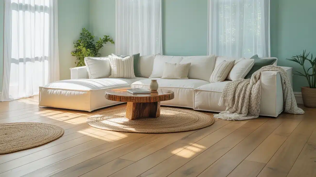
1. Dark Olive and Cream
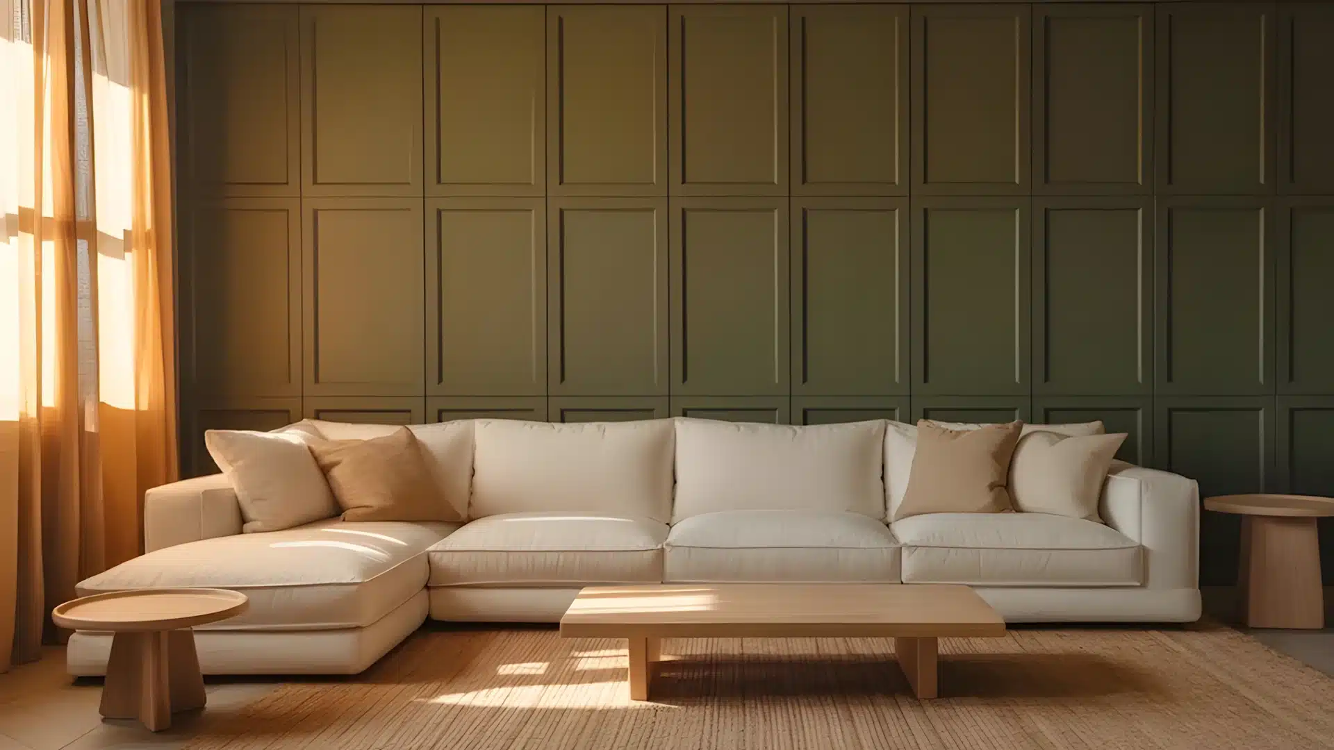
Alt text: A light beige sectional sofa sits on a textured rug before a dark olive green paneled wall, illuminated by warm light streaming through sheer amber curtains.
Dark olive brings depth and a natural, grounded feel to any living room.
Pair it with cream walls or soft furnishings, and the result is warm without feeling heavy. This combination works well in rooms with natural wood furniture or rattan accents.
Add a jute rug or linen cushions to bring the look together.
It’s one of the more grounded earthy combinations — harder to get wrong than it looks.
2. Lilac Purple and Soft Gray
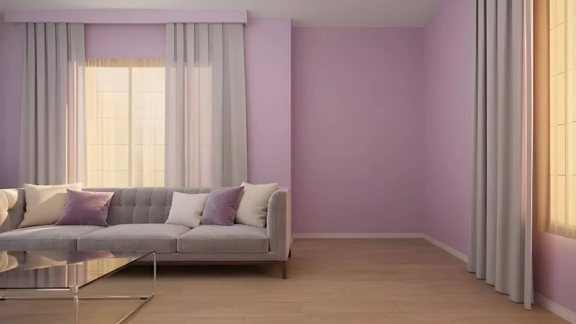
Alt text: Modern living room interior featuring lilac walls, light wood flooring, a gray tufted sofa with lavender and cream pillows, and sheer white curtains covering large windows.
Lilac brings a subtle hint of color without being overpowering. Soft gray keeps it grounded.
The result reads as calm rather than feminine, which surprises most people who write off lilac before trying it.
This pairing works well in rooms where you want color but don’t want anything too bold or committal.
Lilac reads differently depending on the light cooler in north-facing rooms, warmer and more pink in rooms with afternoon sun.
3. Saturated Mauve and Pearl
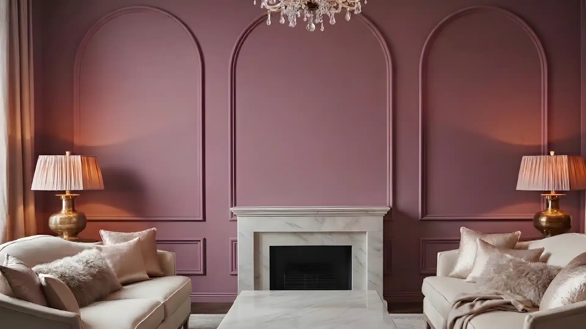
Alt text: Elegant living room featuring mauve paneled walls, a white marble fireplace, a crystal chandelier, and symmetrical beige sofas with plush pillows.
Mauve adds a soft, sophisticated touch without being too bold.
When paired with pearl a warm, slightly creamy white; the result feels refined and comforting.
A good pick if you want something warmer than standard gray-and-white but don’t want to commit to a full saturated color.
Velvet cushions or soft wool throws in deeper plum tones can add extra depth without pulling the room in a different direction.
4. Inky Blue and Off White
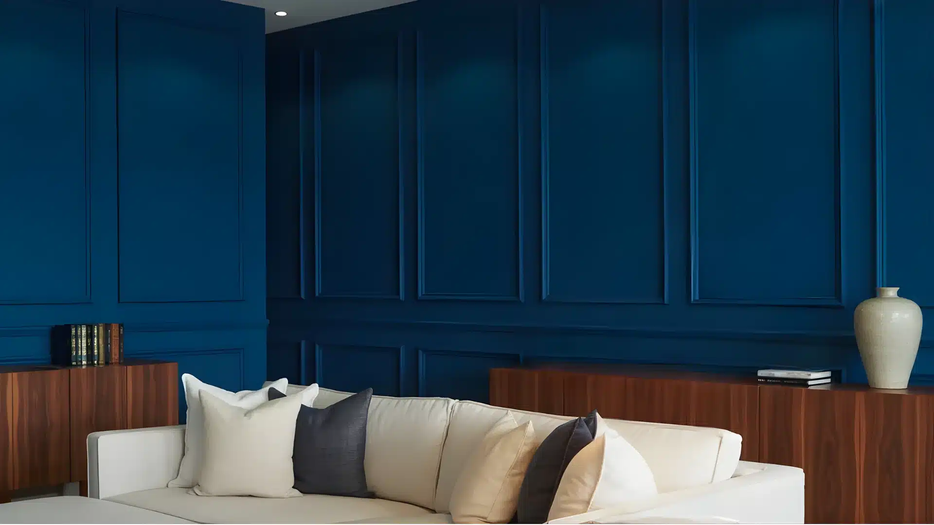
Alt text: A luxurious living room corner features a white sectional sofa against deep indigo blue paneled walls, complemented by dark wood sideboards and neutral throw pillows.
Deep, inky blue makes a strong visual statement.
Balance it with off-white, and it feels grounded rather than exhausting.
This living room color scheme works best in larger rooms. You know – in tight spaces, inky blue can feel oppressive. Warm brass or gold accessories complement it well and stop it reading too cold.
Keep the furniture simple and the accessories simple the color itself does most of the work here.
5. Slate Blue and Soft Gray
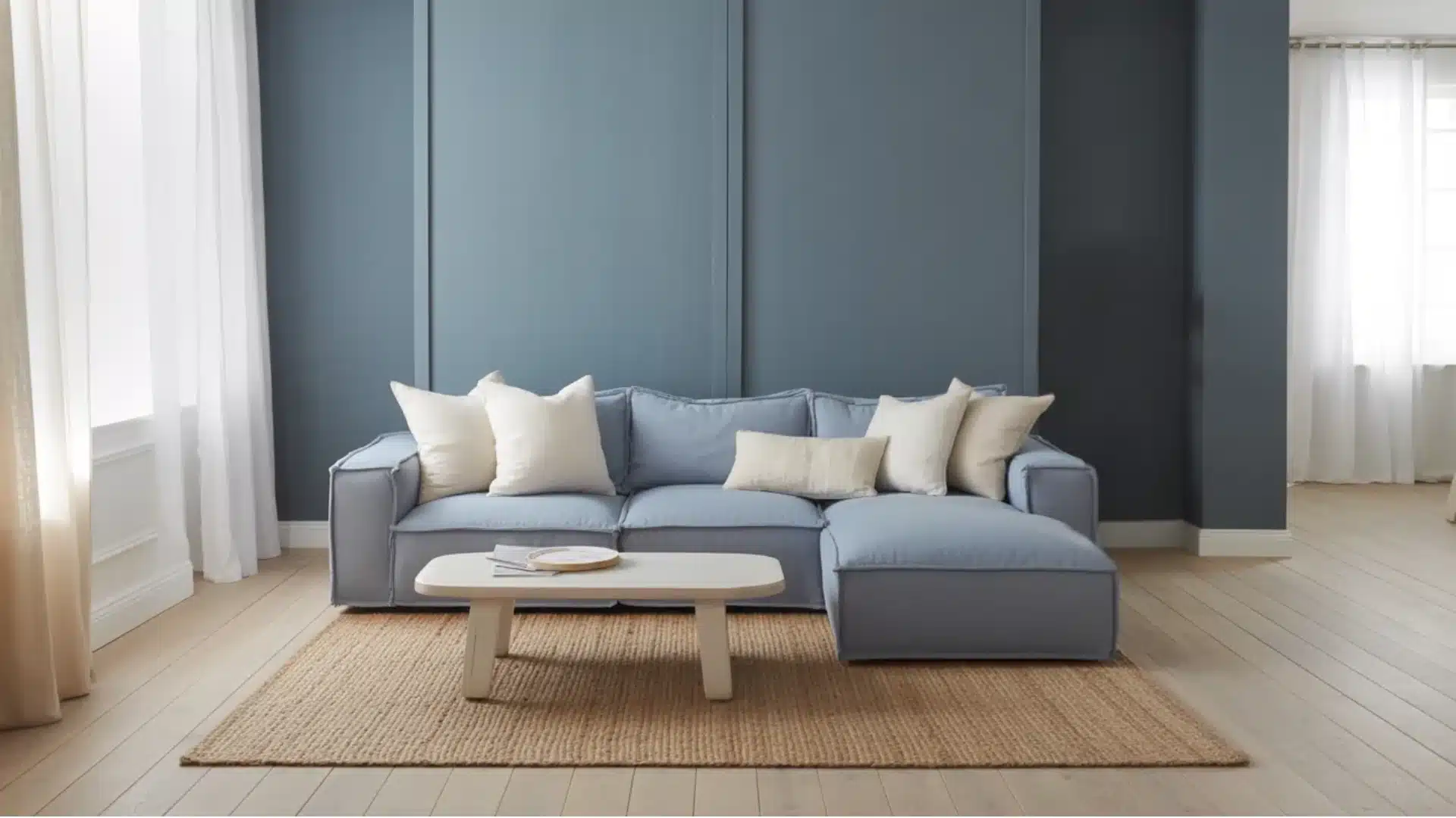
Alt text: A modern living room featuring a light blue sectional sofa with cream pillows, a small white coffee table, and a jute rug against a dark blue paneled wall and light wood flooring.
Slate blue and soft gray sit close together on the color spectrum, which makes them easy to pair.
This is calm, cool, and understated. This combination suits modern and Scandinavian-style interiors well.
Layer in different textures: chunky knit throws, linen cushions, and a wool rug, to stop the palette from feeling flat.
Without texture, this pairing can feel empty. With it, it’s one of the more timeless living room color schemes going.
6. Cloudy Blue and Crisp White
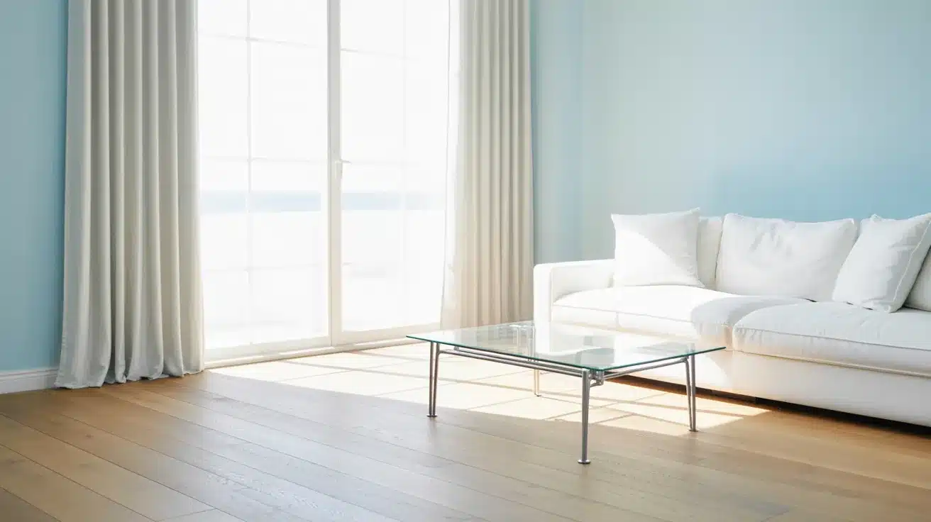
Alt text: Bright, modern living room with light blue walls, light wood flooring, a white sofa, and a glass coffee table illuminated by sunlight streaming through large patio doors.
Cloudy blue feels light and airy. It brings a sense of openness to smaller spaces.
With crisp white as its partner, this living room color scheme feels clean and almost spa-like in its calm.
This combination works across many interior styles from coastal to contemporary.
It’s also one of the easier palettes to accessorize, since most natural tones and soft neutrals sit comfortably alongside it.
7. Delicate Pink and Pearl
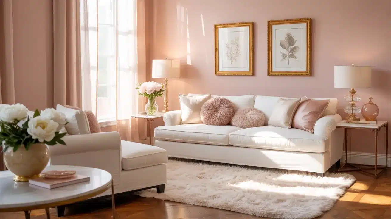
Alt text: Brightly lit living room featuring a white sofa, pale pink walls, a fluffy white rug, and gold-framed botanical art.
This pairing feels soft and warm without crossing into overly sweet territory.
Delicate pink works as a wall color or through soft furnishings, while pearl keeps things grounded. A great choice for living rooms that feel inviting and gentle.
Adding natural wood tones or warm metallic accents like aged brass or copper gives this color combination a more grown-up, considered feel.
It’s softer than most living room color ideas but no less stylish.
8. Ochre and Warm Beige
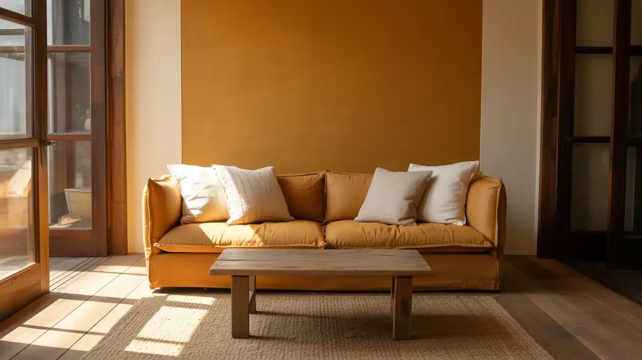
Alt text: A warm living room interior featuring a mustard yellow sofa with white pillows, a rustic wooden coffee table, and bright sunlight streaming through glass doors onto a jute rug.
Ochre is a rich, earthy yellow that adds comfort and character. Paired with warm beige, it creates a cozy, sun-drenched feel.
This living room color idea works beautifully with natural textures like linen, jute, and wood.
Ochre works well as an accent used through cushions, ceramics, or a single painted wall rather than the dominant color throughout the whole room.
9. Burgundy and Cream
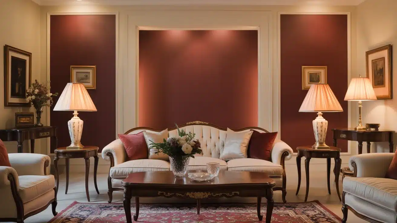
Alt text: A traditional living room features a tufted cream sofa centered against a deep burgundy accent wall, flanked by matching end tables with ornate lamps.
Burgundy is bold and rich. Cream softens it without washing it out.
Together, this classic pairing delivers a warm, elegant living room feel especially striking in the evening with soft lighting.
Burgundy works particularly well in rooms with high ceilings or period features.
It adds a sense of depth and richness that lighter colors simply can’t match. Use cream generously to keep the balance right.
10. Warm Orange and Off White
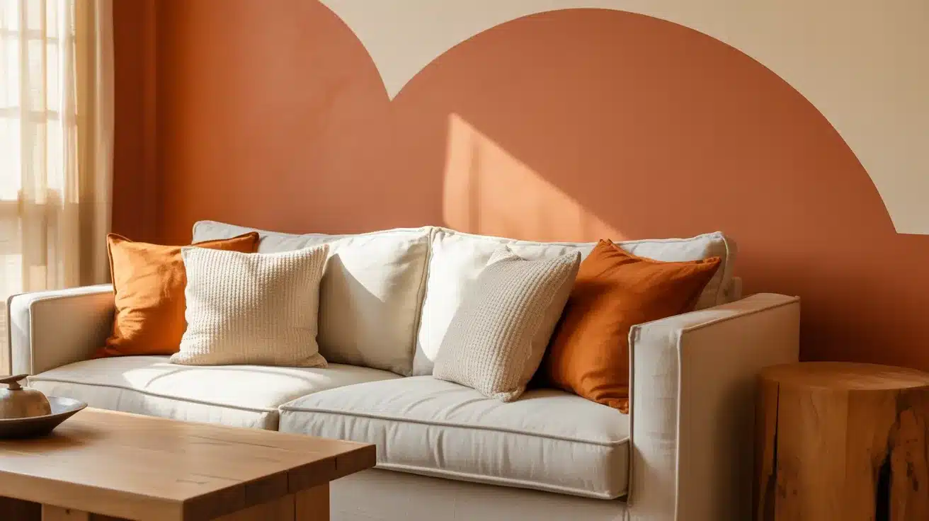
Alt text: Neutral white sofa accented with burnt orange and textured cream pillows sits against an accent wall featuring a large terracotta and cream curved design.
Warm orange adds energy and personality to a living room. Off-white keeps the space balanced and stops the color from feeling too intense.
This combination suits open-plan spaces and social living areas well.
Orange works best when used on one wall or through large soft furnishings rather than throughout the entire room.
Pair it with natural materials like wood and cotton to keep the look grounded and relaxed.
11. Sage Green and Pearl
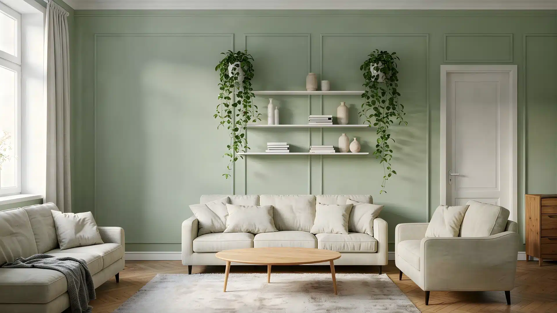
Alt text: A serene living room featuring sage green wainscoting, light cream upholstered sofas, a wooden coffee table, and white floating shelves adorned with plants and decor.
Sage green is a calming, muted tone that feels both fresh and evergreen. Pearl adds a soft glow alongside it.
This is one of the most popular living room color schemes right now. Sage green is incredibly liveable. It doesn’t demand attention.
It pairs well with warm wood tones, white ceramics, and woven textures for a look that feels natural and put together.
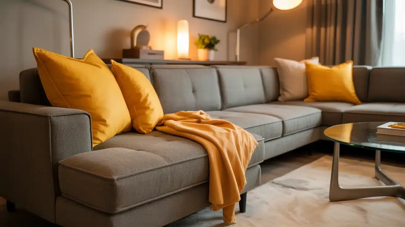
12. Sunshine Yellow and White
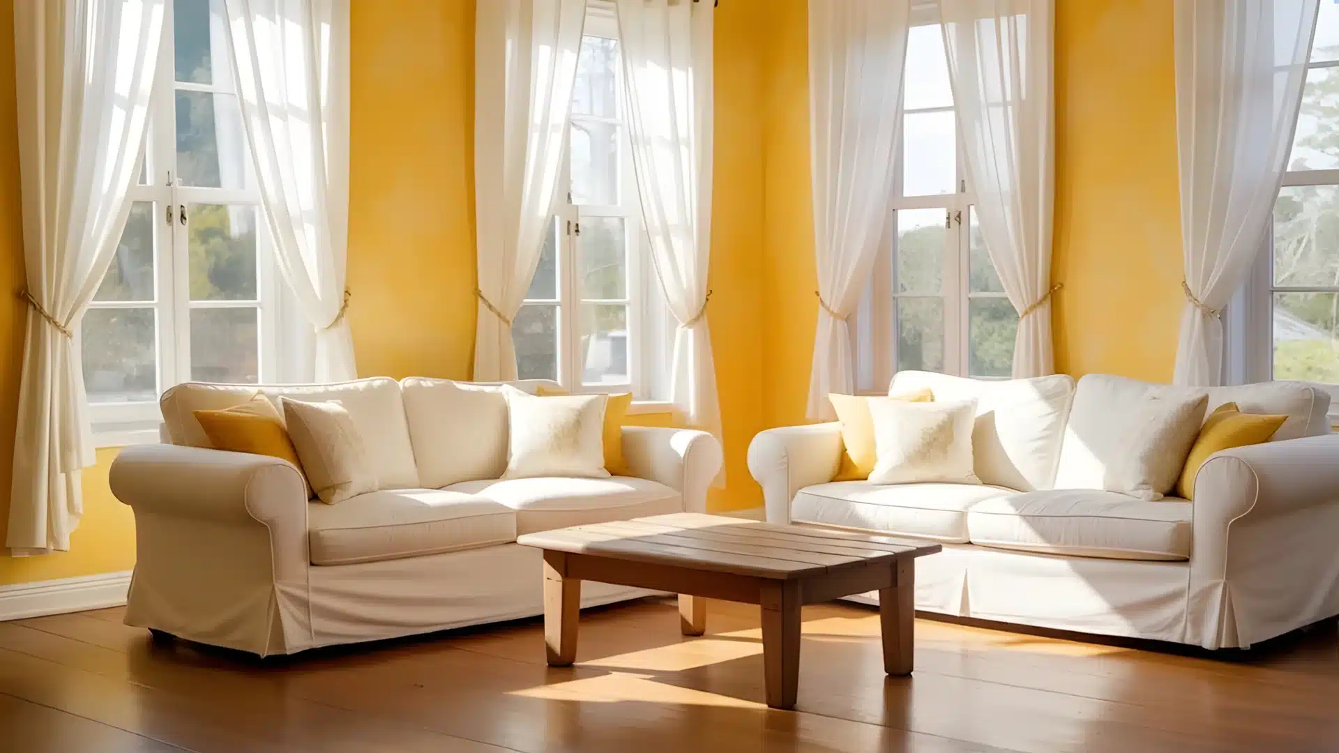
Alt text: A brightly lit living room featuring two white slipcovered sofas, a wooden coffee table, and sunny yellow walls framed by sheer white curtains over multiple windows.
Sunshine yellow instantly lifts the mood. White keeps it from feeling too loud. This is a great living room color idea for north-facing rooms that lack natural light.
Yellow reflects light well and makes a room feel brighter than it actually is.
Keep the rest of the palette simple; white walls, natural wood, and simple textiles so the yellow stays the focal point without the room feeling busy.
13. Bright Pink and Neutral Cream
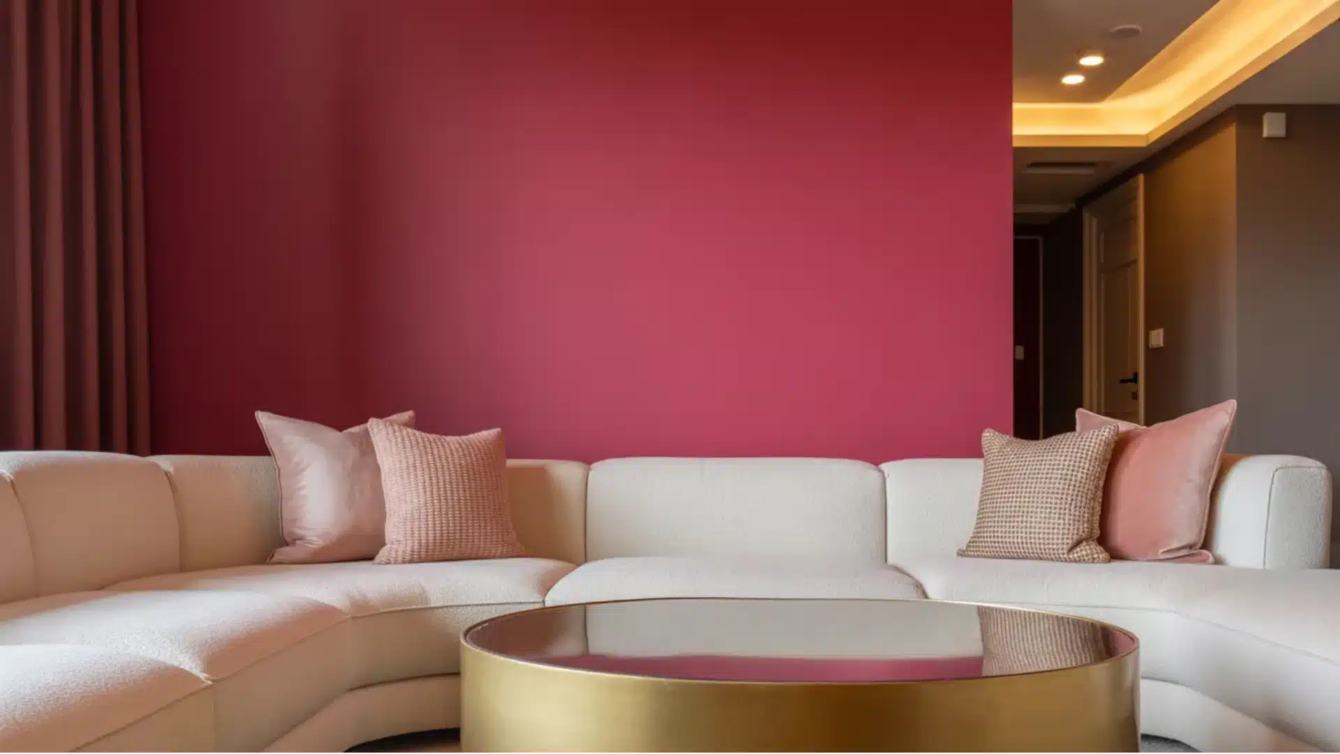
Alt text: A modern living room features a curved white sectional sofa against a vibrant raspberry accent wall, complemented by pink throw pillows and a circular gold coffee table.
Bright pink is bold and playful. Neutral cream pulls it back and gives the eye somewhere to rest.
This combination works well when pink is used as an accent rather than the dominant color.
Think a pink feature wall behind a cream sofa, or pink cushions and art against a cream backdrop. It’s one of those living room color schemes that looks great.
14. Soft Turquoise and Pearl
Alt text: Bright living room with a large white sectional sofa, round wooden coffee table, and natural light streaming across light wood floors and jute rugs.
Soft turquoise feels fresh and light. Pearl adds comfort and stops the color from feeling cold.
Together, they create a living room that feels airy and calm. This combination works well in coastal or relaxed interior styles.
It’s lighter and less intense than deep teal, making it a good option for smaller rooms or spaces where you want color without drama.
15. Pearl and Gray
Alt text: A modern living room with a dark sectional sofa, glass coffee table, floor lamp, abstract wall art, and sheer curtains letting in natural light.
Pearl and gray is a simple, clean combination. It works as a base palette that lets furniture, art, and accessories take center stage.
A great pick for simple, uncluttered living rooms.
The trick with this palette is texture without it, the combination can feel flat.
Wool, linen, and wood layered together fix that. The color range is tight; the material range shouldn’t be.
16. Olive and Burgundy
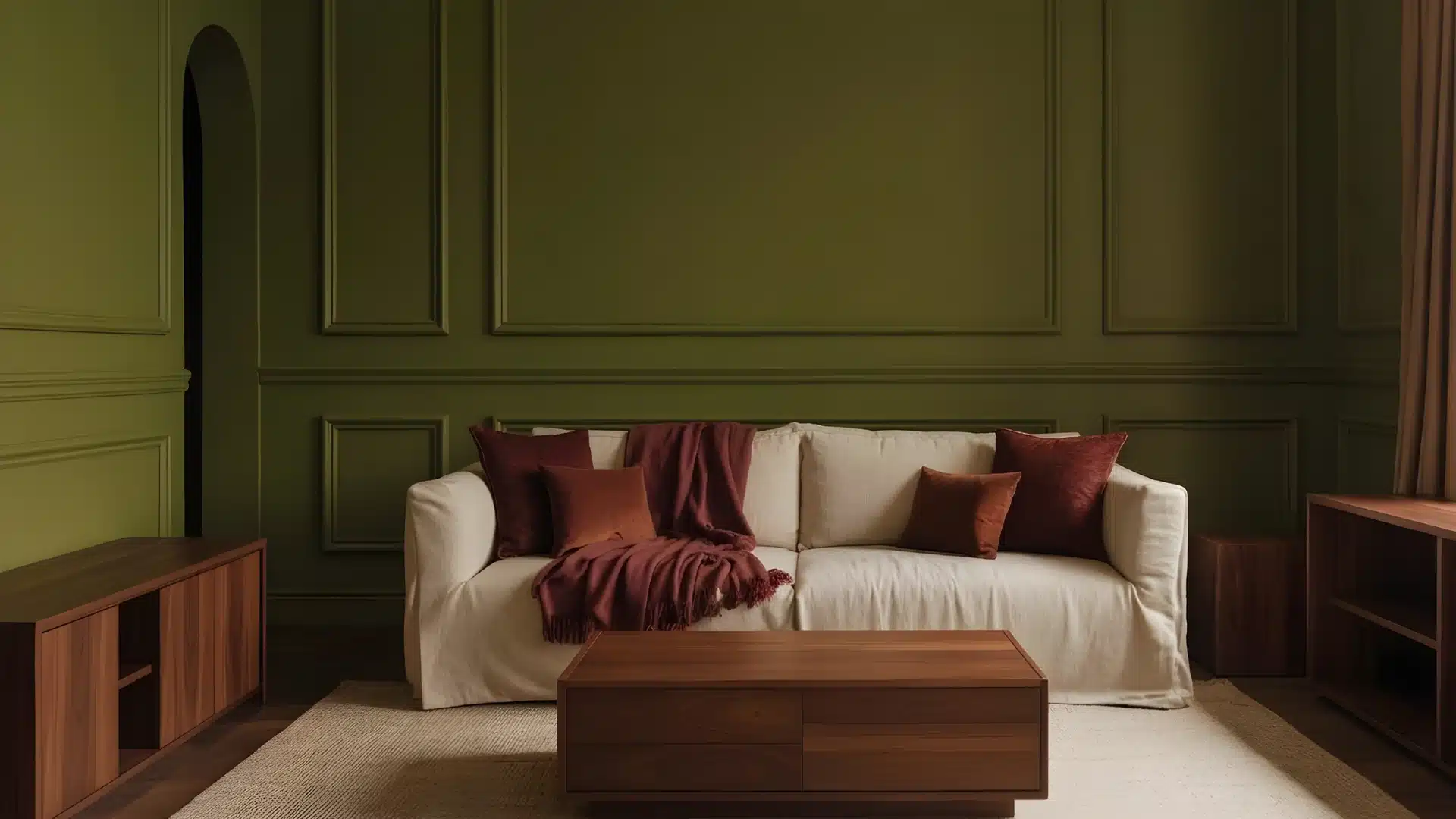
Alt text: A living room featuring a cream sofa with burgundy cushions against a dark olive green wainscoted wall, centered by a modern wooden coffee table.
This is the most underused combination on this list. Olive and burgundy pull from the same earthy warmth, which is why they work — they’re not contrasting, they’re reinforcing.
Use olive as the base and burgundy as an accent for the best result.
Works especially well with warm wood flooring or exposed brick. This is a combination for rooms meant for long evenings rather than Instagram.
17. Mauve and Gray
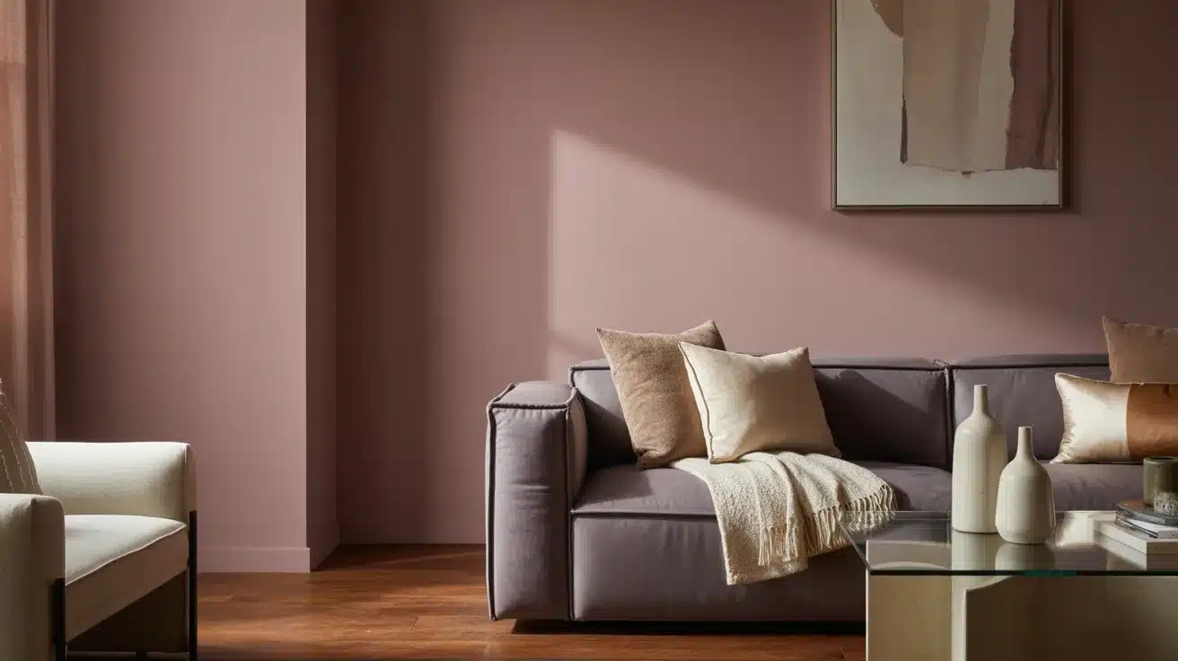
Alt text: A modern living room featuring a mauve-pink wall, a dark grey sofa with beige pillows and a throw blanket, and a glass coffee table holding ceramic vases.
Mauve and gray share a quiet, understated quality. Together, they create a living room that feels calm and refined.
This pairing suits both modern and traditional interiors.
Mauve softens the coolness of gray, while gray stops mauve from feeling too soft or indulgent.
The balance between the two is what makes this one of the more versatile living room color schemes it works in many different settings without much effort.
18. Yellow and Soft Gray
Alt text: Close-up of a contemporary gray sectional sofa accented with bright yellow throw pillows and a matching blanket in a warmly lit living room.
Yellow adds brightness and energy. Soft gray keeps it from feeling too intense.
These living room colors work well in spaces where you want comfort without going full-on bold.
Soft gray is one of the most reliable partners for yellow it tones down the energy without dulling it completely.
Use yellow through cushions, artwork, or a single accent wall rather than throughout the whole room for the best balance.
How to Choose the Right Living Room Color Scheme
A color that works in someone else’s living room might look completely wrong in yours. The difference is usually lighting, flooring, and room size, not the color itself.
Here’s what to check before committing.
Why Color Schemes Matter More Than Individual Colors
Color does a lot of heavy lifting in a room. It shapes how the space feels the moment you walk in.
A well-chosen scheme makes your furniture look intentional. A mismatched one makes even expensive pieces look like they arrived from different homes.
Warm tones make a room feel cozy and inviting, while cool tones feel calm and relaxed.
Light colors make a space feel bigger and more open, and darker shades make it feel smaller but more intimate.
Using the Color Wheel (Without Overcomplicating It)
You don’t need to be a designer to use the color wheel. It’s simply a tool that shows how colors relate to each other.
- Complementary colors: sit opposite each other on the wheel like teal and ochre, or burgundy and olive. High contrast, high visual interest — but easy to overdo.
- Analogous colors: sit next to each other, such as sage green, olive, and yellow-green. They blend naturally and feel easy on the eye.
- Monochromatic combinations: use different shades of the same color, like soft gray, mid gray, and charcoal. The result is clean, layered, and cohesive.
Starting with one of these three approaches takes the guesswork out of building a living room color scheme.
How Color Combinations Shape the Atmosphere of a Room
The colors you choose set the tone for everything that happens in that room.
Warm tones like ochre, burgundy, warm orange, and cream make a space feel lively and welcoming.
They work well in social living rooms where people gather often. Cool tones slate blue, stormy blue, and soft gray create a calm, collected atmosphere, ideal for winding down.
Mixed palettes strike a balance between the two. Pairing a warm tone with a cool one, like teal and cream, feels considered and pulled together.
Conclusion
The best living room color schemes don’t announce themselves.
They just make the room feel right, and you don’t notice why until you try to change them.
Pick two or three options from the list, get the paint samples on the wall, and check them at different points in the day. That’s the whole process.
Frequently Asked Questions
1. What is the Best Color Combination for a Living Room?
Neutral bases like cream or white paired with one accent color like teal, sage, or burgundy work best for most living rooms.
2. What is the 2/3 Rule for Living Rooms?
Two-thirds of the room uses a dominant color, and the remaining third uses an accent or complementary shade.
3. What are the Current Living Room Color Trends?
Sage green, deep teal, warm ochre, and soft mauve are among the most popular living room color schemes right now.
4. What Color is Replacing Gray?
Warm greige, a blend of gray and beige, along with soft taupe and warm white, are gradually replacing cool gray in modern living rooms.