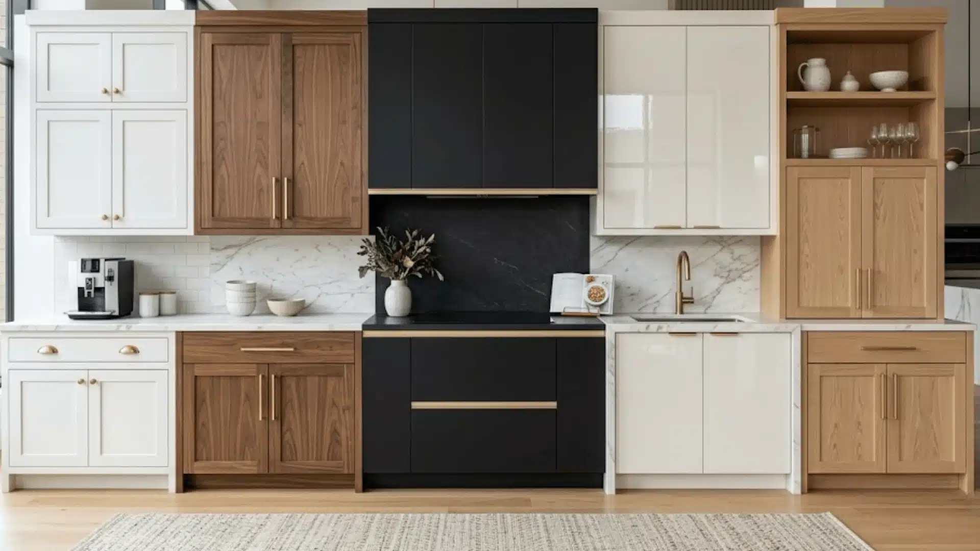
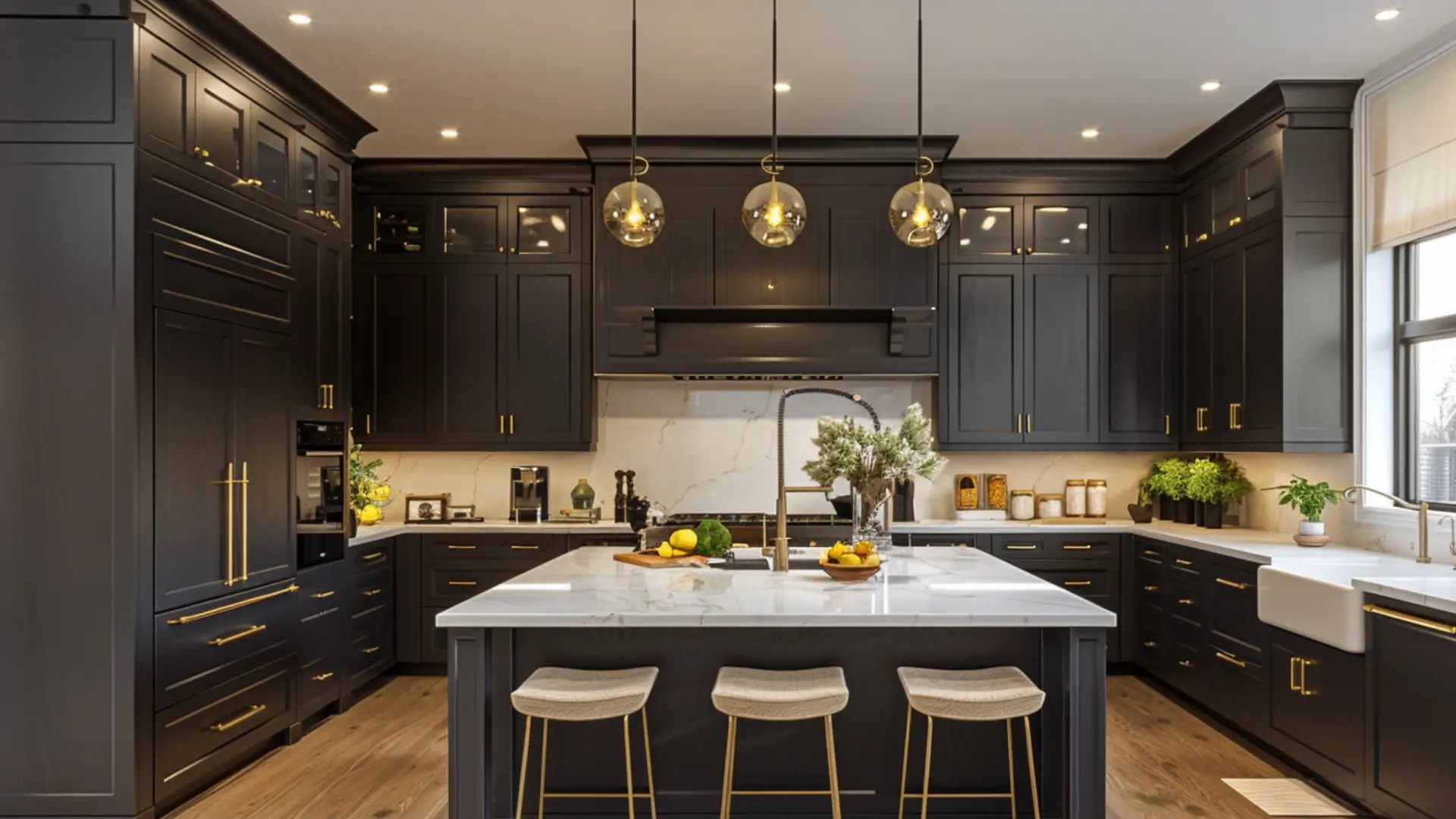
2026 kitchen cabinet colors shifted faster than most people expected.
The whites and cold grays that had felt safe for years started to look tired. Not wrong exactly, just flat. Like a kitchen that forgot to have a personality.
I saw it happening with my clients before I felt it in my own kitchen.
What replaced those safe defaults feels warmer, more considered, more like something someone actually thought about before committing to.
And once you see it, going back feels impossible.
Most Popular Kitchen Cabinet Color 2026
Cool grays and stark whites had a long run. But 2026 kitchen cabinet colors are telling a different story.
The shift is not just about looks.
People want kitchens that feel calming, personal, and connected to something natural.
That push toward wellness-focused living has pulled earthy greens, warm taupes, and grounded neutrals straight into cabinet color conversations.
At KBIS 2026, the pattern was hard to ignore. Designers kept returning to warmth, depth, and colors that feel chosen rather than defaulted to.
Behr went smoky jade with Hidden Gem, Sherwin Williams chose warm golden Universal Khaki, Benjamin Moore picked deep espresso Silhouette, PPG landed on Warm Mahogany, and Pantone softened everything with Cloud Dancer.
My Kitchen Cabinet Buildup Story: How One Color Decision Changed the Whole Feel of My Kitchen?
For two years, I cooked in a kitchen that felt like it belonged to someone else.
Builder white. Flat finish. The kind of cabinets that come with the house and never get questioned. I questioned them every single morning.
I bought samples. More than I needed. Universal Khaki went up first, and I was convinced it was the one. Warm, golden, and looked incredible in the magazine.
At 8 am, on my actual cabinet door, it looked lovely. By 7 pm, under my kitchen lights, it looked like a different color entirely.
That was the moment I stopped trusting chips.
I tested four shades over two weeks before landing on an earthy olive green. Matte finish. Nothing about it looked safe on the chip. Everything about it looked right on the cabinet.
Biggest lessons: light changes everything, undertones will surprise you, and do not cheap out on the hardware at the end.
Top 2026 Kitchen Cabinet Colors
I cross referenced KBIS 2026, paint brand color directions, and real kitchens before narrowing this down.
Anything that felt like a flash in the pan got cut. What is left are ten colors that look better in person than on a screen.
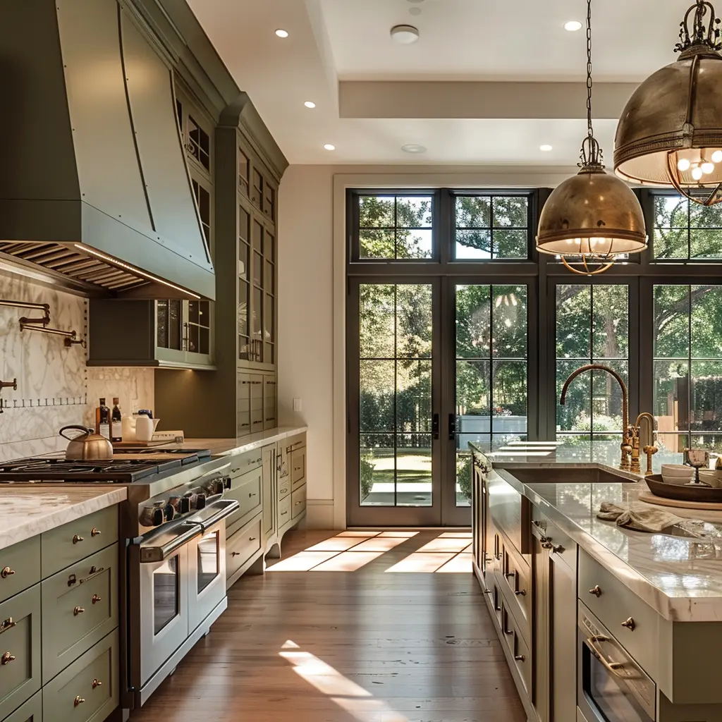
1. Earthy Olive Green Cabinets
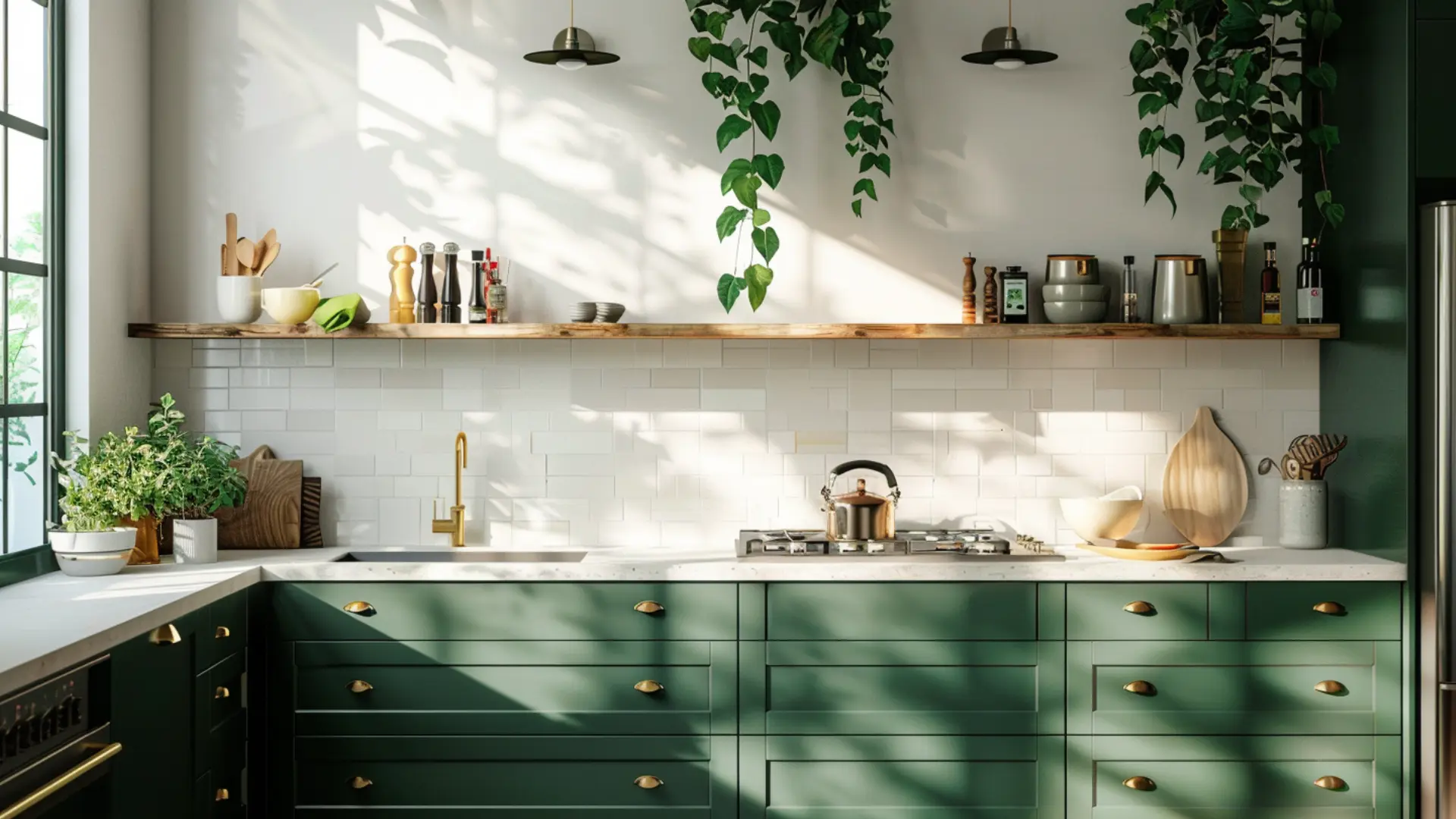
Olive green is a decision people are making and not regretting. It sits between green and brown, which is exactly why it works.
Warm enough to feel inviting, grounded enough to feel considered. Matte finish only. Gloss kills the earthy quality entirely.
Pairs with warm wood shelves, brass hardware, and cream countertops.
Sherwin Williams Olive Grove SW 7701. Rich without being heavy.
2. Rich Mushroom Taupe
This is what happens when beige finally grows up.
Enough brown and grey to read sophisticated, enough warmth to stop the kitchen feeling cold. Works in almost any layout without competing with anything around it.
- Matte black hardware for something sharper
- Warm white countertops to keep the softness
- Light oak flooring so it does not read flat
Benjamin Moore Mushroom Cap AF-85 handles natural and artificial light equally well, which is rare for a neutral this nuanced.
3. Warm Greige
Greige is neither beige nor grey. That in-between quality is exactly what makes it liveable.
Next to warm wood, it leans cozy. Next to the white stone, it feels modern. One of the few cabinet colors that works for resale without feeling like a compromise.
Behr cathedral gray. Neither too yellow nor too cool, regardless of the light.
4. Dusty Blue Green
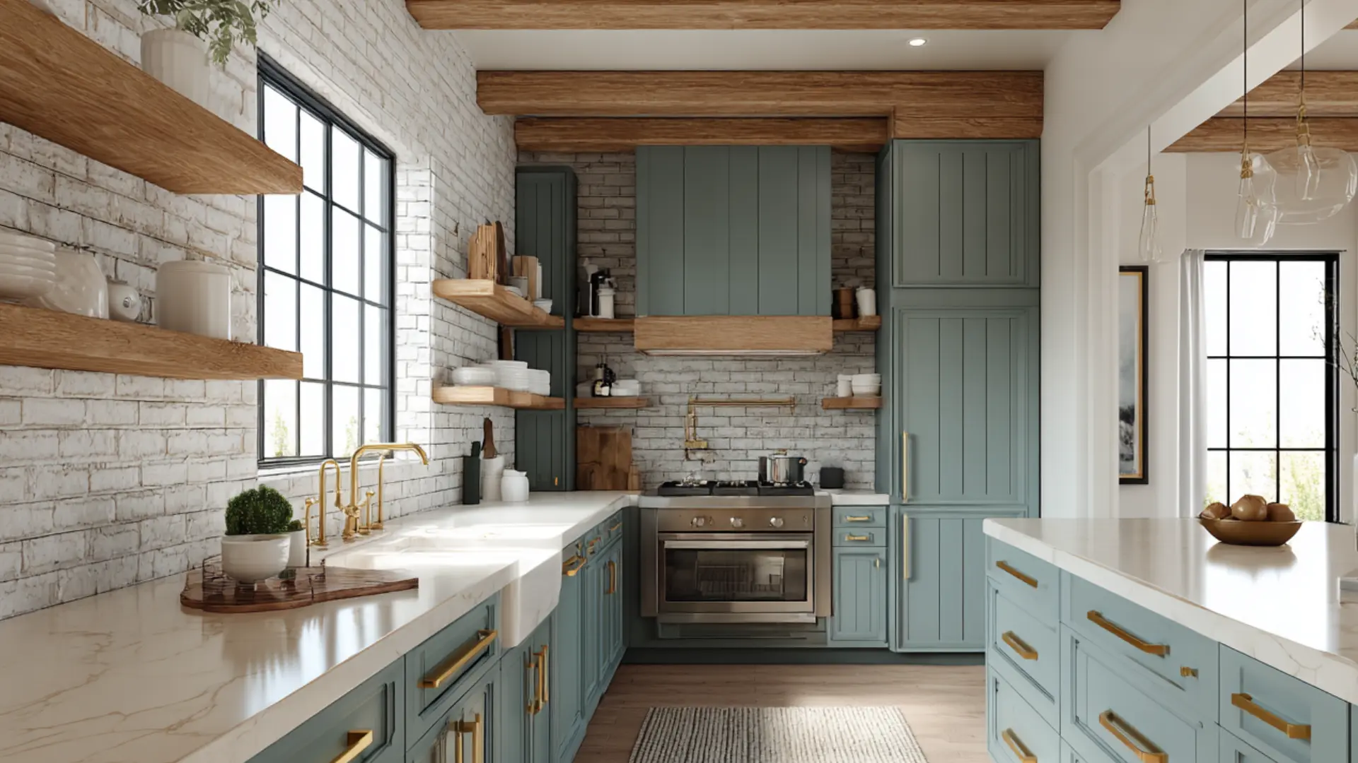
Not quite blue. Not quite green. That ambiguity is the whole point.
It brings color in without making the room feel like a statement. Shifts slightly between blue and green throughout the day in good natural light, which keeps it interesting without being loud.
- Brushed brass hardware brings out the warmth
- White uppers keep the space open
- Avoid cool grey countertops, the undertones will fight
5. Soft Beige
Soft Beige does not demand attention. It just makes everything around it feel better.
Grounded without being heavy, warm without being loud. Linen textures, natural stone, and warm wood all sit beautifully against it.
6. Charcoal Brown
Charcoal brown is the choice when you want depth without the full weight of black.
Cream countertops look sharper against it. Brass hardware looks richer. Even plain white subway tile looks more considered next to it.
- Needs layered lighting, natural or artificial
- Matte finish only, satin shows every mark
- Keep uppers lighter so the room does not sink at the bottom
7. Muted Terracotta
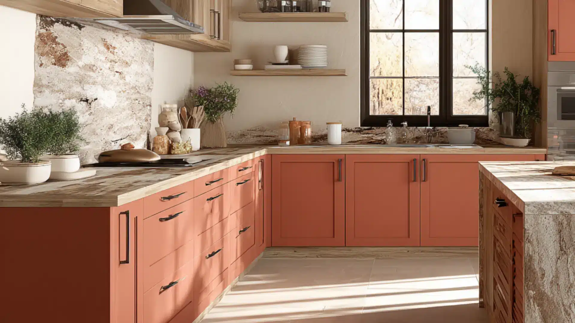
Terracotta done wrong looks like a theme. Done right, it just looks warm.
Saturated terracotta overwhelms fast. A dusty, toned-down version reads as earthy and considered. Start with an island or lower cabinets before going all in. Natural stone countertops, cream walls, warm metal hardware.
Cool grey flooring underneath terracotta cabinets is a fight nobody wins.
8. Moody Navy
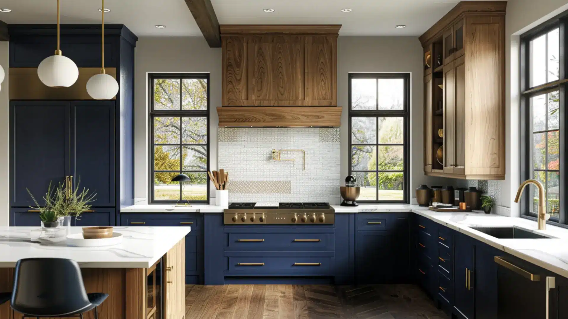
Navy is no longer the question. The question in 2026 is how to keep it feeling current.
The answer is restraint. Lower cabinets in navy, warm wood or off white uppers, simple hardware, nothing competing.
- Brushed gold hardware for warmth
- White quartz for contrast
- Skip cool grey flooring, it flattens everything
One of the few bold colors that holds resale value when paired carefully.
9. Soft Black
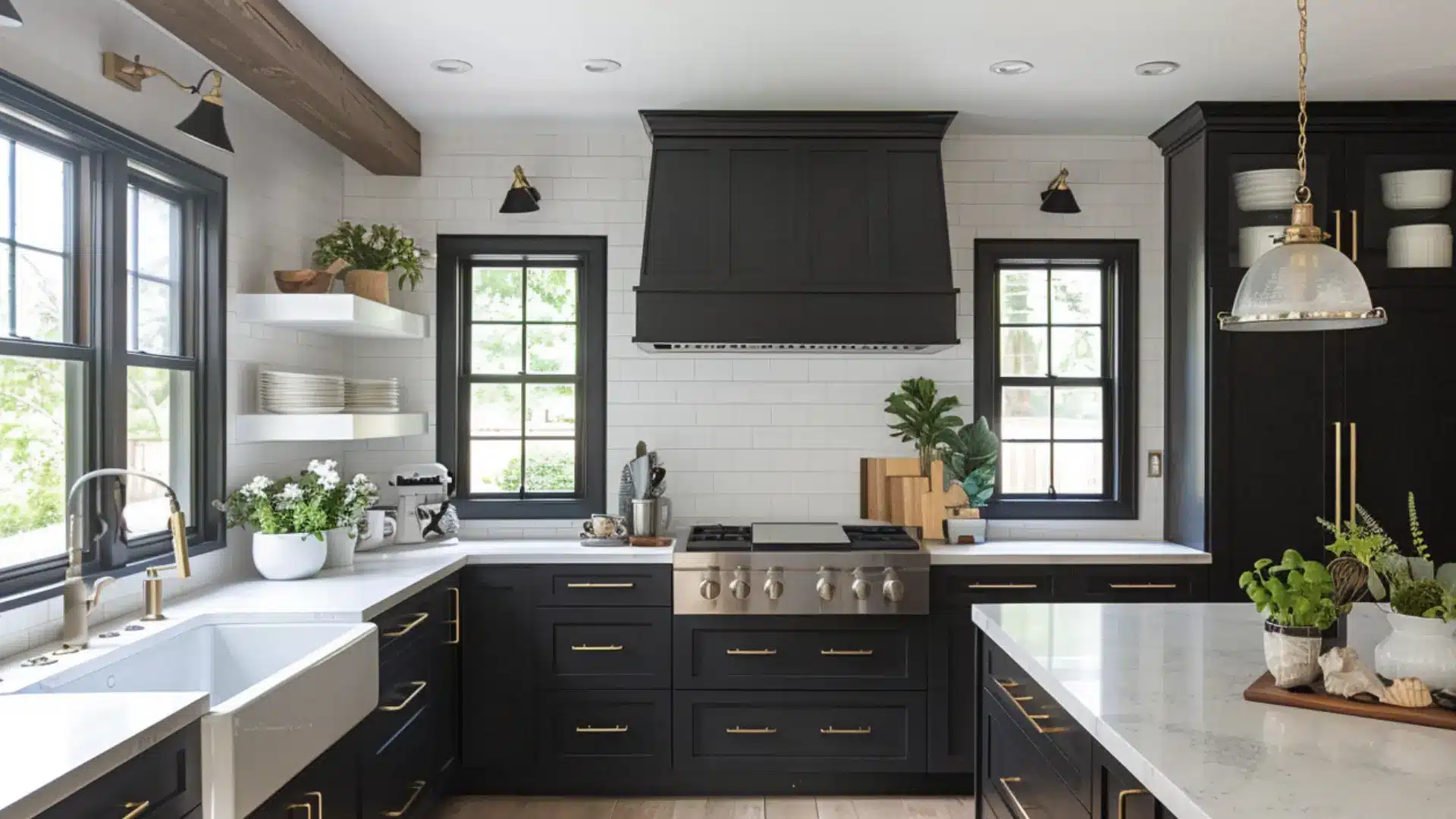
Soft black is not flat black. That difference matters more than most people expect.
Flat black reads harsh. Soft black reads intentional. Works best with strong natural light or well planned artificial lighting. Without it, the kitchen just reads dim.
Warm white countertops, natural wood, brass hardware. Keep the walls light. One strong choice needs everything else to step back.
Which Color Suits a Small Kitchen?
Lighter does not always mean better, but undertones always matter in a small kitchen cabinet color decision.
Warm neutrals like greige and soft clay beige keep the space feeling open without making it feel bare.
Dusty blue-green works too, as long as the uppers stay light and the countertops provide contrast.
I always recommend the two-tone approach before anything else.
Light uppers, slightly deeper lowers. It draws the eye up and adds the illusion of height without adding visual weight.
What kills a small kitchen fast is dark cabinets with no layered lighting. The color is never the problem. The light always is.
How to Test a Cabinet Color Before Committing?
Most color regrets start at the chip. A showroom swatch tells you almost nothing about how a color behaves in your actual kitchen.
- Paint a full cabinet door and live with it for three days. A swatch lies. A full door does not.
- Check at 7 am, midday, and 9 pm. The same color can look completely different by evening.
- Lay your countertop, flooring, and painted door together. Look at them as a group, not separately.
- Hold the white paper next to your sample. Whatever shifts you see is the undertone. Warm with warm, cool with cool.
Get this wrong, and the whole kitchen feels slightly off without anyone knowing why.
To Wrap Up!
Color is the one thing that changes how a kitchen feels without touching a single layout decision.
And the 2026 kitchen cabinet colors worth choosing are not the loudest ones.
They are the ones that still look right two years from now, in your actual light, next to your actual countertops.
Test properly. Match your undertones. Do not rush the hardware.
And if you are still unsure, go warmer than you think you need to. Cold kitchens had their moment. That moment has passed.
Frequently Asked Questions
1. Do Two-Tone Cabinets Work in an Open Plan Kitchen?
Yes, but keep the color on the island or lower run only so the space does not feel visually fragmented.
2. What Hardware Finish Works Best With Warm Cabinet Colors?
Brushed brass is the most reliable choice because it pulls warmth out of the cabinet rather than fighting it.
3. Are Painted Cabinets as Durable as Stained Ones?
A high quality paint with a hard enamel finish holds up well daily, but the prep and primer work matters more than the paint itself.
4. Does Cabinet Color Affect How Big a Kitchen Feels?
Yes, undertones and finish level change perceived size more than the actual shade does.
5. Should Upper and Lower Cabinets Always Match?
Not in 2026. Keeping uppers lighter and lowers deeper is one of the simplest ways to add character without a full renovation.