Colors influence our feelings and behavior more than we assume. Red increases heart rate and speeds up eating, explaining why fast food chains prefer it. Blue decreases food appeal and reduces appetite.
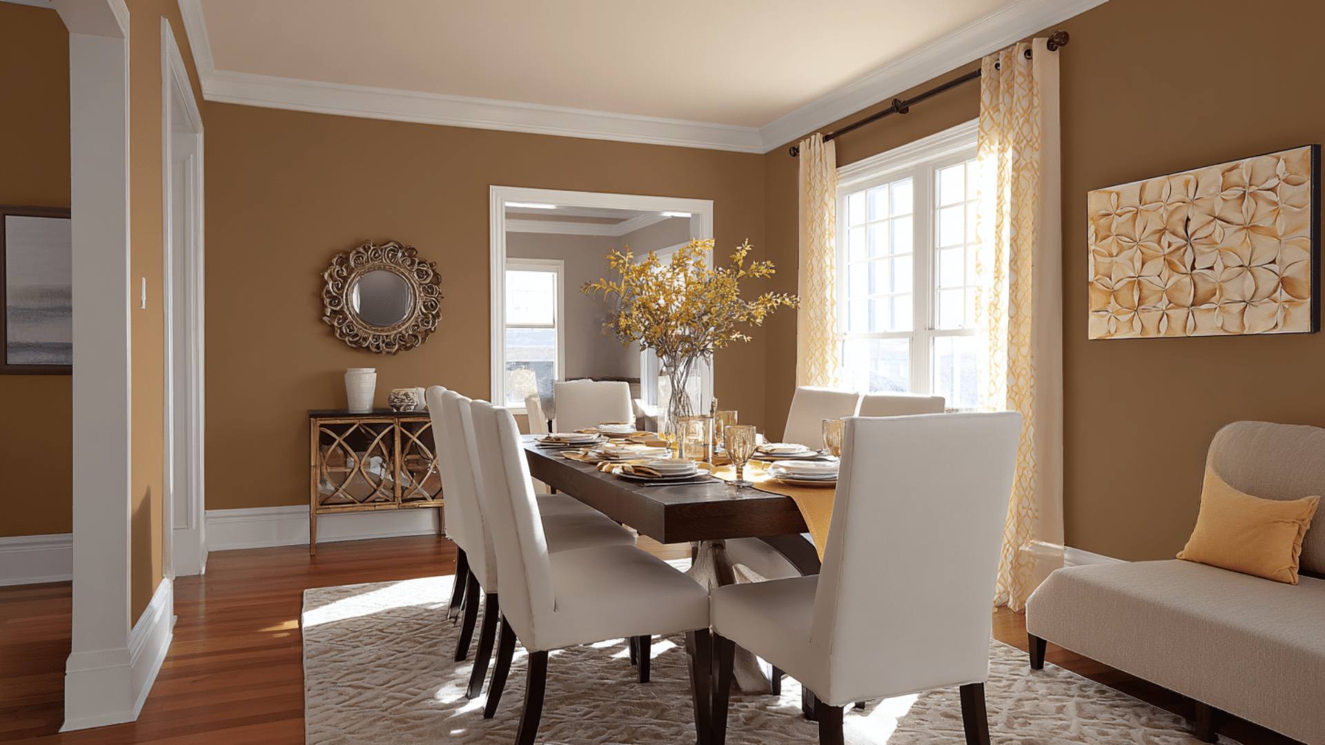
Cozy colors, such as orange and yellow, encourage conversation and create a comfortable atmosphere. They make people linger longer at the table, which is perfect for family bonding.
Cool colors like green promote relaxation and can help with digestion after meals.
Your brain responds to these dining paint colors automatically, so choosing the right one sets the mood before your guests even sit down.
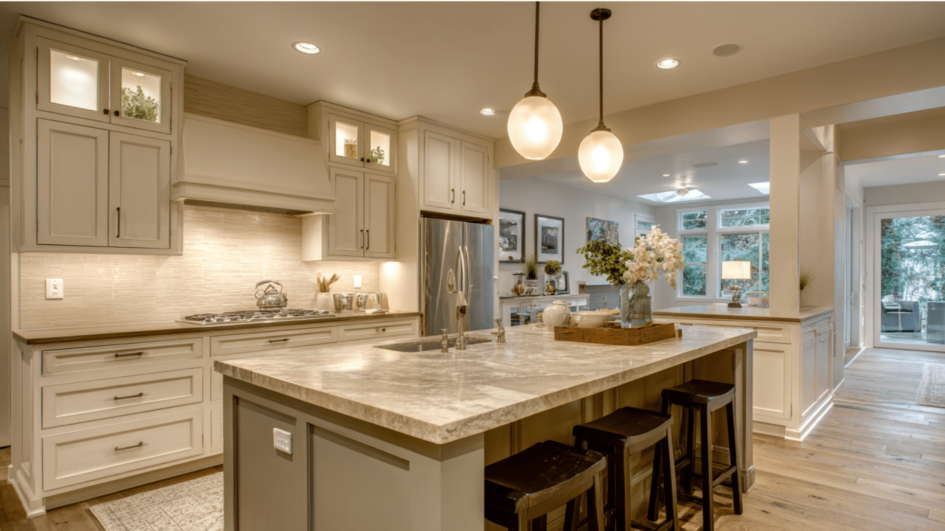
Popular Dining Room Paint Ideas
Here are the most loved dining paint colors that people swear by for creating beautiful dining spaces.
1. Navy Blue
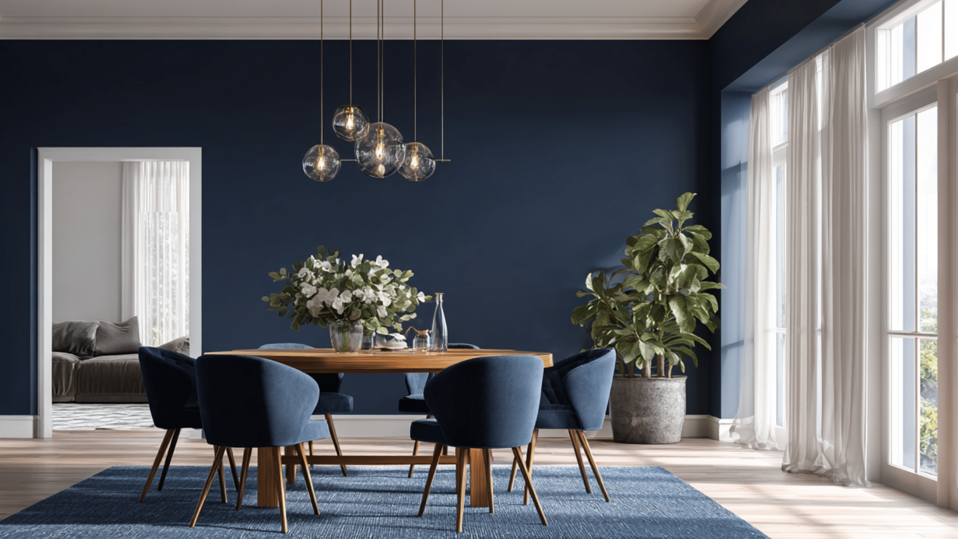
Deep navy creates an advanced backdrop that makes white dishes stand out. This rich shade works well with brass fixtures and wooden furniture. It’s formal enough for dinner parties but cozy enough for everyday meals.
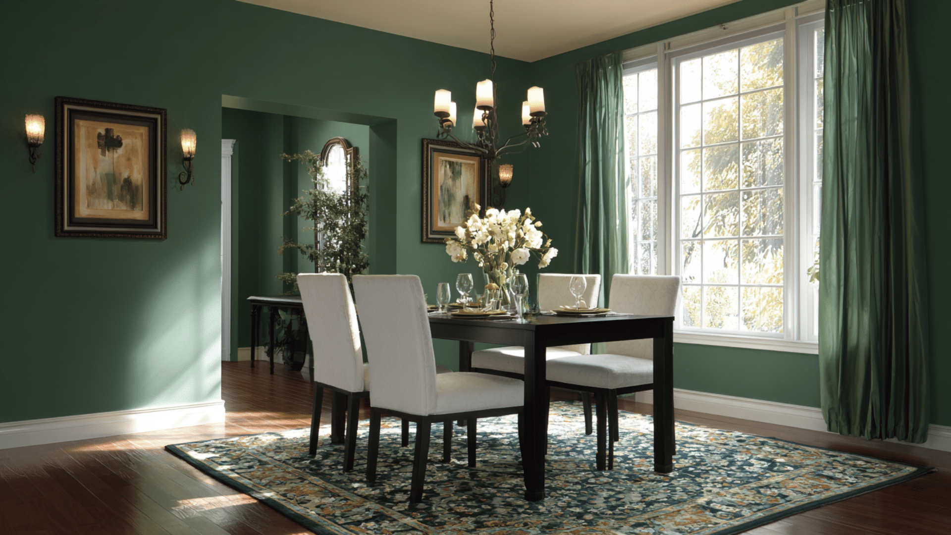
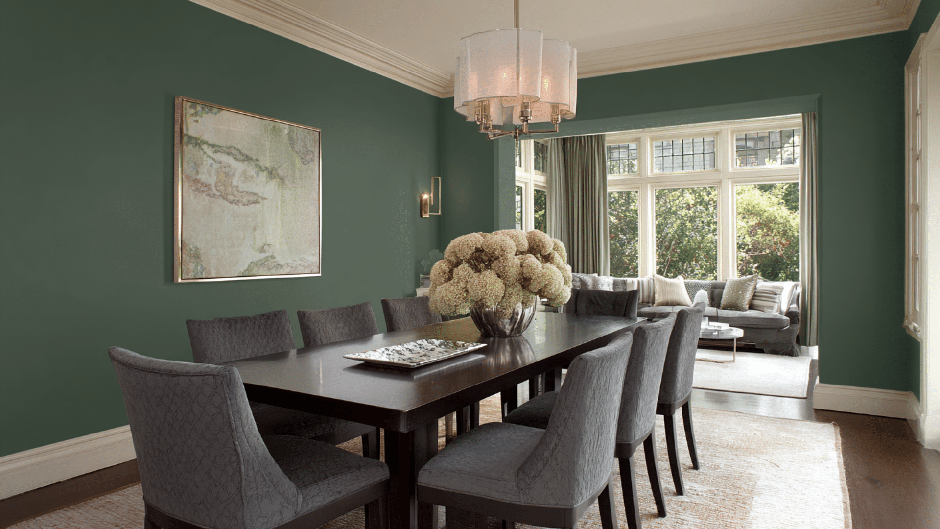
2. Forest Green
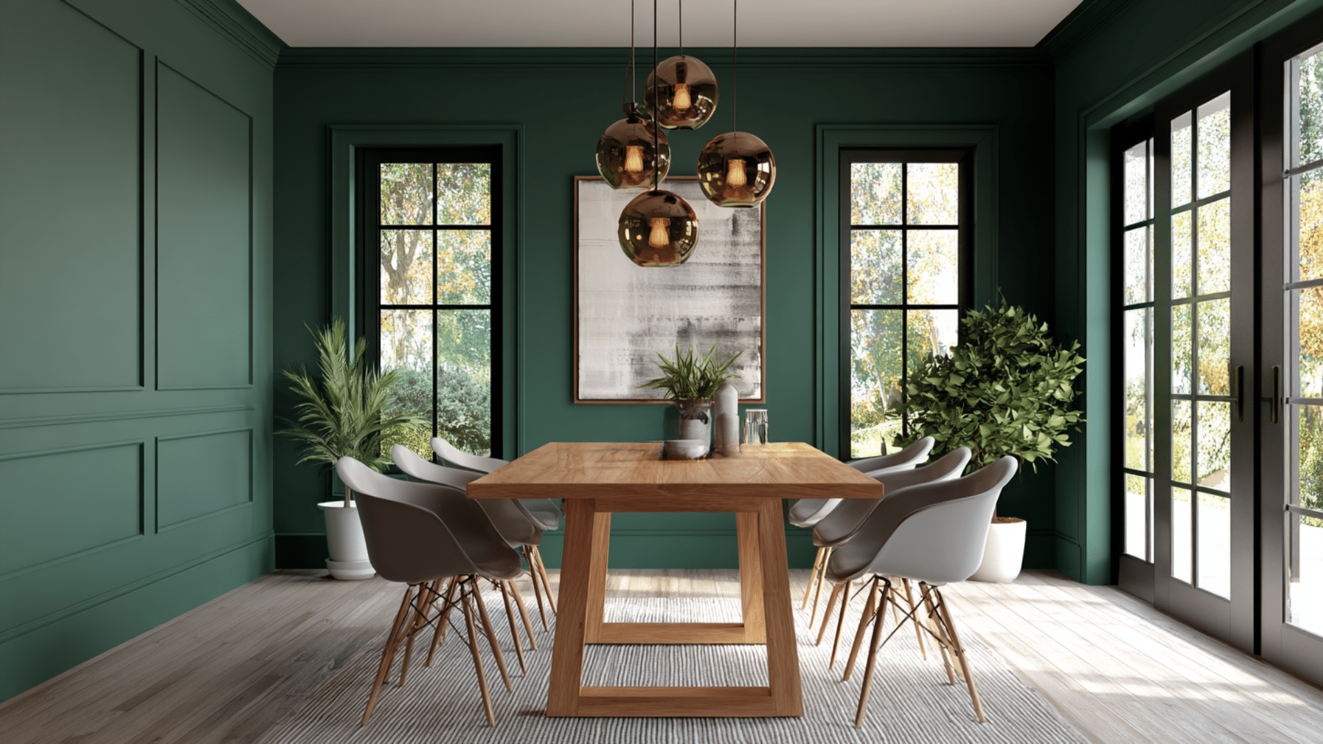
This earthy tone brings nature indoors and goes beautifully with natural wood. Forest green creates a calming atmosphere. It looks great with gold accents and cream-colored furniture.
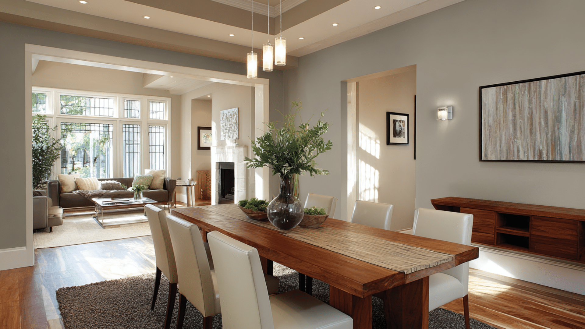
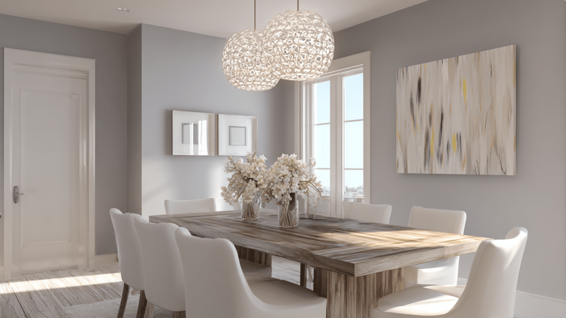
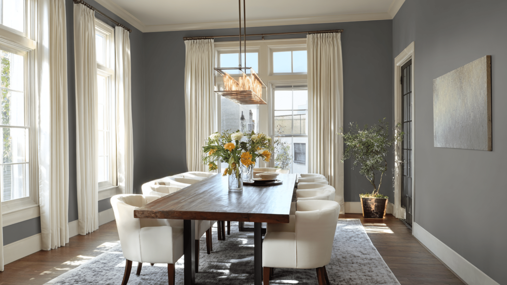
3. Warm Gray
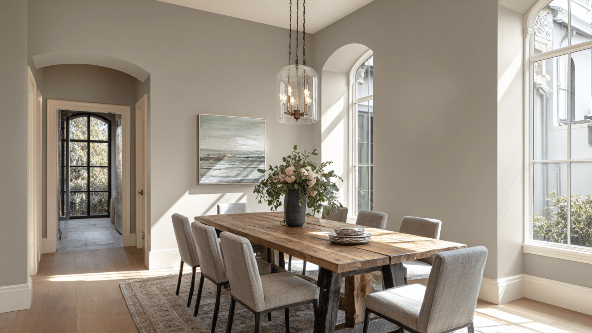
An adaptable neutral that works with any decor style. Warm gray has subtle brown undertones that prevent it from feeling cold and uninviting.
It’s the backdrop for colorful artwork and statement lighting fixtures.
4. Burgundy
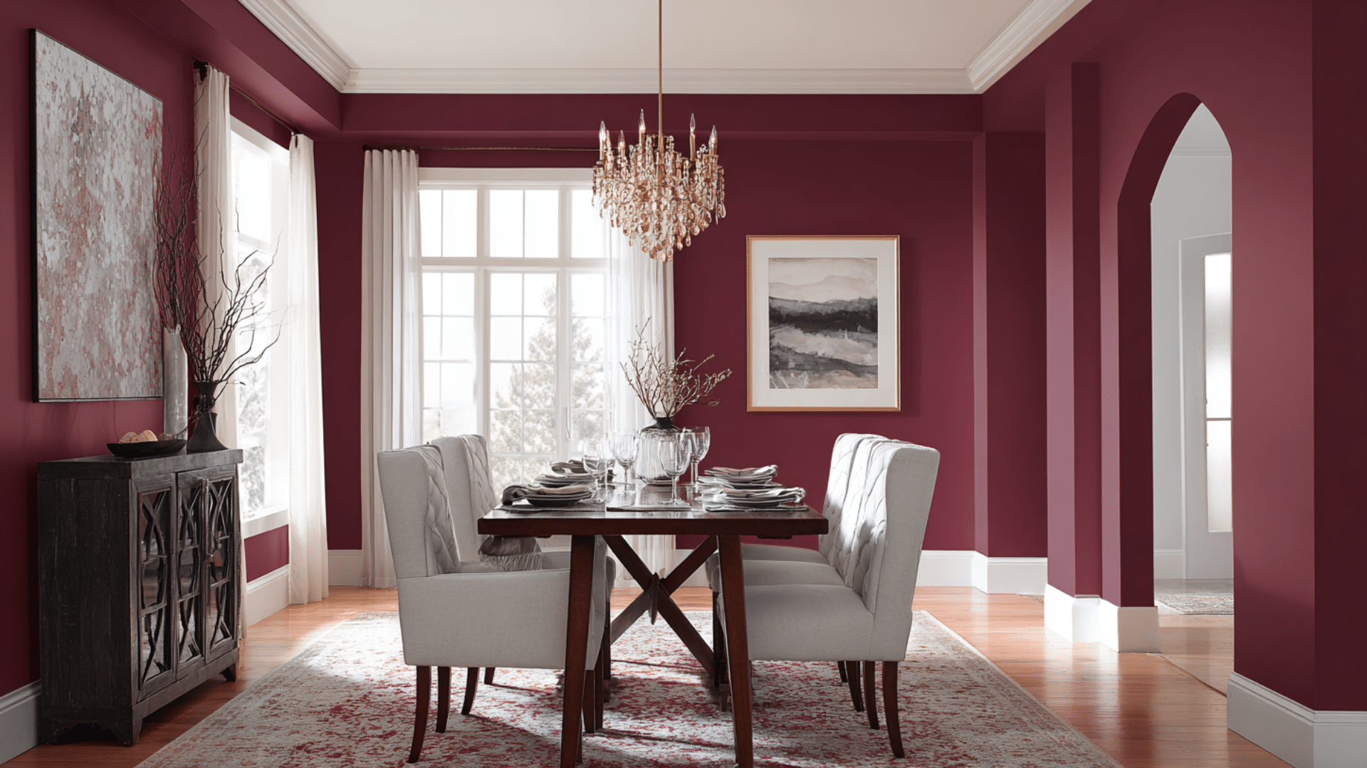
Rich and luxurious, burgundy creates an intimate atmosphere for dining.
This deep red shade stimulates appetite and conversation. It goes wonderfully with cream trim and dark wood furniture for a classic look.
5. Sage Green
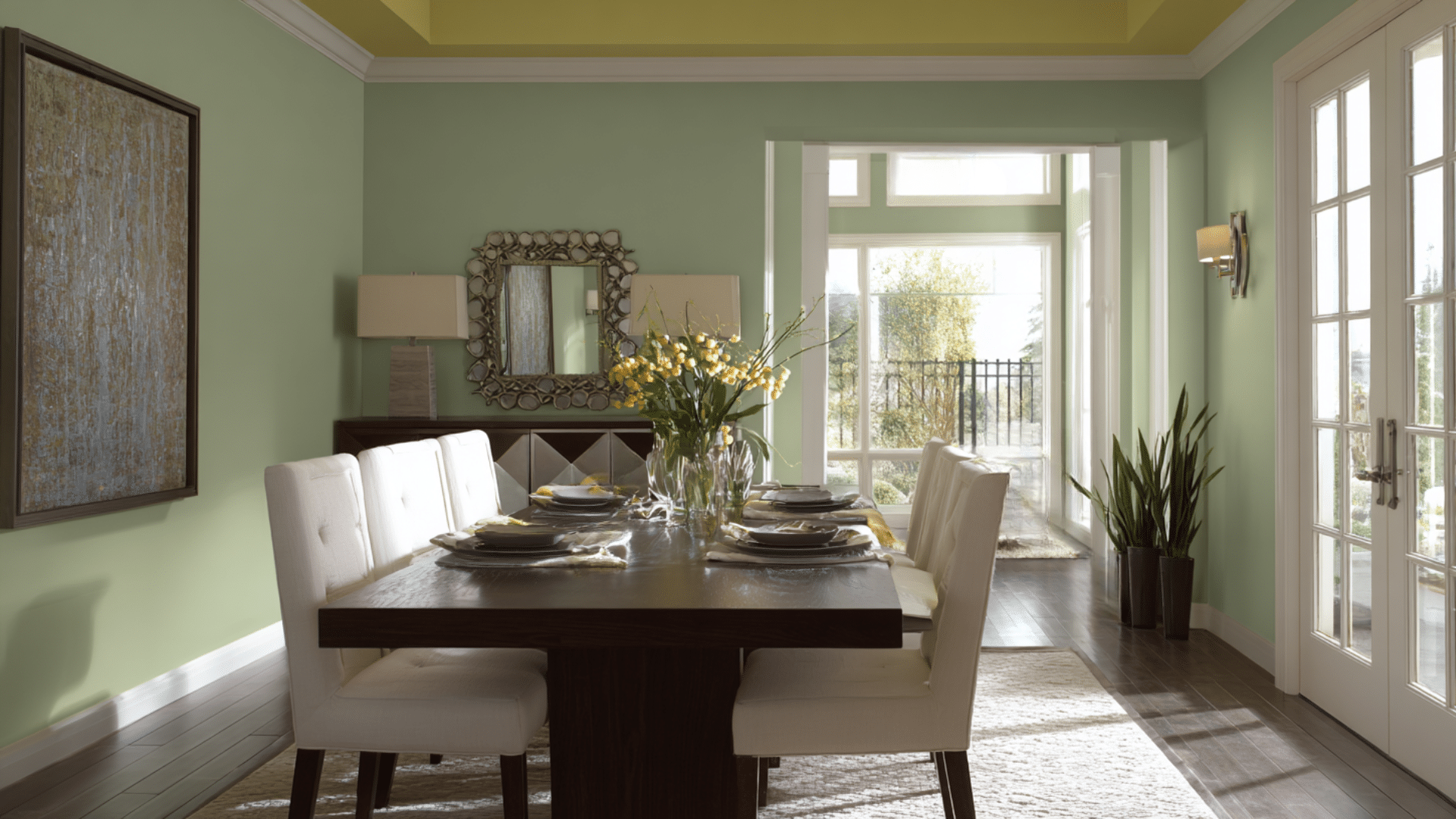
Soft and soothing, sage green promotes relaxation during meals. This muted tone works well in both modern and traditional spaces.
It complements white cabinets and natural textures, such as linen and wood.
6. Charcoal Black
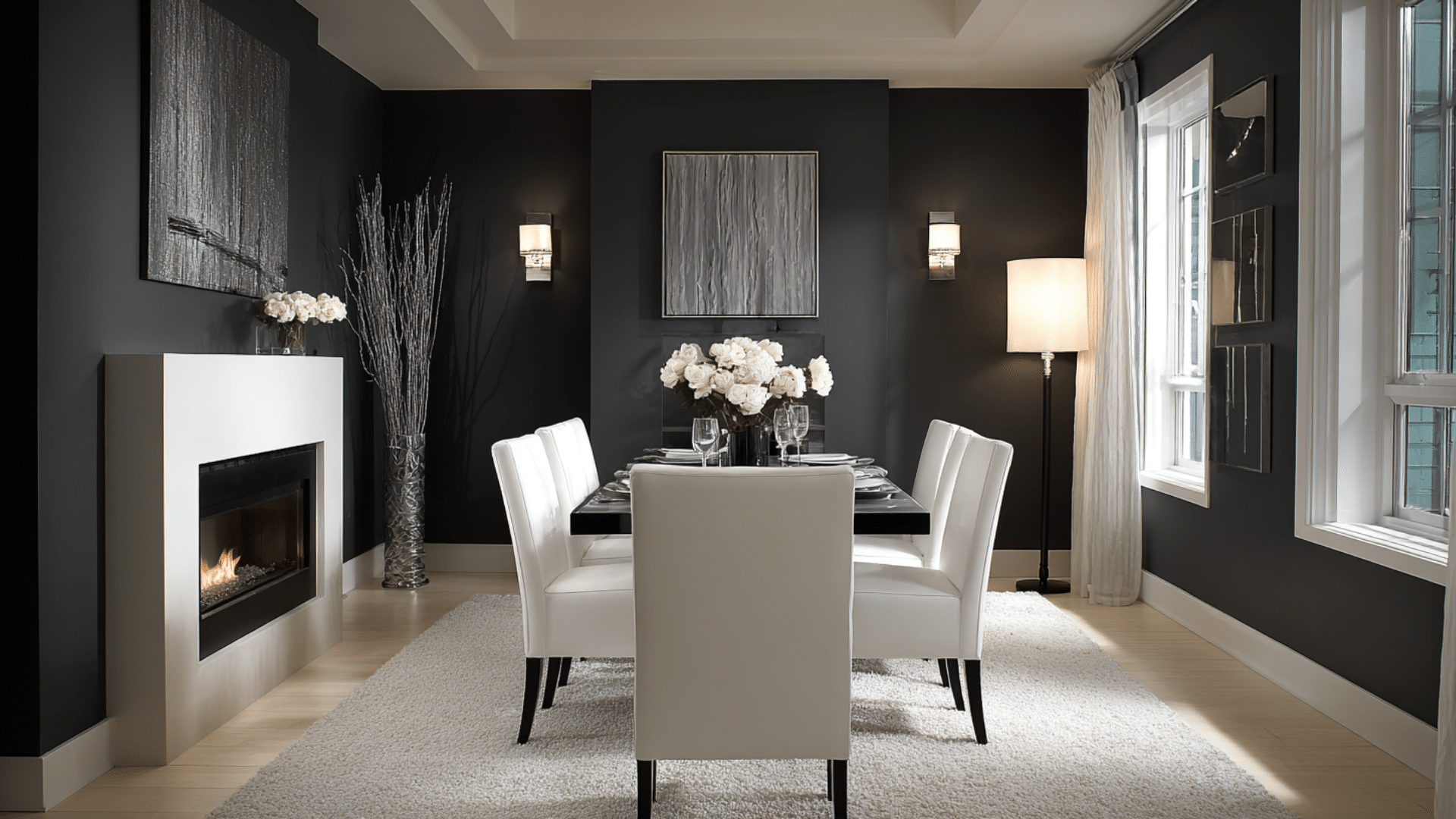
Bold and dramatic, charcoal creates a striking focus in the dining room. This color makes metallic fixtures shine and creates a restaurant-like atmosphere.
It works best in rooms with plenty of natural light.
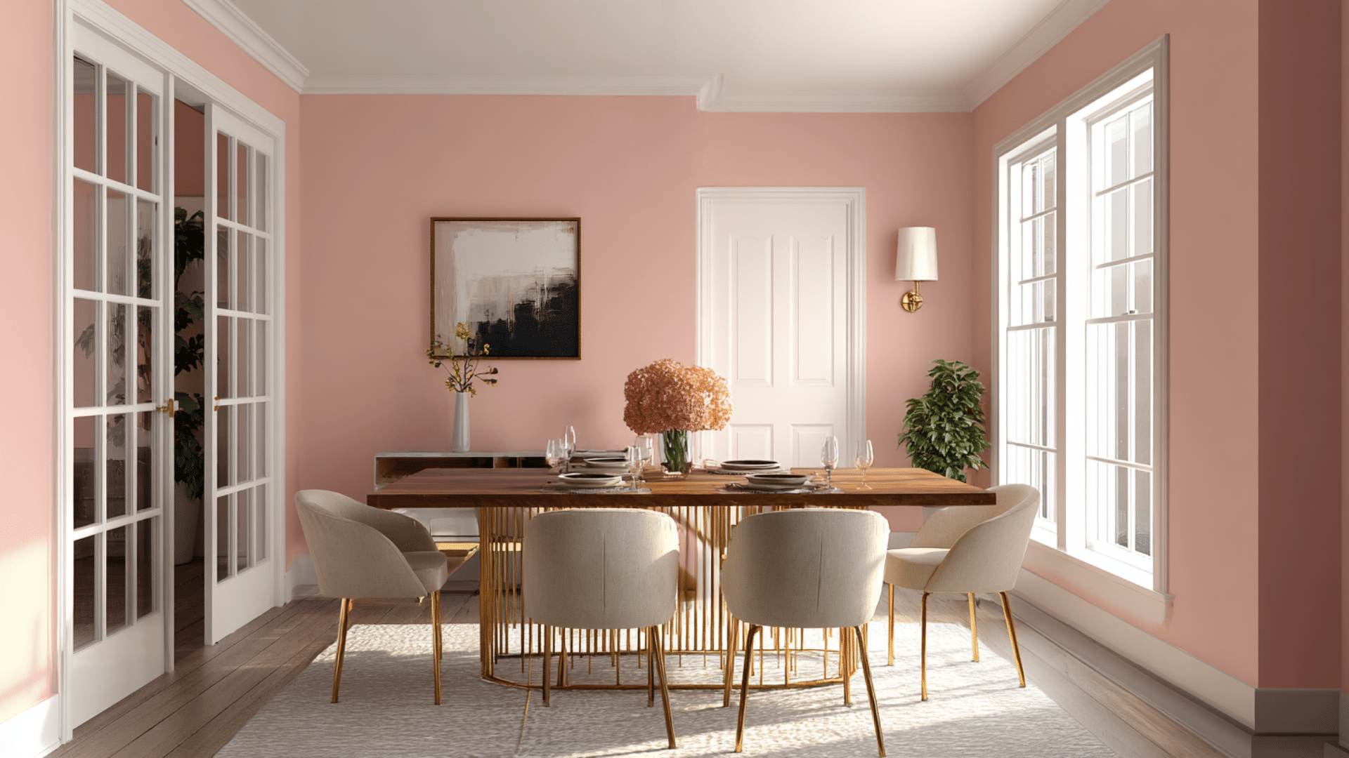
7. Dusty Rose
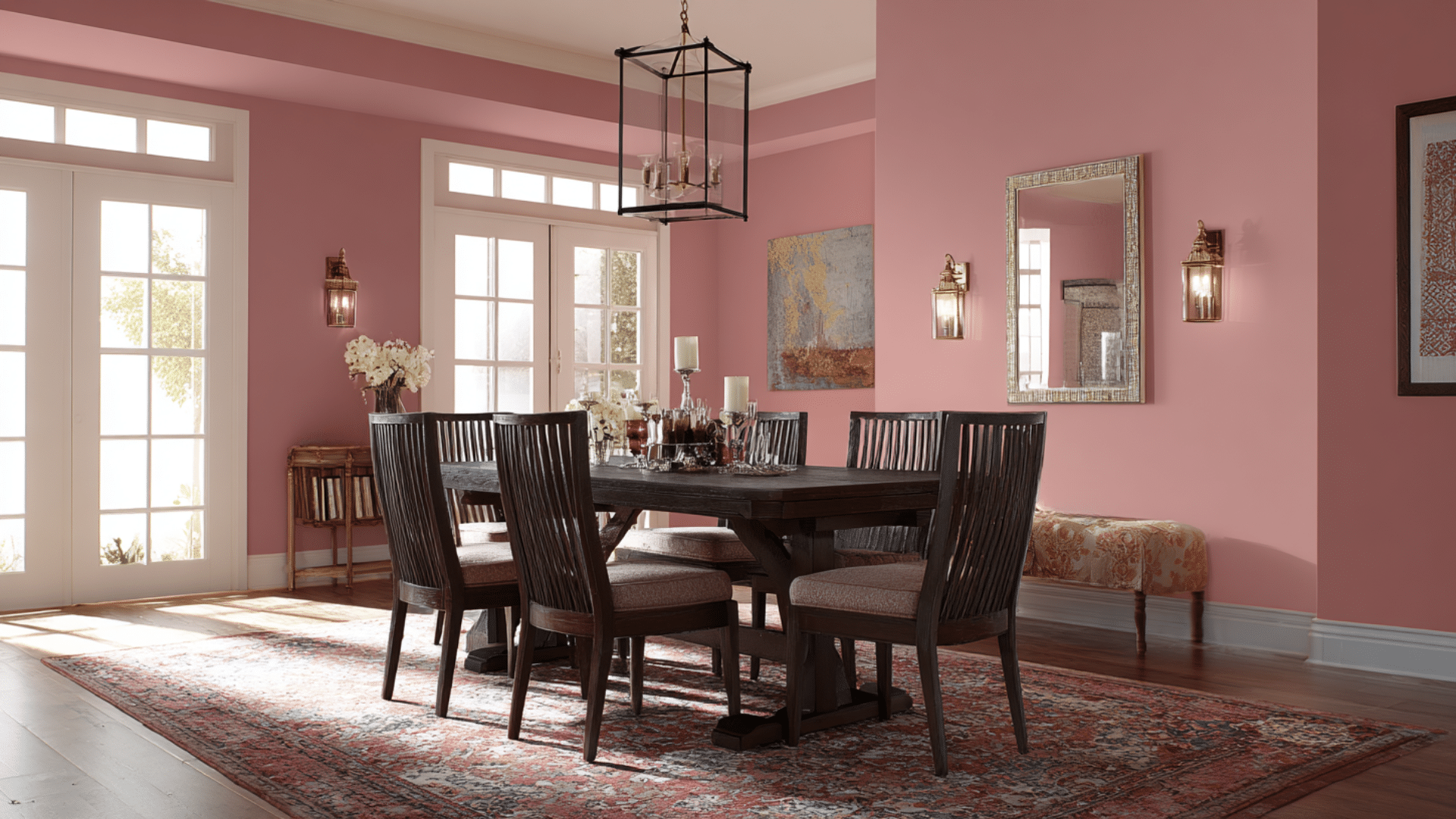
Soft pink creates a romantic and inviting look for dining. This muted shade is advanced enough for adults but gentle enough for family meals. It pairs beautifully with gold fixtures and white trim.
8. Deep Teal
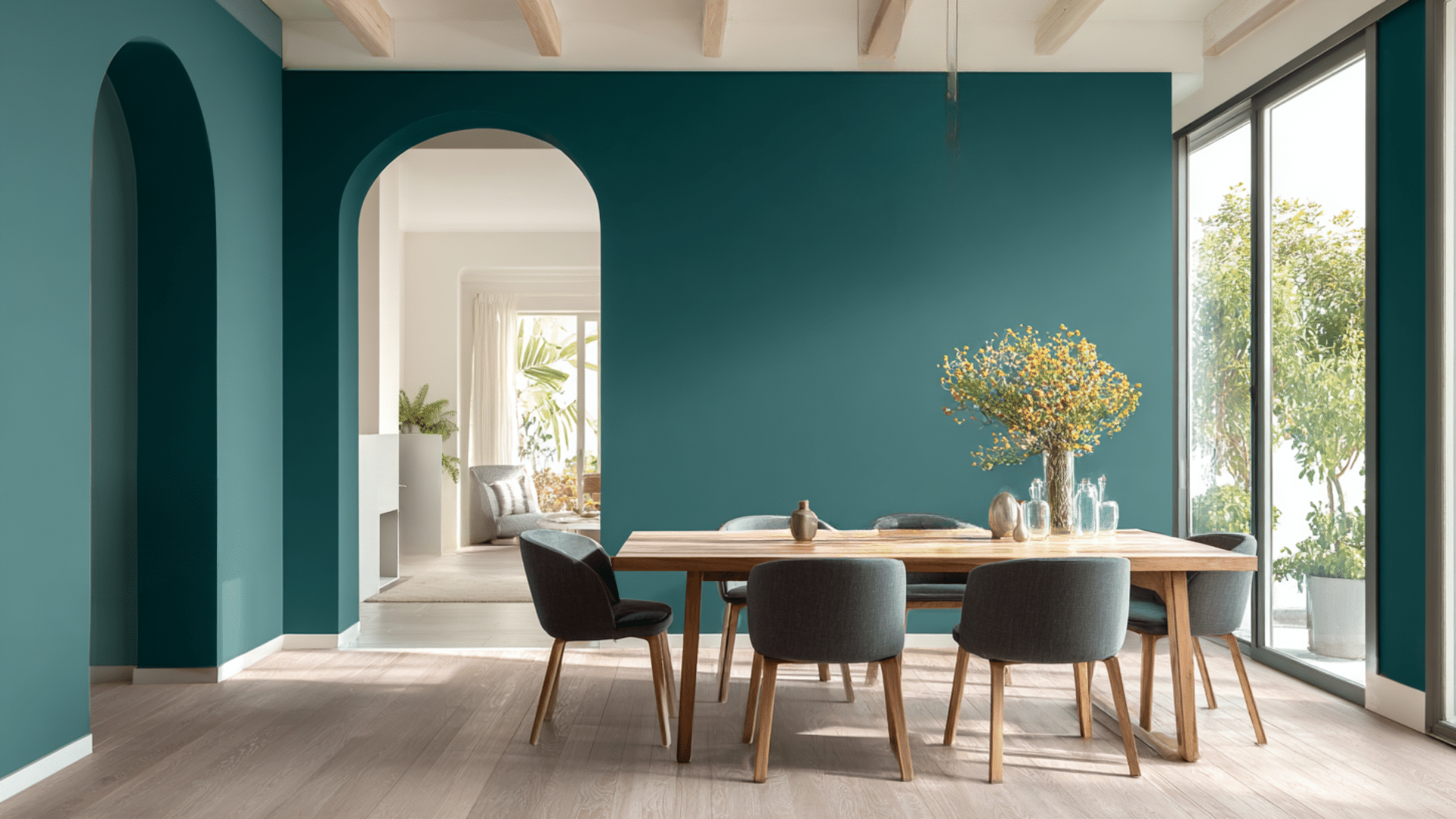
Best of all dining room paint colors, rich and calming, teal combines the best of blue and green.
This jewel tone creates a luxurious feel without being overbearing. It works beautifully with brass hardware and cozy, wood-toned accents.
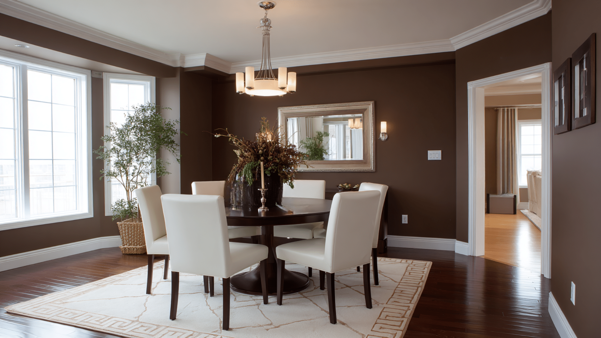
9. Chocolate Brown
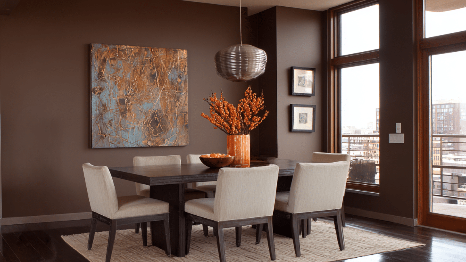
Rich and cozy, chocolate brown creates an intimate atmosphere for dining. This cozy neutral works well with cream accents and metallic fixtures. It’s perfect for creating a library-like, advanced atmosphere in your space.
10. Peacock Blue
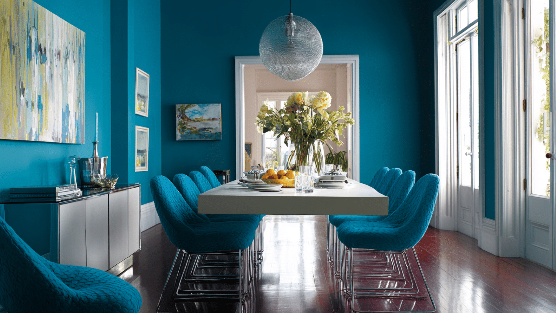
Vibrant and advanced, this blue-green shade makes a bold statement. Peacock blue creates a dramatic backdrop for white dishes and silver fixtures. It works best in formal dining rooms with high ceilings.
11. Mushroom Beige
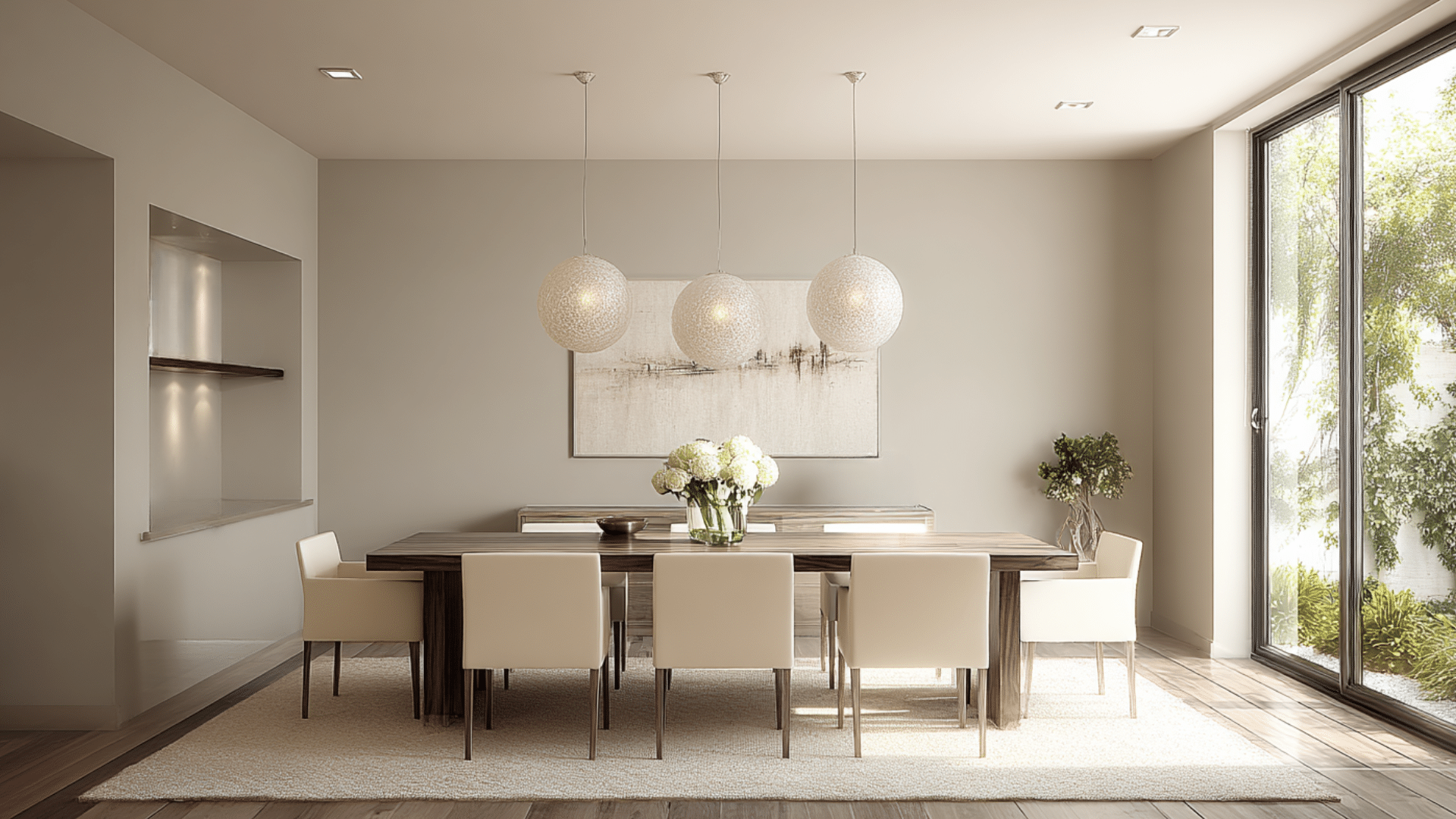
Neutral, mushroom beige is more interesting than plain beige. This earthy tone has gray undertones that prevent it from looking bland. It’s ideal for showcasing colorful artwork and vibrant table linens.
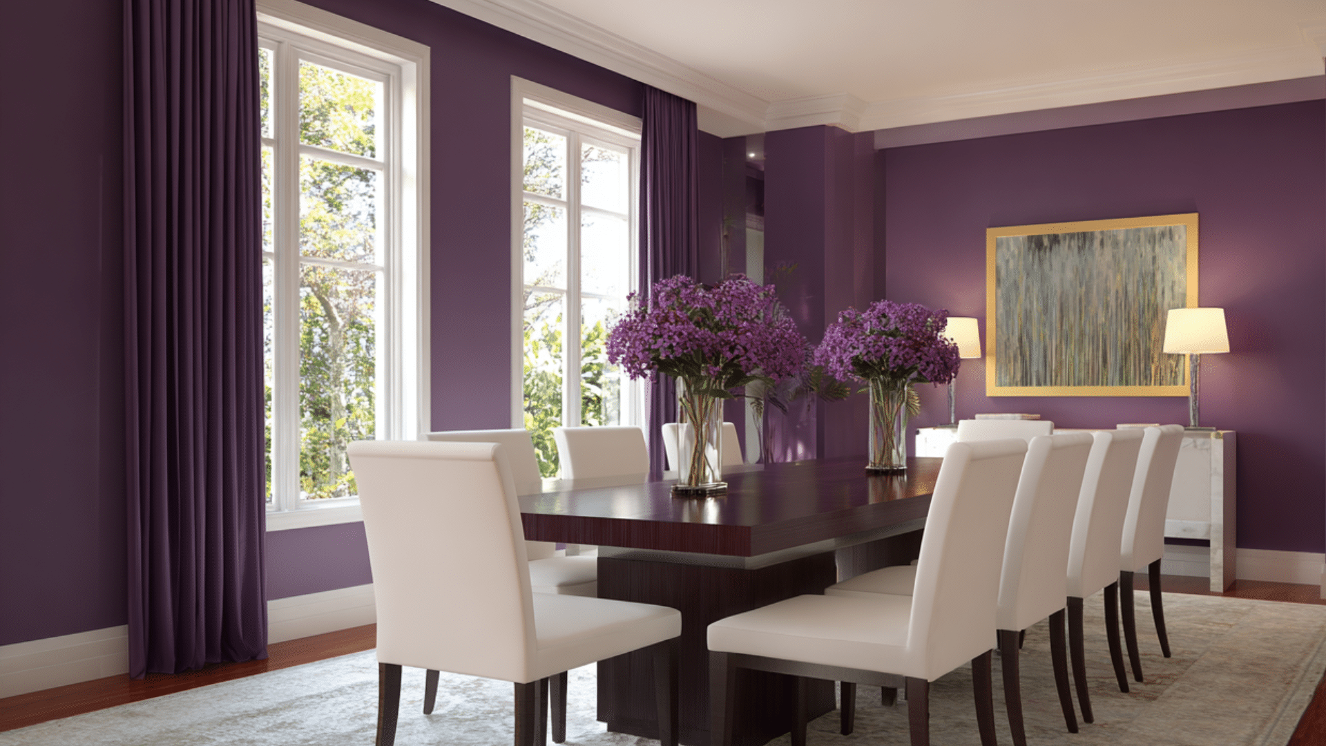
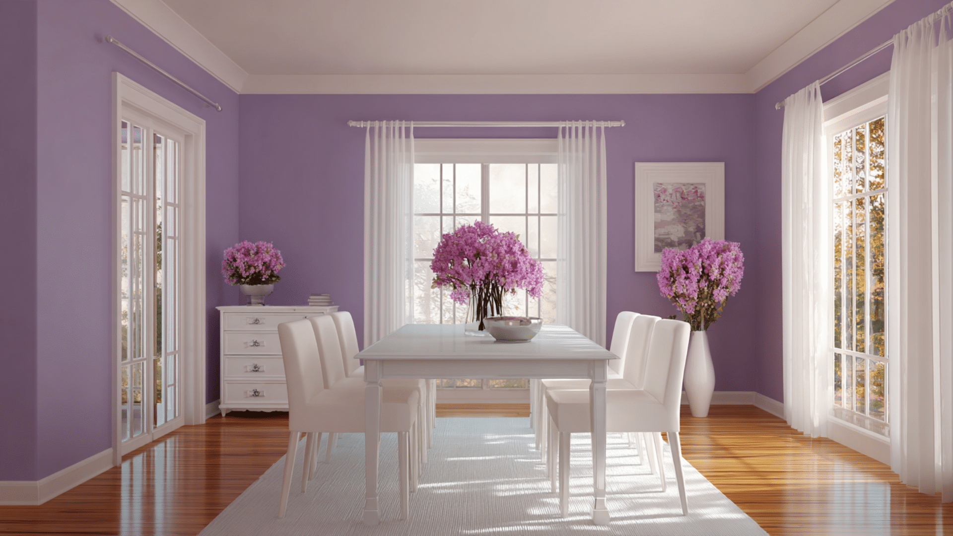
12. Plum Purple
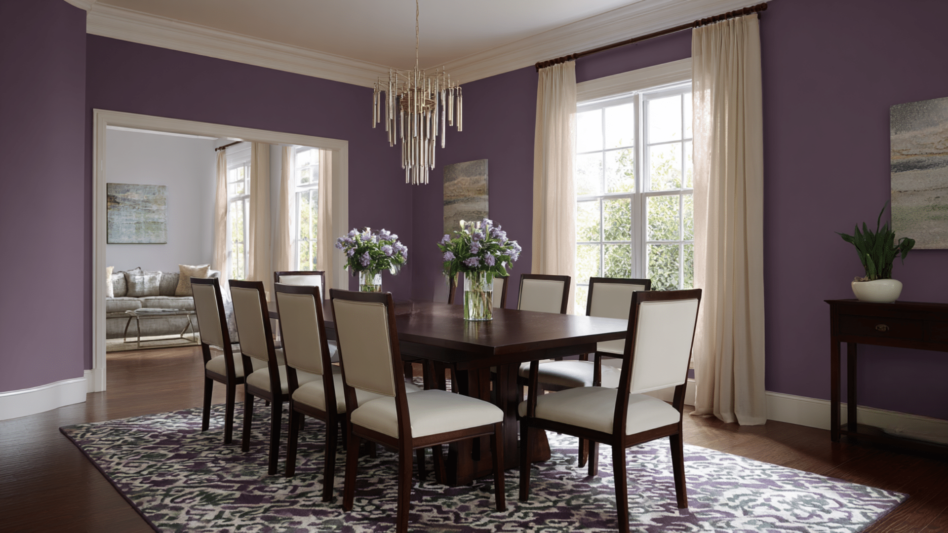
Deep and luxurious, plum creates a royal dining room atmosphere. This rich color stimulates appetite and creates intimate conversation spaces. It goes beautifully with gold fixtures and cream-colored furniture.
13. Caramel Brown
Among all dining room paint colors, one of the most popular choices, sweet and calming, is caramel, which brings cozy comfort to dining spaces.
This medium brown shade works well with both modern and traditional furniture. It creates an inviting atmosphere that makes guests want to linger.
14. Slate Blue
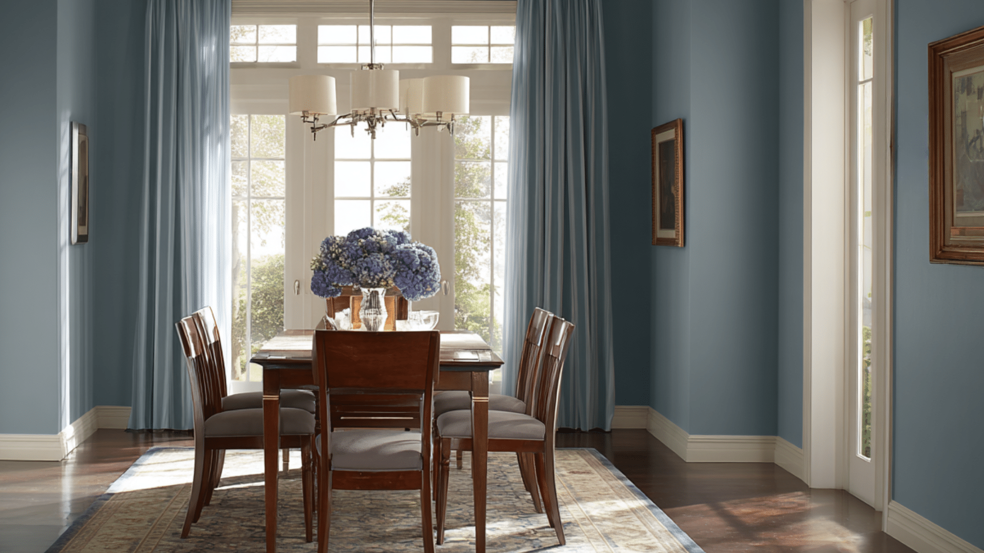
Soft and advanced, slate blue creates a calming dining environment.
This muted shade features gray undertones that complement a wide range of decor styles. It’s perfect for both casual family meals and formal dinner parties.
15. Olive Green
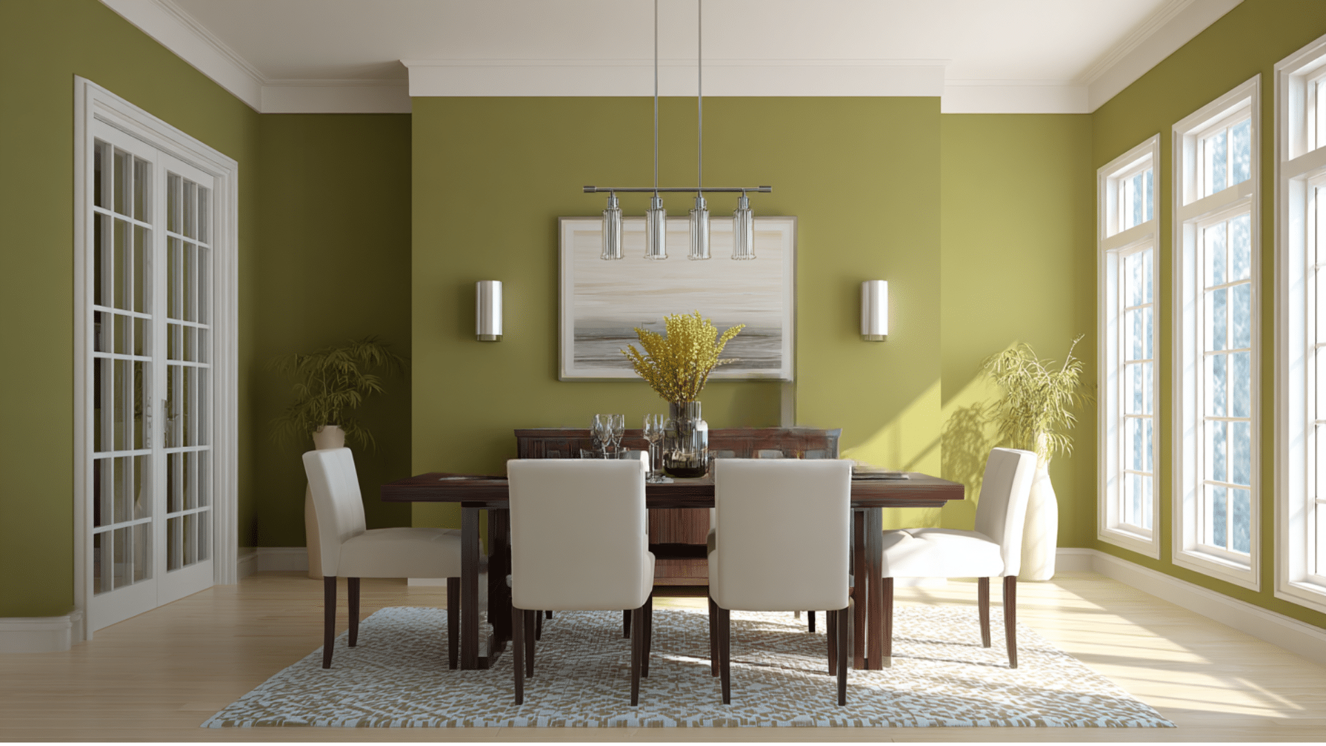
Earthy and advanced, olive green brings natural beauty indoors. This muted tone works well with brass fixtures and natural wood. It creates a Mediterranean-inspired atmosphere that’s both relaxing and stylish throughout.
16. Aubergine Purple
Deep and luxurious, aubergine creates a calm ambiance in a wine cellar. This rich eggplant shade stimulates appetite. It goes beautifully with cream trim and brass fixtures.
17. Taupe
Advance and neutral, taupe combines the ideal blend of brown and gray. This color goes well with both warm and cool accents. It’s perfect for people who want color without making a bold statement.
18. Rust Orange
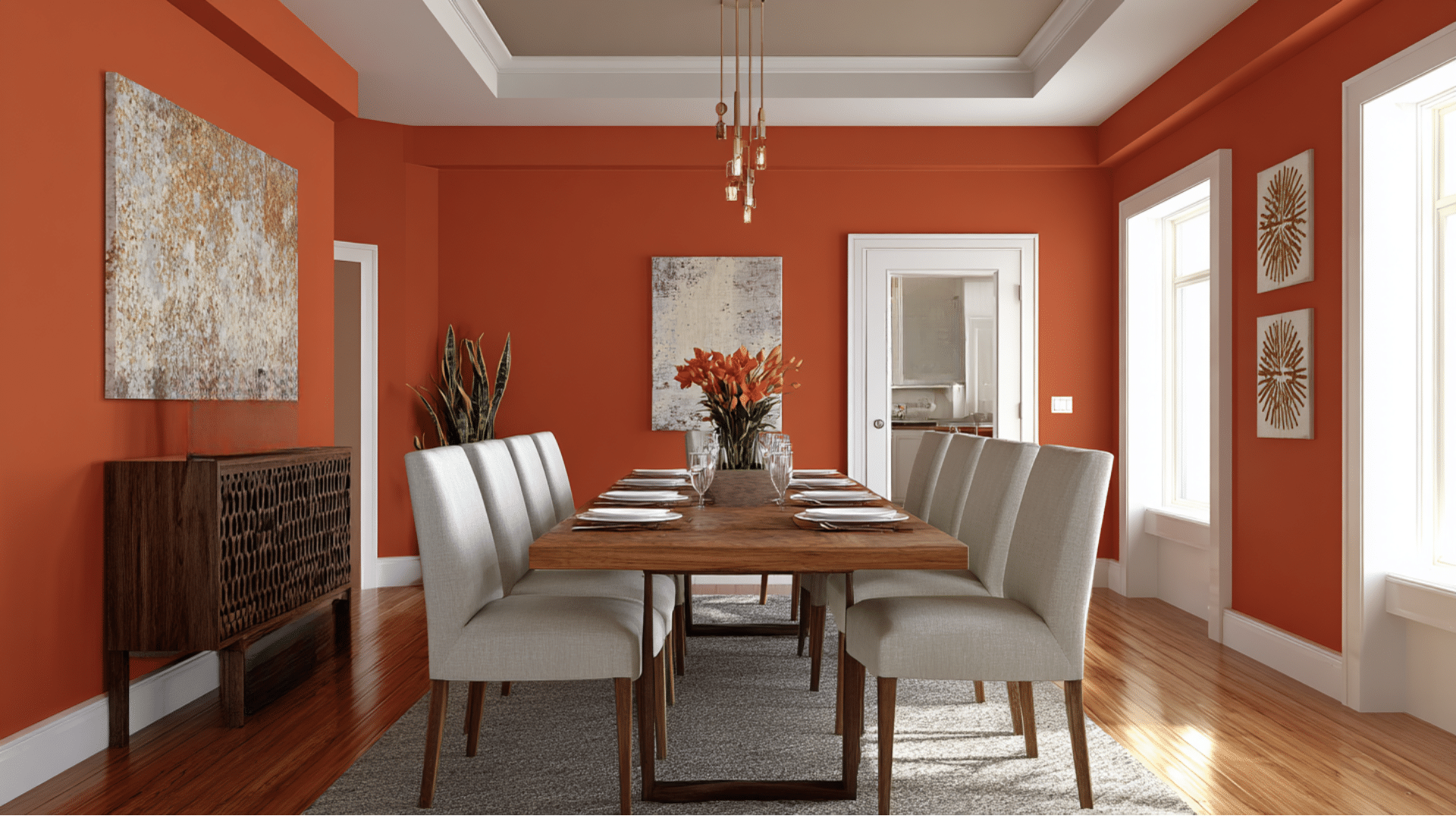
Earthy and calm, rust orange brings autumn vibes year-round. This rich shade creates a cozy, cabin-like atmosphere for family gatherings. It goes wonderfully with cream trim and dark wood furniture pieces.
19. Espresso Brown
Dark and rich, espresso creates a coffee shop atmosphere. This deep brown shade creates a cozy and intimate atmosphere in the room.
It’s ideal for showcasing light-colored artwork and metallic fixtures against the dark backdrop.
20. Cranberry Red
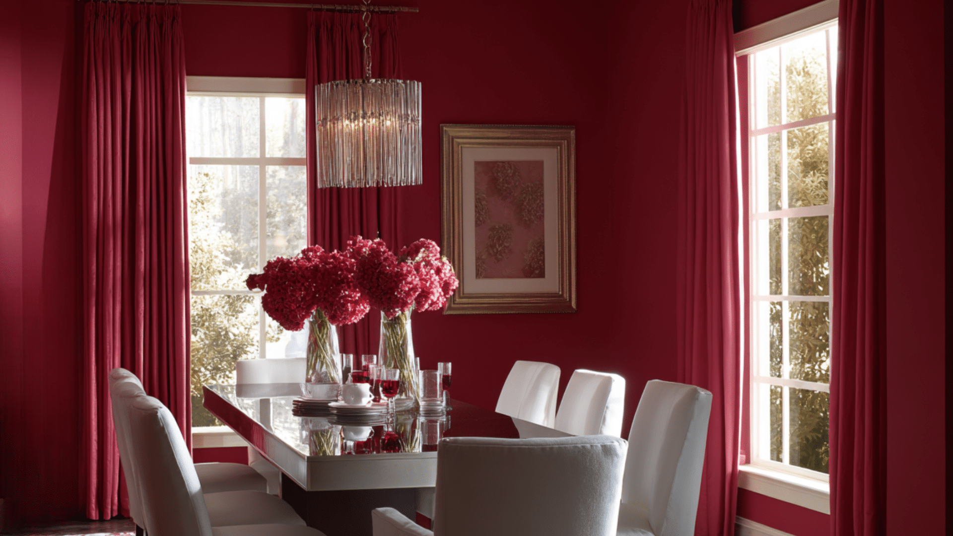
One of the best dining room paint colors, rich and festive, cranberry creates a holiday atmosphere year-round. This deep red shade stimulates appetite and encourages lively conversation.
It works wonderfully with gold fixtures and cream-colored furniture, creating a sense of calmness.
21. Pearl Gray
Soft and advanced, pearl gray features subtle shimmering undertones. This calm, neutral color works well with both relaxed and cool accent colors.
It’s ideal for creating a modern, upscale dining room that exudes an effortless style.
22. Storm Gray
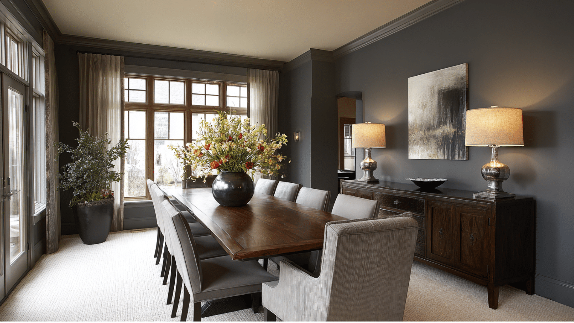
Dramatic and moody, Storm Gray creates an upscale dining atmosphere. This dark neutral has blue undertones that prevent it from feeling heavy. It works beautifully with white trim and colorful artwork for contrast.
23. Blush Pink
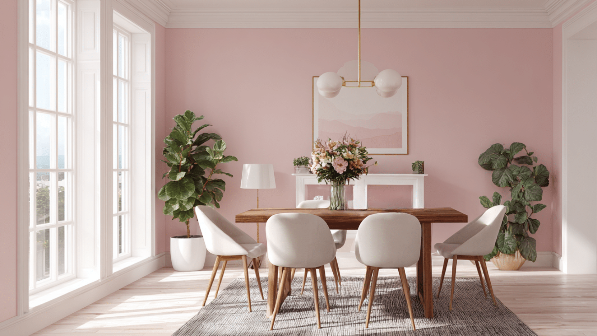
Soft and romantic, blush creates a gentle atmosphere in the dining room. This pale pink shade is advanced enough for adult entertaining.
It goes beautifully with gold fixtures and white furniture, adding a touch of femininity.
24. Hunter Green
Deep and traditional, hunter green creates a classic look in a dining room. This rich shade works beautifully with brass fixtures and mahogany furniture.
It’s perfect for creating an effortless, library-like atmosphere that never goes out.
25. Mauve Purple
Soft and advanced, mauve creates a vintage look in a dining room. This purple shade is more subtle than bright purple options. It works wonderfully with silver fixtures and white furniture for a calm appearance.
26. Pewter Gray
Metallic and advanced, pewter lends an industrial feel to the dining room. This gray shade features silver undertones that complement modern fixtures.
It’s perfect for creating a modern atmosphere that feels polished and professional.
27. Rose Gold
Luxurious, rose gold creates a glamorous look for a dining experience. This pinkish shade works beautifully with metallic fixtures and marble accents. It’s perfect for creating an upscale restaurant atmosphere at home.
28. Honey Gold
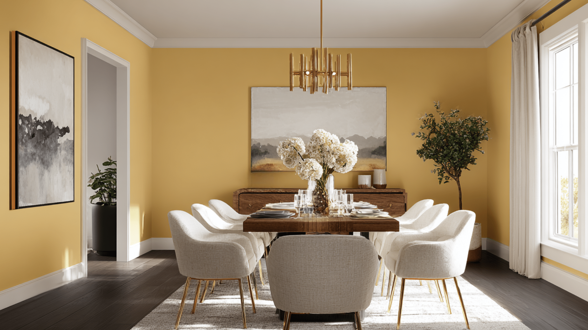
Sweet and calm, honey gold creates an inviting atmosphere in the dining room. This rich yellow shade makes everyone look healthy and radiant. It goes wonderfully with white fixtures and dark wood for a classic combination.
29. Charcoal Green
Deep and advanced, charcoal green creates a forest-like look for dining. This dark shade combines the drama of black with the calming green of nature. It works beautifully with brass fixtures and natural wood for richness.
Tips for Choosing the Perfect Dining Room Paint Colors
- Consider the natural light in your dining room; north-facing rooms tend to require warm colors.
- Test paint samples on different walls at various times throughout the day
- Think about your furniture colors and choose paint that complements them well
- Consider the room’s size, and light colors make small spaces feel bigger
- Match the formality level of your color to how you use the space
- Don’t forget about the ceiling. Darker ceilings make rooms feel cozier
- Consider adjoining rooms and choose colors that flow well together smoothly
Conclusion
Your dining room deserves more than just another coat of white paint. With these beautiful dining room paint color options and proven psychology behind each choice, you now have everything needed to create a space that truly reflects your style.
Start by applying sample patches to your wall. Live with them for a week.
Notice how they look during morning coffee and evening meals. The right dining room paint colors will feel ideal at every hour.
Ready to turn your dining room into a space your family actually wants to spend time in?