Some colors just work, and Boothbay Gray is one of them. It’s a soft, blue-toned gray from Benjamin Moore, color code HC-165.
Designers still reach for this shade today, and homeowners who try it rarely regret it. There’s a reason for that. It makes any room feel calm and pulled together.
So if you’ve been looking for a go-to gray that fits any style – modern, classic, or somewhere in between- this color might be the answer.
Getting to Know This Color
Boothbay Gray (HC- 165) paint is a silvery, powdery blue-gray. Benjamin Moore calls it a lasting blue-gray that adapts to almost any space.
Here’s everything to know at a glance:
- Color Code: HC-165
- Color Family: Neutral / Blue-Gray
- LRV: 43.26
The LRV of 43.26 puts it in the mid-tone range. It isn’t so light that it reads as white. It isn’t so dark that it closes in a room. That middle ground is a big part of its appeal.
This shade carries blue undertones with a very light hint of green. Its low saturation, around 5%, keeps those undertones soft rather than bold.
How visible those undertones get depends on the room’s lighting, which is covered further down.
Strengths and Trade-Offs
Every color has a best-fit scenario and a few rooms where it just won’t click. Knowing both sides upfront helps you avoid a repaint down the line.
Pros
- It performs well indoors and outdoors.
- It pairs with a wide range of colors and materials.
- It isn’t tied to any one trend, so it won’t feel dated soon.
- It works across many design styles.
- Its mid-range LRV suits most room sizes.
Cons
- In low-light rooms, the blue can show up more than expected.
- It isn’t the right pick for a warm or earthy gray look.
- Similar shades like Puritan Gray HC-164 can be hard to tell apart without testing.
How Lighting Changes the Way Boothbay Gray Looks
Light has more say over this color than most people expect. The same walls can look quite different depending on the room’s direction, the time of day, and the bulbs used.
Natural Light by Room Orientation
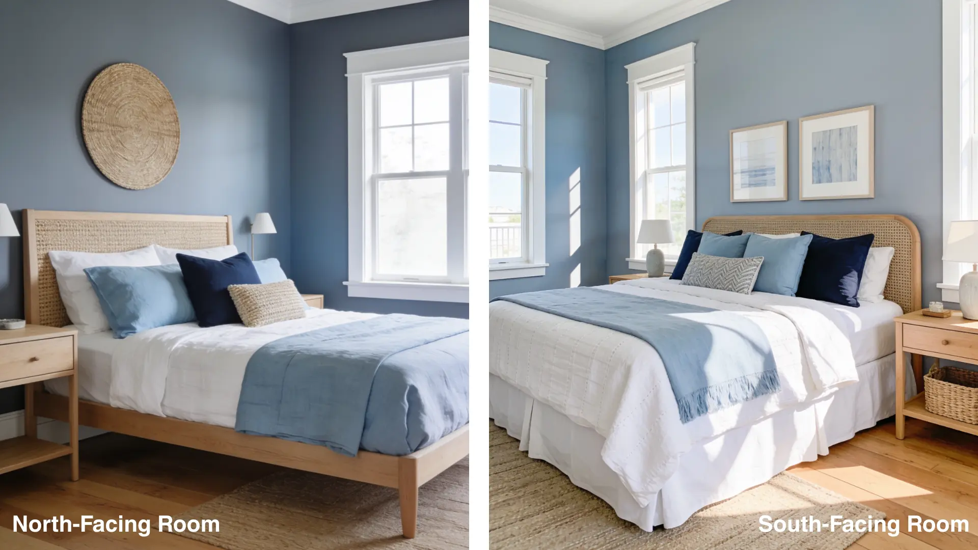 boothbay gray with similar decor; one labeled “North-Facing Room,” the other “South-Facing Room,” both featuring blue walls light bedding and wicker headboards” width=”885″ height=”498″>
- North-facing rooms: The cool, indirect light brings out the blue and green undertones. Expect a crisp, cool, slightly icy slate gray.
- South-facing rooms: Warm sunlight balances out the cool undertones. Here it reads as a soft, even neutral gray with just a whisper of blue. This is where it looks its best.
With an LRV of 43, it soaks up a moderate amount of light. In dark rooms, it can feel like a soft, stormy blue. In well-lit spaces, it lifts to a bright, crisp slate gray.
Artificial Lighting
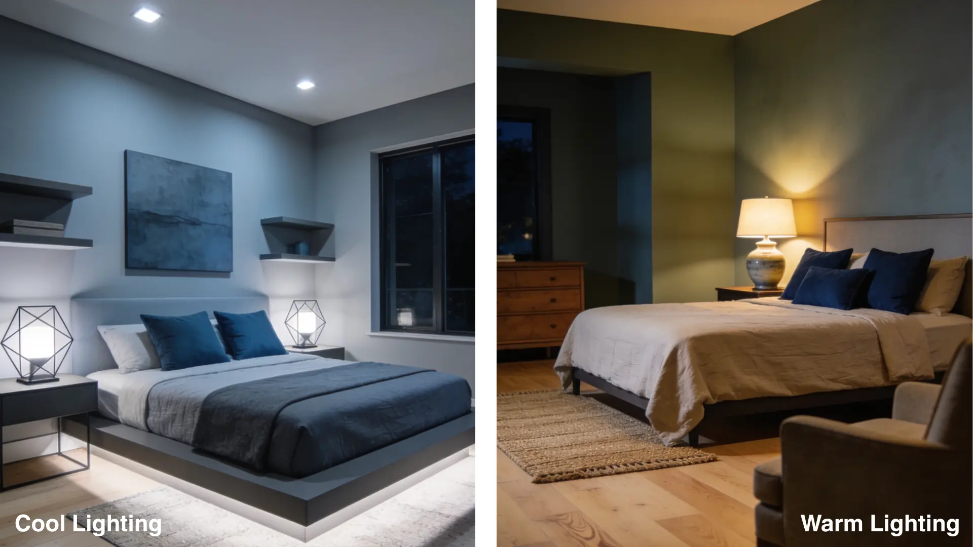
- Warm bulbs (2700K to 3000K): Incandescent or warm LED bulbs bring out the subtle green undertone. The color feels cozy, muted, and closer to a traditional gray-green.
- Cool bulbs (4000K and above): Daylight bulbs boost the blue undertones. The color reads as more vivid and cool, and in some rooms it can feel a bit stark without the warmth of other materials.
How This Color Looks in Real Homes
This shade looks different depending on the room. Here’s how it performs in the spaces people use it most.
Bedrooms
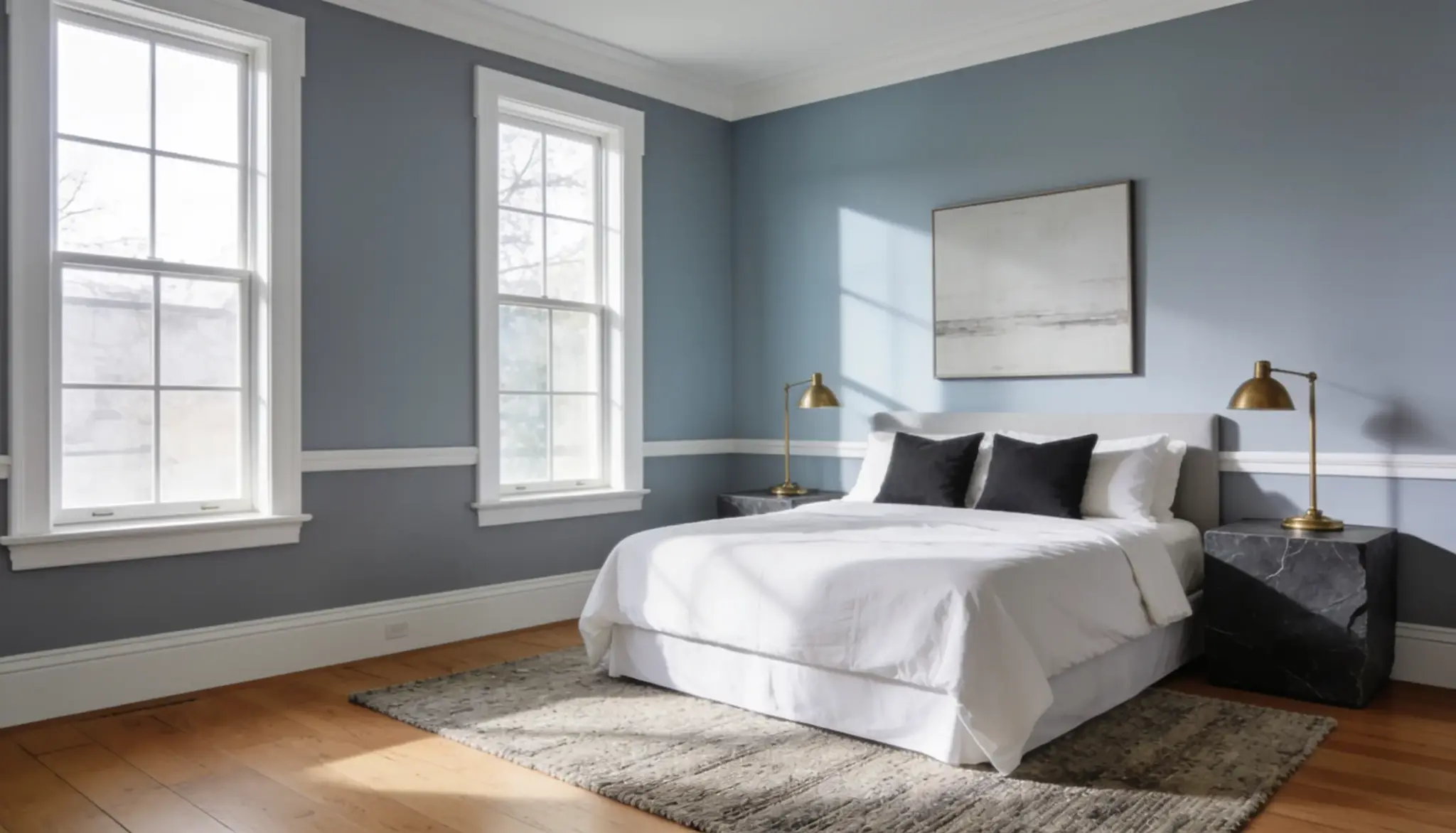
The bedrooms are one of the best spots for this color. It creates a calm, settled feel without weighing the room down.
Interior designer Chelsea Kasch pairs it with Gray Mist or Steam by Benjamin Moore on trim for a softer, layered look.
Dark slate or charcoal accents add contrast without breaking the calm.
Living Spaces
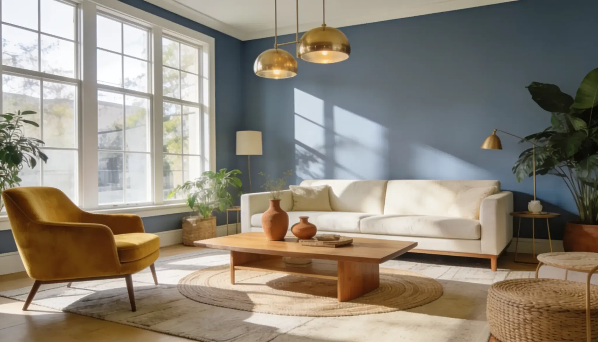
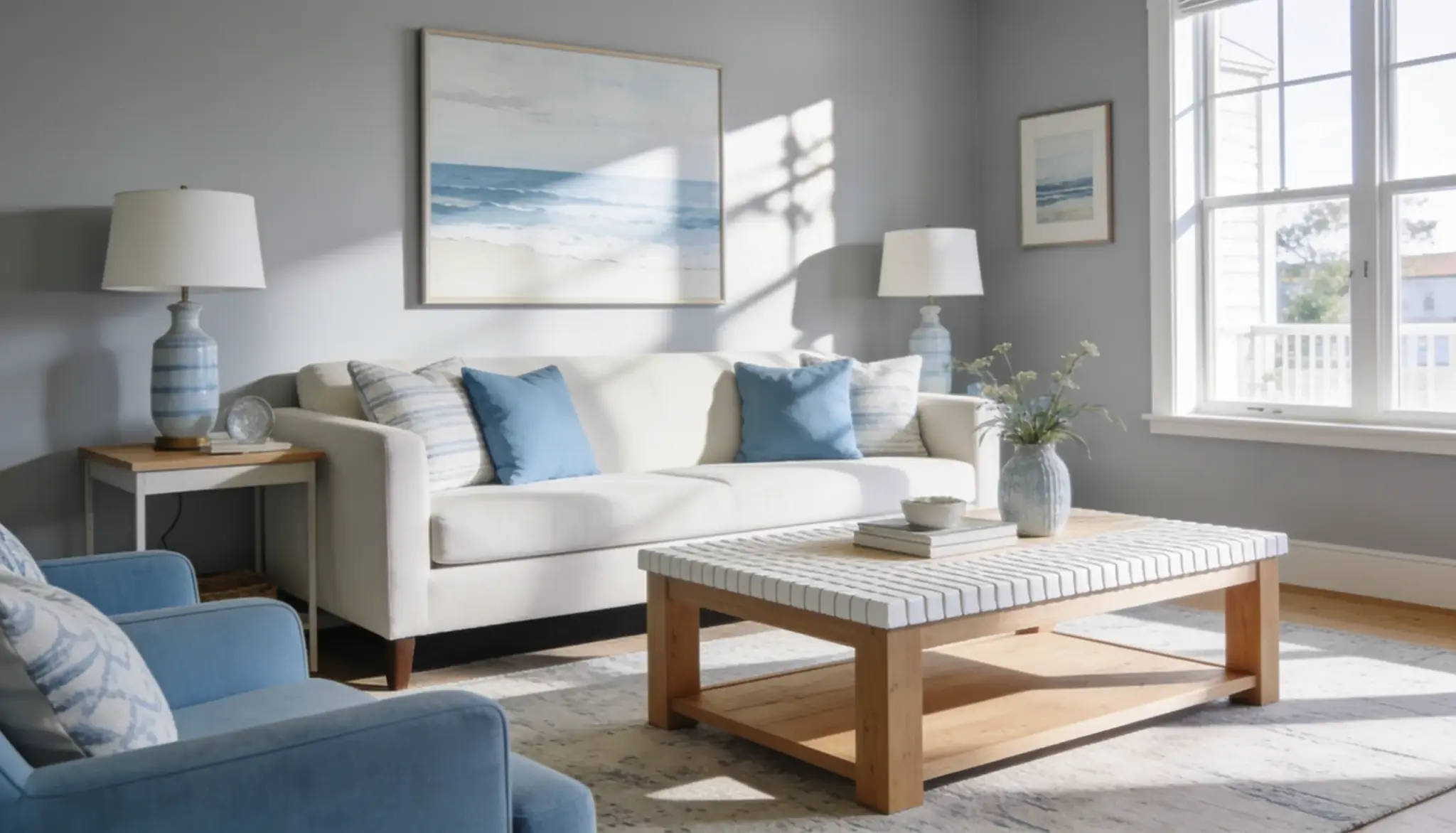
In living spaces this color adds character without being loud. It holds up at full strength, but it also works well diluted to about 75% for a lighter, airier feel.
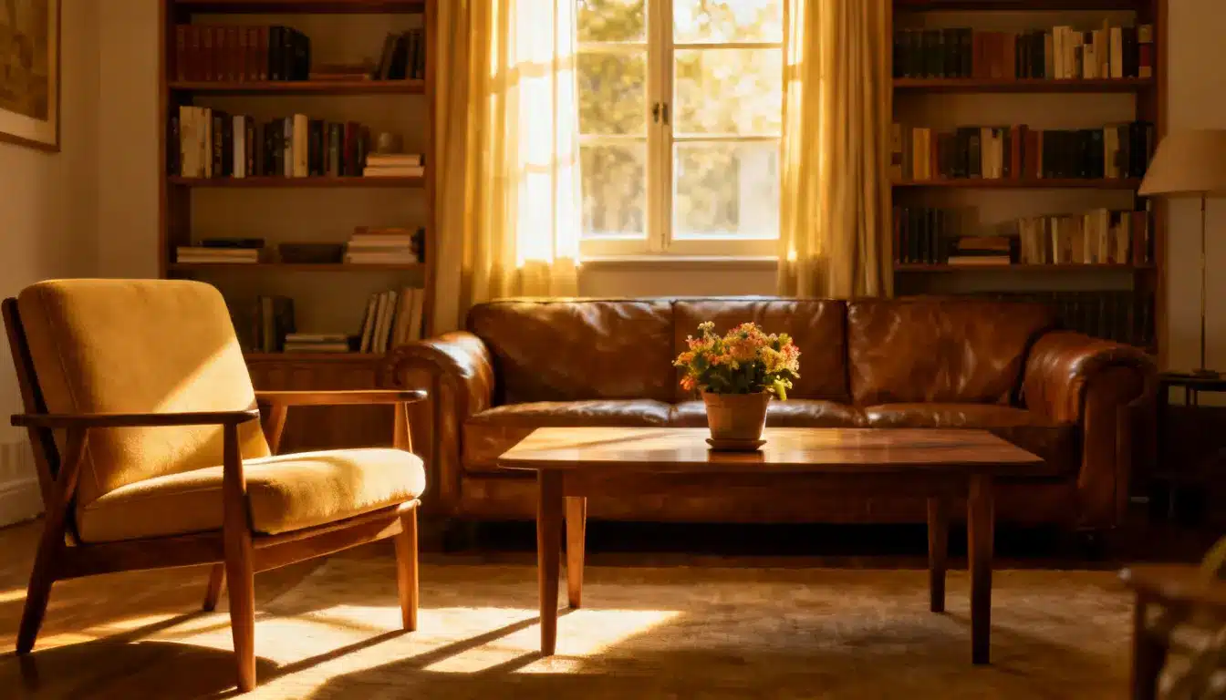
It pairs nicely with warm accents like gold, mustard, and terracotta, which balance out the cool base.
Kitchens
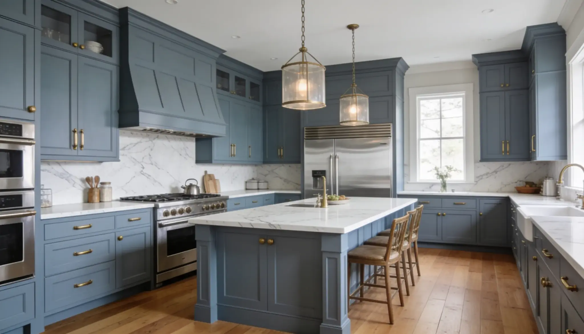
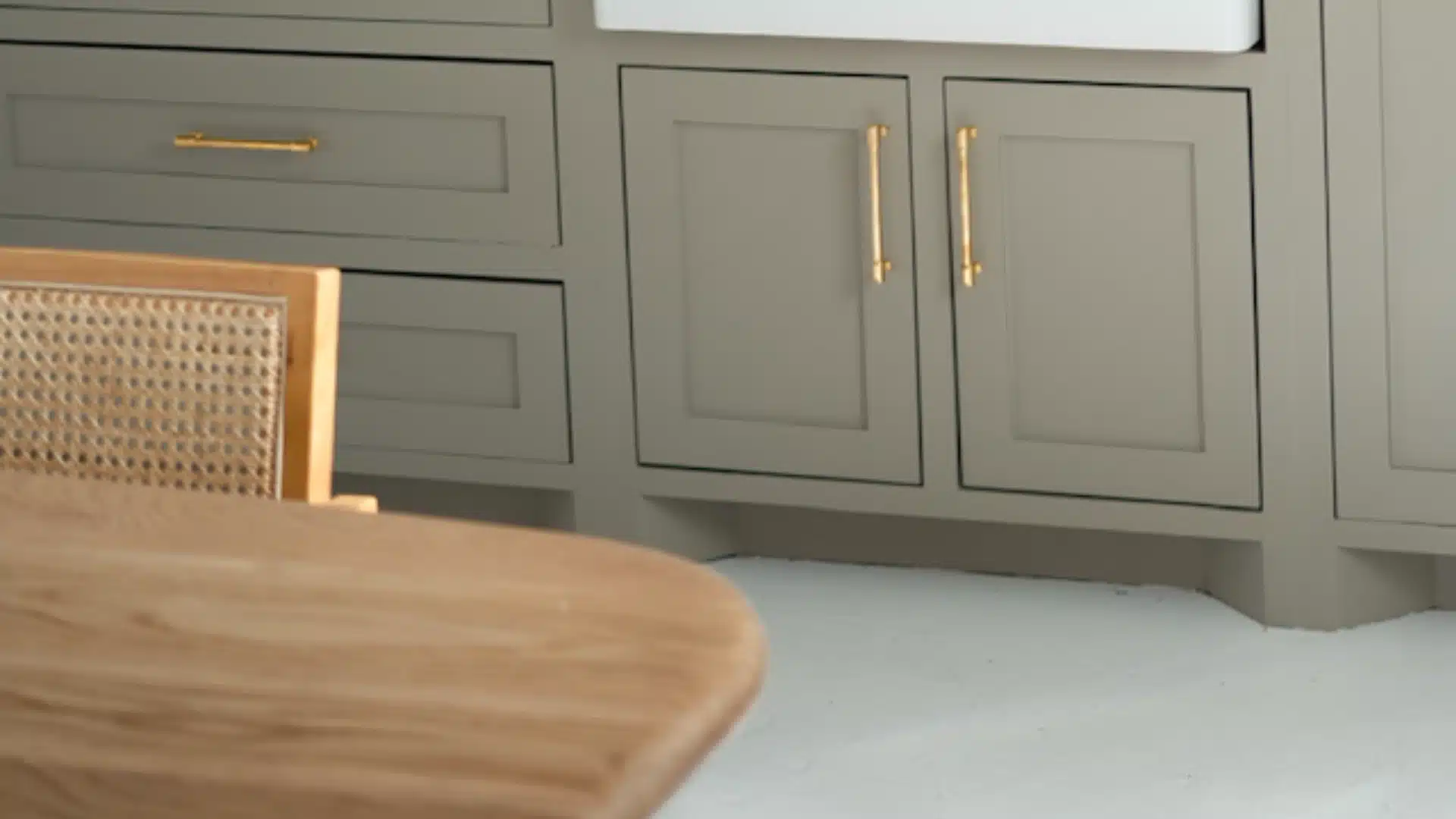
On kitchen’s cabinets, this shade looks sharp and put-together. It pairs well with granite, quartz, or natural stone countertops.
You can try Classic Gray OC-23 or Silver Satin OC-26 on the walls next to it for contrast that feels balanced rather than harsh.
Bathrooms
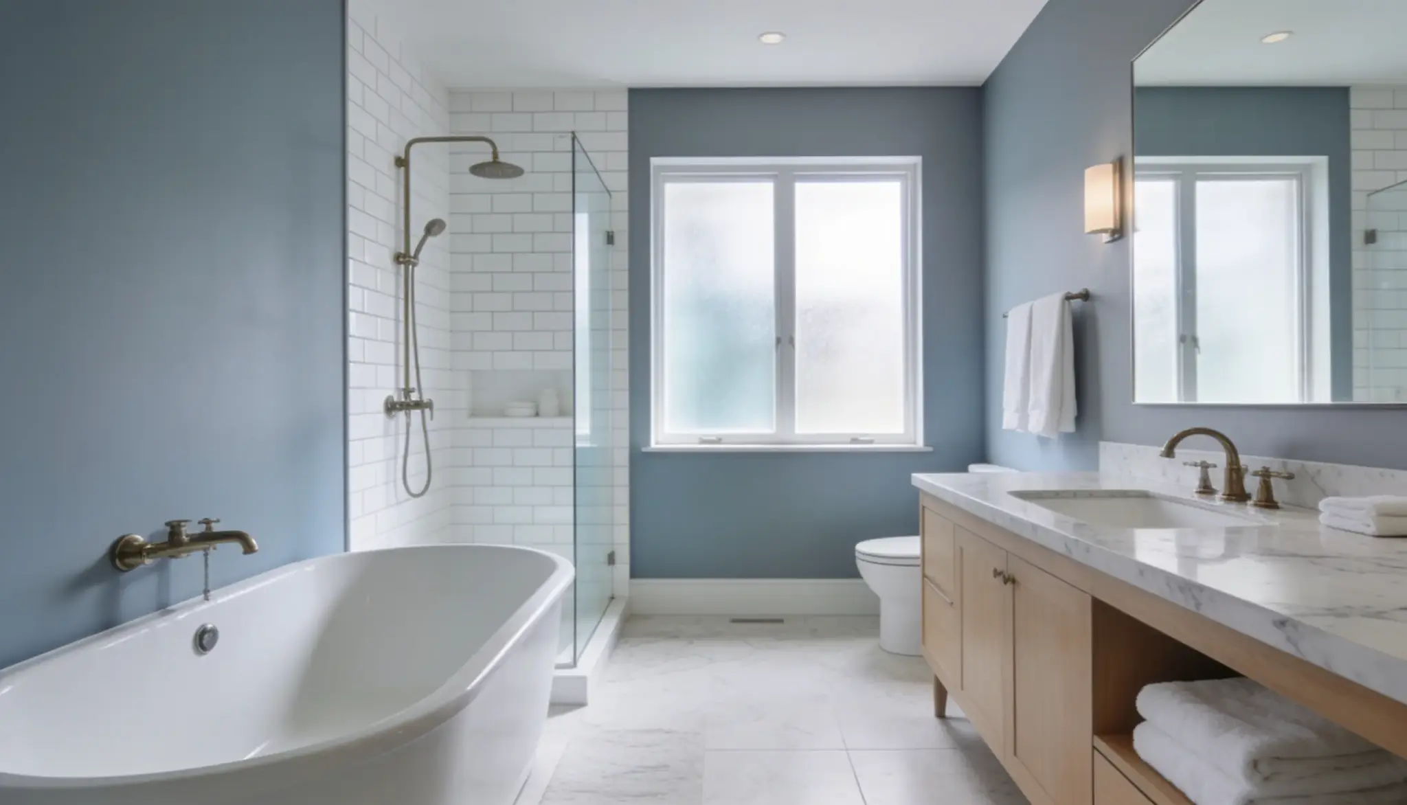
In bathrooms, this color brings a spa-like feel. It works especially well with white subway tile, brushed nickel, or brass fixtures.
Small bathrooms handle it well too, since the mid-range LRV keeps things from feeling cramped. On vanities, it looks sharp next to white or marble-look countertops.
Exterior
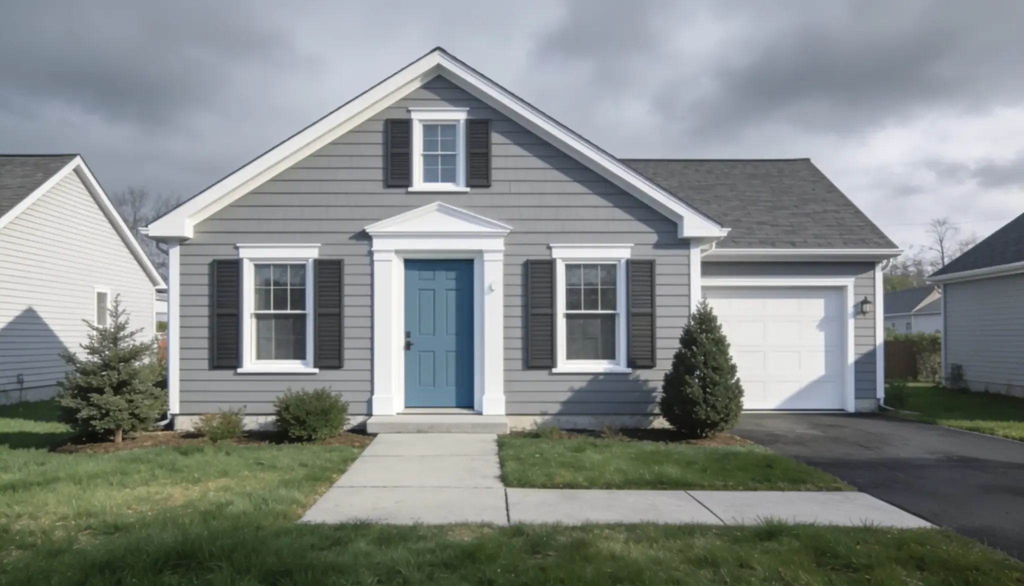
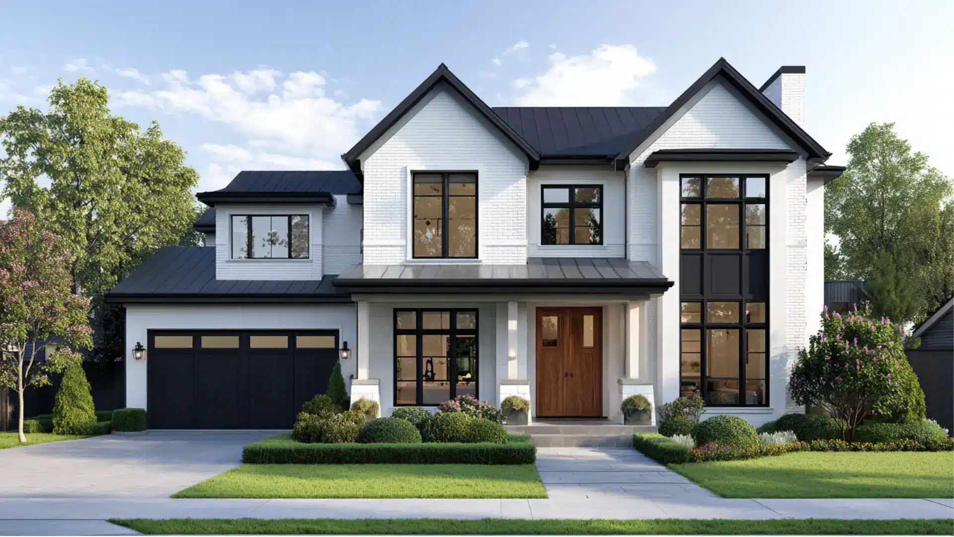
This shade has a strong record on home exteriors. It suits colonial, shingle-style, and Cape Cod homes especially well.
Paired with Decorator’s White OC-149 on the trim, it gives a clean, put-together look that feels right, not forced.
In flat or overcast light, the blue in this color shows up more clearly outside. Test it at different times of day before painting the whole exterior.
Paint Colors That Work Beautifully Alongside It
Once you know how this shade behaves, it’s easy to build a full palette around it.
For rooms, these combinations tend to work best:
- Warm whites and creamy off-whites on nearby walls
- Natural wood tones like oak, walnut, or pine
- Unlacquered brass or matte black hardware
- Earthy neutrals like sand, linen, and taupe as accents
Skip very cool whites with strong blue undertones. They push the whole space too cold and fight the balance that makes this color work so well.
How It Compares to Similar Shades
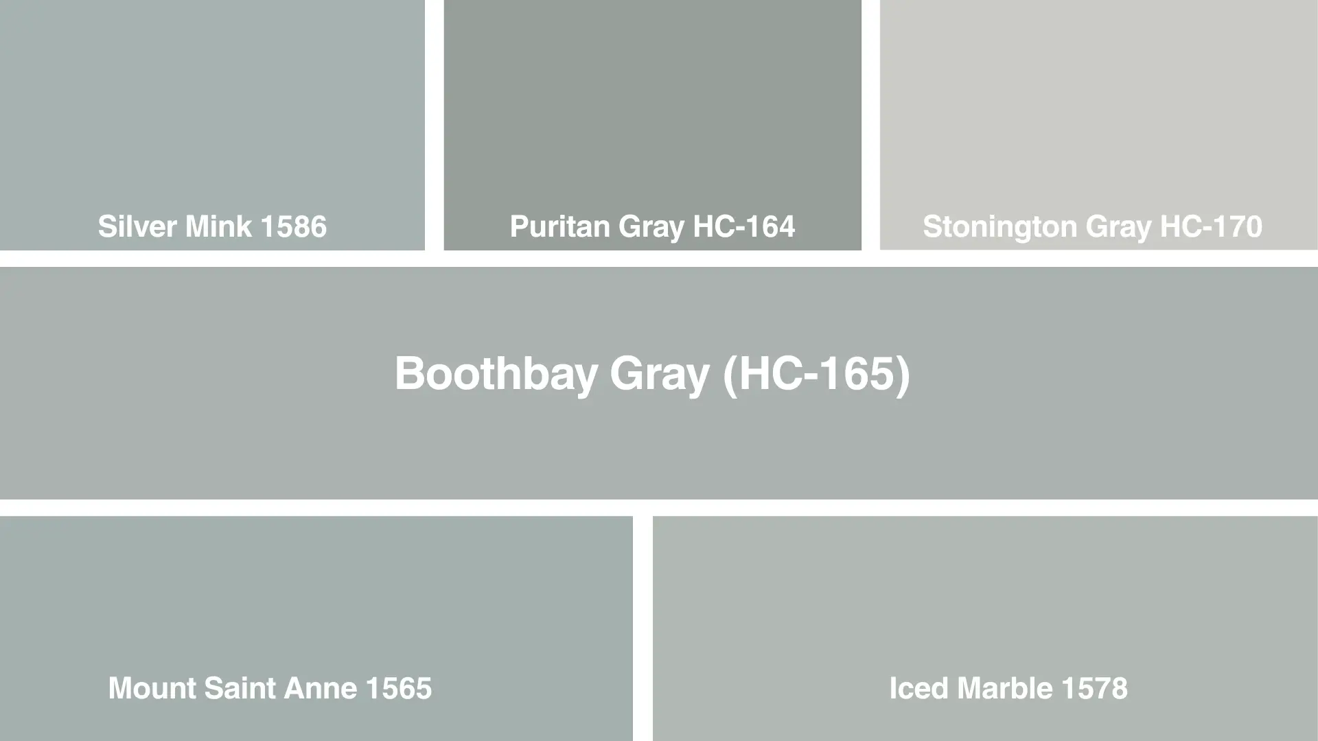
Picking the right gray often comes down to comparing a few close options. Small shifts in tone or brightness can lead you to a totally different mood.
Here’s how some other popular picks stack up.
1. Silver Mink 1586
Silver Mink is a soft greige with warm undertones, offering a cozier alternative to Boothbay Gray’s cooler blue-gray tone.
It shifts between taupe and gray depending on lighting, making it versatile for living rooms and bedrooms. Pair with warm whites and natural wood tones for balanced, inviting spaces.
2. Stonington Gray HC-170
Stonington Gray is a classic light gray with subtle blue undertones, closely echoing Boothbay Gray’s serene, coastal quality.
It reads crisp yet calming across different lighting conditions.
Ideal for exteriors, trim, or whole-house color schemes, it pairs beautifully with white accents and navy blue details
3. Puritan Gray HC-164
Puritan Gray leans slightly greener than Boothbay Gray, delivering a muted, historic charm reminiscent of New England architecture.
This understated shade works wonderfully on exteriors and interiors alike.
It also complements black shutters, brass fixtures, and deep green landscaping for a timeless, sophisticated aesthetic throughout any home.
4. Mount Saint Anne 1565
Mount Saint Anne offers a soft, dusty blue-gray similar to this color but slightly more muted and atmospheric.
It creates tranquil, airy interiors reminiscent of misty mountain views.
This versatile shade pairs effortlessly with crisp whites, weathered wood, and soft grays for calming, cohesive spaces
5. Iced Marble 1578
Iced Marble is a pale, icy gray with cool undertones, offering a lighter, brighter counterpart to this color.
It brings a fresh, airy feel to interiors, especially in spaces with abundant natural light. Complement with crisp whites, silvers, or soft blues for a refined finish.
Is This Still a Good Choice in 2026?
Yes. Some grays from the 2010s have started to feel flat and overused. This shade avoids that trap because it has enough blue in it to feel like a real choice, not a default neutral.
At the same time, it isn’t so blue that it chases the powdery blue trend of recent years.
Homes and Gardens notes that it sits at just the right point between gray and blue, feeling current without depending on any trend.
That’s a hard balance to strike, and it’s why designers keep reaching for it year after year.
Conclusion
This shade sits in a rare middle ground: calm without cold, and full of character without being too bold.
It works on bedroom walls, kitchen cabinets, and full home exteriors. It remains one of Benjamin Moore’s most versatile blue-gray paint colors.
Test a sample in the space and watch it through the day. It’ll quickly become clear why this stays one of the most reliable blue-gray paint colors around.
Frequently Asked Questions (FAQs)
1. What Finish Works Best For Boothbay Gray On Walls?
Eggshell or satin for most walls. Semi-gloss on trim and cabinetry for durability and easier cleaning.
2. Does Boothbay Gray Work In Small Rooms?
Yes. Its mid-range LRV means it does not absorb too much light and performs better in smaller spaces with some natural light.
3. Is Boothbay Gray a Good Choice For Resale?
Yes. It reads polished without being polarizing, which is exactly what works well for resale.
4. Can Boothbay Gray Be Used On a Ceiling?
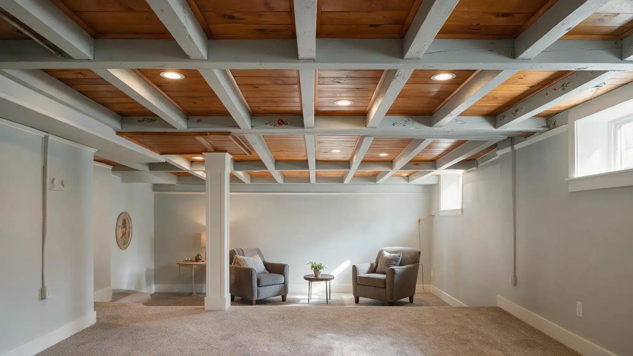
Yes, it can work on a ceiling in a color-drenched scheme.