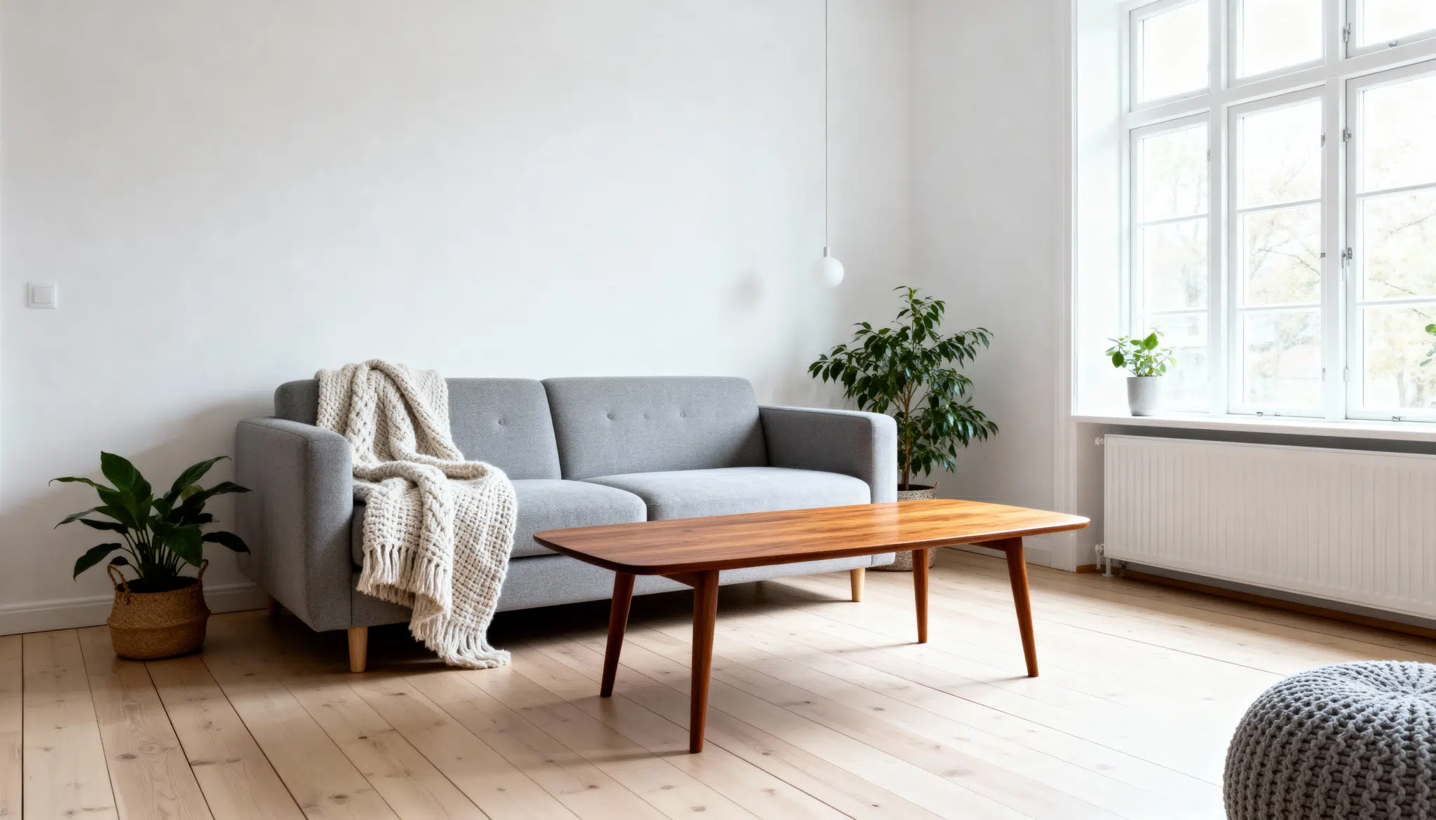

Monochromatic design uses different shades, tints, and tones of a single color throughout a room.
Imagine it like painting with a single color family, but experimenting with different shades of light and dark.
For instance, a blue monochromatic room could feature navy walls, powder blue cushions, and steel blue furniture. This doesn’t mean everything has to be the same shade.
The key is sticking to one color family while varying the intensity and depth of color. It’s simple yet incredibly effective for creating a cohesive and calming space.
Monochromatic design uses varying shades of one color throughout a space, creating sophisticated and unified interiors.
- Creates seamless visual flow: Eliminates color conflicts between rooms, making spaces feel larger and more cohesive, especially in open floor plans.
- Delivers continuous beauty: Never goes out of style, unlike trendy color combinations, protecting your long-term design investment.
- Highlights texture and form: Removes color distractions so architectural details, furniture shapes, and material textures become focal points.
- Simplifies decorating decisions: Makes choosing furniture and accessories straightforward by working within one color family.
- Provides versatile foundation: Easily refreshed with colorful accent pieces without changing the entire scheme.
- Creates a calming atmosphere: Single-color schemes feel naturally peaceful and sophisticated.
Monochromatic Interior Ideas: Shades, Tints & Tones
Monochromatic design utilizes a single color in varying shades to achieve harmony and depth.
It’s simple, modern, and versatile, balancing light and dark keeps spaces stylish and far from boring.
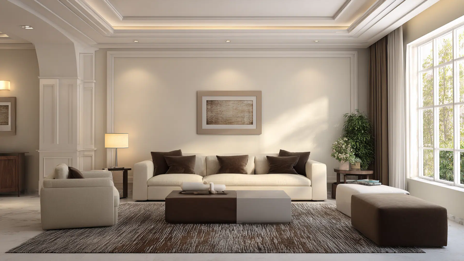
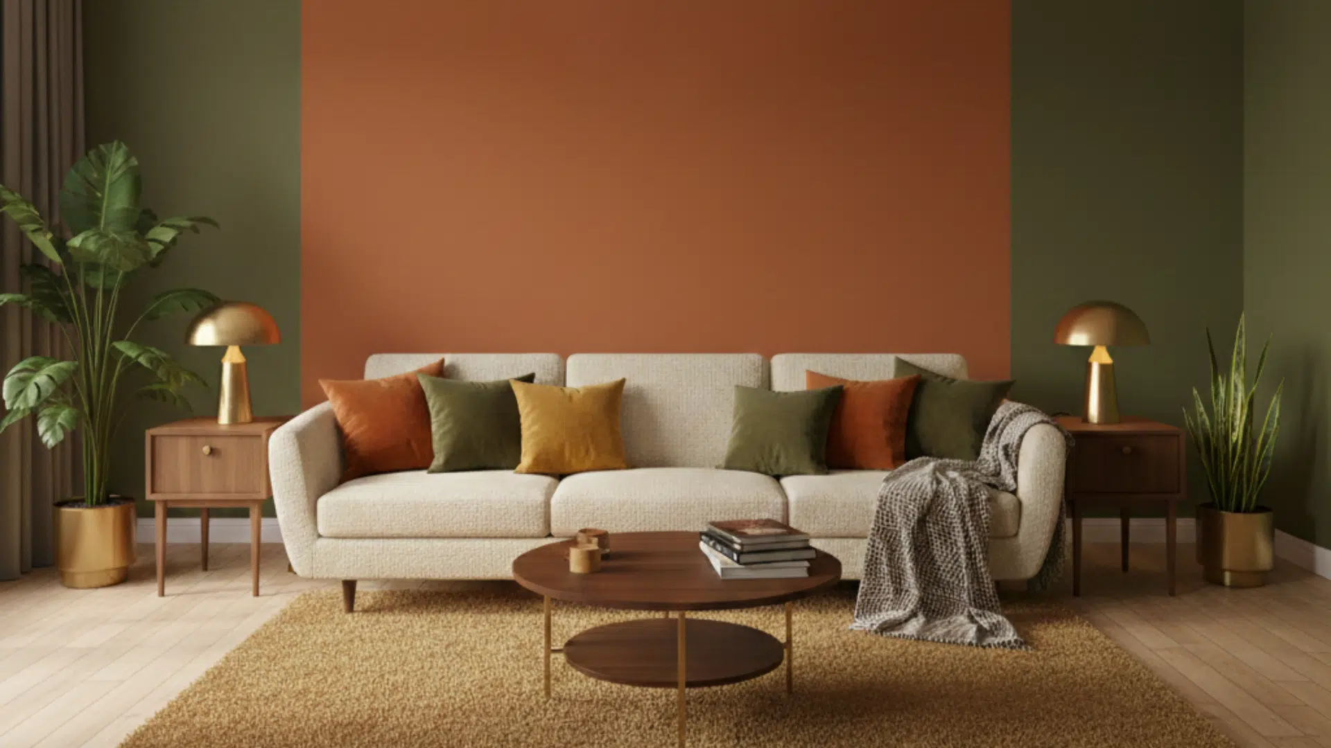
1. Living Room

Blues bring peace and balance, perfect for relaxing spaces. Layer deep and light tones for comfort and depth.
- Shades: Navy sofa, midnight blue accent wall, dark blue artwork
- Tints: Powder blue throw pillows, light blue ceramic vases
- Tones: Steel blue coffee table, dusty blue curtain panels
- Recommendation: Georgian Bay (CC-782)
2. Kitchen

Rich browns create warmth and a welcoming vibe. Combine wood textures with light neutrals for balance.
- Shades: Chocolate cabinets, espresso countertops, walnut flooring
- Tints: Cream backsplash, ivory lights, off-white stools
- Tones: Taupe walls, beige island, mushroom accents
- Recommendation:Benjamin Moore Edgecomb Gray (HC-173).
3. Bedroom

Gray promotes calm and relaxation. Mix soft and dark shades with cozy textures for depth.
- Shades: Charcoal headboard, slate dresser, pewter lamps
- Tints: White bedding, light gray blanket
- Tones: Dove gray walls, greige curtains
- Recommendation: Acier (SW 9170)
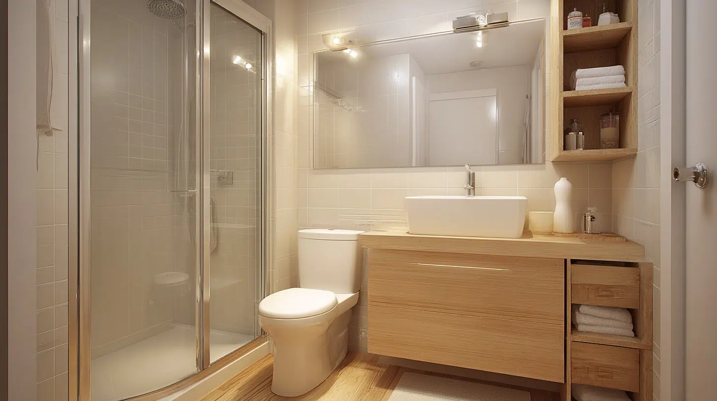
4. Bathroom
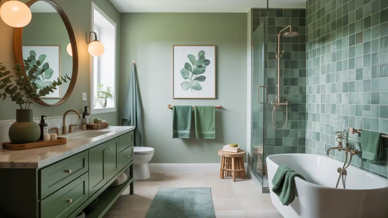
Greens create a refreshing, nature-inspired spa look. Add wood or stone textures for an organic touch.
- Shades: Forest vanity, sage tiles, emerald towels
- Tints: Mint walls, seafoam mat, white fixtures
- Tones: Olive decor, jade pots, eucalyptus art
- Recommendation: Nature’s Gift (N410-4)
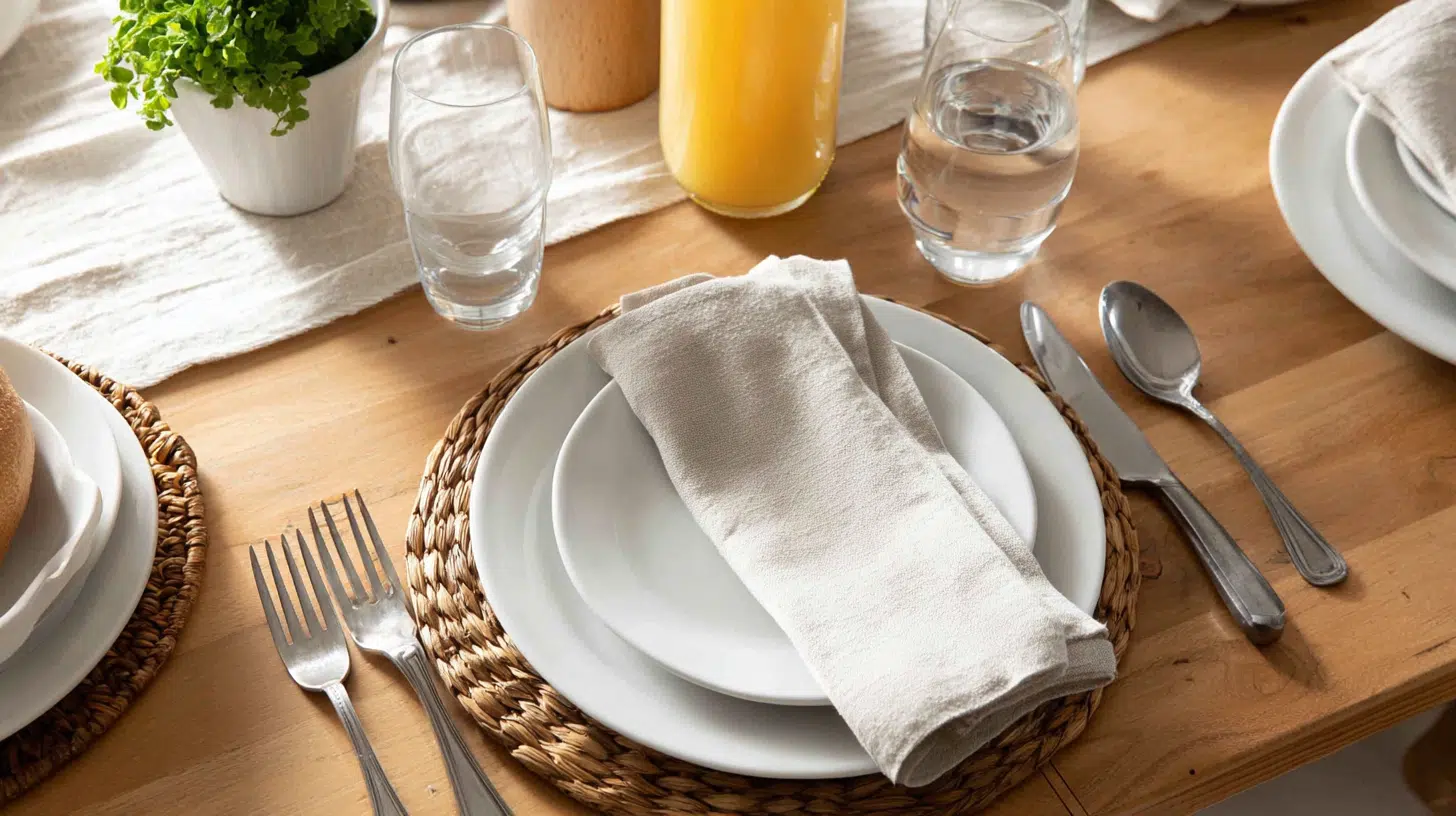
5. Dining Room

Burgundy adds luxury and warmth to gatherings. Contrast dark tones with blush and metallics.
- Shades: Wine chairs, burgundy runner, red art
- Tints: Blush napkins, rose gold accents
- Tones: Dusty rose walls, mauve curtains
- Recommendation: Benjamin Moore Cranberry Cocktail (2083-20)
6. Home Office

Beige tones boost focus while keeping a soft, welcoming feel. Add wood and greenery for warmth.
- Shades: Tan chair, coffee shelving, bronze lamp
- Tints: Cream walls, ivory keyboard
- Tones: Beige rug, mushroom cabinet
- Recommendation: Sherwin-Williams Balanced Beige (SW 7037)
7. Nursery

Soft yellows bring light and joy without overstimulating. Perfect for a calm, cheerful baby space.
- Shades: Golden chair, mustard basket, amber lamp
- Tints: Butter walls, cream bedding, lemon mobile
- Tones: Wheat curtains, champagne frames
- Recommendation: Benjamin Moore Laguna Yellow 291.
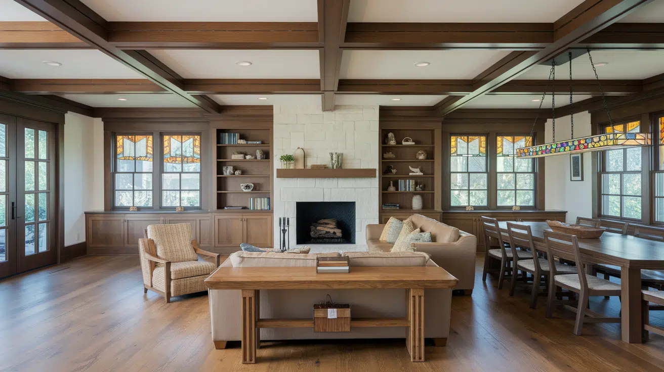
Adding Textures and Materials for Interest
Color alone won’t make your monochromatic room feel complete. You need texture and different materials to add depth and prevent flatness.
- Mix smooth surfaces like glass tables with rough textures like woven baskets
- Combine soft fabrics, such as velvet cushions, with hard materials like metal
- Layer different patterns within your color scheme, like stripes with solid colors
- Add natural elements such as wood grain or stone to bring warmth
- Include reflective surfaces like mirrors or metallic finishes to catch light
How to Design a Perfect Monochromatic Color Palette
Creating a successful monochromatic palette begins with selecting the right base color you love, as it will dominate your room.
Test paint samples at different times to see how lighting affects your choice.
| Color Scheme | Darkest Shade | Medium Tone | Light Tint | Lightest Accent |
|---|---|---|---|---|
| Classic Navy Monochrome | Deep navy | Steel blue | Powder blue | Cream white |
| Warm Gray Palette | Charcoal gray | Dove gray | Light gray | Crisp white |
| Earthy Brown Scheme | Chocolate brown | Tan | Beige | Ivory cream |
| Fresh Green Harmony | Forest green | Sage green | Mint green | Soft white |
| Sophisticated Burgundy | Deep wine | Dusty rose | Blush pink | Off-white |
| Calming Beige Tones | Dark taupe | Warm beige | Cream | Pure white |
| Coastal Blue Blend | Midnight blue | Ocean blue | Sky blue | Pearl white |
Expert Tips
- Use artificial lighting strategically to highlight different color depths throughout the room
- Paint the ceiling slightly lighter than the walls to create height and visual expansion
- Incorporate one metallic accent like brass or copper for subtle contrast and warmth
- Place your darkest elements near the floor to ground the space naturally
- Add houseplants in complementary pots to introduce life without breaking color harmony
Final Thoughts
The key is understanding how shades, tints, and tones work together.
Choose calming grays or bold burgundy, add varied textures, consider lighting, and include expert touches like metallic accents.
Your home deserves this level of calmness. Start with one room and watch how this approach turns not just your space, but your entire relationship with interior design.