I founded THE STYLE SALONISTE as an online style magazine in Summer 2009. And in the months before the launch I searched for an art director for the blog. I was fortunate to be introduced to Brian Dittmar. Our mutual friend, Lisa Boquiren, told me that Brian, an accomplished interior designer, had extensive previous training as a graphic designer / art director.
Brian and I first set to work to design the logo…which has remained the same crisp Bodoni typeface from the time THE STYLE SALONISTE went live.
This week as we celebrate eight years of THE STYLE SALONISTE, I want to express my gratitude to thousands of readers in 149 countries around the world. I’ve made so many blog friends since we went live. I know many readers…and many many international readers have become very dear and appreciated friends.

And this week I would like to express my deep gratitude to Brian Dittmar who has been the outstanding and truly wonderful art director of THE STYLE SALONISTE for all these years. Brian Dittmar is both an accomplished and acclaimed San Francisco-based interior designer — and he is also a very talented art director and graphic designer.
I love Brian’s design and art direction—and it is always thrilling to see his polished and elegant work. We are a great team of two!
Pour a cup of tea or a glass of rosé, and come with us for a visit — and meet Freddie, his delightful 6-year-old pug.
Brian’s apartment, near Buena Vista Park, is in a very beautiful area of San Francisco. Brian acquired the apartment 14 years ago, and has added his favorite art, a handsome John Dickinson table, his clock collection, beautiful rugs, delicious textiles, and a sense of comfort and ease.

BD: In Europe recently I was captivated by window displays featuring blush and dusty pink clothing and accessories — it creates such a soft, ethereal and warm vibe. Now I see those soft neutral rose-colored tones in interior design world ‘trend reports’ and I love it. I’ve already included some similar pink and copper tones in our living room, so I guess now I’m ‘on trend.’
I’ve also been noticing interesting bronze mirrored furniture pieces that pair very well with matte brass/gold metal trend we’ve been seeing over the last few years. Very warm and very rich — and certainly not the garish polished brass of the 80s.
TSS: Everyone in San Francisco lives with a beloved dog. How have you as a designer adapted your apartment/ décor/ living to welcome your dear Freddie?
BD: Years ago someone told me that pugs don’t shed — clearly they never lived with a pug. They shed — a lot! Freddie and our late pug, Moe, both have had the full run of our house and that’s how my partner, Thomas, and I want it. But it has certainly created some design challenges to work around.
Fabrics and rugs with texture and pattern can be your best defense with a dog, as they both hide a million sins. The sofa fabric has proved to be indestructible. It’s deep taupe textured chenille velvet from Romo’s Villa Nova line (through De Sousa Hughes) that looks almost as good today as it did when it was new. Sadly, it’s been discontinued, so I am in search of the next best thing for when it comes time to reupholster!
Indoor/outdoor fabrics now have options that are perfect for a sofa or chair in the living room of a residence with a dog. Sunbrella is probably the most widely known brand, but Perennials has become one of my favorite lines with many very interesting textures and weaves. They even have outdoor velvets.
And then, of course, washable items are smart choices when decorating around a pet. The Matouk coverlet on our bed is cream and it’s washable.

TSS: In your apartment, you’ve used lots of neutral tones and the effect is, at the same time, very rich.
BD: When I launched my interior business after years as a graphic designer, I wanted to see color, color and more color. But as time has gone by, in my personal space — as well as in my other projects — I want less bold color, fewer patterns and a calmer overall environment.
I am always a huge fan of blues, greens and teals, so they are the primary accent colors I have used throughout. The Turkish-style rug in the living room has accents of persimmon, oyster, pale blue and navy, which play well with all the other neutrals in the space. The striped pillows on the sofa are in a Barbara Barry's ‘cinnabar' fabric, along with the other solid pillows in fabrics from Threads by Lee Jofa (cream) and Kirkby Design (teal).

In the dining room, vintage Milo Baughman chairs from 1stDibs were recovered in Pollack speckled 'tidal pool' velvet, which I absolutely love. They sit around a vintage 1960s walnut table from Brown Saltman and underneath a birdcage-style chandelier by Avrett, a custom lighting studio in Charleston, South Carolina. Some people may recognize that fixture from my 2012 San Francisco Decorator Showcase room…the benefit of doing showcase rooms is that some items eventually find their way into designers’ own homes!

The bedroom conveys a restful, feeling. The carpet, from Mark Nelson Designs, is pale blue and cream woven wool, which is very flat but also very soft. The walls are covered in a Kneedler|Fauchère linen wallpaper, which is subtle in tone, but adds a great dimension and texture.
To finish off the bedroom, the ceiling is painted in a smokey blue color which helps to bring the ceiling down and the room into proportion — as the space is as wide as it is tall. Many people assume you must paint the ceiling white, but I strongly disagree and often paint ceilings interesting colors or even wallpaper them. Ceilings are the “fifth wall" after all.
The study is the smallest room in the apartment so I went bolder with color and wallpapered the walls in a wonderful textured blue grasscloth — 'Broadway Blues' by Phillip Jeffries. It’s one of my favorite elements in the entire apartment and contrasts well against the white bookcases. On the loveseat, covered in a pale gold Glant fabric, multi-color patterned pillows in a watercolor motif fabric by Thomas O’Brien for Lee Jofa accompany an orange felt pillow.
TSS: Secret design sources you can share with us?
BD: I’m very exited to be able to share news of a forthcoming design showroom that I know will become a go-to source for many designers — as well as the general public. Design Theory Hardware, a new decorative hardware showroom, will be opening in early 2018 near the San Francisco Design Center. Brett Rogers and Marc Waisanen, of Hayes Valley’s Plantation Design have teamed up with Selena Fong, who brings over a decade of decorative, architectural hardware experience, to launch the new showroom. Decorative hardware is like jewelry and can make a kitchen, bathroom or piece of furniture really sing. I cannot wait for Design Theory Hardware’s grand opening!
For lighting, I’ve become fond of the products from Cedar & Moss, a Portland-based artisanal studio specializing in modernist and mid-century fixtures. Their products showed up quite a bit in this year’s San Francisco Decorator Showcase, which was great to see. I have loved the fixtures from Brooklyn-based Apparatus Studio for quite some time as well. Their 'Cloud 37’ chandelier was the focal point of a great room I designed several years ago.
Recently, I’ve been following several friends on Instagram and their interest in Shibori, the Japanese dyeing technique which produces organic patterns on fabric. It’s beautiful and resonates with me and where my interest in design is going. Shibori has a natural hand-made quality that I love. It’s simple, graphic and rich.
For the best in vintage finds, Palm Springs has become widely known for treasuring and advancing appreciation for mid-century design. I always relish popping into the many galleries along Palm Canyon Drive in the Uptown Design district — including the Palm Canyon Galleria and Towne in The Shops at Thirteen Forty Five — to see what is on display. But many other fabulous treasures can be found several miles east at the Perez Art & Design Center along Perez Road in Cathedral City.
Definitely off the beaten path and in a nondescript warehouse district, this little gem is headlined by HEDGE (not to be confused with Hedge Gallery in San Francisco) and Spaces, a gallery comprised of multiple dealers specializing in mid-century modern, modernist, Brutalist, and Hollywood Regency furniture and decor.
TSS: Where are you traveling next?
BD: My partner and I always try to make it down to Palm Springs several times a year. It is definitely my “happy place” — a one-hour flight from San Francisco, but a world away...from the desert landscape and mountains to the weather and the wide array of vintage design shops.
We are heading to Italy soon and this trip includes time at a villa in Tuscany with friends and then quick stops in Venice, Cinque Terre, Lake Como and Milan.
Milan is one of the most underrated cities of Europe. While it may not have as much to offer as Paris or London, it has a great energy and wonderful design all around. Window-shopping along the Via Montenapoleone is always a pleasure. The Duomo in Milan is a Gothic fantasy — and climbing around the top of it is great fun, with spectacular views.
In Milan, I especially enjoy some of the newest architecture in the Porta Nuova district, including Cesar Pelli’s spire-topped, glass semi-circular Unicredit Tower (the tallest building in Italy) and the pair of residential towers called “Bosco Verticale” (translation: vertical forest) by Boeri Studio which all 20+ floors are virtually covered in living trees and other plants.
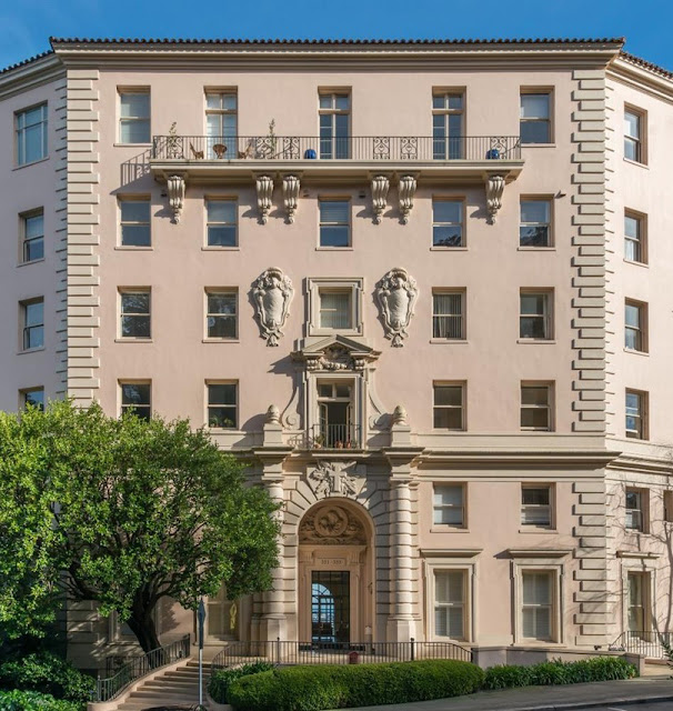


Originally built as St. Joseph’s Hospital in 1926, the Mediterranean Revival building Brian lives in was converted to condominiums in 1986. It was designed by Arthur Brown, Jr. of the architecture firm, Bakewell & Brown — better known for designing such landmarks as San Francisco City Hall, the San Francisco War Memorial Opera House, Coit Tower and several buildings on the campus of Stanford University. The façade of the building was cast as the sanatorium in Alfred Hitchcock’s 1958 film, Vertigo.
It sits on the southern edge of Buena Vista Park and overlooks the Castro district, Corona Heights, Dolores Park and the Bay beyond.
Hundreds of thousands of unique visitors each month. Millions of unique visits. Most exciting. This is a niche blog, very specialized and focused, and my goal is to delight, inspire, inform, and amuse and entertain my readers each week.
After more than eight years, THE STYLE SALONISTE has a worldwide audience of curious, passionate, stylish, talented, philanthropic, creative and excited readers.
Thank you to all the photographers, interior designers, architects, artists, storeowners, creative talents, inspirations, writer, art dealers, authors, artists, gallery directors, and so many fantastically super-bright and enthusiastic creators I’ve written about and published.
Cheers and cheers. I send my gratitude.
CREDITS:
Photography:
Brian Dittmar
Brian's favorite design sources in his apartment:
Brian has appeared on HGTV and his work has been featured in local and national magazines. Also a former graphic designer, he has worked for clients including Stanford University, Chronicle Books and Lincoln Center. He lives in San Francisco with his partner, Thomas Carragher, a merchandising executive at Gap Inc., and their pug Freddie.
BRIAN DITTMAR DESIGN, INC.
www.briandittmardesign.com
Phone: 415.235.0529
Fax: 415.558.9693
Email: [email protected]
And I know we have many dog and pug lovers among our readers — be sure to follow the adventures of Freddie the pug on Instagram: @freddiethepuginsf

Brian and I first set to work to design the logo…which has remained the same crisp Bodoni typeface from the time THE STYLE SALONISTE went live.
This week as we celebrate eight years of THE STYLE SALONISTE, I want to express my gratitude to thousands of readers in 149 countries around the world. I’ve made so many blog friends since we went live. I know many readers…and many many international readers have become very dear and appreciated friends.

And this week I would like to express my deep gratitude to Brian Dittmar who has been the outstanding and truly wonderful art director of THE STYLE SALONISTE for all these years. Brian Dittmar is both an accomplished and acclaimed San Francisco-based interior designer — and he is also a very talented art director and graphic designer.
I love Brian’s design and art direction—and it is always thrilling to see his polished and elegant work. We are a great team of two!
I plan and research and write all text and select and plan all images. Brian…a brilliant tech person as well…presents and gives all images and text their best concept and design. I love the polish and clarity of his design. Thank you — and bravo, Brian. I’m grateful and honored to work with you for many happy years. It has been a pleasure.
Exclusively this week on THE STYLE SALONISTE we are presenting Brian’s San Francisco apartment. It’s perched on a tree-framed hill in the center of the city. And I had a lively conversation with Brian, speaking of design, travel, ideas, design trends…and living with (and designing around) a beloved dog.Pour a cup of tea or a glass of rosé, and come with us for a visit — and meet Freddie, his delightful 6-year-old pug.

Brian’s apartment, near Buena Vista Park, is in a very beautiful area of San Francisco. Brian acquired the apartment 14 years ago, and has added his favorite art, a handsome John Dickinson table, his clock collection, beautiful rugs, delicious textiles, and a sense of comfort and ease.
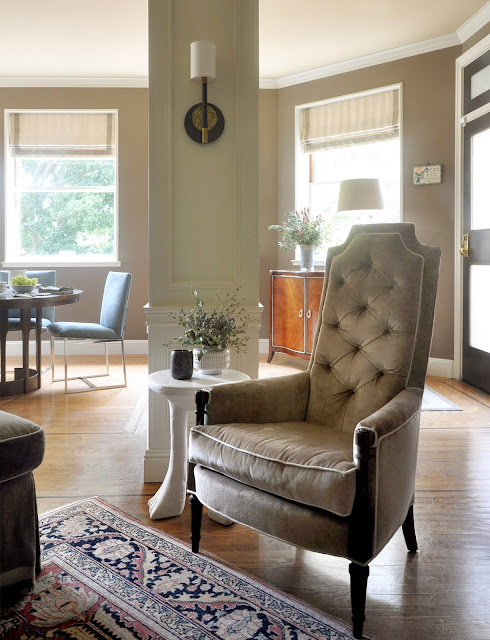
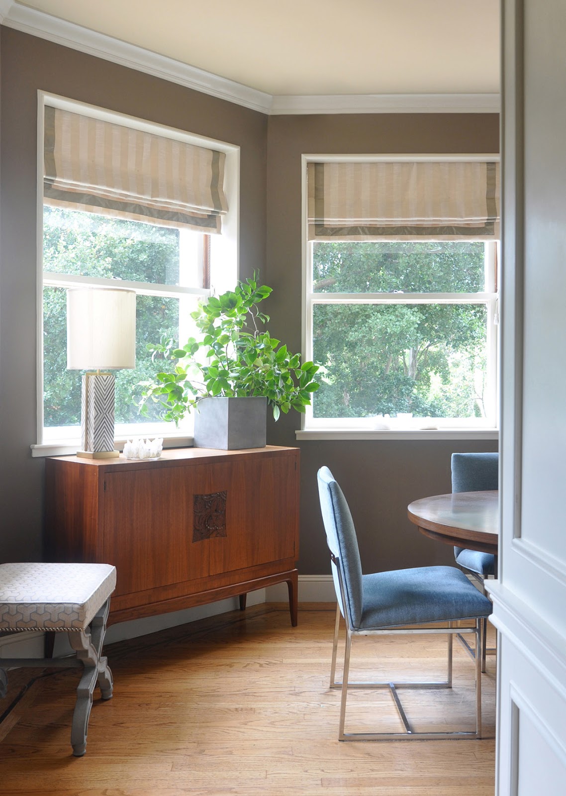
“I love mixing styles throughout this apartment. More traditional rugs paired with more modern furniture. Traditional architectural paneling details contrast with transitional metal light fixtures. Antique items alongside contemporary pieces. It is similar to my reaction to the architecture in London — a fabulous mix of old and new side-by-side and juxtaposed, creating a very interesting urban fabric.” — Brian Dittmar

In Conversation with Brian Dittmar
TSS: What design trends on the horizon are you excited about?BD: In Europe recently I was captivated by window displays featuring blush and dusty pink clothing and accessories — it creates such a soft, ethereal and warm vibe. Now I see those soft neutral rose-colored tones in interior design world ‘trend reports’ and I love it. I’ve already included some similar pink and copper tones in our living room, so I guess now I’m ‘on trend.’
I’ve also been noticing interesting bronze mirrored furniture pieces that pair very well with matte brass/gold metal trend we’ve been seeing over the last few years. Very warm and very rich — and certainly not the garish polished brass of the 80s.
 |
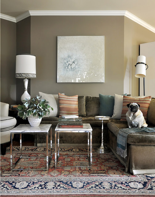
| Freddie the pug holding court on a swivel chair upholstered in a Barbara Barry gray wool. Behind him is a 1940s Swedish Art Moderne credenza from the Scandinavian vintage collection of Björk Studio in Atlanta. |
TSS: Everyone in San Francisco lives with a beloved dog. How have you as a designer adapted your apartment/ décor/ living to welcome your dear Freddie?
BD: Years ago someone told me that pugs don’t shed — clearly they never lived with a pug. They shed — a lot! Freddie and our late pug, Moe, both have had the full run of our house and that’s how my partner, Thomas, and I want it. But it has certainly created some design challenges to work around.
Fabrics and rugs with texture and pattern can be your best defense with a dog, as they both hide a million sins. The sofa fabric has proved to be indestructible. It’s deep taupe textured chenille velvet from Romo’s Villa Nova line (through De Sousa Hughes) that looks almost as good today as it did when it was new. Sadly, it’s been discontinued, so I am in search of the next best thing for when it comes time to reupholster!
Indoor/outdoor fabrics now have options that are perfect for a sofa or chair in the living room of a residence with a dog. Sunbrella is probably the most widely known brand, but Perennials has become one of my favorite lines with many very interesting textures and weaves. They even have outdoor velvets.
And then, of course, washable items are smart choices when decorating around a pet. The Matouk coverlet on our bed is cream and it’s washable.
 |
| In 2010, Brian debuted at the San Francisco Decorator Showcase with his room "Poetry in Time" that highlighted his long-time interest in clocks. Above are three from his collection: The Bavarian cuckoo clock was a wedding gift to his great-grandparents; an 1860s bronze French Empire mantle clock; and a custom-made industrial clock by metal artist Paul Benson — created especially for the showcase room. |
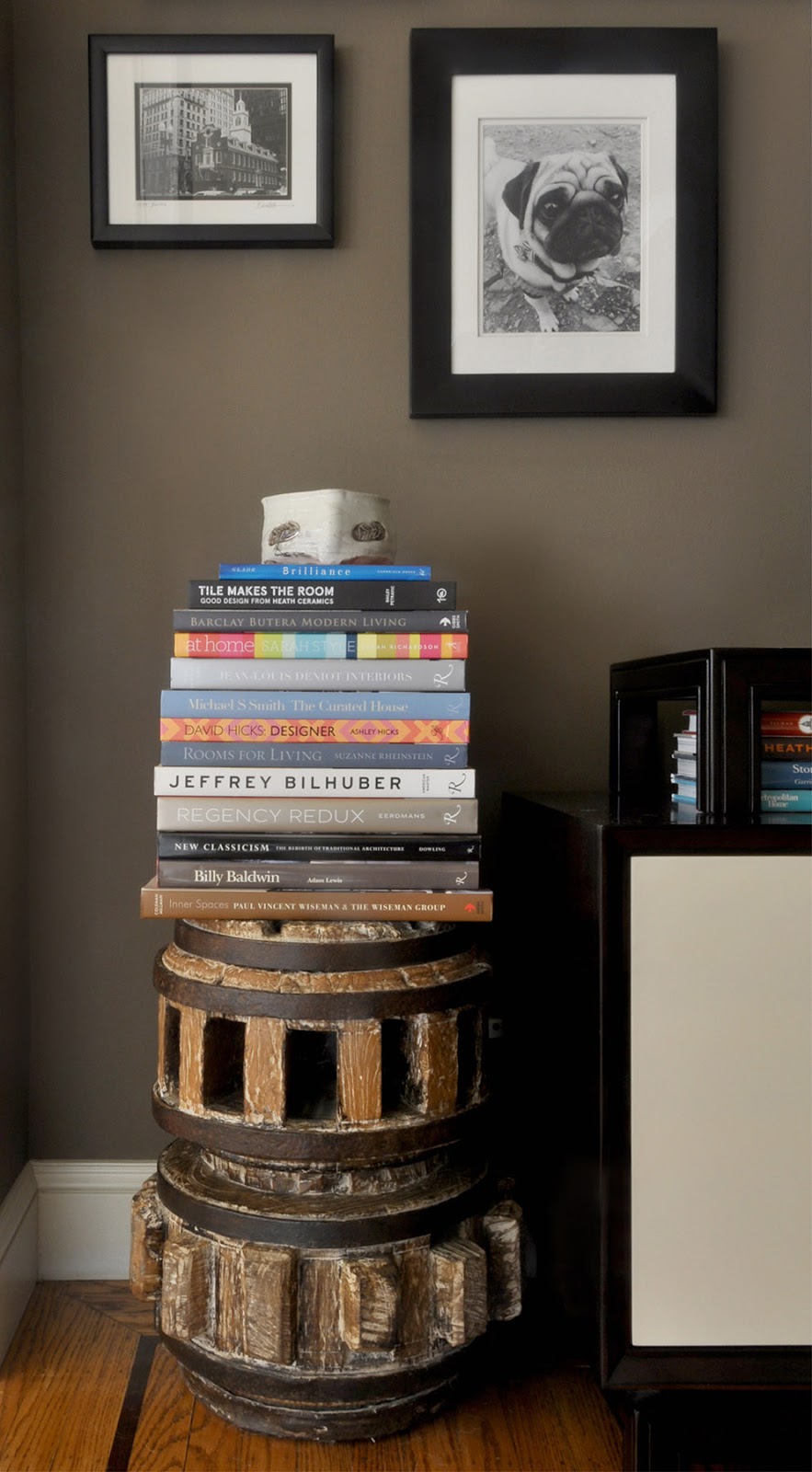 |
| A vintage wooden cog and gear from Ohmega Salvage in Berkeley becomes a perch for a stack of favorite design books. |

TSS: In your apartment, you’ve used lots of neutral tones and the effect is, at the same time, very rich.
BD: When I launched my interior business after years as a graphic designer, I wanted to see color, color and more color. But as time has gone by, in my personal space — as well as in my other projects — I want less bold color, fewer patterns and a calmer overall environment.
I am always a huge fan of blues, greens and teals, so they are the primary accent colors I have used throughout. The Turkish-style rug in the living room has accents of persimmon, oyster, pale blue and navy, which play well with all the other neutrals in the space. The striped pillows on the sofa are in a Barbara Barry's ‘cinnabar' fabric, along with the other solid pillows in fabrics from Threads by Lee Jofa (cream) and Kirkby Design (teal).
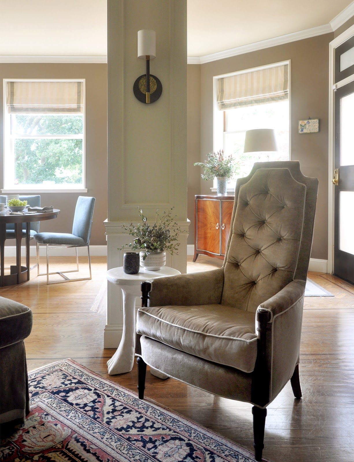
Across the room, the matte white John Dickinson 'African Table' reissued by Sutherland nestles up to a vintage Hollywood Regency tufted chair, which I inherited from my grandmother. When she had it, it was upholstered in a lime green, powder pink and white stripe fabric — certainly very on-trend in the late 60s. Now it's recovered in camel toned velvet with a cream contrast welt.
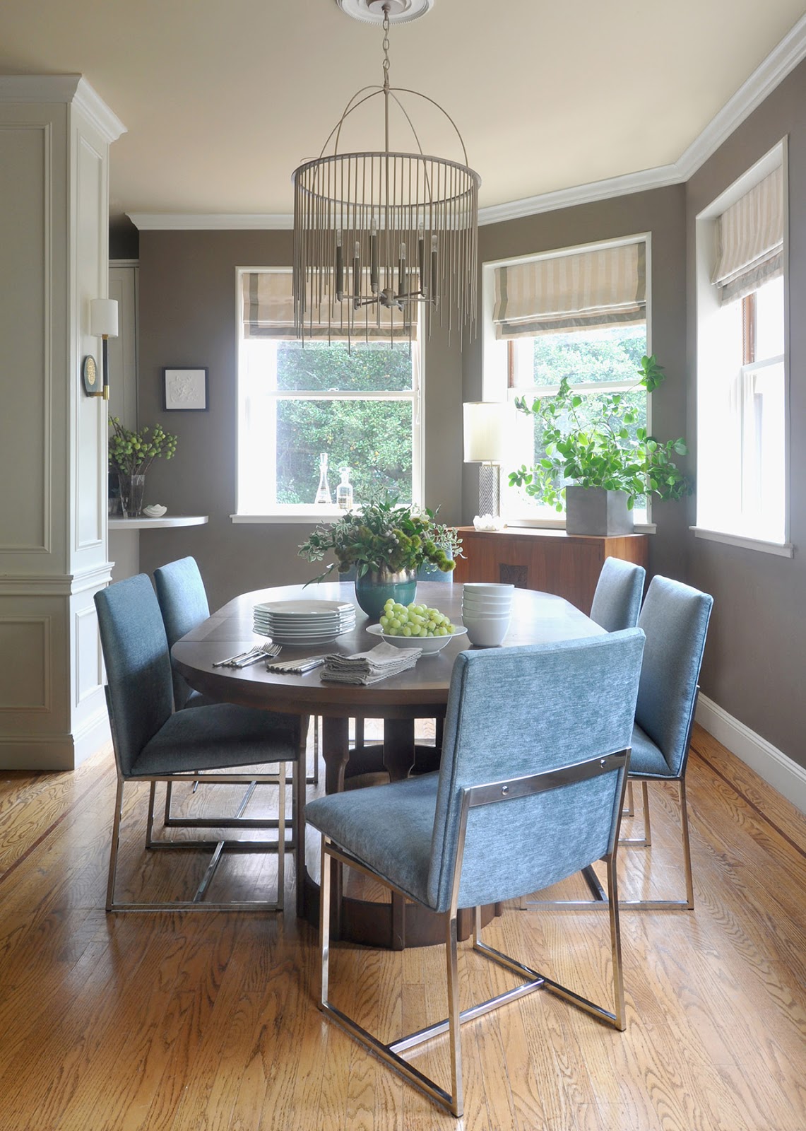
In the dining room, vintage Milo Baughman chairs from 1stDibs were recovered in Pollack speckled 'tidal pool' velvet, which I absolutely love. They sit around a vintage 1960s walnut table from Brown Saltman and underneath a birdcage-style chandelier by Avrett, a custom lighting studio in Charleston, South Carolina. Some people may recognize that fixture from my 2012 San Francisco Decorator Showcase room…the benefit of doing showcase rooms is that some items eventually find their way into designers’ own homes!
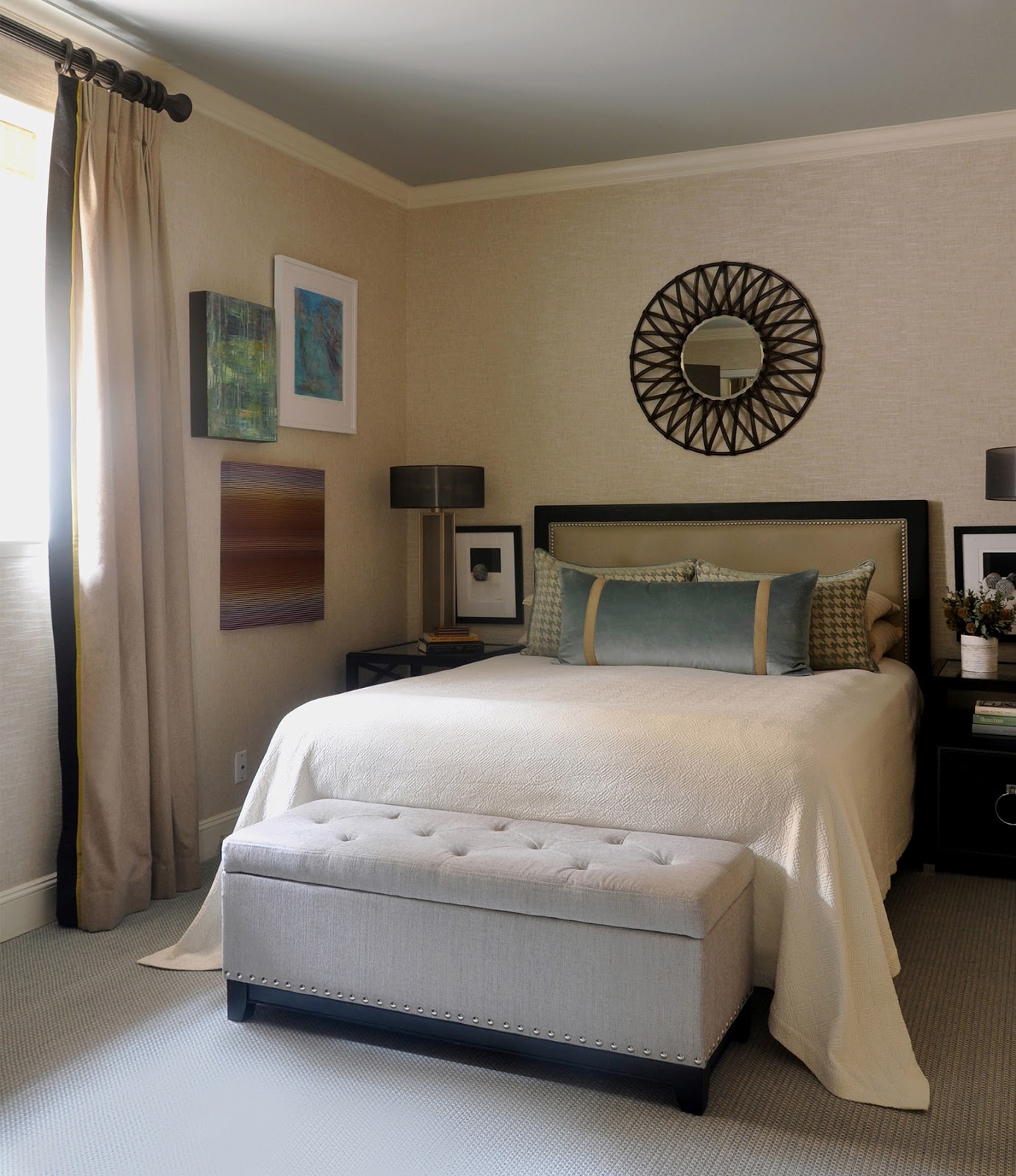
The bedroom conveys a restful, feeling. The carpet, from Mark Nelson Designs, is pale blue and cream woven wool, which is very flat but also very soft. The walls are covered in a Kneedler|Fauchère linen wallpaper, which is subtle in tone, but adds a great dimension and texture.
 |
| The bedroom lamps are by Avrett; nightstands by Vanguard; oversized houndstooth pillow fabric by Kravet and teal green velvet by Pollack. |
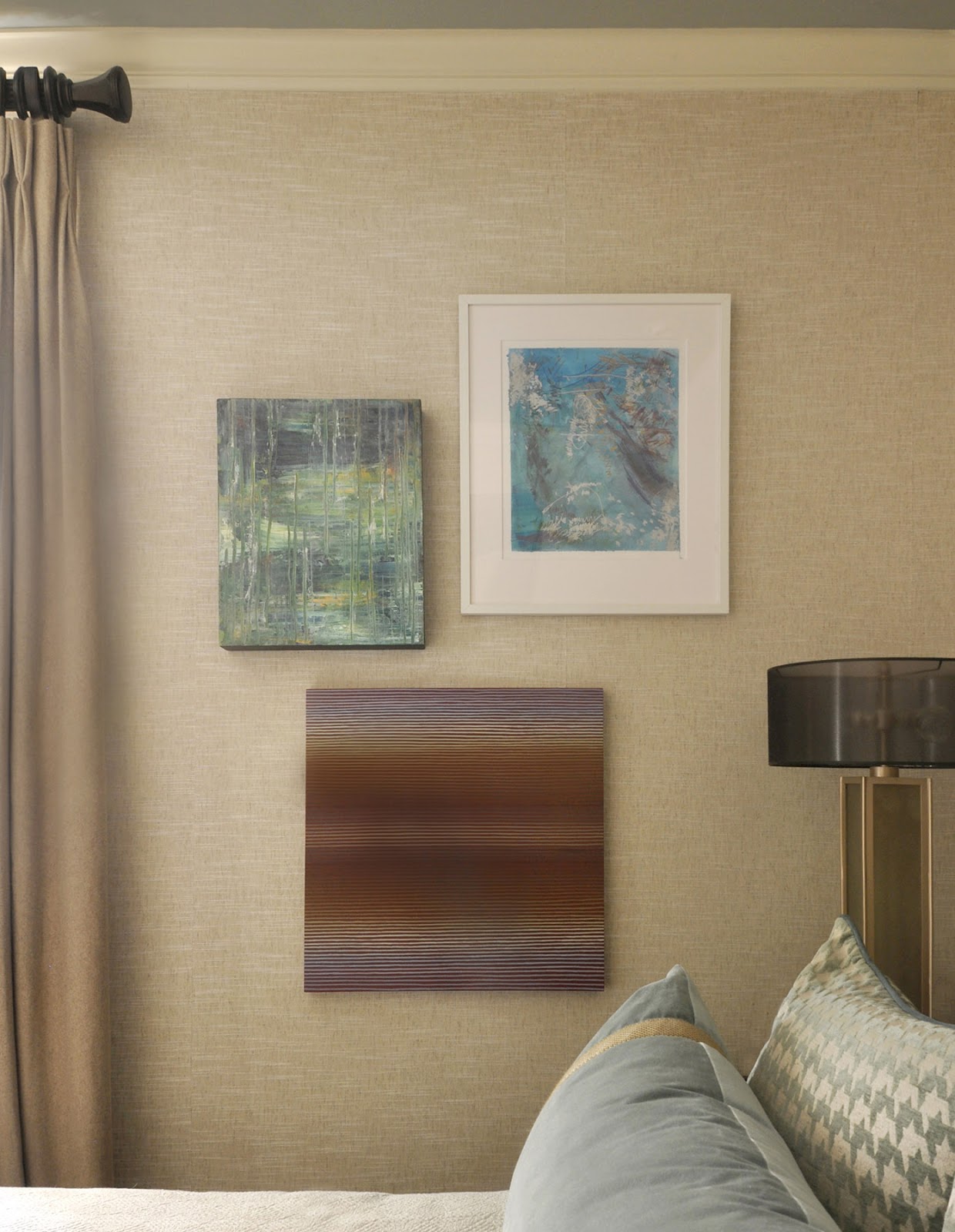 |
| A grouping of art adorns the bedroom wall, including a 60s vintage abstract painting; a framed abstract drawing by one of the youth members of San Francisco's Creativity Explored; and an Op Art-inspired painting by Bay Area artist Mel Prest. |
 |
| Rustic flowers in a vintage cream ceramic container sit in front of a black and white photo by San Francisco artist Durwood Zedd. |
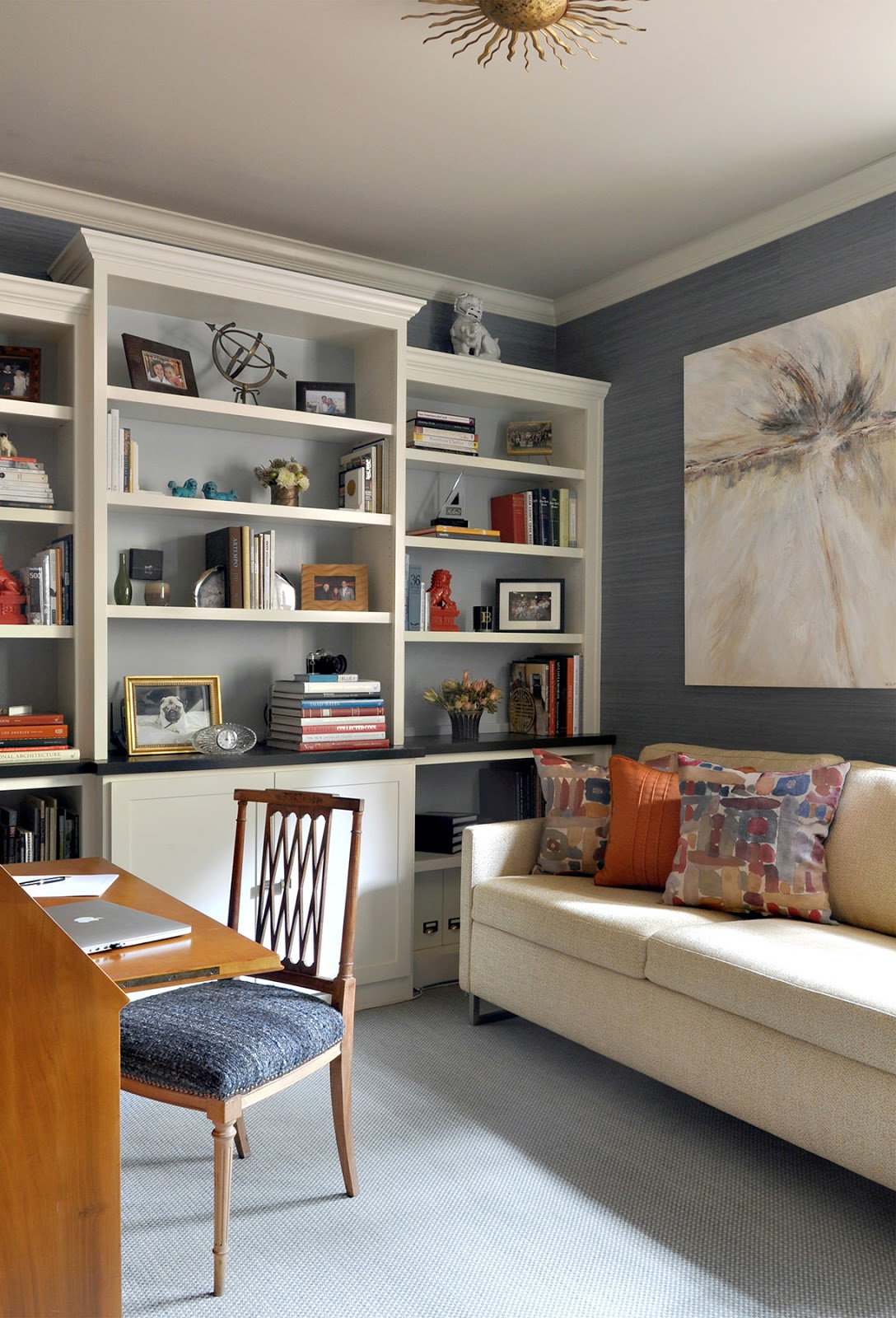 |
| The large abstract painting on the wall of the den is by Brian Dittmar. A collection of ceramic foo dog statues are interspersed throughout the bookcase. Blue and cream woven wool carpet is from Mark Nelson Designs. |
The study is the smallest room in the apartment so I went bolder with color and wallpapered the walls in a wonderful textured blue grasscloth — 'Broadway Blues' by Phillip Jeffries. It’s one of my favorite elements in the entire apartment and contrasts well against the white bookcases. On the loveseat, covered in a pale gold Glant fabric, multi-color patterned pillows in a watercolor motif fabric by Thomas O’Brien for Lee Jofa accompany an orange felt pillow.
 |
| A 1950s teak bar cabinet was a special find at Stuff, the vintage collection in San Francisco's Mission district. |
TSS: Secret design sources you can share with us?
BD: I’m very exited to be able to share news of a forthcoming design showroom that I know will become a go-to source for many designers — as well as the general public. Design Theory Hardware, a new decorative hardware showroom, will be opening in early 2018 near the San Francisco Design Center. Brett Rogers and Marc Waisanen, of Hayes Valley’s Plantation Design have teamed up with Selena Fong, who brings over a decade of decorative, architectural hardware experience, to launch the new showroom. Decorative hardware is like jewelry and can make a kitchen, bathroom or piece of furniture really sing. I cannot wait for Design Theory Hardware’s grand opening!
For lighting, I’ve become fond of the products from Cedar & Moss, a Portland-based artisanal studio specializing in modernist and mid-century fixtures. Their products showed up quite a bit in this year’s San Francisco Decorator Showcase, which was great to see. I have loved the fixtures from Brooklyn-based Apparatus Studio for quite some time as well. Their 'Cloud 37’ chandelier was the focal point of a great room I designed several years ago.
Recently, I’ve been following several friends on Instagram and their interest in Shibori, the Japanese dyeing technique which produces organic patterns on fabric. It’s beautiful and resonates with me and where my interest in design is going. Shibori has a natural hand-made quality that I love. It’s simple, graphic and rich.
For the best in vintage finds, Palm Springs has become widely known for treasuring and advancing appreciation for mid-century design. I always relish popping into the many galleries along Palm Canyon Drive in the Uptown Design district — including the Palm Canyon Galleria and Towne in The Shops at Thirteen Forty Five — to see what is on display. But many other fabulous treasures can be found several miles east at the Perez Art & Design Center along Perez Road in Cathedral City.
Definitely off the beaten path and in a nondescript warehouse district, this little gem is headlined by HEDGE (not to be confused with Hedge Gallery in San Francisco) and Spaces, a gallery comprised of multiple dealers specializing in mid-century modern, modernist, Brutalist, and Hollywood Regency furniture and decor.
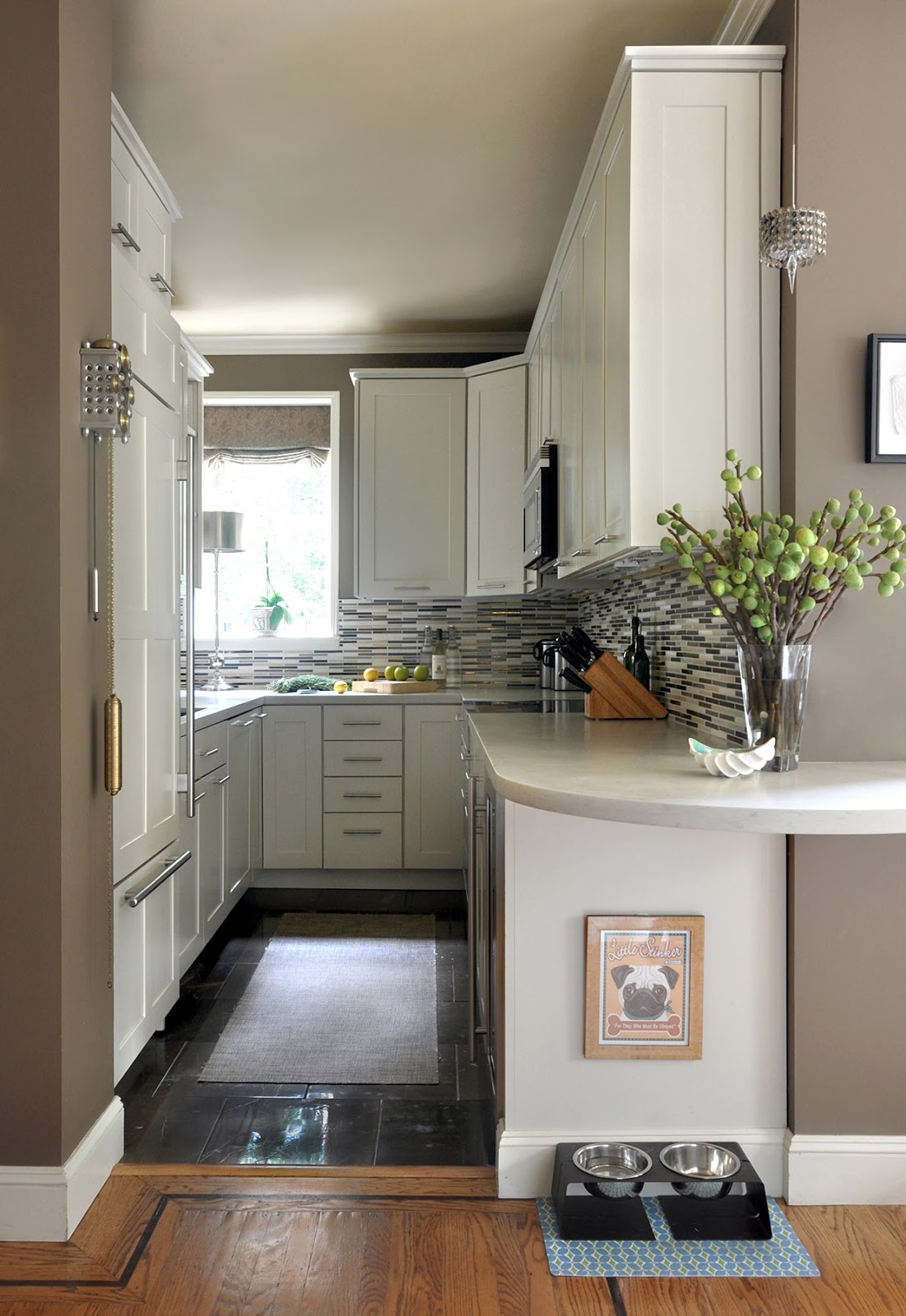 |
| The kitchen backsplash is a custom mosaic tile from Pratt & Larsen that features a mix of all the neutral tones in the apartment; honed quartz countertops by Caesarstone; taupe limestone floor tile by Ann Sacks. |
TSS: Where are you traveling next?
BD: My partner and I always try to make it down to Palm Springs several times a year. It is definitely my “happy place” — a one-hour flight from San Francisco, but a world away...from the desert landscape and mountains to the weather and the wide array of vintage design shops.
We are heading to Italy soon and this trip includes time at a villa in Tuscany with friends and then quick stops in Venice, Cinque Terre, Lake Como and Milan.
Milan is one of the most underrated cities of Europe. While it may not have as much to offer as Paris or London, it has a great energy and wonderful design all around. Window-shopping along the Via Montenapoleone is always a pleasure. The Duomo in Milan is a Gothic fantasy — and climbing around the top of it is great fun, with spectacular views.
In Milan, I especially enjoy some of the newest architecture in the Porta Nuova district, including Cesar Pelli’s spire-topped, glass semi-circular Unicredit Tower (the tallest building in Italy) and the pair of residential towers called “Bosco Verticale” (translation: vertical forest) by Boeri Studio which all 20+ floors are virtually covered in living trees and other plants.
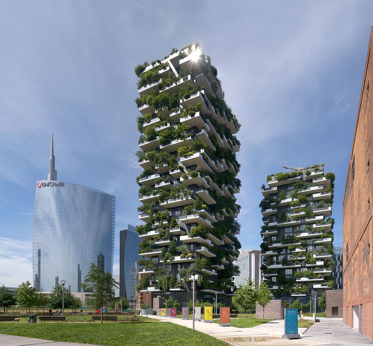 |
| Cesar Pelli's Unicredit Tower next to Bosco Verticale in Milan's Porta Nuova district. Photo from Wikipedia by Thomas Ledl. |
TSS: Thank you, Brian. I wish you many more years of success, great clients and design.
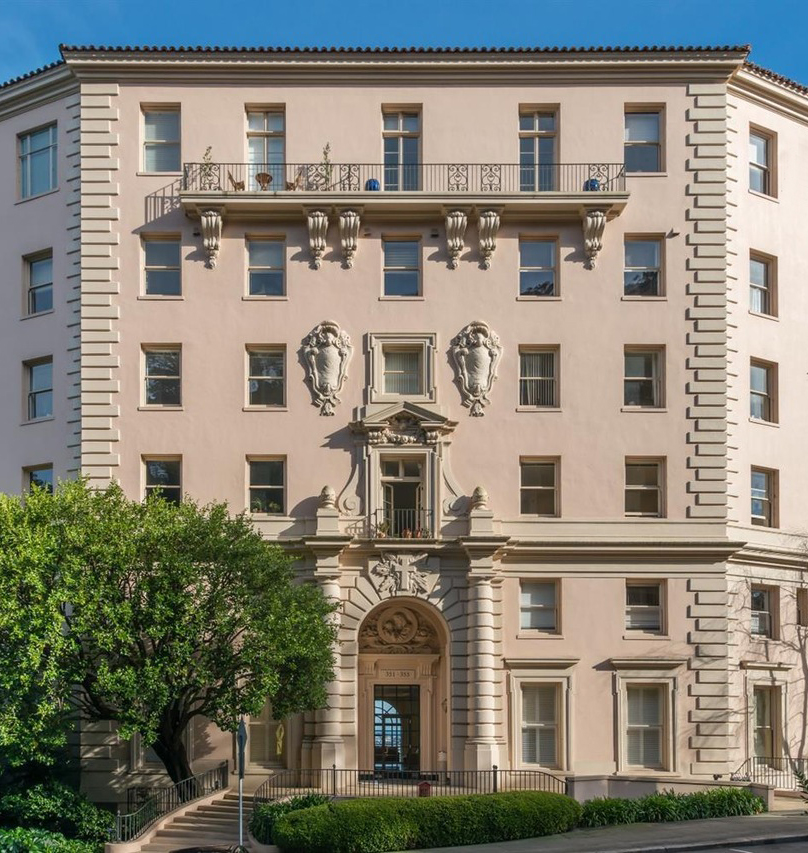


Originally built as St. Joseph’s Hospital in 1926, the Mediterranean Revival building Brian lives in was converted to condominiums in 1986. It was designed by Arthur Brown, Jr. of the architecture firm, Bakewell & Brown — better known for designing such landmarks as San Francisco City Hall, the San Francisco War Memorial Opera House, Coit Tower and several buildings on the campus of Stanford University. The façade of the building was cast as the sanatorium in Alfred Hitchcock’s 1958 film, Vertigo.
It sits on the southern edge of Buena Vista Park and overlooks the Castro district, Corona Heights, Dolores Park and the Bay beyond.
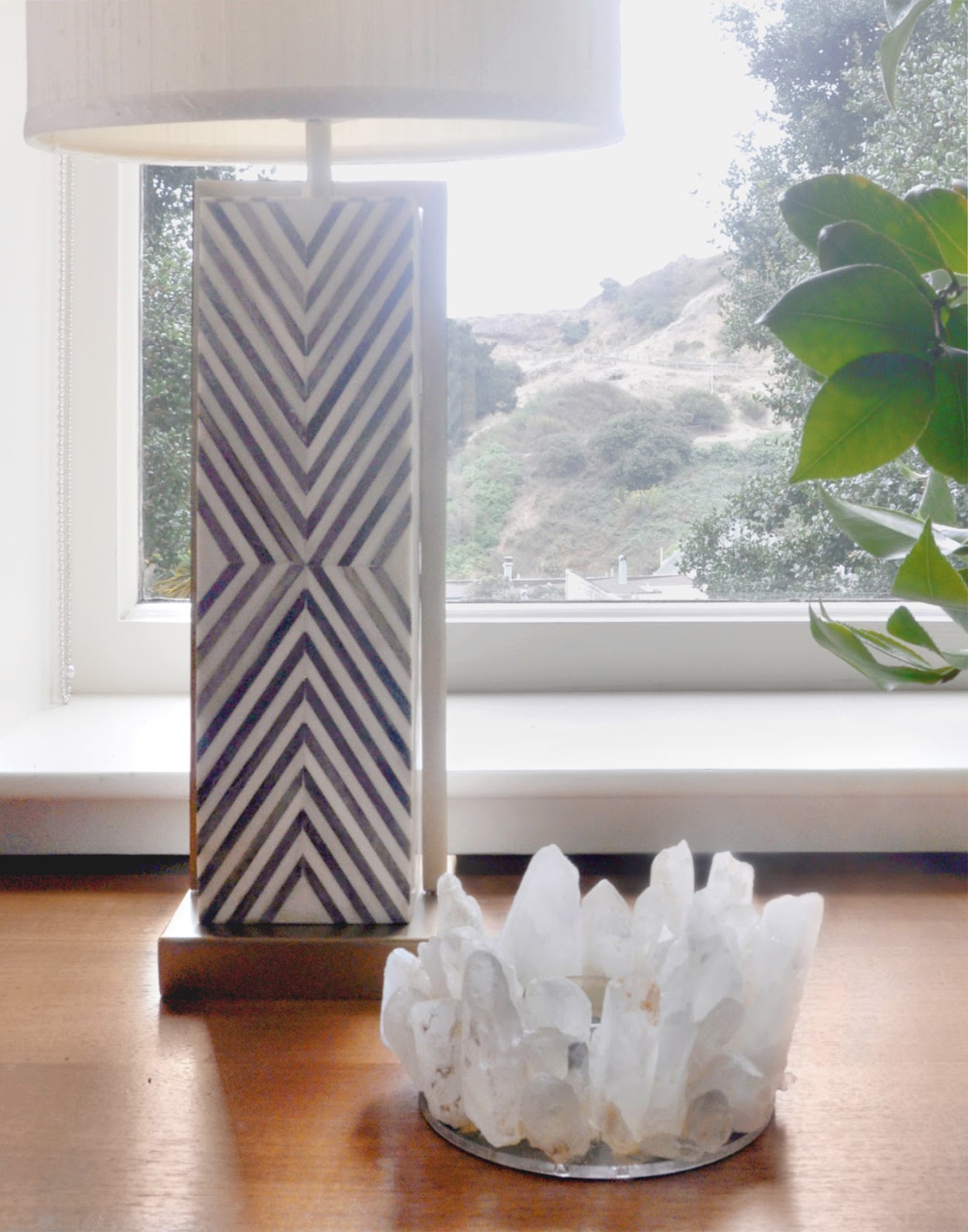 |
| A West Elm chevron pattern bone inlay lamp and a rock crystal votive holder sit atop a 1950s teak bar cabinet — the view out the window overlooks Corona Heights park. |
 |
| Bronze and brass wall sconces by Hudson Valley Lighting adorn the paneled structural columns separating the living room from the dining room. |
Thank You — We Love Our Readers
I am so honored to have the best and most talented members and subscribers and followers. THE STYLE SALONISTE has an international retinue of pals — as well as thousands of Facebook friends and Pinterest pinners and Instagram followers and friends, along with Tweeters and emailers, and message-writers and readers all over the world.Hundreds of thousands of unique visitors each month. Millions of unique visits. Most exciting. This is a niche blog, very specialized and focused, and my goal is to delight, inspire, inform, and amuse and entertain my readers each week.
After more than eight years, THE STYLE SALONISTE has a worldwide audience of curious, passionate, stylish, talented, philanthropic, creative and excited readers.
Thank you to all the photographers, interior designers, architects, artists, storeowners, creative talents, inspirations, writer, art dealers, authors, artists, gallery directors, and so many fantastically super-bright and enthusiastic creators I’ve written about and published.
Cheers and cheers. I send my gratitude.
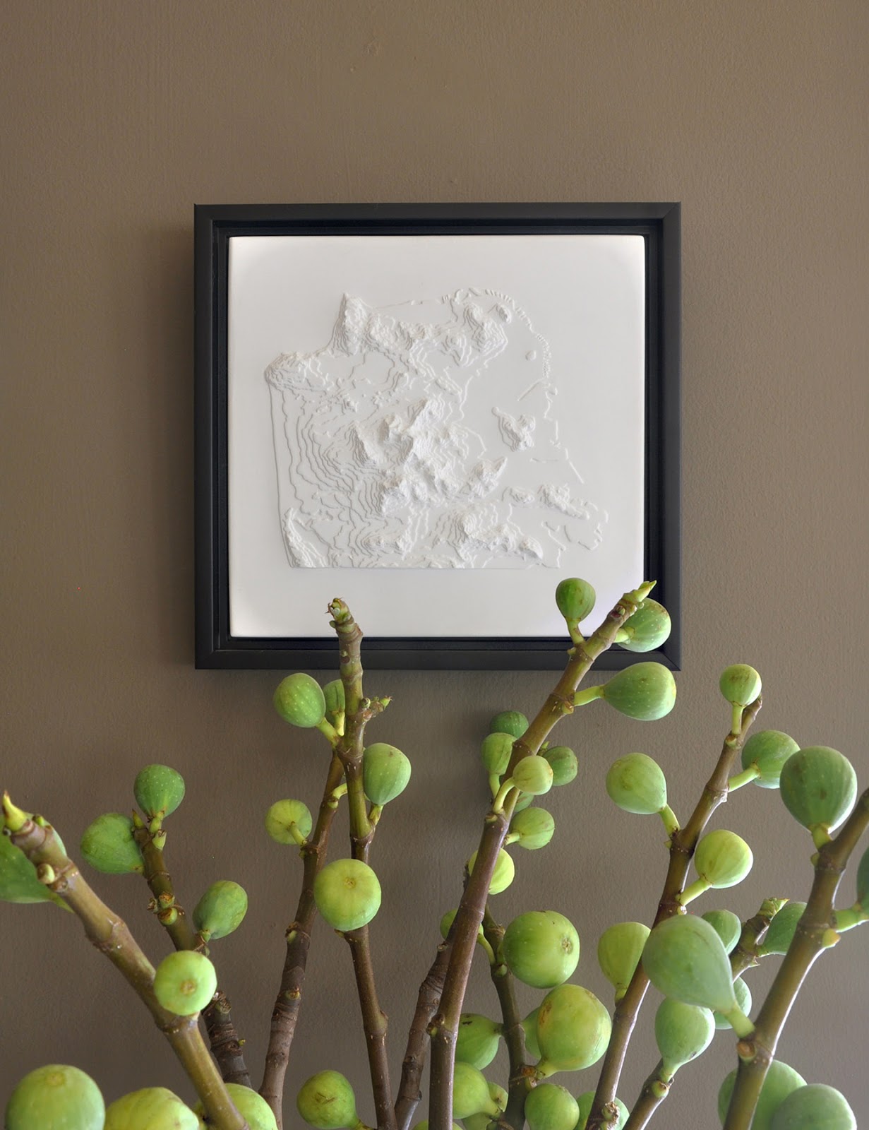 |
| The small plaster tile is a 3D topographical map called "San Francisco Terrain" by the late antique dealer Connor Fennessy. |
CREDITS:
Photography:
Brian Dittmar
Brian's favorite design sources in his apartment:
Art above the sofa:
Cassandria Blackmore
John Dickinson table:
Sutherland Furniture
Chandelier and bedside lamps:
Avrett
Carpet in bedroom and study:
Mark Nelson Designs
Grasscloth wallpaper in study:
Phillip Jeffries Ltd.
Linen wallpaper in bedroom:
Kneedler|Fauchère
Vintage Scandinavian credenza:
Björk Studio
Custom metal clock and aluminum drink table:
Paul Benson
 |
| Photo by David Duncan Livingston. |
About Brian Dittmar Design
Brian’s design aesthetic and approach to the process are influenced by his long-time passion for the graphic arts and architecture. He honed his interest in classical furniture and furnishings — by exploring the interiors and collections of the Wintherthur Museum, near his childhood home in Wilmington, Delaware.Brian has appeared on HGTV and his work has been featured in local and national magazines. Also a former graphic designer, he has worked for clients including Stanford University, Chronicle Books and Lincoln Center. He lives in San Francisco with his partner, Thomas Carragher, a merchandising executive at Gap Inc., and their pug Freddie.
BRIAN DITTMAR DESIGN, INC.
www.briandittmardesign.com
Phone: 415.235.0529
Fax: 415.558.9693
Email: [email protected]
And I know we have many dog and pug lovers among our readers — be sure to follow the adventures of Freddie the pug on Instagram: @freddiethepuginsf