Benjamin Dhong is a master at selecting soothing colors and subtle textures and patterns. He loves to deploy a jolt of color to give guests and family a happy moment.
In the Napa Valley, he has created a new dream house for a dream client — a well-travelled and design-savvy businesswoman. Her fresh and welcoming country house is stylish, comfortable, practical and full of delight.
“The setting for the house—miles of vineyards, the silhouette of mountain ranges all around, bright sunshine, all inspired the color scheme,” said Dhong.

“I see furniture as sculpture in a room with each piece in conversation. And like all polite conversations we didn’t want everything to shout “look at me”. And to balance the sofa in the living room we designed an over-scaled parchment coffee table whose decorative lines are classically playful.” — Benjamin Dhong
In Conversation with Benjamin Dhong
TSS: Congratulations on this gorgeous Wine Country getaway. It’s the perfect custom décor. Each room has a classical, timeless feeling.BD: Thank you. The client is a retired investment banker, and as well a serious gardener and beekeeper. She had impeccable taste. Her collection included fine American and English antiques. I wanted to create a California relaxed feeling.
I love it when a client has a point of view and fine heirlooms. This helps to create a more personal story.
TSS: The design is superbly composed and all the rooms feel calm and coherent.
BD: I think of a house as a narrative. As a designer I am bringing out the best in her life, with a strong welcome as you walk in. Each room, as the house slowly reveals itself, is consistent with her point of view.
TSS: What colors were the basics for your interiors plans?
BD: My client spends part of the year in Palm Beach, and loves that Florida style, but those strong bold colors felt wrong for this house. So the plan was let the house flow with neutral colors and then plan several rooms with stronger accent colors.
Early on yellow and green felt both harmonious with the neutrals but also evocative of being out in the country. Yellow is such a happy color without losing its elegance. And green ties the inside to her exquisite gardens and miles of vineyards and the endless forests beyond.
Early on yellow and green felt both harmonious with the neutrals but also evocative of being out in the country. Yellow is such a happy color without losing its elegance. And green ties the inside to her exquisite gardens and miles of vineyards and the endless forests beyond.
TSS: And your general inspirations? The heirlooms included some fine Hepplewhite chairs and excellent Georgian furniture.
BD: We took ideas and concepts from charming English country houses, mixing a variety of styles of furniture. Noting that all English country houses have large-scale comfortable upholstered pieces, I created cozy seating. I also incorporated lighter materials like rattan, bamboo, seagrass, and linens. I planned fabric wallcoverings, which are a strong feature of English country houses, to create dramatic backdrops. Most of all we wanted it to be relaxed, to seem assembled over the years and cozy during all seasons.
TSS: How did you conceptualize the project, starting with the architectural renovation.
BD: The aim was to quiet down the elements that were intrusive and rebalance it into a wine country house. All of the trim was originally dark wood or painted brown. Those were immediately painted in neutrals so the eye didn’t focus on them. To all the coved ceilings we applied pale faux bois wallpaper, which looks like real wood paneling.


TSS: In this beautiful setting, with the fragrance of harvests, wine country life, you designed superbly tranquil and polished rooms. How did you get started with the overall concept?
BD: Spending time in East Coast houses and with friends in the English countryside was a primer in having both beautiful antiques and still make people feel completely relaxed and at home when they visit.
Margo’s existing dining chairs were fine Queen Anne but they felt formal. I remember visiting an English cottage that had an old farm table instead of a kitchen island. We made an over-scaled pleated shade with a yellow block print from Piggotts store in Sydney, Australia. This company in Woollahra makes the most wonderful block print cottons. This changed a formal dining room into a place that said, “Come on in and sit a spell!”
Margo’s existing dining chairs were fine Queen Anne but they felt formal. I remember visiting an English cottage that had an old farm table instead of a kitchen island. We made an over-scaled pleated shade with a yellow block print from Piggotts store in Sydney, Australia. This company in Woollahra makes the most wonderful block print cottons. This changed a formal dining room into a place that said, “Come on in and sit a spell!”

TSS: You wanted it to look ‘country’ without the clichés.
BD: She already had great antiques…primarily English, American.
We did this in a less formal manner by keeping all of her pieces but incorporating country upholstered pieces, lots of custom fabric wallpaper, linens and block prints, handcrafted patterns.
We did this in a less formal manner by keeping all of her pieces but incorporating country upholstered pieces, lots of custom fabric wallpaper, linens and block prints, handcrafted patterns.
TSS: You boldly use wallcoverings, fabrics, painted finishes that feel joyful and lyrical.
BD: The living and dining room were tied together to create a larger and cohesively balanced space. We used the same custom fabric wallpaper in both rooms, choosing a block print [Lee Jofa, Diamond in Gold] in a soft golden tone that was still quiet.
To frame each room and create a stronger sense of entry and reveal, we flanked each opening with linen portieres [Quadrille, SOHO, in Camel dot]. …
To frame each room and create a stronger sense of entry and reveal, we flanked each opening with linen portieres [Quadrille, SOHO, in Camel dot]. …
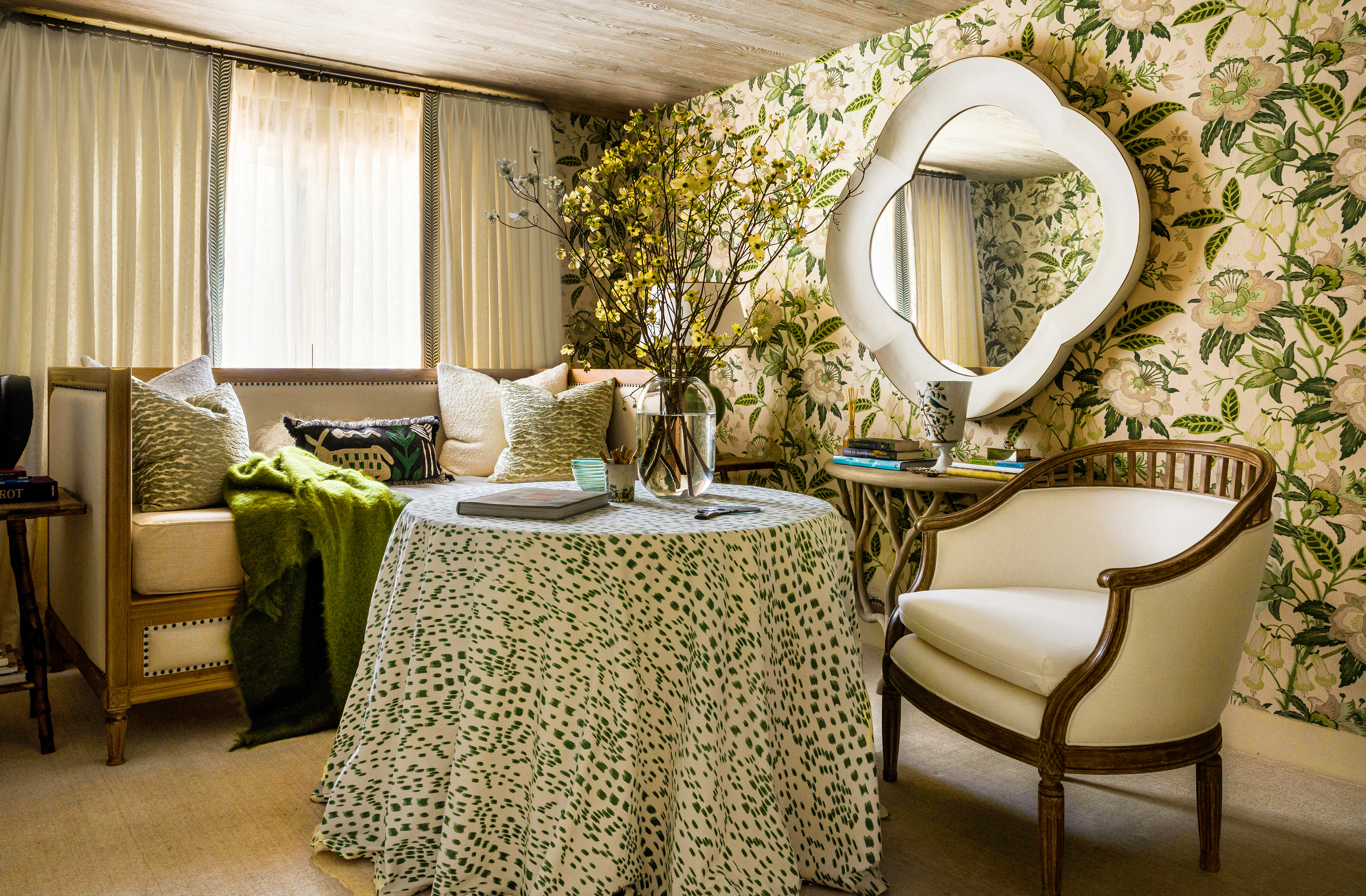

“We created a new sitting room, converted from an unused guest bedroom. We emphasized the garden feeling through the use of the white and green floral fabric [Kravet], which we turned into a vibrant wallcovering. Fabric makes the best wallcovering adding not only pattern but also texture.” – Benjamin Dhong
.jpg)

“In the family room we used the same fabric portieres from the entry to create continuity. The walls were wallpapered in a custom floral print from Bennison (Palampore - Charcoal Blue on Oyster] its primarily a neutral to harmonize with kitchen but the yellow and orange flowers provide the happy pop.” – Benjamin Dhong


“In the dining room we balanced the formality of the table and chairs with a light rattan piece from SOANE UK and whose sinewy lines drape down to the floor. This added a relaxed feeling and was a strong counterpoint to the dark brown antiques/ There is also a faux tortoise bamboo side table that fills a corner with a sense of purpose and whose colors and texture add a richness to the mix.” – Benjamin Dhong

“In the master bedroom instead of placing the bed in the center of the room we placed it on the opposite end of the entry door and added a skirted center table. The tribal pattern and softness of the drape adds a romantic element to the space and avoids the visual clutter of too many legs.” – Benjamin Dhong
TSS: What are your rules for creating comfort? The house is polished and at the same time wonderfully relaxed and it all feels very natural and inviting.
BD: For me its really modulating the balance of textures, shapes, colors and functions. I believe in mixing high-low, shiny-matte, hard-soft…and most importantly creating a visual purpose to rooms and spaces. For example, a small writing desk or window seat in a hall or staircase landing might never be used but it makes you happy every time you walk by. Barrel-back or club chairs add softness and embrace the sitter.”

“Don’t we all just love mudrooms? I think its because it captures our true daily lives and comings and goings, arrivals, departures, The cabinetry keeps it all tidy and organized. So we decided to use a bold color to add some happy zest to the passage. The addition of lightly antiqued mirrors to the back of doors reflects the garden.” – Benjamin Dhong
TSS: You designed rooms that feel cool and fresh in the Napa Valley summer, and cozy and warm when there is frost in the vineyards. What are your recommendations for year-round houses like this one.
Congratulations for creating this joyful and chic country house.
BD: Thank you, Diane. It’s a happy house. And now my dear client spends more time there. I could not be more pleased.

CREDITS:
Design
Benjamin Dhong Interiors
www.benjamindhong.com
Instagram: @benjamindhong
Photography
www.benjamindhong.com
Instagram: @benjamindhong
Photography
David Duncan Livingston
Instagram: @daviddlivingston