A Visit to One of the Most Refined, Focused and Polished Rooms at the Recent San Francisco Decorator Showcase
Come with me to take a close look at an exquisitely designed library/ sitting room/ cocktail salon by one of California’s top interior designers. It raises pertinent questions about our relationship with books—and the traditional concept of a library as a room for securing, enjoying, and admiring books.
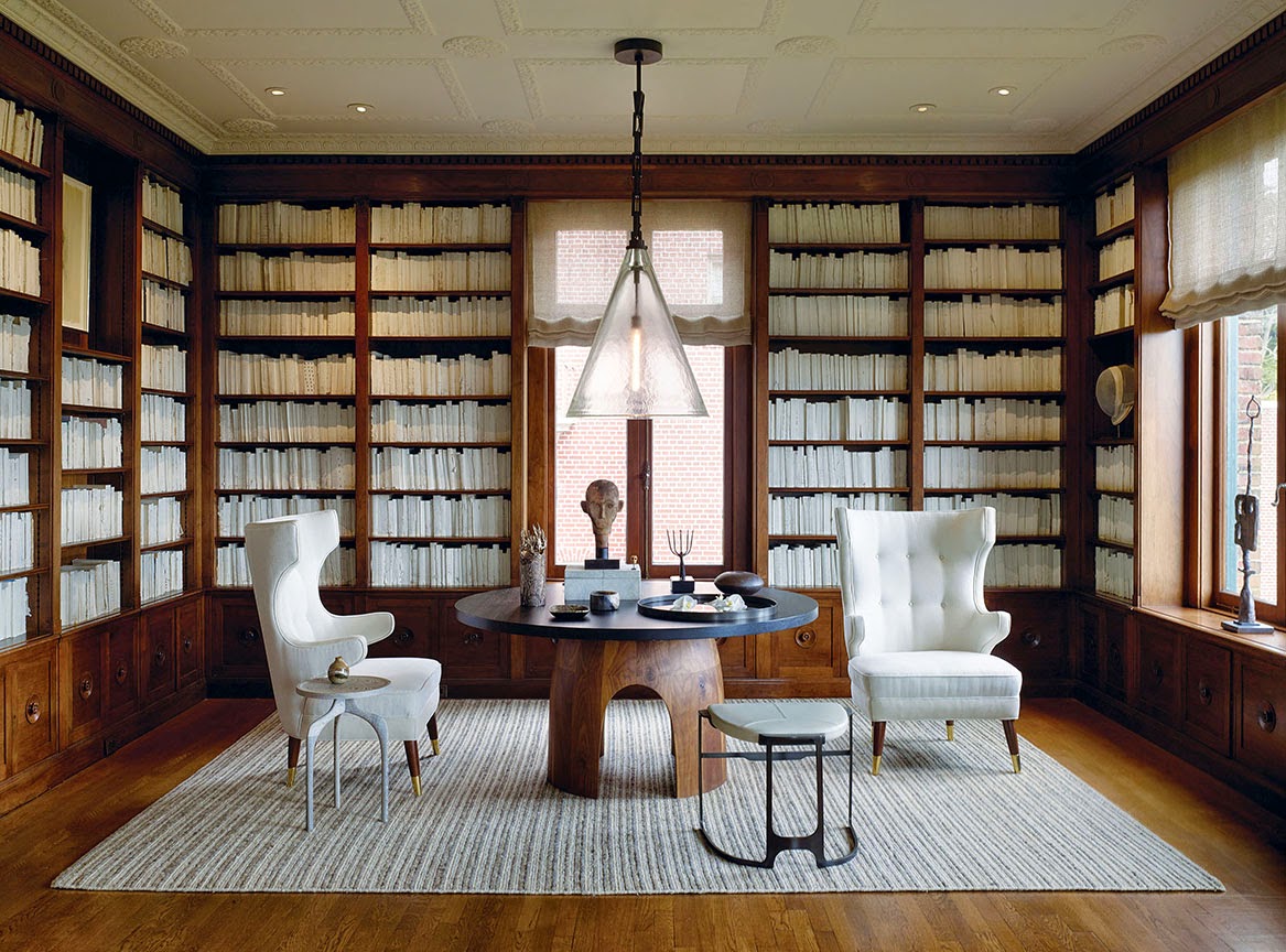
Geoffrey de Sousa dreamed up and perfected this versatile and tranquil room, which was situated on the second floor of a 1907 house in Presidio Heights in San Francisco. Books here are ‘in the cloud’. The whole library. But, you say…I see books. Come with me to discover a thought-provoking room.
 |
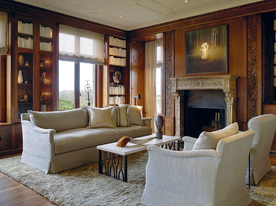
| Lit by moths and colored with such delicacy, the room is sculpted in tones ranging from ivory and white all the way to deep espresso, glittering glass and richly mottled bronze. |
From its broad sweep of windows, the library offered an ultra-private and privileged view over a perfectly symmetrical classical garden. Linen window coverings framed eucalyptus groves and a smudge of San Francisco Bay with the misty hills of Northern California beyond in the wistful distance.
But we’re not here to linger on or even admire the panorama. Not at all. This room is so compelling in its harmony, cohesive concept and controlled monochromatic palette, that anyone who entered turned away from the view to partake in this chic composition.
 |
| De Sousa's rendering for the Design Advisory Board: View toward the fireplace, with two perfectly symmetrical sofas placed for repose, reading, cocktails, or a deep, deep dialogue. |
Designers’ Information Sheet
Space Name: Library
Name of Design Firm: Geoffrey De Sousa Interior Design
Description of the design: Geoffrey de Sousa’s statement
Alfred Sutro, the mansion’s original owner loved books. He escaped into his 1907 library after a long day as partner in the law firm of Pillsbury, Madison, and Sutro. The fictionalized homeowners of 2014 also need a retreat.
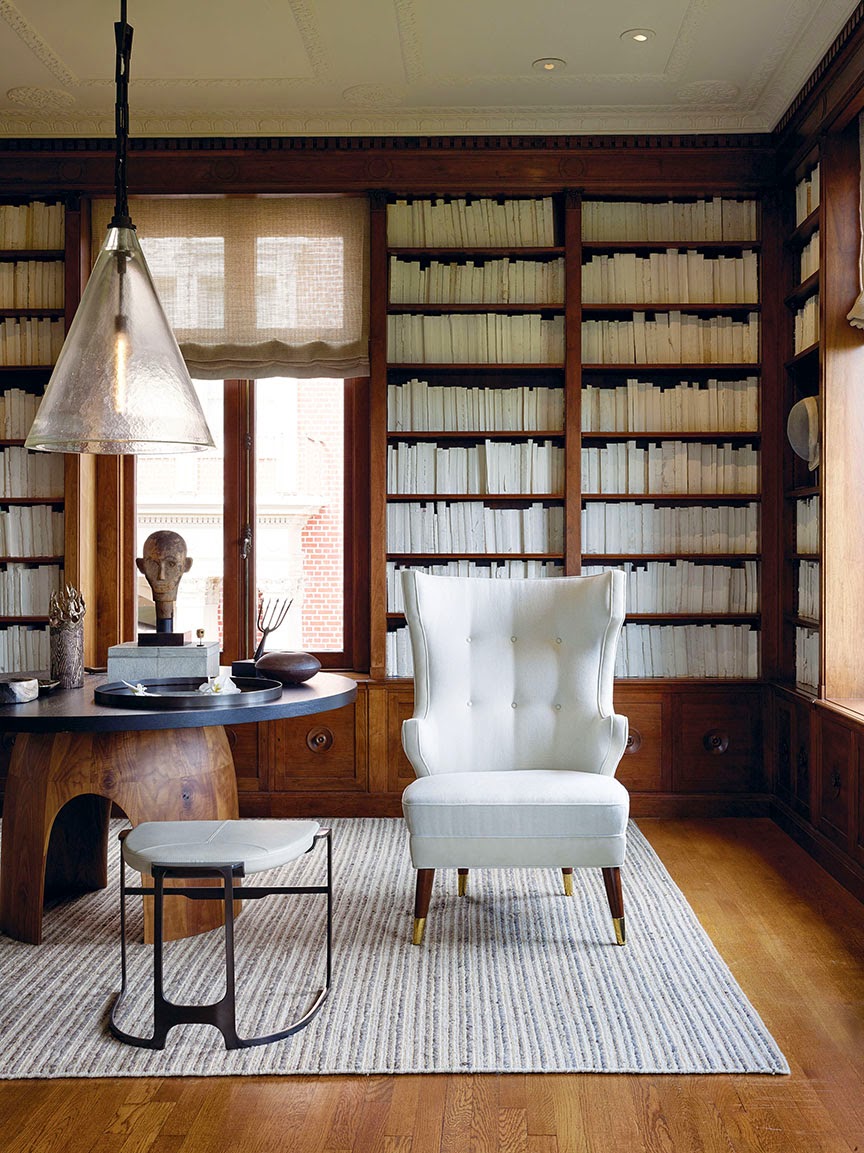
Although their house is iPad-centric, with music and visuals and action activated and stored on this magic pad, the library has real books, real life, and an escape from the virtual world and The Cloud. As well as a virtual library, the dark-wood paneled room has bookcases filled with real collections of volumes with white hand-painted covers (an aesthetic choice).
A monochromatic palette of tactile linens, silks, and velvet-soft suede sooths the hand, eye, and spirit.
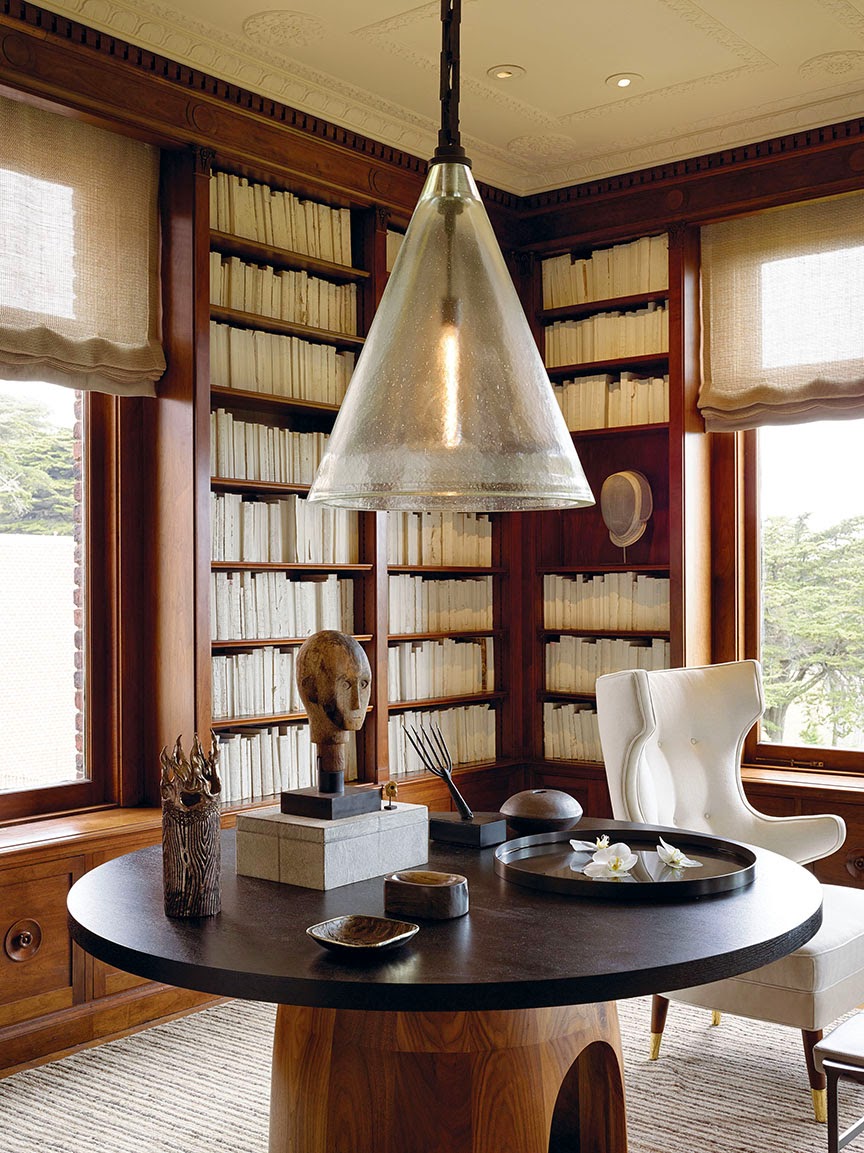
Primitive artifacts and bronze sculptural pieces dance on a contemporary center table. A monumental glass cone light fixture, both elegant and somewhat elemental and organic, illuminates the tablescape.
Rough linen Roman shades frame the lush gardens and mercurial views of the bay.
Three Points by Geoffrey de Sousa
· Rather than fight the dark traditional paneling of the library we chose to juxtapose it with a light modern design concept.
· The iPad-centric fictional homeowner’s library is kept mostly in the cloud. White painted folios provide the backdrop for the room.
· Whereas Sutro’s original library might have featured heavy dark textiles, natural linens were chosen to give the space a relaxed mood.


Speaking Volumes
I recently sat down for a chat with Geoffrey de Sousa. He explained his design concepts and his vision for this memorable room. Sit down with us for a moment on theses down-filled sofas.DDS: The concept of the design?
GDS: The neutral inspiration came from the room’s Classical Revival mantelpiece. I imagined a younger affluent couple appreciating the mansion’s Bliss & Faville architecture but wanting a contemporary library in which to reflect and chat and sip wine and gather the family. Ghostly pale painted volumes act as a sculptural wall covering. The detailed plaster ceiling mirrors the color of the books while contrasting with the rich carved woodwork.
Because much of the clients’ collection of reading materials is now kept in the cloud the room addresses the future of the private library. Will bibliophiles still collect first editions of F. Scott Fitzgerald’s The Great Gatsby?


DDS: Will books on design and art be treasured? Yes. Will we want to hold books in our hands and treasure their beauty and essential information? Of course. And we’ll all love the ease and excitement of the electronic world and its neural connections. This is a modern library—books and fast-thinking electronics. How large is the room and how did that influence your design?
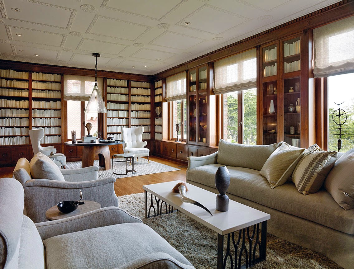
GDS: The room’s generous size of 17- feet 9 inches wide x 30 feet long with ten-foot ceilings allowed for two distinct conversation groups.
In front of the mantel we paired the hand-built and very traditional Vallone sofa from the New York City studio family business, Dmitriy & Co, with two companion armchairs.
A bronze based coffee table with a honed limestone top centers and balances the upholstery. To ground the space we selected a Moroccan style carpet from Tony Kitz, a longtime and prized San Francisco carpet dealer. Its meandering pattern mimics the foliate carvings flanking the mantel.
On the opposing side of the room we installed a modern library table with curved walnut base and ebonized top by Montana designer Ty Best for Caste. Two sculptural club chairs from Studio Van Den Acker provide seating while the cone-shaped glass fixture casts a haunting light on the vignette.


DDS: Tell us more about the large-scale pendant light that looms over the table and gives the room a glow.
GDS: Produced by the Chicago manufacturer Mattaliano, the Conique Chandelier combines a massive glass funnel with a solid bronze rectangular chain. Weighing 200-plus lbs. it required three of us to hold it up while the electrician magically connected the wiring. We played its mass against the other light fixture in the room, a skeletal floor lamp from Christian Liaigre. The chandelier’s chain material also echoes Kit Ruether’s Giacometti-esque bronze sculptures.
DDS: The room is so calm. How did you create that?
GDS: For my past rooms in the San Francisco Decorator’s Showcase I used bold vivid colors. My Living Room in the 2008 showcase on 2820 Scott Street featured deep indigo walls complimented by terra cotta textiles. In the 2014 library we did not want anything to distract from the symmetry of the room or the rich wood carved paneling. We selected monochromatic colors resembling the whiteness of bone, and very soft taupe and powdery dark browns. We also built up contrasts of texture with sand- colored wool and nettle rug from Rosemary Hallgarten, and stonewashed linens from London-based de le Cuona. A steer horn with horsehair from San Miguel Allende is displayed on the Catena coffee table from Troscan.


DDS: The 'culture clash' of modern and old and rough and smooth textures is very subliminal, and very thrilling. Tell us about these juxtapositions in your design.
GDS: In homage to the mansion’s rise from the ashes of the City’s 1906 Earthquake, we surmounted the ornate mantel with a gritty contemporary photo of a fire hydrant by Kurt Manley. On the polished top of the modern Caste dining table we placed a roughly carved wooden Tau-Tau or ancestral memorial head from the Toradja people of Sulawesi Island, Indonesia.
A collection of pale mid-century Scandinavian pottery by Gunnar Nyland and his protegé Carl Harry Stålhane coexists with ash colored hand coiled architectural vessels from Berkley ceramicist Erin McGuiness. The tension of opposites creates energy in a room and makes it memorable.

DDS: What have the many thousands of visitors said?
GDS: I love it when people enter the library and comment on its serene ambiance and inviting atmosphere. They are the majority. The white painted books caused the most debate and the discussions about these volumes—decorative and designed and somewhat abstract-- point to the perceptions of different generations. Painting the recycled volumes and obscuring their titles horrified mature visitors. When I explained my design concept of a younger client with an iPad and iPod library they started to get it. While they felt nostalgic for the loss of print they also saw what this technology means for the future. Has technology rendered printed material merely decorative? Personally I’m collecting great books. Nothing can replace the feel of a beautiful folio in your hands. And I love the quick access to information and entertainment that electronics offer.
DDS: Geoffrey, thank you very much for our private tour. I was impressed when I first saw the delicately colored and beautifully balanced rendering you created for the proposed room—and I was even more impressed to spend time in this superbly restrained design.
There is a quietness and tranquility here. The room is hidden from public life, and it has a view that’s like a green/blue painting by Monet or Constable. It’s the precision and control of your design that makes me want to linger and linger.
Thank you for creating such beauty.
ABOUT GEOFFREY DE SOUSA
Since launching his eponymous firm fifteen years ago – a practice independent of his role of showroom impresario – De Sousa has made a name for himself creating urbane, artful spaces that reflect his curatorial mindset.
For a San Francisco Victorian or a modern Palm Springs retreat, De Sousa’s interiors are cosmopolitan and feel consummately modern. De Sousa’s aesthetic stems from his upbringing in Massachusetts, where he grew up in a traditional colonial and where his family traces its lineage to the 17th century.
“I love history, and there’s a real sense of tradition in my approach, but I also love using pieces that are great juxtapositions of each other. Things just must be sculptural and stand in the now.” In his over twenty years as an interior designer, De Sousa has worked on projects on both coasts, including a Pacific Heights mansion designed by Robert A.M. Stern, a five-star Sonoma B&B and residences in Palm Springs, Boston and New York City. His work has been featured in Architectural Digest, Departures, Traditional Home, House Beautiful, and many other publications.

CREDITS
Geoffrey De Sousa Interior Design:
Interiors: www.geoffreydesousa.com
Showroom: www.desousahughes.com
Photographers:
Matthew Millman, www.matthewmillman.com
David Duncan Livingston, www.davidduncanlivingston.com
6 comments:
Wonderful Article for a Wonderful room!
The room is absolutely beautiful, so serene and inviting. However it hurts me to know that the books were painted, why not cover with paper?
DEAR TROY-
Thank you!
I agree. It is not trying to be 'innovative' and it is not trying to be trendy.
The formality of the woodwork and fireplace rather spoke to classicism and detail and harmony.
The symmetry is superbly realized. braveo Geoff.
DIANE
MARY JANE-
I'm happy you love the room…and appreciate the design.
You will note that in my text I write that the books were covered in ivory colored/white vellum…they were not painting.
Geoff bought the books from a charity shot…so already he was support the charity, which I love…and they were in bad condition, faded and not of particular interest in terms of the content. He wrapped them in the white/ivory covers…a good choice. He was making a statement, which he realized beautifully. Don't forget also that the house was a SHOWCASE for designers, there were no real owners living there at the time--and it was an opportunity for somewhat more abstract and conceptual thinking…he would not do this for an actual client. Creativity and free-thinking were the points here. thanks so much for your concern--they were in fact covered. Keep in touch, DIANE
Diane it is a fabulous room and a very interesting concept. In reality I would love to see the titles etched in a lovely matte gold on the vellum.
Geoff definitely made a statement, which I applaud.
xoxo
Karena
The Arts by Karena
Karen-
Yes,…thank you for your comment.
Yes…gold titles! Could have been witty titles or cryptic….
Geoff did not do this…and I think he liked the 'no color' and 'abstraction' of the books…all clustered together…
I once published a great bedroom in which all the book titles had been turned around…meaning that the books were all stacked along the shelves and the titles were at the back. It looked great and very abstract…and books could in fact easily be found…but I had more negative comments to that than any story I ever wrote…it seemed to upset readers terribly…
books…so endlessly interesting… D
Post a Comment