In his dramatic Pacific Heights apartment, San Francisco designer Orlando Diaz-Azcuy pared down the interior architecture to create a dynamic gallery for the crème de la crème of his art and antiques collections.
Come with me for a visit to Orlando’s penthouse in Pacific Heights, San Francisco. As it happens he is a five-minute walk from where I live, and I can almost peer into his windows from my roof. No need…I can hop over for a visit. Come with me now.

Three years ago, I wrote a book about Orlando Diaz-Azcuy, the great San Francisco interior design/architect. Rizzoli was the publisher. The book, ‘Orlando Diaz-Azcuy’ went into a second printing, and has been very well-received.

San Francisco interior designer Orlando Diaz-Azcuy is a passionate modernist at heart. So it’s not surprising that after living in a stately Spanish Revival house in St. Francis Wood for a decade he became restless and started hunting for a crisp pared-down modern apartment.
“I wanted an apartment in a contemporary building that was in the right location, and not far from my downtown office,” said the award-winning designer, who found his new location overlooking Lafayette Park, and facing south with all-day sun, views of the ocean in the distance.
Diaz-Azcuy, who founded Orlando Diaz-Azcuy Design Associates in 1987, is recognized as one of the top designers in the country. He is a partner with the highly talented David Oldroyd (I published his house on THE STYLE SALONISTE…find it in the archive), as well as Greg Stewart.
Their Post Street firm works on top commissions for residential and commercial interiors, and Diaz-Azcuy designs highly successful collections for companies like San Francisco-based McGuire Furniture Company. After more than 40 years in the design business, the Cuban-born designer continues to dazzle.
“San Francisco is a challenging place for a modernist to find an apartment, as the city has only a handful of great contemporary apartment buildings, so I searched for two years,” said Diaz-Azcuy. “Finally I discovered this apartment with ten-foot ceilings and views from the Pacific Ocean to the East Bay, and I bought it on the spot” said the designer.
A perfectionist, Diaz-Azcuy immediately planned a ceiling-to-floor redesign of his apartment, which is on the 17th floor of a sixties building.
“The apartment was a standard 3-bedroom, with lowered ceilings, and all chopped up into small rooms,” recalled Diaz-Azcuy.
“I didn’t want the interior architecture to deny that it’s in a high-rise,” he said. “My goal was to achieve a light, fresh-air, California feeling.”
He stripped down the interior architecture to make it feel calm, very minimal. No baseboards, no trim, no moldings.
“But I have to have luxury, too,” he noted. “That comes from the antiques and the art and sumptuous fabrics.”

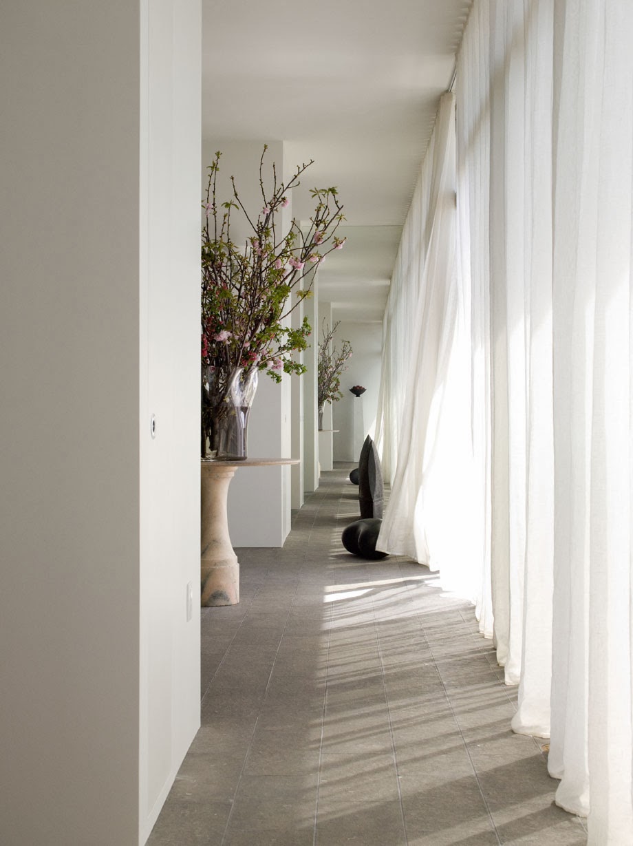
Walls throughout the apartment are sprayed with eggshell-finish white paint for a smooth, brush-free effect. Mechanicals and wiring are concealed in sections of lowered ceilings that run along the hallway. He even minimized the doors by concealing frames in the walls.
A wall of glass windows and sliding doors runs along the south-facing apartment, which is now re-shaped into two bedrooms, a comfortable study, a large living room with an adjacent dining room, and a long broad hallway.
Floors throughout the house are a soft pale blue-gray Blue Lagoon limestone with a flamed finish. The apartment has sub-floor radiant heat.
“I am always tempted to see how simple I can make drywall look, and I am seldom tempted to embellish,” said Diaz-Azcuy.


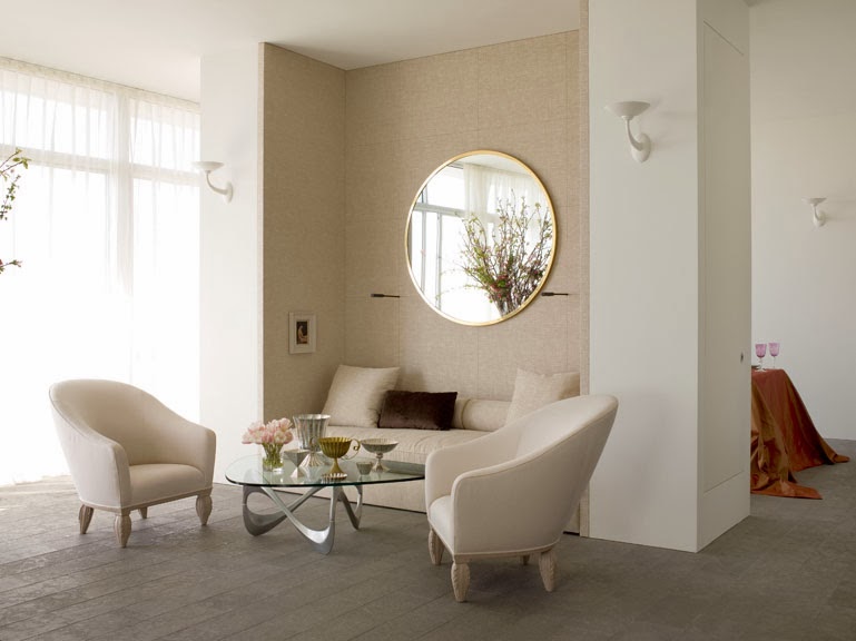
The spacious, open rooms are the ultimate thrill for a modernist, and the interiors are dazzlingly edited.
“I like a sense of voluptuousness,” said Diaz-Azcuy. “I love the idea of monastic interiors but the heart desires beautiful things to look at and touch. I believe in superb comfort. I have a great appetite for modern furniture, but I use them as an accent, with upholstered pieces to actually relax on.”
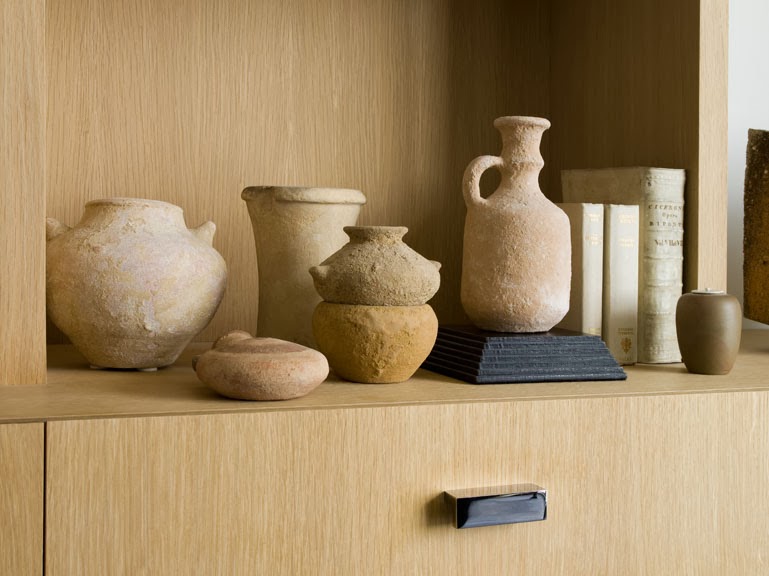
All this simplicity makes a sumptuous background for his collections of art and antiques. Eccentricity, contrasts and surprises in furniture and art are a key to the designer’s confident style.
“Rough and smooth objects, elaborate and modern classic furniture, curvy and straight chairs, antique and modern, these are juxtapositions I make almost subliminally,” noted Diaz-Azcuy. “A room that’s all one style—all modern, totally monochromatic, all one period—lacks individuality.
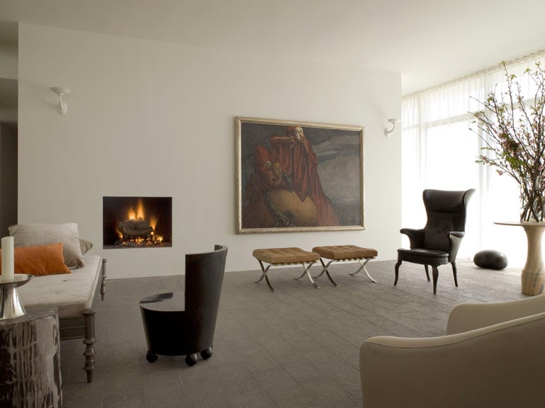
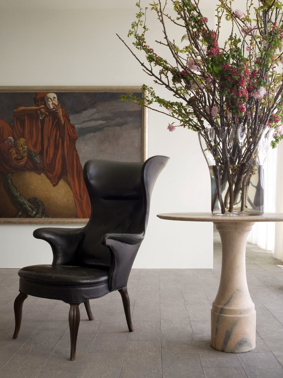
In the living room, he combined a Roman-style daybed upholstered with silk velvet, with a quirky black lacquered Art Décor chair with ball feet, along with a narrow table made with petrified wood.
In another corner, a pair of Mies van der Rohe tan leather tufted ottomans is lined up near a sculptural 1930 Fritz Henningsen leather and teak armchair.


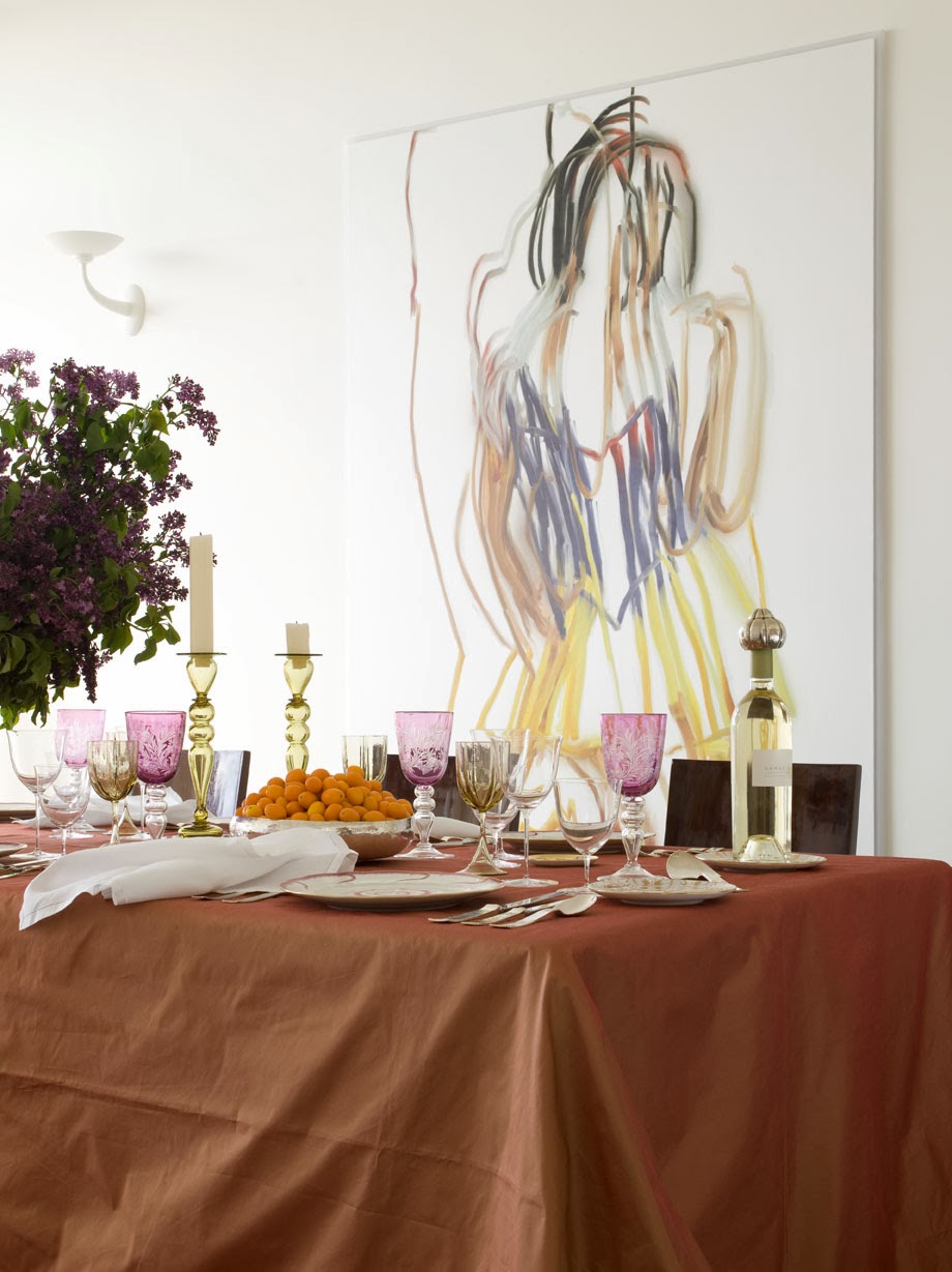


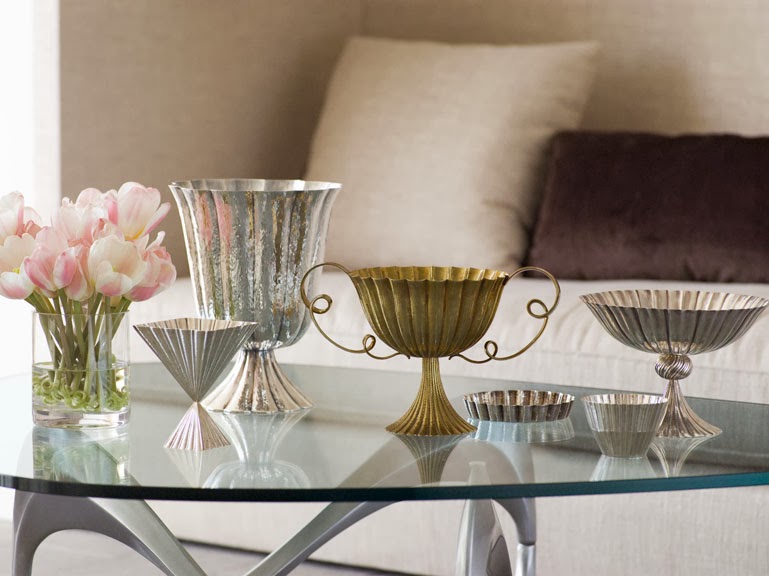
For the dining room, Diaz-Azcuy designed a tablecloth of saffron and tangerine shot silk. Walls are animated with Deborah Oropallo works of art. He also displayed his museum-quality collection of Josef Hoffmann Wiener Werkstatte hammered silver urns, vases, wine-bottle stoppers, bowls, and decorative objects.
Diaz-Azcuy said that even growing up in western Cuba, he was tuned in to design and architecture.
“Havana in the sixties was very cosmopolitan and my college student accommodations there were in an elegant Beaux-Arts inspired building,” he noted. “There were Neutra houses built in Cuba. It was a very stimulating atmosphere for a young design aficionado.”
At the age of 22, Diaz-Azcuy was sent by his family to study architecture at Catholic University in Washington DC.
He went on to complete a master’s degree in landscape architecture and city and regional planning from the University of California at Berkeley.
“ I was exposed to modernism subliminally as a child,” he said. “Cuban houses in smaller towns were just a white cube with perhaps one touch of exuberant color and a chandelier. It’s a pattern I’ve returned to in my apartment.”
This early desire for simplicity with a controlled color palette and concern for the minutest detail of design and perhaps the splash of vivid color and a dash of luxury, have played out in all of his designs. Diaz-Azcuy said he has never liked excess in interiors, preferring simplicity with a touch of glamour.


For the moment, the apartment is bliss for the designer.
“For my clients I can design any style of interiors ranging from very traditional to lofts, country houses, a pied-a-terre, offices, a hotel, but for myself it’s a modern approach,” said the designer. “For now, I find these rooms restful, calm, and personal, but I know the apartment will change and evolve.”
“The daily hazard of being a decorator is that I am constantly exposed to the best art, amazing sculpture, the top collections, auctions, antiques and accessories,” said Diaz-Azcuy. “I buy pieces for their innate beauty, quality and spirit. I know I’ll see something exceptional. In six months, the apartment will look quite different.”


WHITE
DDS: You have always loved to work with white. For you it is powerful.
ODA: There is nothing more beautiful than white. I love white linen. I like muted white walls. I like white jackets, white shirts. For me, white soothes my soul. I don’t use it because it is hot but because it is eternal. In my apartment I have a wall of windows that I have covered with sheer Irish linen that billows in a slight breeze. It indicates emotion, air, light, purity, and a sense of nature outside the window. White has also been associated with Modernism—and used frequently by Le Corbusier, Mies, Pei, Richard Meier, and rigorously by John Paulson.
White in my interiors gives me the flexibility to change everything. I’m always moving new paintings and new sculpture in and out of my apartment.
DDS: Which white paints do you like?
ODA: My favorite white is ‘Soda’, which I developed for Fuller paints 25 years ago. It is no longer available but Benjamin Moore ‘Cloud White, OC-130, is very close. It’s slightly warm. I also like Benjamin Moore OC-65 for a pure white. But I develop custom colors for all of my clients, and for myself, especially here in the apartment, I’ve mixed all paints, totally custom. I think the success of paint application is in the hands of a paint craftsman. And I don’t deny the quality of Donald Kaufman paints, or Farrow & Ball.
DDS: Living with white.
ODA: A white and ivory color palette makes my happy and enhances everything in the rooms, no matter the style or mood. Generally I find it tranquil, calm.
I like the flexibility offered by white or pale ivory walls. In San Francisco we have bright light reflecting off the ocean and in the moisture of our ocean air. White is luxurious, pure, exciting, and with its reflective power and energy it is better than any color.
WORKING WITH CONTRAST
“Design needs juxtaposition and contrast to come alive. Mundane things often enliven luxurious décor, just as quiet phrasing and bass notes add balance to coloratura opera scores. Décor should not be unremittingly rich or minimal. You don’t see the beauty. In a room with museum-quality paintings or Greek antiquities, and opulent antiques, I may balance the luxury with simple white linen upholstery, bare floors or discreet and worn Oriental silk carpets, and some pared-down modern architecture.”


COLOR USED JUDICIOUSLY
“People think I never use color, but it isn’t true. I seldom use pattern, but I love color! In Cuba, as a teenager, I once painted my parents’ living room shocking pink. I spend hours working on color schemes. Many people are not tuned to tone-on-tone colors, or a carefully selected and calibrated collection of whites, and they don’t notice subtlety. Soft, neutral, barely-there colors are still colors. Some of our most exciting projects are true color inspiration. But I always look for the unusual shade, tone or hue. I’m happiest working with colors you can’t exactly name—pale cornflower blue, blush pink, blue-gray, an unusual blue dashed with gold.”


EDIT, EDIT, EDIT
“The most successful design is a result of rigorous, disciplined editing. Simple and successful interiors are always the result of taking out and not putting in more things. A complex solution brought down to the minimal expression gets to the soul of the solution.”
ESSENTIAL TEXTURES
“Contrast emphasizes the special attributes of any interior. Rough and smooth, textured and plain, curvy and straight, rich and rustic. A room that’s all one note—all modern, totally monochromatic, all one period—lacks individuality.
FOCUS ON LIGHT
“Control and use of light are the strongest elements of my design. Light –natural and artificial--creates mood, a sense of comfort and well-being, and makes an interior totally functional.”


ACCESSORIES
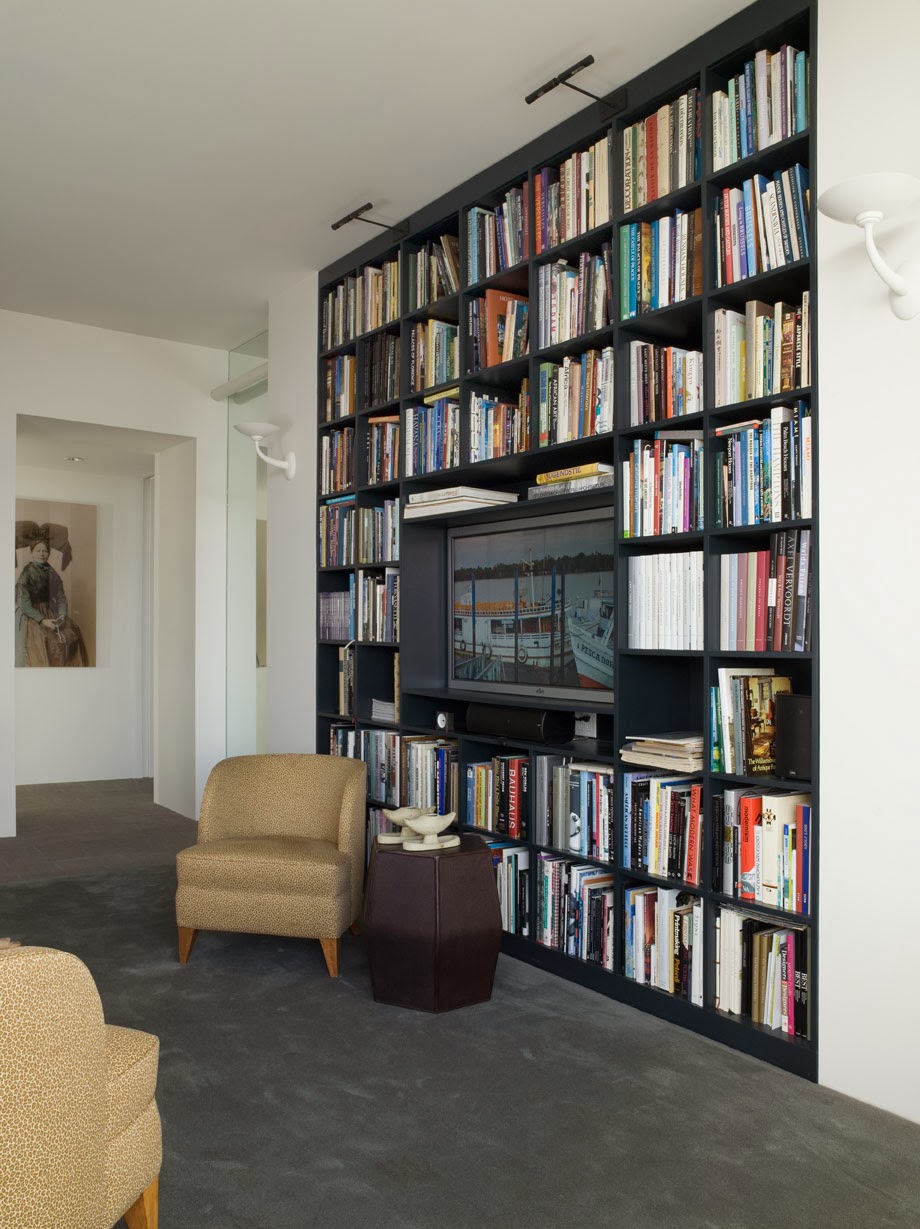
“An interior without accessories it is an interior without expression. While I am known for controlled, tailored and very polished interiors, I personally appreciate eccentricity, and the jolt of the unexpected. Provocative conceptual art, found objects, garden flowers, fine old paintings, contemporary sculpture. Well-edited collections, and have course a bookcase stacked with books, make a room come to life.”
.jpg)
Credits:
ALL IMAGES PUBLISHED ON THE STYLE SALONISTE ARE USED HERE WITH EXPRESS PERMISSION OF THE COPYRIGHT HOLDERS.
Images of Orlando’s penthouse: David Duncan Livingston, www.davidduncanlivingston.com
Portrait of Orlando in white jacket: Tim Street-Porter, www.timstreet-porter.com
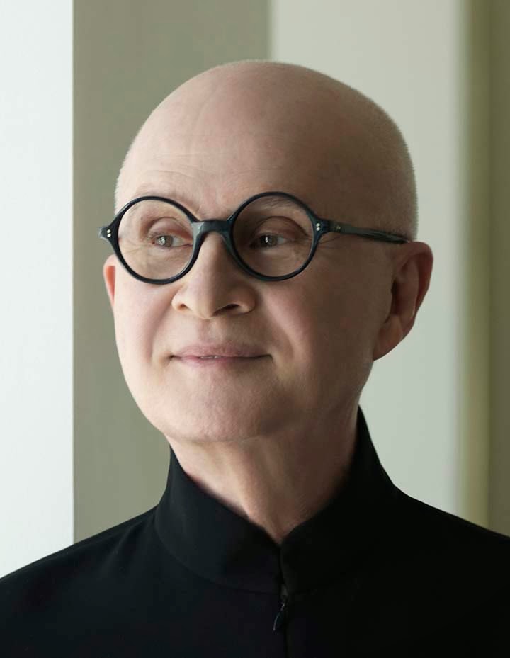
Portrait of Orlando in black shirt: Peter Tjahjadi: www.petertjahjadi.com
Come with me for a visit to Orlando’s penthouse in Pacific Heights, San Francisco. As it happens he is a five-minute walk from where I live, and I can almost peer into his windows from my roof. No need…I can hop over for a visit. Come with me now.
Three years ago, I wrote a book about Orlando Diaz-Azcuy, the great San Francisco interior design/architect. Rizzoli was the publisher. The book, ‘Orlando Diaz-Azcuy’ went into a second printing, and has been very well-received.
San Francisco interior designer Orlando Diaz-Azcuy is a passionate modernist at heart. So it’s not surprising that after living in a stately Spanish Revival house in St. Francis Wood for a decade he became restless and started hunting for a crisp pared-down modern apartment.
“I wanted an apartment in a contemporary building that was in the right location, and not far from my downtown office,” said the award-winning designer, who found his new location overlooking Lafayette Park, and facing south with all-day sun, views of the ocean in the distance.
Diaz-Azcuy, who founded Orlando Diaz-Azcuy Design Associates in 1987, is recognized as one of the top designers in the country. He is a partner with the highly talented David Oldroyd (I published his house on THE STYLE SALONISTE…find it in the archive), as well as Greg Stewart.
Their Post Street firm works on top commissions for residential and commercial interiors, and Diaz-Azcuy designs highly successful collections for companies like San Francisco-based McGuire Furniture Company. After more than 40 years in the design business, the Cuban-born designer continues to dazzle.
“San Francisco is a challenging place for a modernist to find an apartment, as the city has only a handful of great contemporary apartment buildings, so I searched for two years,” said Diaz-Azcuy. “Finally I discovered this apartment with ten-foot ceilings and views from the Pacific Ocean to the East Bay, and I bought it on the spot” said the designer.
A perfectionist, Diaz-Azcuy immediately planned a ceiling-to-floor redesign of his apartment, which is on the 17th floor of a sixties building.
“The apartment was a standard 3-bedroom, with lowered ceilings, and all chopped up into small rooms,” recalled Diaz-Azcuy.
“I didn’t want the interior architecture to deny that it’s in a high-rise,” he said. “My goal was to achieve a light, fresh-air, California feeling.”
He stripped down the interior architecture to make it feel calm, very minimal. No baseboards, no trim, no moldings.
“But I have to have luxury, too,” he noted. “That comes from the antiques and the art and sumptuous fabrics.”
Walls throughout the apartment are sprayed with eggshell-finish white paint for a smooth, brush-free effect. Mechanicals and wiring are concealed in sections of lowered ceilings that run along the hallway. He even minimized the doors by concealing frames in the walls.
A wall of glass windows and sliding doors runs along the south-facing apartment, which is now re-shaped into two bedrooms, a comfortable study, a large living room with an adjacent dining room, and a long broad hallway.
Floors throughout the house are a soft pale blue-gray Blue Lagoon limestone with a flamed finish. The apartment has sub-floor radiant heat.
“I am always tempted to see how simple I can make drywall look, and I am seldom tempted to embellish,” said Diaz-Azcuy.
The spacious, open rooms are the ultimate thrill for a modernist, and the interiors are dazzlingly edited.
“I like a sense of voluptuousness,” said Diaz-Azcuy. “I love the idea of monastic interiors but the heart desires beautiful things to look at and touch. I believe in superb comfort. I have a great appetite for modern furniture, but I use them as an accent, with upholstered pieces to actually relax on.”
All this simplicity makes a sumptuous background for his collections of art and antiques. Eccentricity, contrasts and surprises in furniture and art are a key to the designer’s confident style.
“Rough and smooth objects, elaborate and modern classic furniture, curvy and straight chairs, antique and modern, these are juxtapositions I make almost subliminally,” noted Diaz-Azcuy. “A room that’s all one style—all modern, totally monochromatic, all one period—lacks individuality.
In the living room, he combined a Roman-style daybed upholstered with silk velvet, with a quirky black lacquered Art Décor chair with ball feet, along with a narrow table made with petrified wood.
In another corner, a pair of Mies van der Rohe tan leather tufted ottomans is lined up near a sculptural 1930 Fritz Henningsen leather and teak armchair.
For the dining room, Diaz-Azcuy designed a tablecloth of saffron and tangerine shot silk. Walls are animated with Deborah Oropallo works of art. He also displayed his museum-quality collection of Josef Hoffmann Wiener Werkstatte hammered silver urns, vases, wine-bottle stoppers, bowls, and decorative objects.
Diaz-Azcuy said that even growing up in western Cuba, he was tuned in to design and architecture.
“Havana in the sixties was very cosmopolitan and my college student accommodations there were in an elegant Beaux-Arts inspired building,” he noted. “There were Neutra houses built in Cuba. It was a very stimulating atmosphere for a young design aficionado.”
At the age of 22, Diaz-Azcuy was sent by his family to study architecture at Catholic University in Washington DC.
He went on to complete a master’s degree in landscape architecture and city and regional planning from the University of California at Berkeley.
“ I was exposed to modernism subliminally as a child,” he said. “Cuban houses in smaller towns were just a white cube with perhaps one touch of exuberant color and a chandelier. It’s a pattern I’ve returned to in my apartment.”
This early desire for simplicity with a controlled color palette and concern for the minutest detail of design and perhaps the splash of vivid color and a dash of luxury, have played out in all of his designs. Diaz-Azcuy said he has never liked excess in interiors, preferring simplicity with a touch of glamour.
For the moment, the apartment is bliss for the designer.
“For my clients I can design any style of interiors ranging from very traditional to lofts, country houses, a pied-a-terre, offices, a hotel, but for myself it’s a modern approach,” said the designer. “For now, I find these rooms restful, calm, and personal, but I know the apartment will change and evolve.”
“The daily hazard of being a decorator is that I am constantly exposed to the best art, amazing sculpture, the top collections, auctions, antiques and accessories,” said Diaz-Azcuy. “I buy pieces for their innate beauty, quality and spirit. I know I’ll see something exceptional. In six months, the apartment will look quite different.”
The Wisdom of Orland0
I asked Orlando for his thoughts about white in design. Here’s what he told me:WHITE
DDS: You have always loved to work with white. For you it is powerful.
ODA: There is nothing more beautiful than white. I love white linen. I like muted white walls. I like white jackets, white shirts. For me, white soothes my soul. I don’t use it because it is hot but because it is eternal. In my apartment I have a wall of windows that I have covered with sheer Irish linen that billows in a slight breeze. It indicates emotion, air, light, purity, and a sense of nature outside the window. White has also been associated with Modernism—and used frequently by Le Corbusier, Mies, Pei, Richard Meier, and rigorously by John Paulson.
 |
| Orlando has wardrobes of beautifully tailored jackets and shirts in his San Francisco, and in his New York apartment overlooking the East River. Above, he’s photographed at home…wearing black. |
White in my interiors gives me the flexibility to change everything. I’m always moving new paintings and new sculpture in and out of my apartment.
DDS: Which white paints do you like?
ODA: My favorite white is ‘Soda’, which I developed for Fuller paints 25 years ago. It is no longer available but Benjamin Moore ‘Cloud White, OC-130, is very close. It’s slightly warm. I also like Benjamin Moore OC-65 for a pure white. But I develop custom colors for all of my clients, and for myself, especially here in the apartment, I’ve mixed all paints, totally custom. I think the success of paint application is in the hands of a paint craftsman. And I don’t deny the quality of Donald Kaufman paints, or Farrow & Ball.
DDS: Living with white.
ODA: A white and ivory color palette makes my happy and enhances everything in the rooms, no matter the style or mood. Generally I find it tranquil, calm.
I like the flexibility offered by white or pale ivory walls. In San Francisco we have bright light reflecting off the ocean and in the moisture of our ocean air. White is luxurious, pure, exciting, and with its reflective power and energy it is better than any color.
Orlando Diaz-Azcuy Talks on Design
Orlando told me some of his secrets—and I’m sharing them with you for inspiration.WORKING WITH CONTRAST
“Design needs juxtaposition and contrast to come alive. Mundane things often enliven luxurious décor, just as quiet phrasing and bass notes add balance to coloratura opera scores. Décor should not be unremittingly rich or minimal. You don’t see the beauty. In a room with museum-quality paintings or Greek antiquities, and opulent antiques, I may balance the luxury with simple white linen upholstery, bare floors or discreet and worn Oriental silk carpets, and some pared-down modern architecture.”
COLOR USED JUDICIOUSLY
“People think I never use color, but it isn’t true. I seldom use pattern, but I love color! In Cuba, as a teenager, I once painted my parents’ living room shocking pink. I spend hours working on color schemes. Many people are not tuned to tone-on-tone colors, or a carefully selected and calibrated collection of whites, and they don’t notice subtlety. Soft, neutral, barely-there colors are still colors. Some of our most exciting projects are true color inspiration. But I always look for the unusual shade, tone or hue. I’m happiest working with colors you can’t exactly name—pale cornflower blue, blush pink, blue-gray, an unusual blue dashed with gold.”
EDIT, EDIT, EDIT
“The most successful design is a result of rigorous, disciplined editing. Simple and successful interiors are always the result of taking out and not putting in more things. A complex solution brought down to the minimal expression gets to the soul of the solution.”
ESSENTIAL TEXTURES
“Contrast emphasizes the special attributes of any interior. Rough and smooth, textured and plain, curvy and straight, rich and rustic. A room that’s all one note—all modern, totally monochromatic, all one period—lacks individuality.
FOCUS ON LIGHT
“Control and use of light are the strongest elements of my design. Light –natural and artificial--creates mood, a sense of comfort and well-being, and makes an interior totally functional.”
ACCESSORIES
“An interior without accessories it is an interior without expression. While I am known for controlled, tailored and very polished interiors, I personally appreciate eccentricity, and the jolt of the unexpected. Provocative conceptual art, found objects, garden flowers, fine old paintings, contemporary sculpture. Well-edited collections, and have course a bookcase stacked with books, make a room come to life.”
Credits:
ALL IMAGES PUBLISHED ON THE STYLE SALONISTE ARE USED HERE WITH EXPRESS PERMISSION OF THE COPYRIGHT HOLDERS.
Images of Orlando’s penthouse: David Duncan Livingston, www.davidduncanlivingston.com
Portrait of Orlando in white jacket: Tim Street-Porter, www.timstreet-porter.com
Portrait of Orlando in black shirt: Peter Tjahjadi: www.petertjahjadi.com
11 comments:
WOW,Thank you!
I feel like I had a full college course in interior design all in one post!
contrast in textures, light creating mood, importance of simplicity coupled with interesting accessories, color can be subtle.
His result is such a calm, restfull home...with splashes of sensual surroundings. He created enough space to actually see and feel the furnishings. I agree, we often fill so much, we never see our special finds. We can't see the trees for the forest.
Please thank him!
I adore his style of modern and well balanced groupings. I am also admiring those leopard print library chairs that I have already pinned them! Thank you for a lovely post about another talent. Best regards, Naomi
A piece about a great designer.
A great piece about a great designer.
One of the most beautiful homes I've ever seen. LOVE his use of white and pale color in walls and upholstery and vivid color in his art.
I absolutely adore his home. The photos are magnificent. Thank you for the wonderful peek inside.
Dear Friends-
Thank you for your kind comments. I appreciate every word.
I also received the following charming note from Orlando, in a taxi, in New York City:
Diane - THANK YOU--
It looks beyond me. I am afraid to read it and believe it. Very well layout, composed, whatever is called in this new age.
Immensely grateful.
Best, Orlando
Hello-
Lots and lots of comments on FACEBOOK…some of them very delicious…and lots of links and shares…designers love this story.
I received also the following note from DAVID OLDROYD, Orlando's business partner at their firm:
Lovely article on the 'Style Saloniste' Diane. You never cease to amaze! What a terrific piece...and thanks for the sensitive and forward looking portrayal!
Xo
David
iPhone
White is the perfect interior paint for this home. Minimal and beautiful!
Hi Diane,
I read religiously all your posts, seldom comment lately but this article relates to one of my favorite books and adds so much to what I learned from it.
Thanks,
Albarosa
Hello Diane!
Sorry my comment was lost. I was saying Orlando's rooms are so airy and serene. And his use of colour is so nuanced and precise. I always notice and delight in those exquisitely subtle and indescribable colours too. He is a master of colour where some might say that he uses little. That is such an art!
And I noted that I've seen the book before but did not realize you wrote it. You are so accomplished Diane and what an interesting person to write about. I will add this book to my birthday wish list!!
Best wishes and hope you are well. Xo Terri
Post a Comment